On setting costume expectations

If you go to your local "Kenny Rogers' Roaster" establishment and see a special advertised for "Roasted Chicken", you are going to assume that the meal you order will have either something roasted or something chicken, and preferably both.

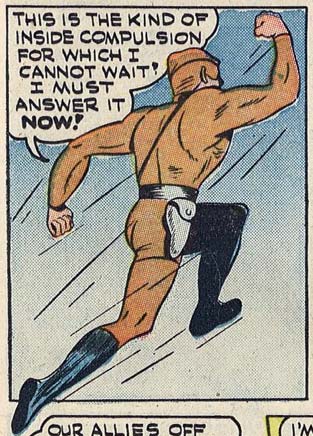
The same rule of setting customer expectations should apply to comic book characters as well, but sadly the creators of "The Black Cobra" are unaware of the convention:
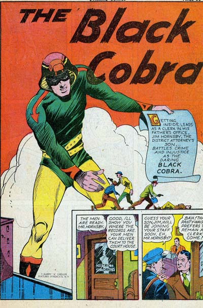
Because if you're going to have the word "Black" in your adventuring name, and you're a white guy, you damn well better have some black in your costume! A quick visual check using my handy color wheel, however, reveals that while the Black Cobra has yellow, green, orange, and purple (!), he does not sport anything black*.

Returning to our initial analogy, it's like Kenny dished you up roasted fish instead of roasted chicken.

Furthermore, an extensive HeroMachine Blog Investigation reveals that cobras do not, in fact, feature yellow**, orange, or purple in their actual bodies. I can forgive that partially, since at least he gives us some green, but if you're going to call yourself after a colored animal with a color that animal does not, in fact, possess, I am again going to have to deduct points for not actually using the introduced color in your costume.

Reducing this outfit's appeal even more is the "My animal is swallowing my head" motiff, which I've commented on before and never liked.

Plus, it appears that instead of a forked tongue featured in most reptiles, our hero has instead given his inspiration an arrowed tongue. I'm not sure what it's pointing to, but I am sure I don't want to know. He's also chosen to chop it out of the cobra's mouth and staple it to his arm instead.

Somehow, I don't see this guy being championed by the Cobra Anti-Defamation League any time soon.

Finally, in addition to him misleading us by setting false expectations via his name, he also doesn't grow in size like this splash page indicates, nor is his power holding up giant signs touting his own awesomeness. So to the publishers of Dynamic Comics, I say "BAH!" Take your fake not-black not-growing not-color-correct, tongue-stapling character and slither away!

For the record, here's how you rock a Cobra-themed outfit:
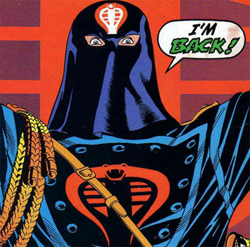
And that's why Cobra Commander is back, while Black Cobra never really arrived in the first place.

* Except maybe the face mask, but that's probably just shadowed green.
** Some have a sort of yellowish color on their undersides, but I consider it more like a beige.

(Image from "Dynamic Comics" number 1, 1941.)

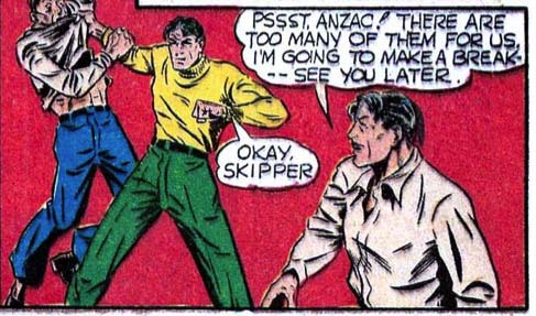
RP: The restroom’s that way, sir.

(From "Four Favorites" number 8, 1942.)

Poll Position: Green Lantern movie

Short but sweet this week:

{democracy:158}

You can view the trailer here. Go watch it, I'll wait.

Back? Good. Did you bring me popcorn? Get out.

I would say the trailer makes me somewhat more interested in seeing the movie. It helped sell me on the idea of Reynolds in the lead role, and I am buying the "Hal Jordan, cocky test pilot" angle.

Where I'm still struggling a bit is with the fundamental difficulty of melding an intergalactic space opera with an Earth-bound spandex-wearing super-hero. Those are two tough genres to pull off, and mashing them together is exponentially more difficult.

Anyway, what do you think, having now seen the trailer?

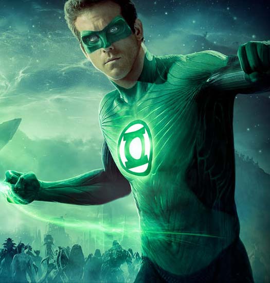
Updated to add: Man I hate the costume in this shot. It just looks ... muddy. And why have glowing, cool CGI effects in the threads but make the insignia look so pasted-on? I'd have liked to see them go whole-hog and make the insignia a floating hologram or something to match the rest of the costume.

I hope it's just the way the image is lit, but I miss the sharply defined color areas, the deep black of space and the crisp white of the gloves in the original design.

RP: Apparently he wanted caramel

(From "Four Favorites" number 8, 1942.)

Character Contest 50: Lord Random the Third

MMI pointed out that we haven't done a "random name" character contest in a while, and upon review I realized he was right -- it's been almost six months! So I think it's about time we revisited this always-fun concept.

It's pretty straightforward and a great way to stretch your creative muscles.

Whoever comes up with the best character based on a random name generated by Seventh Sanctum Superhero/Villain Name Generator will win a) his or her choice of either any item they like to be included in the final HeroMachine 3 version; b) a portrait to be included in the final HeroMachine 3 version, or c) a "sketch of the day" style custom drawing. The rules are fairly simple:

  • Go to the Seventh Sanctum Superhero/Villain Name Generator and choose "10" from the number of names to generate. Leave the other selection boxes at their default and hit "Generate". Your character(s) must be based on one of these generated names. Try your best to limit yourself to one spin of the wheel instead of generating names over and over till you get one you like!
  • Post an image of your character(s) to any publicly accessible web site (i.e. PhotoBucket.com, ImageShack.com, etc.) and put the link(s) and any commentary in a comment to this post.
  • Check back on Monday to see if you won!

No limit on entries this week, so knock yourselves out. Just make them good!

Character Contest 49 Winners!

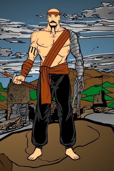
Just to be different, this week I am going to list all the Finalists (including the winner) for "Character Contest 49: Scorpio", and then at the end just say which one won. Because that's the way rock and roll rebels like me like to roll. And rock. Or something.

Anyway, off we go!

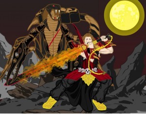
Asder was on FIRE this week, and as proof, here's his "Man vs. Scorpion King" complete with a sword that is on fire. There's a lot to like about this illustration, from the design of the characters themselves to the cool flame effect to the nice way he's pointed the toes on the human figure. A great example of "set design" in action.

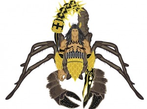
Asder's second Finalist is "Scorpion King". He (it?) looks totally cool and I think shows a lot of creativity in how it's assembled. The mace and spike tail in particular is wicked.

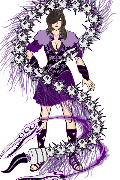
Finally, Asder gives us "The Scorpio Whip". I love that he uses "scorpio" in the name of the weapon instead of the character, just the kind of left-field thinking I cherish. And the whip itself kicks ass, a very cool concept well executed. The color scheme is tight as well, and supports the entire illustration perfectly. Excellent job, Asder!

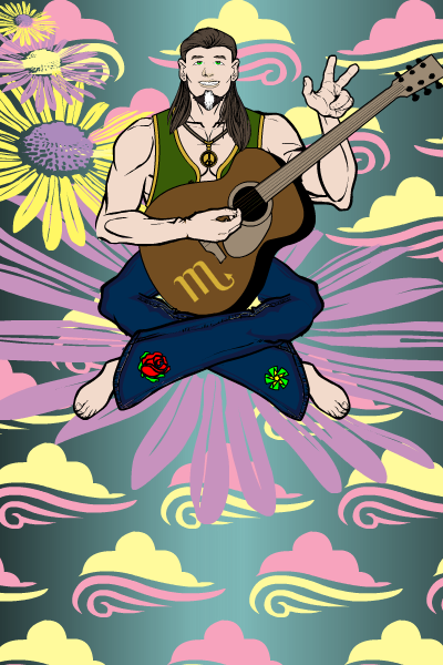
Atomic Punk's "70s Scorpio", a musical genius from the Age of Aquarius generation, makes great use of non-traditional elements in the sky and background to sell the story. I think it's a real hoot.

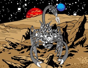
I love Cliff's imaginative use of pieces to build his "Scorpio BioMech". The planetoidal (I just made that word up!) surface is also very convincing and helps bring the entire concept together.

Galahad's "Scorpio" doesn't do anything crazy, but is a solid and interesting character nonetheless. You don't always have to push the program to breaking (literally in all too many cases) to get something cool.

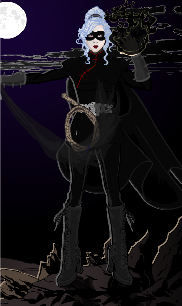
"I forget what name I use" put together a very cool "Black Scorpion" image for us. The purple-to-black gradient in the background works great, and the back-lighting that I think MMI introduced us to in his "Cemetery" series is also a wonderful touch. Very moody and effective.

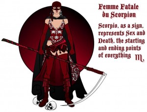
Speaking of MMI, his run of great characters continues this week with "Femme Fatale du Scorpion". I love the vaguely "Zorro" vibe, tight color scheme, and overall character design.

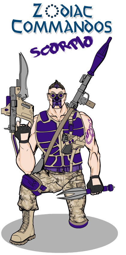
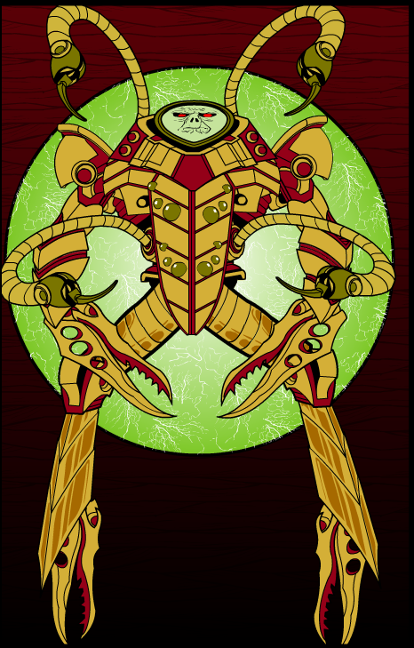
MLS promises a series of Zodiac-inspired characters, and that's the thing most likely to prompt me to actually doing the series each month. I like the improvised blade-gun Scorpio wields here a lot. The knife is also cool.

Like Cliff, Rancid assembled his own figure out of bits and pieces, and I love it. The face in particular is both eerie and intimidating, with the unusual flat-plane orientation. I think the background rocks too, an excellent energy-portal type of effect. The colors chosen also work great together and help bring it all home. Nice job Rancid!

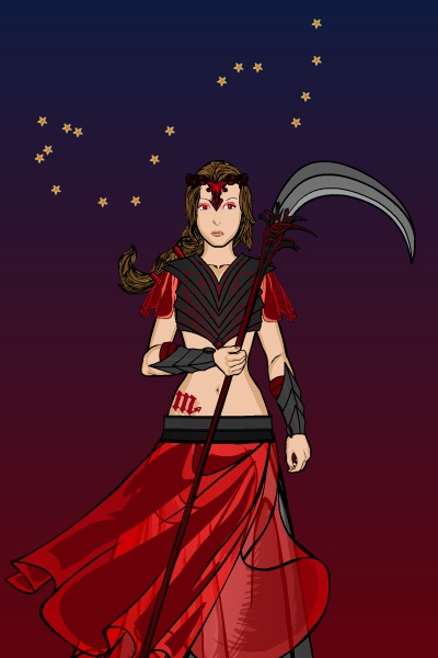
Finally, Sandcat makes great use of the two-color gradient and a hand-placed constellation to perfectly complement the innocence of "Scorpio".

Which brings us to the announcement of our winner. Namely, Asder! With that many great entries I couldn't deny the guy, and from the beginning I though "The Scorpio Whip" was a fantastic illustration.

So congratulations to Asder for the win, to all the Finalists for their great work, and to everyone who had the courage to share your work with the wide world!

META: Class

I'm teaching my first-ever "How to Draw Super-Heroes" class at the library today (community service type event, not an actual school or anything) and I'm a little freaked out. So if my posting today is a little scattershot, my apologies.

I'll try to get the contest judged and done asap. If you have an idea for the next character contest, or if you'd prefer I stick to the schedule of alternating character designs with caption contests, please chime in below.

Otherwise I will stick to the schedule for this week, including Open Critique Day on Thursday.

Finally, don't forget you can vote in Friday Night Fights every day! So if your favorites aren't winning, head back in and toss another vote on the pile!

RP: Profiles in Leadership

(From "Four Favorites" number 7, 1942.)

RP: Way to go, Makes No Sense Man!

(From "Four Favorites" number 7, 1942.)

First look at Green Lantern

Courtesy of buddy John, some footage from the upcoming "Green Lantern" movie. What do you think?