Category Archives: I Hate Rob Liefeld’s Art

What Were They Thinking?: Marvel’s Rebirth Problem

HEATH AND SAFETY WARNING: THIS WEEKS WWTT CONTAINS "ART" BY ROB LIEFELD. PLEASE TAKE ALL NESSESCARY HEALTH AND SAFETY PRECAUTIONS BEFORE READING. THANK YOU.

You know, doing a reboot isn't always a bad thing. DC successfully did it back in the 50's, taking the names of established characters from the 40's and changing their origins and personalities to create new characters and boom, Silver Age of comics. I mean, ok, they have now officially over-egged that omelette after the 18 trillionth time they've rebooted their universe, but still the original idea of taking the name "The Flash" and having it be a guy called Barry Allen rather than Jay Garrick was possibly the best in comic book history, maybe after the idea of putting Superman in bright red underwear over a blue one-piece. But, that's DC, what about Marvel. They aren't exactly known for their reboots are they. Whilst DC was creating all new characters from old ones, Marvel just slotted the new characters in alongside the old. So, they never needed to do a big reboot right? Yes, that's true, but this is What Were They Thinking (the place where we look at the stupidest most ill-advised things in all of comic book history), so of course, they did it anyway and what did we get? We got this...

Rob Liefeld cannot art.

Continue reading

Minor Victory!!!

So, it's true now that Rob "How Does He Have A Job" Liefeld has called it quits at DC. We no longer have to suffer through some of the worst art ever to be printed by a comic book company. It was apparently because of editorial battles. For more information, check out the Newsarama page: http://blog.newsarama.com/2012/08/22/rob-liefeld-quits-dc-the-0s-are-my-last-issues/

I'm mentally doing backflips, cartwheels and just generally jumping for joy! That's one less set of comics we have to endure Rob Liefeld working on.

Reason #13: He’s a hack

The upcoming "Hawk & Dove" relaunch features a cover by none other than Rob Liefeld, whose art (as you know) I hate with the white-hot intensity of the sun. Here's the cover:

Apparently DC, having already decided to grant an entire line to two characters no one has cared about since the Nineties, went all-in by having the cover drawn by an artist no one has cared about since the Nineties.

Rob Liefeld is a hack. That means he never got the necessary grounding in the fundamentals of professional illustration (or human anatomy), the absolutely essential scaffolding upon which good art is built. Now, don't get me wrong, I'm not dissing hacks in general. I consider myself one in many ways, certainly when it comes to programming (I'm totally self-taught, so there are embarrassing gaps in the fundamentals anyone having gone through a structured program would have received). Sometimes, the only way to get clear of the choking jungle is to hack your way through.

But he's a bad hack. Whose hackery inspired twenty years of insipid imitation that gutted the artistic integrity of a medium I love.

Thus, after a long absence I bring you another installment in the "I Hate Rob Liefeld's Art" series!

Rather than type out my review of why this cover is a classic example of Liefeldian Hackery, I give it to you in image format. Enjoy! And if I missed anything, please chime in to let me know.

(Image and characters ©2011, DC Comics, Inc. If they choose to claim ownership of either, that is.)

Freelance Friday: Babewatch edition

You don't have to be a filmmaker to know if you like a movie or not, and to offer a critique of it.

You don't have to be an author to know if you like a book or not, and to offer a critique of it.

And you don't have to be an illustrator to know if you like a particular drawing or not, and to offer a critique of it.

Several times on this blog, I've drawn (get it?!) some fire for coming across as too harsh on a given artist or character or series or costume. Which is fine, that's why they pay me the big bucks. But critique is a perfectly valid -- in some ways, an invaluable -- method of refining your own understanding of what you like and, more importantly, why you like it. Any art form can be appreciated (or not) at a gut level, and it's perfectly fine to live your whole life experiencing it there and no further.

But for a subject you love, like me with comics, there's so much more you can get out of it with a little time and effort. Which is why this week, I'm going to give YOU the chance to play critic.

I want you to go to Marvel's site and check out the preview pages at the bottom for Rob Liefeld's "Deadpool" issue 900. And then I want you to come back here and offer a genuine critique of the work. You don't have to be mean, or glowing in your praise, or sycophantic, or snidely hip, or anything other than honest. I want you to look at the pages of what will surely be one of the best-selling issues of the year, and I want you to think about what you do and don't like. Maybe you'll focus on the panel layouts, or the overall page design. Maybe you'll focus on the costumes or the environment, or the dialog, or the way the action flows.

Whatever it is you choose to comment on, give it some thought and give me your reaction to it. You all know my opinion of his overall "oeuvre" at this point, so there's no surprises there, but I don't want this to just be a bash-fest. The point is for you to take something that generates strong reactions in the viewer (which Deadpool 900 certainly should!) and to examine why you react to it the way you do. To articulate what it is you do and do not like.

Criticism gets a bad rap, because it's awfully easy to slip from knowledgeable commentary for the purpose of enlightening your own understanding to schoolyard heckling. But it's an important part of how we understand art, and I think it's very much worth pursuing.

I look forward to hearing your thoughts!

Reason 12c: Yet more bad swiping

I'd like to take a look at another Rob Liefeld swipe (with thanks to the Adlo blog), this time from the incomparable Frank Miller, to show why I hate Rob Liefeld's art. Again, I don't have a problem with "swiping" (using someone else's previously published layout as a template for your own), I have a problem with bad swiping.

Which, given that it's Rob Liefeld we're talking about, is pretty much the only kind we're going to get.

He makes it all the worse when he uses such titans of the craft as Frank Miller, and his iconic "Ronin". But, never one to pass on a Level Five Suck Challenge, Rob went for it.

Continue reading

Reason #12b: More bad thievery

Under the theory that you can never have too much whiny sniping and carping, I wanted to follow up last week's post showing how Rob Liefeld can't even swipe right with another example, this time featuring the exact same character as in the original from Jim Steranko's "Captain America". First, the original and then Liefeld's version:

Continue reading

Reason #12: He steals badly

Pretty much every artist has at some point "derived inspiration from" or "paid homage to" or "flat out stolen" work from another artist, but the thing is that when you do that, what you come up with still has to be good. Which Rob Liefeld is not. As evidence, and with a tip-o-the-hat to Glenn Hauman, here are two panels for you to compare. The first is from Rob Liefeld's New Mutants #93, cover date September, 1990, and the second is from Fantastic Four #247, by John Byrne back in October 1982:

rip-new-mutants-093_05
rip-fantasticfour_v1_247_p20

I don't have a problem with him lifting the design from Byrne, but I do think this is a great example of his deficiencies as an artist. Let me run down the reasons for you.

Continue reading

Reason #11: The Whole Package

Picking apart individual aspects of Rob Liefeld's art is easy, but sometimes you need to step back and take a look at the "big picture" as it were, a point I was forcibly reminded of when I stumbled upon this example:

regex112

This one has it all, folks, in a much subtler way than you might expect. We'll take it from the top.

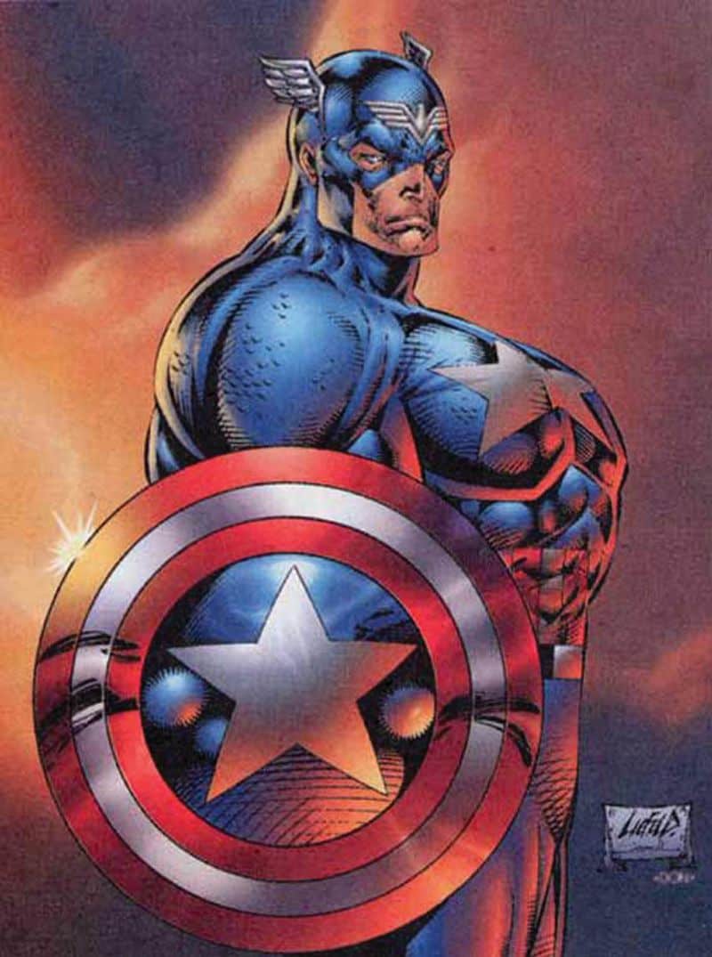
First of all, props to Rob for using cross-hatching in the background. It's still an amorphous blob just taking up space, but at least he -- or more likely, the inker -- used an actual artistic technique for the rendering. Still, the use of something, anything, to take up space in the background instead of an actual scene is a big Rob Liefeld staple. This one has the advantage of a random shape and random lines that add nothing to the composition except a vague feeling that this gentleman is about to be eaten by an amoeba.

Which explains why he has an enormous sword bared and ready, up to and including the serrated edges on the top of the blade. I'm trying to figure out why you would want a sword with the rippy bits up there, and I am coming up blank. If you wanted to saw with it you'd have to either do it underhanded or the knuckle guard would get in the way. Of course a nonsensical melee weapon is also a Rob Liefeld staple so we welcome it nonetheless.

But why obsess over a sword when you've got grenades! Because just one weapon is never enough for Rob Liefeld, we thankfully have at least seven, hanging from a bandoleer that's skin-tight across the chest but miraculously loose under the shoulder blade exactly where he needed something to take up space. How lucky! Or course it's possible those grenades are not part of the other ones, and instead represent some sort of clever underarm explosive device. Because who needs deodorant when you've got C4, amirightfellahs?!

Somehow I've gotten this far without talking about the head, which is just chock-full of awesomeness. You've got the face frame of hair, including longer hair on the cheeks than you'd find on Rapunzel's noggin. I'm a fairly hirsute fellow and no way in hell I can grow whiskers like that, but I reckon that's why I write software instead of launching high explosives from my pits.

But it's the actual face that really nails this as an authentic Liefeldian production. This one has it all folks, the skin pulled taut to the skull, the tooth-baring grin that couldn't possibly fit on a face with actual jaws, the sullen mismatched eyes, the excessive lines, this is a veritable masterpiece of hack. Throw in the enormous noggin, cleverly concealed by the aforementioned mane of not-Wolverine hair and it just takes your breath away.

But wait, there's more! Because when I say this drawing has the "whole package" of Liefeld hackery, I mean that literally. I rarely give this advice outside a FedEx delivery station, but check out that guy's package. Either he's going Mr. Greenjeans on us with the hiked-up waist line or you could fit his entire alien-like head in that space. And the cross-lines! Good lord, what's going on in there?! "Yes, is this Marvel HQ? I think I found where Wolverine is hiding ..." Maybe that's why he looks so constipated; there's nothing like a rabid super-hero with metal claws trying to escape from your pants to make you glad you're armed to the teeth.

And that, my friends, is reason number 11 why I hate Rob Liefeld's art.

Reason #10: The outfits

The Joel Schumacher Rule allows for no exceptions, and simply stated it commands that "Thou shalt have no nipples on the outside of thy costume", but apparently Rob Liefeld didn't get the memo when it came time to put together Stryfe's "look":

xf-33-nips

My theory is that when this guy got his nose smashed in, it forced his nipples to pop out of his armor. Or, it's really really cold. Or, he's into that kind of "play" and couldn't resist leaving little booby-portholes in his otherwise impregnable defense. Or Rob Liefeld couldn't design his way out of a paper bag.

My theory, and darkest nightmare, is some combination of the last two.

I suppose, however, that if your evil armorer was so lazy he just poked some eye holes in the nearest battle-axe for your "helmet", forgetting pesky details like a space for your nose or ears, you've got bigger problems than an inappropriate level of sexual discretion.

If so, you'd have company in Shatterstar, whose outfitter pawned off an old wrestling head protector as "state of the art meta-human cranial protection":

shatterstar
shatterstar2

He paid a bundle for it, too, which explains why he had to slum it with Cable's eye-makeup guy. "Glowing is so IN right now!" he gushed.

But let's be honest, it's not like Rob Liefeld has all that many arrows in his costume design quiver; had he put together HeroMachine, there would only be twelve items in it, and eight of them would be thigh pouches.

(All images and characters ©Rob Liefeld and Marvel Comics.)

Reason #9: The Covers

Somewhere along the line, the powers-that-be realized that perhaps Liefeld's "greatest" weaknesses -- complete lack of page layout ability, utter disregard for basic anatomy, the wordsmithing of a Tourette's-afflicted kindergartner, unnatural fixation on shouting/grimacing/overwrought faces -- could be turned into strengths if he were used as a cover artist instead of a regular interior penciler. Which gives us horrors like the following:

Continue reading