Category Archives: Digital Illustration Lessons

Submission Box: Suleman Tutorial: Frankensteining

Greetings Fellow Machiner,

I am starting off a new feature for the blog called Submission Box. If you have something you'd like to share with the community be it a tutorial, a heromachine "recipe" A cool youtube video you found, a great article you found on the web you can email me and submit it for the submission box. I will take a look and if I approve I will post it on the blog. Submissions will be posted as I have time you look at them, so some days you will have 5 or 6 Submission box posts and some days you will not have any. ...

Well lets get started with our first Submission box, which is a tutorial from community member Suleman which you will find after the jump........

Continue reading

Blank Bodies for Hand-Drawn Illustrations

In the process of cleaning up some hard drive space, I came across some body outlines I drew back in 2006. I cleaned them up a bit and provide them here for downloading and printing. These are not part of HeroMachine 3, they're just for folks who want to hand-draw (or use the computer with something like Paint if you want) outfits but need a body to hang them on.

These are all transparent PNGs so if you do want to use them in a painting application, they're easy to isolate from the background.

Creating a Custom Illustration

I thought you might be interested to see how an illustration goes from concept to final product. The client wishes to remain anonymous so I'll be leaving out their name and identifying characteristics of the characters.

Continue reading

SOD.065 – Superwoman

I got a little carried away with the Sketch of the Day this time around, as you can see:

065-31

Cory Walker has been doing a new Supergirl redesign every Wednesday as part of his "Sketch of the Day" series, which is probably where I got the impetus to do this one. Originally it was supposed to just be a regular quick black and white sketch like the others, but I just couldn't leave it alone until I finally settled on what you see.

Continue reading

Freelance Friday: Babewatch edition

You don't have to be a filmmaker to know if you like a movie or not, and to offer a critique of it.

You don't have to be an author to know if you like a book or not, and to offer a critique of it.

And you don't have to be an illustrator to know if you like a particular drawing or not, and to offer a critique of it.

Several times on this blog, I've drawn (get it?!) some fire for coming across as too harsh on a given artist or character or series or costume. Which is fine, that's why they pay me the big bucks. But critique is a perfectly valid -- in some ways, an invaluable -- method of refining your own understanding of what you like and, more importantly, why you like it. Any art form can be appreciated (or not) at a gut level, and it's perfectly fine to live your whole life experiencing it there and no further.

But for a subject you love, like me with comics, there's so much more you can get out of it with a little time and effort. Which is why this week, I'm going to give YOU the chance to play critic.
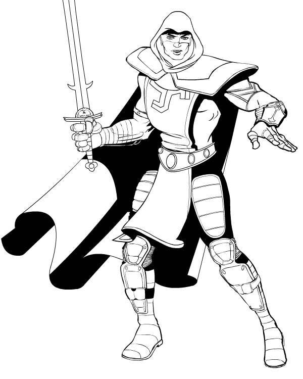
I want you to go to Marvel's site and check out the preview pages at the bottom for Rob Liefeld's "Deadpool" issue 900. And then I want you to come back here and offer a genuine critique of the work. You don't have to be mean, or glowing in your praise, or sycophantic, or snidely hip, or anything other than honest. I want you to look at the pages of what will surely be one of the best-selling issues of the year, and I want you to think about what you do and don't like. Maybe you'll focus on the panel layouts, or the overall page design. Maybe you'll focus on the costumes or the environment, or the dialog, or the way the action flows.

Whatever it is you choose to comment on, give it some thought and give me your reaction to it. You all know my opinion of his overall "oeuvre" at this point, so there's no surprises there, but I don't want this to just be a bash-fest. The point is for you to take something that generates strong reactions in the viewer (which Deadpool 900 certainly should!) and to examine why you react to it the way you do. To articulate what it is you do and do not like.

Criticism gets a bad rap, because it's awfully easy to slip from knowledgeable commentary for the purpose of enlightening your own understanding to schoolyard heckling. But it's an important part of how we understand art, and I think it's very much worth pursuing.

I look forward to hearing your thoughts!

Mustang Sally deconstructed

I thought you might like to see how an illustration is put together. After the jump I'll post an edited image I created while putting together Ian's prize for winning Caption Contest 42.

Continue reading

Wrestling brick

I've posted about this before elsewhere, but I thought you might enjoy seeing how an illustration for a magazine or role playing game happens from start to finish. I begin with the art specification (spec) from the art director:

Character illustration — [super villain]: [super villain] is an enormous brute of a man, 6'8" tall and with the super-muscular build one would expect of a man who can lift 400 tons. He's technically white, but the internal solar fires that give him his powers have "burned" his skin a sort of charcoal grey and caused all the hair on the top of his head to fall out. His costume is a sort of gold-colored leotard and tank top that resembles a professional wrestler's outfit; he doesn't wear gloves or a mask, but does have oversized black boots ("the better to stomp you with," as he sometimes puts it).

And here's how I proceeded.

Continue reading

Progress on Mideios

The illustration for Mideios, the contest finalist, is going very well. I've gotten approval on the black and white lineart, and though you might like to see how it's going so far (click the image for a larger, non-pixelated version):

Mideios in black and white

The black and white drawing is done in Flash in layers as I've described elsewhere. I fill the inside bits with white, then export it as a high-resolution Adobe Illustrator file. Now I'll import that Illustrator file into Photoshop for the color work, which I'll post as soon as it's approved. This is fun!

Free blank figure templates

Maybe you want to see the character you've designed in a pose unavailable in the HeroMachine. Maybe you want to try freehanding your own illustration, but you're not very good at drawing the basic figure. To help you out, I've created the following "blank" figure drawings for you to use as a base for your own designs. These are all copyright-free, you're welcome to use them however you like without attribution. Just right-click on the template you want, and choose "Save As ..." or "Save Image As ..." to put it on your hard drive. Once you have it, load it into an image editor like Photoshop or MS Paint and start customizing it. You can also click on each image to load it full-size in its own window to see it without pixelation. Good luck!

Continue reading

Tweak (and I don't mean the South Park character)

Sometimes I get the impression that non-artists think illustrations just leap full-blown and ready-made from the pen to paper, already fully formed and perfect. My friend, nothing could be further from the truth. The odds are that the image you see in front of you has been through more revisions than the story you're concocting to explain to the nice police man why you're naked on the neighbor's front lawn. Here's an example from my own work of what I mean.

Talon Ironhawk

This illustration was for the "Legends of Steel" RPG being developed by my friend Jeff Mejia. He wanted a character sketch of young nobleman Talon Ironhawk. Here's my first pass at it (click on any of these to see them at their actual size, without distortion):

Talon Ironhawk - beard

Jeff replied that the character was too old, that he should be much younger and not quite so grim. Now, when you're an illustrator, time is money. Having to completely redraw something takes hours, hours which you're not spending getting new dollars to roll through the door. (Believe me, getting dollars to roll in the first place is plenty hard enough, you don't want to do anything to make it more difficult.) So I tried to get away with just redoing the face and adding a Three Musketeers type of facial hair effect, because nothing says "youthful exuberance" like a beard and mustache that went out of style 200 years ago:

Talon Ironhawk, Musketeer

Close, but no cigar, was the reply. He told me to lose the facial hair as Talon wasn't really old enough for that sort of thing, and so I ran off and did a color version with those changes:

Talon Ironhawk, first try

Luckily Jeff was not to be distracted by pretty colors, and rightfully declared that this was still not really what he was looking for. At all. Talon was supposed to be a young noble, just starting out on his life of adventuring. He'd have nice but functional gear, no flashing gems and whatnot. This pose was just too flamboyant and frivolous, and he still didn't look young enough. Realizing that I'd just not done a good job at all on the first illustration, I started from scratch and redrew the entire thing, finally ending up with this:

Talon Ironhawk, final

The final result is so much stronger than the initial versions; I'm really glad Jeff had the vision to know what he wanted, and the intestinal fortitude to ask for it.

This was actually a pretty easy project, I've had some that went through many (many!) more revisions before finally being accepted. And some never got accepted at all. So next time you look at that pretty illustration in your favorite magazine or comic, don't kid yourself that it was done all in one fell swoop. Behind every elegant line and perfect color is hours of tweaking; don't get discouraged if it takes you a long time to get your drawing just right. Believer me, you're not alone!