I'd like to take a look at another Rob Liefeld swipe (with thanks to the Adlo blog), this time from the incomparable Frank Miller, to show why I hate Rob Liefeld's art. Again, I don't have a problem with "swiping" (using someone else's previously published layout as a template for your own), I have a problem with bad swiping.
Which, given that it's Rob Liefeld we're talking about, is pretty much the only kind we're going to get.
He makes it all the worse when he uses such titans of the craft as Frank Miller, and his iconic "Ronin". But, never one to pass on a Level Five Suck Challenge, Rob went for it.
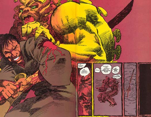
Frank Miller, "Ronin" number 1, page 32-33 (1983)
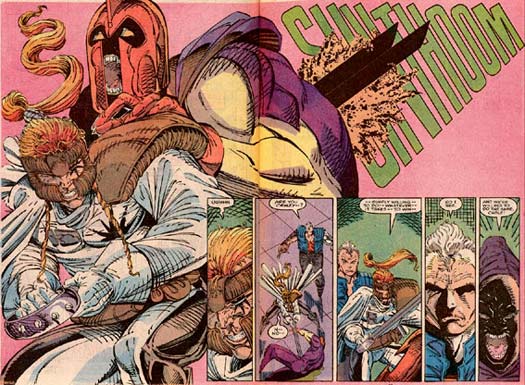
Rob Liefeld, "New Mutants" number 100, page 27-28 (1991):
Let's pass on Shatterstar's ridiculous outfit and prehensile pony tail and just focus on the layout, because I think this is a great example of how very small changes can have a very large impact. Take a look at the rear figure's left hand in Miller's panel, and note how its pinky overlaps Ronin's shoulder. We've talked about the importance of overlapping lines before, and once again Liefeld demonstrates that he has no understanding of the technique at all.
By choosing to line his figure's fingers parallel to Shatterstar's shoulder blade instead of across it, he loses that sense of imminent, looming menace that Miller achieves. In "Ronin" you have a slavering demon killed just as he's about to completely enclose the warrior in a crushing grip. In "New Mutants" you have a guy in a funny helmet about to give a sword-wielding wrestler a backrub.
That's a lot of weight for one pinky to handle.
There's more to it than that, of course. Look at how Miller's colorist has made the fingers yellow and the face red, to reinforce that layered effect, while Liefeld has red gloves right next to a red helmet, making them blend in together even more, flattening the composition further.
Miller's also much better with shading. Moving from lower left to upper right, the Ronin figure has his chest and abdomen in shadow, the front of his shoulder in light, the demon hand shadow, the lighted demon hand, the shadowed demon chest, the lighted demon shoulder, and then the darker background. You go dark-light-dark-light-dark-light-dark, stepping the viewer through layer after layer of shapes overlapping and reinforcing each other.
Compare that to Liefeld's haphazard and nonsensical line work, which looks like someone let his four year old loose with a Bic pen. There's no rhyme or reason to the placement of light and shadow, so instead of Miller's carefully thought-out and mutually reinforcing use of line, shadow, and form, you get a big pile of disjointed and badly designed monkey feces.
Suffice it to say, the actual drawing (as opposed to the design) also blows. In the original, Ronin is using a katana, which has a hilt you can grip from any angle, making the hand placement logical. Shatterstar, on the other hand, is using a cutlass, which means he's having to grip the actual blade in order to shove it through his enemy's guts. Even assuming the first few inches are dull on the cutting side, that's still not a great idea; you'd think his off hand would be on the pommel for the added thrust. But hey, Miller didn't draw it that way, so what's an artist to do?
Also, I find it incomprehensible that a) Shatterstar has a sword with two blades on it because WTF, this ain't a Schick razor, and b) neither one of them line up with the actual hilt! Dude's got two freaking blades on that thing and still he can't line them up! I guess Liefeld was too busy that day to reach for the straightedge, despite all the time he saved letting Miller do the layout for him twelve years earlier.
I also wonder why this guy is stuffed with sawdust, judging from its explosion from the exit wound, but I don't want to kick a guy when he's down.
The last thing I want to point out is Liefeld's decision to use an onomontoPOWia for the blade exiting the target. As best as I can tell it's "SHVTHOOM", which is just flat out stupid. On what freaking planet does a slab of metal slicing through a meaty physical body make a noise that has anything like "THOOM" in it? But worse than the content of the sound effect is its mere presence. Whereas in Miller's layout you have a grim spectacle in classic samurai silence, a moment of extreme violence captured soundlessly and classically so the visual dominates the stage and you're left in this great suspended moment, Liefeld stomps in like a dinosaur in combat boots and has to SHVTHOOM all over everything. It's oafish, clumsy, cluttered, and completely unnecessary to include a sound effect there, and having to lazily jam it into that bizarre trapezoidal shape because oh no, page border! just makes it all worse.
If you're going to swipe another, much greater artist's work, at least do it the honor of treating it with respect and skill. Rob Liefeld has neither, and that is yet another reason why I hate his art.


