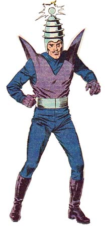
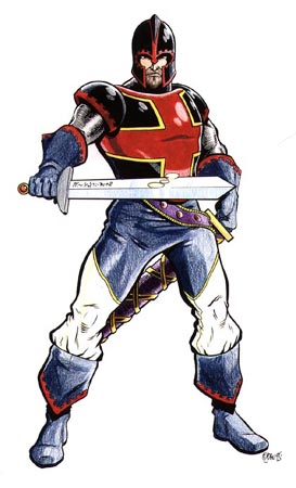
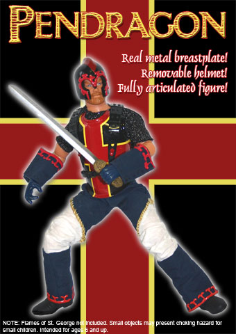
Kitbashing is the art of assembling your own action figure out of a combination of hand-made and store-bought accessories. Kind of like HeroMachine in non-digital three dimensions. A couple of Christmases ago I took a stab at it myself, following the advice of my friend The Evil DM. I started with a friend’s character, Pendragon:
I bought a bunch of action figure pieces (literally a bag of parts) from eBay, purchased fabric of the relevant colors, and acquired a package of Super Sculpy modeling clay for the helmet. After several weeks of work, three sculpted helmets exploded in the oven, and a new appreciation for the work of seamstresses everywhere, I ended up with a one of a kind action figure:
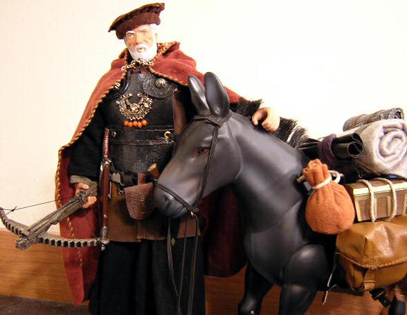
I’m a rank beginner, though, especially compared to the work of guys like The Evil DM:
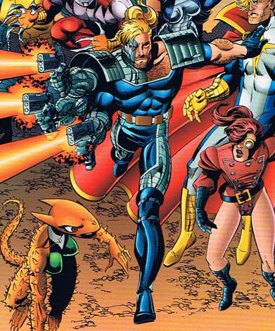
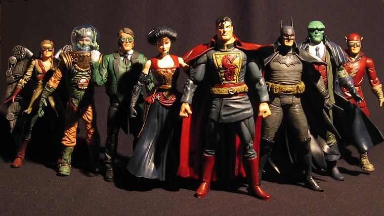
And then there’s this guy, whose Gaslight Justice League I saw yesterday. Just unreal:
If you ever wanted to see the characters you’ve created in HeroMachine take life, you should try your hand at kitbashing. The worst that can happen is your mom yells at you for all the exploded Super Sculpy in her oven, and at best you develop a whole host of new uber-geek skills. And some really cool action figures.
(Pendragon illustration and character © John Hartwell, Hartwell Studio Works. Merchant action figure photograph © Jeff Mejia. Gaslight Justice League figures and photo © … ummm … the guy at this URL. Characters depicted in the Gaslight JLA image are © DC Comics, Inc.)