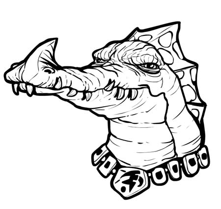
Alternate version after the jump.
Sponsored Links (which Premium Members will never see):
Comments Off on SOD.047 – Crocalien
Posted in Sketch of the Day
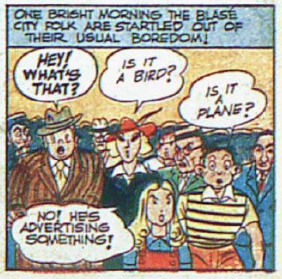
(From "America's Greatest Comics" number 7, 1943.)
Comments Off on RP: Because sometimes Clark needs a little pocket change
Posted in Daily Random Panel
Come up with the funniest -- while still being clean, that's important this week, as you'll see -- replacement dialog for the balloon in this panel and you'll win the chance to include any item you like, or a portrait of yourself, in HeroMachine 3!
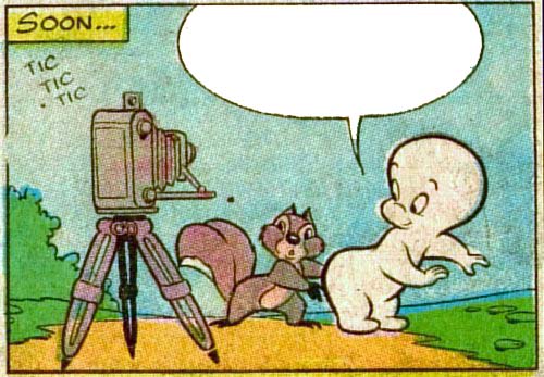
The rules are simple:
That's it! Good luck everyone, we'll post the Finalists for voting next Monday.
Comments Off on Caption Contest 70
Posted in Challenges
I hate doing this, but I am going to change the rules for the "Hunted vs. Hunter" contest mid-stream because this thing didn't quite work out the way I intended originally. My apologies for the course correction. What we're going to do instead is to have two polls, one for the best overall Hunter and one for the best overall Hunted. The top vote getter overall will receive a free custom black and white character portrait by yours truly, while the top vote getter in the OTHER category will get any item they like or a portrait of themselves to go into the HeroMachine 3 final version.
In other words, if the overall vote leader is a Hunter, then the Hunter team "wins" and that person gets a character portrait. The top Hunted vote-getter essentially becomes runner-up and gets an item. Or if the overall leader is Hunted, the top Hunter would come in second. Hope that makes sense.
Good luck everyone! You can vote for three Hunters and two Hunteds. Congratulations to all the Finalists, you did a great job! Click on any of the images below to see the character in a larger size.
[polldaddy poll="2704666"] [polldaddy poll="2704689"]Comments Off on Character Contest 27 Vote!
Posted in Challenges
Congratulations to TheNate for winning Caption Contest 69!

Nate, let me know what item you'd like to appear in HeroMachine 3's final version, or if you'd prefer a portrait instead.
Thanks to everyone who entered and to all the other Finalists!
Comments Off on Caption Contest 69 Winner!
Posted in Challenge Favorites, Challenges
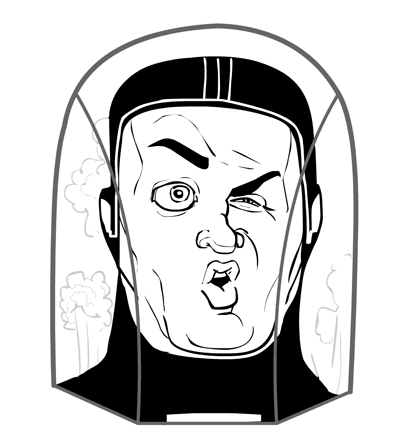
Comments Off on SOD.046 – The peril of self-contained breathing suits
Posted in Sketch of the Day
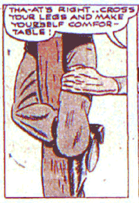
(From "America's Greatest Comics" number 6, 1943, in the "Commando Yank" chapter.)
Comments Off on RP: Bad things to hear from a guy named “Commando Yank”
Posted in Daily Random Panel
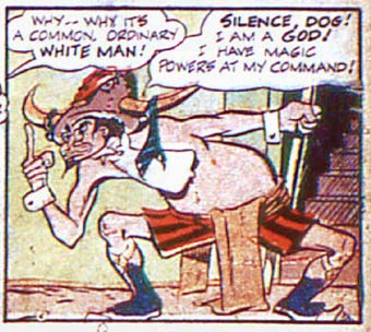
(From "America's Greatest Comics" number 6, 1943.)
Comments Off on RP: You can tell by the black socks with shorts
Posted in Daily Random Panel
I've been working for the last couple of weeks on rethinking the layout and user interface for HeroMachine 3. Here's a first pass at translating these thoughts into a design (click for a larger version):
Some of these ideas are from Mark Shute's excellent usability study from a few months back, while some are new on my part. The main problems the current rough layout pose to my mind are:
There's a lot more "under the hood work" to be addressed as well, naturally, but before I start coding I want to make sure I have the layout and user interface nailed, or as close as I can get, anyway.
I'm eager to hear your thoughts on all this, please let me know what you think, if this promises to be better or worse, obvious pitfalls you see, etc. Thanks!
Comments Off on HM3: New UI ideas
Posted in HeroMachine 3, Previews