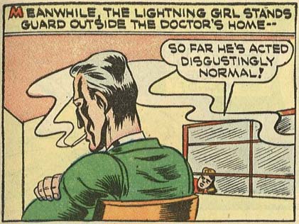
(From "Four Favorites" Number 8, 1942.)
Sponsored Links (which Premium Members will never see):

(From "Four Favorites" Number 8, 1942.)
Comments Off on RP: When fetishes clash
Posted in Daily Random Panel
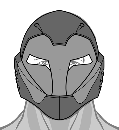
I've just added the following item to Headgear-Standard for HeroMachine 3 as MScat's "Character Contest 47" prize:
And the following three items to "FootRight-Male-Standard" for Joshua's "Caption Contest 86" prize:

That's the same boot, just broken into the foot portion, the calf portion, and then assembled all as one.
Enjoy! If you like 'em, be sure to thank the winners.
Comments Off on More prizes
Posted in Challenge Prizes, Challenges
Don't forget, you've got until midnight tonight to cast your votes in Friday Night Fights 2, Round 1: Friar Tuck! Some of the races are super tight, so every vote counts. Vote in the active tournament here, and in the consolation round here.
Comments Off on Last call for FNF voting!
Posted in Friday Night Fights
After cancellation the last couple of weeks, it's time once again for another Open Critique Day.
If you have a HeroMachine illustration or another piece of artwork you've done that you'd like some help with, post a link to it in comments along with your thoughts on it -- what you think is working, what you're struggling with, etc. I will post my critique of the piece, hopefully giving some tips on how to improve it.
Of course everyone is welcome to post their critiques as well, keeping in mind the following rules:
That's it! Hopefully we can get some good interaction going here and help everyone (me included!) learn a little bit today.
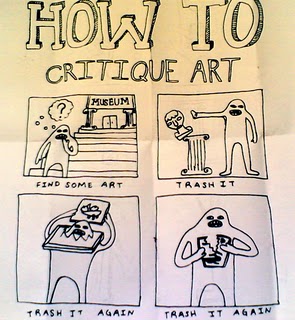
(Image © Mail Art Fun Club.)
Comments Off on Open Critique Day #5
Posted in Open Critique Day
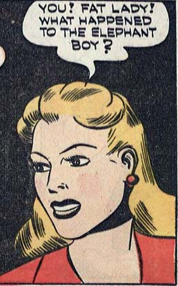
(From "Four Favorites" number 8, 1942.)
Comments Off on RP: Worst Senior Prom chaperone ever
Posted in Daily Random Panel
With thanks for their patience, I am happy to announce two more contest prizes have been approved, both from last time's Friday Night Fights. I figured I should probably get those done before this FNF concludes :-/
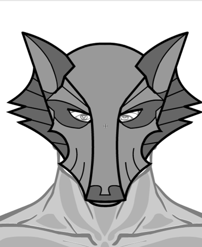
First up was Gene's consolation round prize. He chose a sci-fi helmet based on a wolf concept, and it is now live in Headgear-Standard:
Second is Imp's runner-up custom black and white character sketch, featuring "Rocket Ninja":
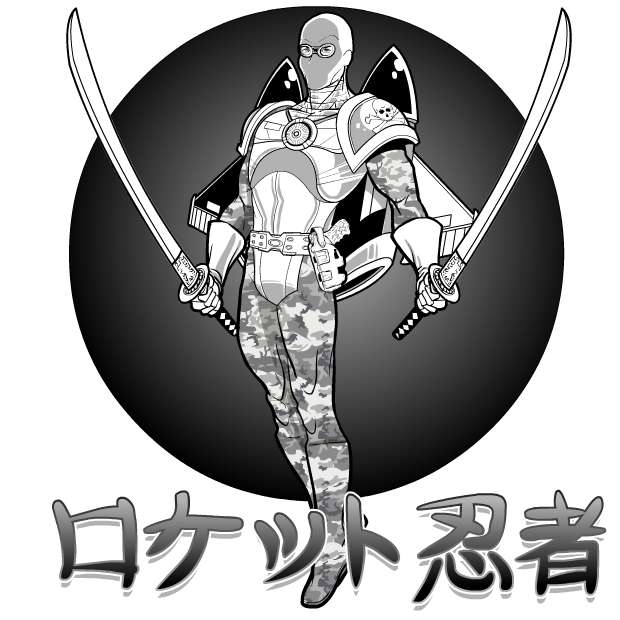
Thanks again to both of those guys for being so patient and easy to work with. These were fun illustrations to do!
Comments Off on Two more contest prizes
Posted in Challenge Prizes, Challenges
If you go to your local "Kenny Rogers' Roaster" establishment and see a special advertised for "Roasted Chicken", you are going to assume that the meal you order will have either something roasted or something chicken, and preferably both.
The same rule of setting customer expectations should apply to comic book characters as well, but sadly the creators of "The Black Cobra" are unaware of the convention:
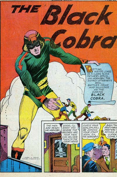
Because if you're going to have the word "Black" in your adventuring name, and you're a white guy, you damn well better have some black in your costume! A quick visual check using my handy color wheel, however, reveals that while the Black Cobra has yellow, green, orange, and purple (!), he does not sport anything black*.
Returning to our initial analogy, it's like Kenny dished you up roasted fish instead of roasted chicken.
Furthermore, an extensive HeroMachine Blog Investigation reveals that cobras do not, in fact, feature yellow**, orange, or purple in their actual bodies. I can forgive that partially, since at least he gives us some green, but if you're going to call yourself after a colored animal with a color that animal does not, in fact, possess, I am again going to have to deduct points for not actually using the introduced color in your costume.
Reducing this outfit's appeal even more is the "My animal is swallowing my head" motiff, which I've commented on before and never liked.
Plus, it appears that instead of a forked tongue featured in most reptiles, our hero has instead given his inspiration an arrowed tongue. I'm not sure what it's pointing to, but I am sure I don't want to know. He's also chosen to chop it out of the cobra's mouth and staple it to his arm instead.
Somehow, I don't see this guy being championed by the Cobra Anti-Defamation League any time soon.
Finally, in addition to him misleading us by setting false expectations via his name, he also doesn't grow in size like this splash page indicates, nor is his power holding up giant signs touting his own awesomeness. So to the publishers of Dynamic Comics, I say "BAH!" Take your fake not-black not-growing not-color-correct, tongue-stapling character and slither away!
For the record, here's how you rock a Cobra-themed outfit:
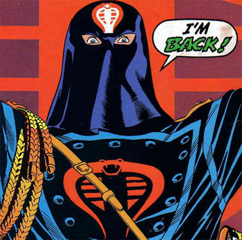
And that's why Cobra Commander is back, while Black Cobra never really arrived in the first place.
* Except maybe the face mask, but that's probably just shadowed green.
** Some have a sort of yellowish color on their undersides, but I consider it more like a beige.
(Image from "Dynamic Comics" number 1, 1941.)
Comments Off on On setting costume expectations
Posted in Bad Super Costumes
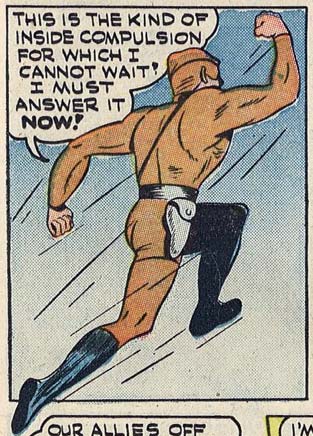
(From "Four Favorites" number 8, 1942.)
Comments Off on RP: The restroom’s that way, sir.
Posted in Daily Random Panel
Short but sweet this week:
You can view the trailer here. Go watch it, I'll wait.
Back? Good. Did you bring me popcorn? Get out.
I would say the trailer makes me somewhat more interested in seeing the movie. It helped sell me on the idea of Reynolds in the lead role, and I am buying the "Hal Jordan, cocky test pilot" angle.
Where I'm still struggling a bit is with the fundamental difficulty of melding an intergalactic space opera with an Earth-bound spandex-wearing super-hero. Those are two tough genres to pull off, and mashing them together is exponentially more difficult.
Anyway, what do you think, having now seen the trailer?
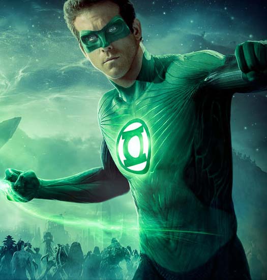
Updated to add: Man I hate the costume in this shot. It just looks ... muddy. And why have glowing, cool CGI effects in the threads but make the insignia look so pasted-on? I'd have liked to see them go whole-hog and make the insignia a floating hologram or something to match the rest of the costume.
I hope it's just the way the image is lit, but I miss the sharply defined color areas, the deep black of space and the crisp white of the gloves in the original design.
Comments Off on Poll Position: Green Lantern movie
Posted in Movies and TV, Versus

(From "Four Favorites" number 8, 1942.)
Comments Off on RP: Apparently he wanted caramel
Posted in Daily Random Panel