Monthly Archives: January 2008

Good group costume design – Linkin Green

Browsing through the UGO HeroMachine forums, I've seen a number of "group shots", characters all built around a common theme and then assembled together in Photoshop. But I think this trio from "Count Libido" (don't let the name scare you, it's all clean), called "Linkin Green":

Linkin Green Heroes

All of the Count's character images are really well done, even stretching back to 2005 (!) and the earlier HM versions. Note in this Linkin Green group how well the color palettes match. They're obviously three individuals, but just as clearly they're part of a group, and it's done by setting a simple four color palette and sticking with it. A common mistake when making characters is to load every color in the rainbow onto their outfits, but that just looks like a peacock exploded on them. Keep it to a tight group of colors like Count Libido and you'll end up with a much better design.

OnomontaPOWia

By virtue of the authority vested in me by BAs in Art and English ("Why get one useless degree when you can get two?"), I hereby coin a new word to describe visual sound effects used in comic books*:

OnomontoPOWia: turning text into art in order to render sound. From onomatopoeia.

Yes, capitalizing the POW is required. And if I could figure out how to insert an exclamation point in there without killing half the librarians in the world with a brain aneurysm, I would.

You see examples of onomontoPOWia in pretty much every title on the stands. "Sound effects" help bring the page to life, strangely making the action seem more real even while inserting a completely unreal visual element into the scene. The 1960's camp series "Batman" really brought this technique to prominence, with spinning "POW!" and "BAM!" starbursts flying from the Caped Crusader's fists. But they've been with the medium virtually from the beginning, and they continue to make comic books better and better. Or worse and worse, depending on how they're used.

And so, as an homage to this underrated comic book element, every Friday I will attempt to bring you an awesome example of onomontaPOWia, like this mind-blowing example found in Marvel Comics' "Battle Tide II":

Continue reading

Peanuts Legion

My long-standing love for all things "Legion of Super-Heroes" compels me to link to this well-done mash-up putting "Peanuts" characters in the role of Legionnaires. Enjoy!

Linus as Brainiac

(Hat tip to Rob Rogers, whose upcoming super-hero novel "Devil's Cape" you should pre-order today!)

Rip-Offs

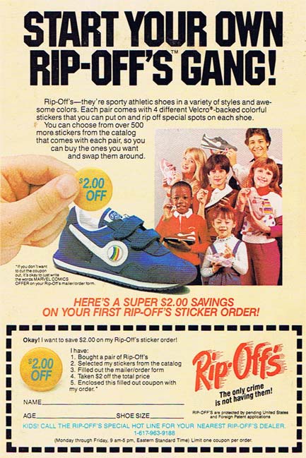
An ad from the back of a 1985 comic book on my desk:

Rip-Off Shoes

I salute you, Rip-Offs, for admitting right in the name of your product what it is you're doing to the kids who purchase you. And then to have the ironic foresight to put the ad in the first edition of "The West Coast Avengers", a rip-off comic if there ever was one -- well. Sir, your name is Genius.

Beldar as Super-Villain

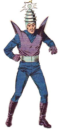
I used to feel bad that most super-villains were humans, but I was delighted to find that the Coneheads, too, have their problems:

Brain Storm Conehead

Apparently Beldar went to seed after his movie bombed and he took up a life of crime. Pity.

Actually this is an image of DC's "Brain Storm", but I think the Coneheads connection is closer to the truth. Take this sentence from his character write-up: "Discovering at last that his brother was not dead, but merely teleported to France accidentally by Brain Storm's own power ... "

And when asked where he's from, what does Beldar the Conehead famously answer? That's right, "We are from France." I rest my case.

(Image and character @1985 DC Comics, Inc., "Who's Who", volume III.)

Win a Free Custom Character Portrait!

Note, February 1, 2008: This contest is over, so comments on this post have been disabled.

I am pleased to announced the first ever HeroMachine Custom Character Portrait Contest! The winner will receive a free custom, hand-drawn digital illustration of their character by me, Jeff Hebert, professional illustrator and bald guy. Here's how it works:

  1. Send in your HeroMachine character either via the HeroMachine.com Contact Form; via direct email (afdstudios@gmail.com); or as a comment to this post. You can attach your character either as a JPG/GIF/PNG or as just the HeroMachine save string, whichever you prefer. If your HeroMachine image is already posted elsewhere (i.e. on the UGO forums), just send in the link to your artwork.
  2. You can use any HeroMachine version you like.
  3. No more than three submissions per person.
  4. In two weeks, on January 21, I will select from the submitted entries the five I think show the most creativity and originality. I will publish those three submissions here on HeroMachine.com, and create a poll so visitors can vote for their favorite.
  5. The entry with the most votes as of midnight Central time on January 27 will be declared the winner, with the announcement to be made on the morning of Monday, January 28.
  6. The winning entry will receive a custom digital illustration of the winning character (meaning on the computer only, not a physical drawing), with input from the creator. The completed illustration will be displayed on HeroMachine.com, but the artwork will belong to the winner to use as they see fit otherwise.

You can see examples of HeroMachine creations turned into custom illustrations in the posts I've made previously about Kubota, Hangman, and Talena.

The final artwork will be created by me, Jeff Hebert, original HeroMachine artist whose work has been published in numerous super-hero gaming supplements and magazines. This is a real custom illustration just like those that would cost you hundreds of dollars at a convention or via an artist's commission.

So get busy with the HeroMachine and let your imagination run wild!

Stealing from yourself

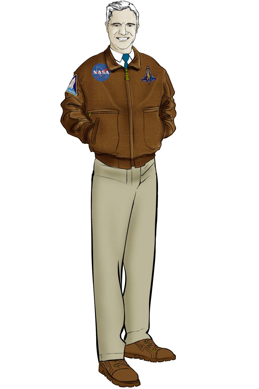
One of the key advantages to using Flash as my illustration platform is that I can easily steal from myself. Take the example of Harry Kruger, NASA bigshot:

Harry Kruger

Harry is a character by Neil Ma from the Uberworld Play By eMail (PBeM) shared universe I'm involved with. Take special note of Harry's face, because I chopped it up and put its pieces into the HeroMachine expansion.

I created the original set of facial features in HM2 by drawing the eyes, noses, mouths, eyebrows, and ears all separately. As a result, they don't always look great put together. So with the Expansion, I took pre-existing faces (either from photo reference or from prior illustrations I'd done, like Harry) and cut up the individual features. That way, when they're put together, you come out with a pleasing whole that fits. As an added bonus, they still look good mixed and matched, too, which is always nice.

This sort of thing is much more widespread than I think most people realize. It's not a bad thing to recycle artwork you've used before, and having your originals available in a digital format (especially a lossless vector format) makes it that much easier. I've even duplicated entire figures as background elements for a different illustration, saving a ton of time and making the final result that much better.

So if you're going to steal, kids, steal from yourself!

(Harry Kruger character © Neil Ma.)

Text Insignia

Did you know you can type in your own letters in a variety of fonts to use as a logo for your HeroMachine character? After picking the body style you want, choose the "Insignia" component, then the "Text" genre of items. By default they all say "ABC", but if you click on the actual item on the character, your cursor turns into a text-selection i-beam. Delete the default ABC and type in whatever you like, from numbers to letters.

On the UGO HeroMachine forums, for example, "monkeykid12" has chosen a text font from the "Expansion1" genre and created "High Five", who probably won't be a guest on an anti-drug "After School Special" any time soon, but who does look pretty neat:

High Five

It helps to choose a non-white color for the Insignia before selecting the font item to make it easier to see. Now get out there and make some heroes!

Phlegmings

Everyone in the creative business hopes to leave a legacy for the future, some mark on their craft that will resonate through the ages long after the originator has died.

In the case of Image Comics, part of that proud legacy is spit.

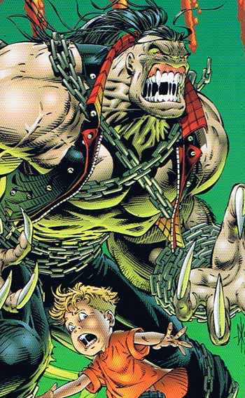
I call it a "phlegming", a long strand of saliva visible in the widely gaping mouth of the character. While today you see it everywhere, it reached salivary perfection with the fine stable of Rob Liefeld clones at Image Comics, as in this cover from "Pitt" (motto: "So much awesomeness we needed two Ts!") number two:

Super-Hero Saliva

As you can see, when you're a young man you have only one phlegming, because your adolescent body is just not sufficiently developed enough. But eat all your breakfast and work hard every day, and soon you'll grow into an eight foot tall Hulk/Wolverine rip-off with six, seven or even more phlegmings of your own!

Notice, however that supporting that many phlegmings at once is not easy. Just look at how many new and innovative neck muscles not present in regular humans are required to generate so much viscous spittle. And the jaw control required to form it into strings instead of flinging it about as droplets results in massive growth of your teeth and gums. Practically your whole face gets devoted to supporting the creation and maintenance of phlegmings, but I think we can all agree it's well worth the effor.

On a more positive note, given the size of his enormous melon, I think that young man definitely has what it takes to be a top-notch super-hero one day, supporting his own set of phlegmings and other mucous-related products.

(Image and character © 1993, Dale Keown.)

Custom Hangman

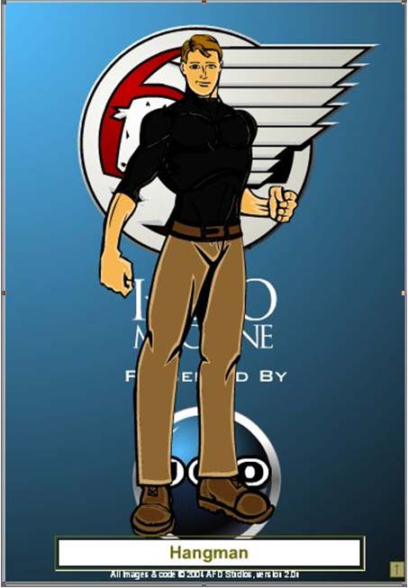
Pre-fab is good, but custom is better. At least, that's what my home builder told me just before handing me his bill, but it's just as true for super-heroes as it is for houses. As another example, from the pages of "Roll Call 06" by Oforie Murray, I give you Steven Warfield's "The Hangman". Steven's initial proposal had this HeroMachine illustration:

Initial Hangman Proposal

When you're doing a custom illustration for someone, the more detail you can get, the better, and Steven certainly came through. Here are the initial artist's notes he sent in:

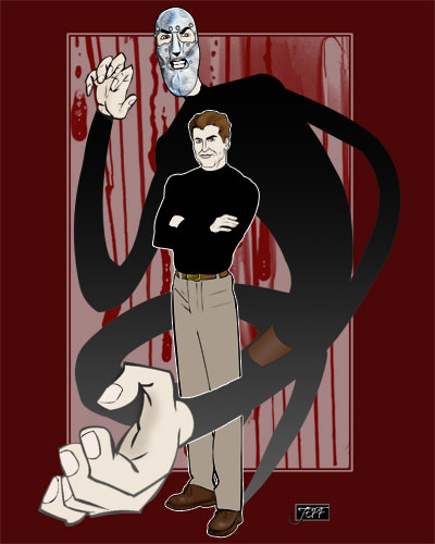
Artists Notes: So this is obviously a pretty generic bit of art (the piece I did up at HeroMachine), but I think that it gets across the idea of how I think that Hangman would look "in character." As per his description, he wears the upper part of the bodysuit under any normal clothing (and would wear long sleeve shirts to accomplish that).
I am thinking maybe the smarmy overconfidence that Edward Norton displayed toward the end of Primal Fear for how he would look in the face (I would include a picture of what I am talking about, but as of yet cannot find any). I also think that it might be a good idea to have a "plainclothes" version of him in the foreground, with the elongated, masked version in the background/behind him rising up (to give an idea of how he gets away with his "dual existence" to some extent). If that is not possible, perhaps an "action shot" of him sloughing off his regular clothes and elongating out might be cool. As for his clothing - I am thinking some sort of body-suit that can stretch with him (to a degree). His hands would remain ungloved (so that he can feel what he is doing, both in terms of being more capable and also the thrill he gets from it). As for the mask, I think that a more elongated version of the one I have attached would be damn near perfect - and would give a chance to see the side that he doesn't display when he is hunting to really come through (since you can still see his eyes and mouth).

After a few initial tries, eventually that first generic HeroMachine image turned into this:

Custom Hangman

Next week I'll be announcing a special contest that will let you -- yes, you there, in your pajamas! -- try to get a custom illustration like this for your very own character, so be sure to check back then!