It's good to be a geek

When I was looking through my old sketch books for the early HeroMachine designs, I stumbled upon the first comic book concept I worked on as more than a passing fancy. A friend of a friend and I worked through actual story ideas and I came up with a number of conceptual sketches that I remember being fairly proud of at the time. Nothing ever came of those discussions, but I've scanned the drawings in and re-inked them:

Against the Dagons

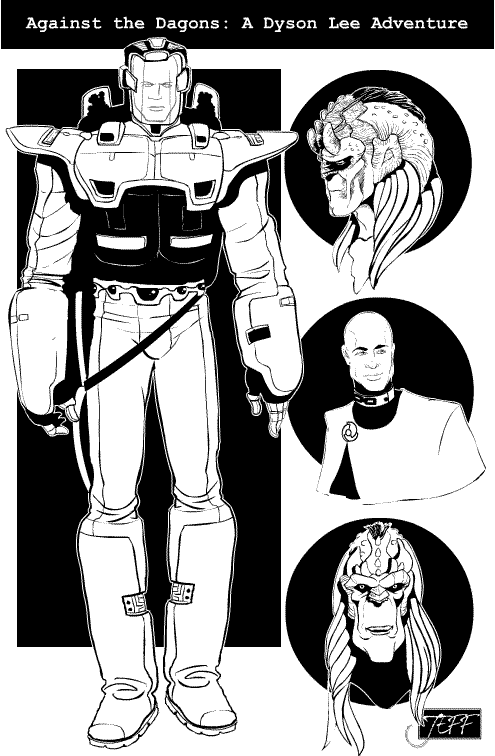
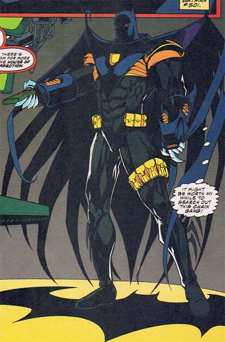
The Dagons were the bad guys, if I recall, and representing the forces of humanity was Dyson Lee, Space Marine. Or Navy SEAL. Or something, we never figured out which. I do remember envisioning that humanity was controlled by a very powerful theocracy, founded on the notion that everyone in the military voluntarily enslaved themselves to the hierarchy for the duration of their service. Hence the chain links as rank insignia on his uniform there.

I also argued that men and women both who were in the military should be bald, since that made the most sense in a helmet-wearing zero-gee environment. Looking back on it that might have been pleasing from a story-telling standpoint, but likely would have been disastrous in terms of marketing.

Sometimes I step back a bit and marvel at the sheer creative energy that geeks like us put out. I mean, I would bet that every person who's reading this has a hard drive full of the remnants of whole worlds they've imagined, whether in the form of a half-baked comic like this one or that great American novel that never quite came together. People describe today's generation as passive consumers, but at least the gamer/geek subculture is anything but. What we love about comics and movies and gaming is that it helps us feel creative. It spurs us to create our own worlds, our own characters, and if, like the Dagons and Dyson Lee, they never make it to print, well that's all right too. At least they live on in our imaginations.

Long live the geeks!

Random Panel: Villain or 'Depends' spokesman?

It’s already too late. Gotta go.

Hello, is Batman in there somewhere?

Try to guess what I hate the most about this Batman costume redesign from the pages of "Chain Gang War":

bad-batman-chaingang.jpg

Notice anything missing? How about the most recognizable super-hero logo on the planet. Imagine an iPod with no little apple on it, or a Nike sneaker without the swoosh. What's the point of investing all that time and energy into making your brand instantly recognizable, only to leave it off the product? I know the temptation to tweak legendary characters is powerful, but this effort really blows it.

Besides the lack of a logo, the entire assemblage betrays the essence of Batman. He's supposed to be about speed, agility, stealth, and lethal force delivered with precision, but this costume comes off as bulky and ponderous. From the rigid, hook-tipped wings with long flowing streamers, to the massive gloves and metal fingers (metal freaking fingers?!), this outfit looks like the worst parts of an Iron Man and Spawn love-child. There's very little "Batman" in it, which may be why he's reduced to standing on a giant Bat logo to remind himself of who the heck he's supposed to be.

And just why the heck is Bruce Wayne getting all dressed up to watch TV anyway? You'd think he'd be comfortable enough to take off his mask and kick up his feet in the Batcave, but apparently not. I bet he goes through a lot of remotes, too, as those metallic fingers punch right through the plastic buttons. I also wonder if he required the leg pouches to offset his utility belt's lack of a cinch, buckle, or any other method for actually hooking together. At least he was able to get it in the extra-thick 'Image' size.

I could go on and on about the yellow banded armor under the thick cape front, or the strange blank yellow hole on the chest piece, or the silly fringe on the boots, or the bizarre energy blasters on the gauntlet, or the lack of a mouth-hole in the mask, or the tiny "Catman" style ears, but suffice it to say, I hate this redesign.

Random Panel: This week in sexism: Even women physicists are bundles of fluff.

The real shame is that you’re such a sexist pig you forgot her brain

Caption Contest 11: Dammit Jim!

Come up with the best caption for this random comics panel and you'll win your very own custom black and white illustration of whatever you like (within reason) by professional artist Jeff Hebert!

caption11.jpg

Be sure to note which balloon gets which dialog in your entry. For example:

Spock-ish guy: Now that I've been taken over by Eclipso, I find your emotional outbursts highly amusing.
Kirk-ish guy1: Dammit Spock, you've got to snap out of it!
Kirk-ish guy2: And why isn't this Vulcan Nerve Pinch working?!
Spocki-ish guy: How can you have scored with that many females and yet still think that's my neck?

Note that the last balloon has an ambiguous pointer (not that there's anything wrong with that) and could be going to either character.

Anyway, as always, the rules are:

  1. No more than three entries per person;
  2. Keep it appropriate for a broadcast TV sitcom (i.e. no swearing);
  3. Leave your entry in the comments to this post.

Good luck everyone!

Caption Contest 10 Winner!

The winner of Caption Contest 10 is ... The Grizz!

I can’t take any more of this Hannah Montana!

Many thanks to all entrants, this was a pretty good bunch. Here are some of the other ones that made me laugh:

Top Balloon- Well, at first I thought Hell was going to be awful.
Bottom Balloon- However, I didn’t count on Rasputin to be such a good baker. Cyanide cookies are a lot more tasty than they sound.

top: aaw man!
BOTTOM: Is it always like this in here after burrito night?

top bubble-Odious Kamodius?
bottom bubble- Rhyming in hell? Is this, Dr. Suess’s “you only go to hell once?”

Top Balloon: “Holy Slanted Floors!”
Bottom Balloon: “Who knew Hell was constructed from old Batman TV series sets?!”

By the way, BrokenSlot never got back to me about his prize for Caption Contest 9. If anyone knows him or her, please pass the word to get in touch with me. Thanks!

Random Panel: Please let that be a fight going on off-panel …

I shudder to imagine what he thinks fun might be …

Mini colors

I'm continuing to work on the basic functionality and code for the series of HeroMachine Minis we'd like to do. One of the neat features -- not Earth-shattering or anything, just a fun little addition -- I've installed is a color guide:

Color palette

When you mouse over a color, the line of text at the upper right tells you what that color is named. It "sticks" as well, always showing you what the currently selected color is. This should be helpful for color-blind folks using the program, but I think it'll still be a nice little addition for everyone who's wondered "What the heck color is that, anyway?"

Most of the names are from Photoshop, so don't blame me if they seem silly!

On the coding side, the applet is turning out to be much easier to program and much tighter. It will hopefully be much easier to "skin" and change, allowing for faster updates and additions down the line. That's the hope, anyway. I've learned a lot about writing code in the past five years that I can implement in the new version to make it all work faster, better, and more easily. The next big challenge is the scaling control.

Mashup 11: The Great Escape

It's time once again for me to take one (and only one) panel from each of ten randomly selected comic books and try to make a story out of them. This week's bunch included "Rocky and Bullwinkle", which is always a challenge, so we'll see how it goes. I'm continuing the "serious" story attempts, and the panels selected include wild teenage parties, skeleton-wearing jungle hunters, slimy prisons, and using all our brains. So here goes!
Continue reading

Random Panel: I sure hope 'sister' doesn't mean 'nun'. And that your sister is hot.

I’m your endless lover! A fact we should tell my sister about, don’t you think?