Sons of Scissorhands

We all know Tim Burton was doing serious weed when he created "Edward Scissorhands", and we all remember what difficulties that lovely fictional character had just trying to perform everyday tasks. So why in the name of the dainty-footed Buddah would Image Comics make two blade-fingered dimwits in the same comic?
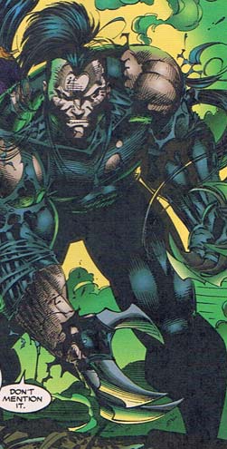
ripclaw
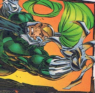
warblade

The first dashing young cutlery-digited "hero" there is Wolverine Ripclaw and the second is Wolverine Ripclaw Warblade. You can tell they're different because Warblade has a gigantic horse tail sticking out of the back of his skull and wears blue-green, while Ripclaw also has a giant horse's tail sticking out of the back of his skull, but he's wearing regular blue! A lesser audience would miss those subtle tell-tales, but Image knew even then it was attracting the cream of the crop.

The other thing they both have in common, of course, is that instead of fingers they have giant finger-ish metal claws. You might wonder how metal finger-claws bend at the joints to allow their owner to, you know, perform the kind of basic tool-manipulation that distinguishes us from our simian relatives, but you're missing the point -- you stab and slash and kill with finger claws, while regular fingers are only good for gouging out eyes! Duh. Clearly you do not have what it takes to be a creative Image genius.

Rest assured, though, that much gut-stabbing and flesh-rending occurs in this book. And it's always accompanied by a multi-toothed grimace of either pain or disgust at their own inability to wipe in a sanitary fashion because, hey, toilet paper and metal claws don't mix.

Maybe that's what the super-duper long pony-tails are for?

Great, now I wish I had giant metal finger-claws so I could gouge out my own eyes in an effort to get that mental image out of my head. Blech!

HM3 Journal: Day 4

I spent all morning finalizing the Zombifier applet for the client, and am waiting on one final bit of direction before that's totally done. In the meantime I've been refining the basics of HeroMachine 3.

Continue reading

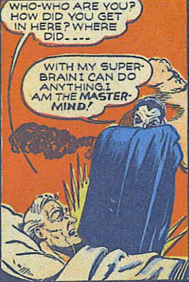
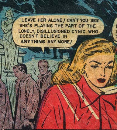
Random Panel: Back when there was no such thing as an internal monologue. Or narrator.

disillusioned-cynic

Slots and sets in HM3

Fabien asked a good question in the comments to the last post -- what happened to Headgear and Masks? Discussion to follow the jump.

Continue reading

Fashionhunter

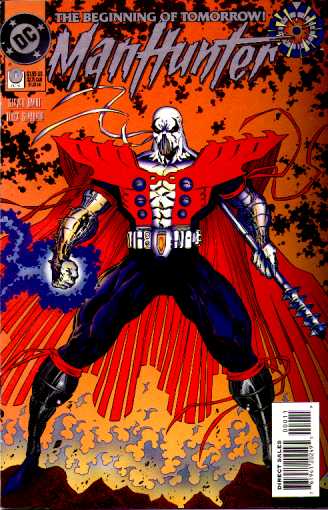
I have a suggestion -- the first guy this man ought to hunt down and kill is whoever designed his outfit:

manhunter

You can tell DC put this out during the Image-imitating Nineties, with the atrocious sausage-thighs, spittle-teeth, and oversized shoulder pads, but I think they really accomplished something new here. Specifically, a new low.

Continue reading

HM3 journal, Day 3

On Monday (Day 1 of the HeroMachine 3 development process), I finalized the slots and started researching how to load external movies (.swf files) into the main Flash application in Action Script 3. Yesterday I actually laid down sample code to do just that, and was able to load in sets of bodies and then heads from the Horror mini. I was then able to click on the previews for each item and load it onto the stage where I could drag it around and do all other sorts of nifty things to it.

That was the biggest programming challenge; now that I've settled that, I can move on to the rest of the coding. Today I am going to be starting work on the relatively complicated navigation system for choosing which slot you want to be working on, and which set of items within that slot you want. I also have to do a lot of the background stuff like deciding how to format the array holding all the slot variables, what properties to give them, conceptualize how they'll all stack, etc.

After the jump I'll put the list of slots, if you see anything missing that ought to be there, let me know. Like in the recent Minis, you'll be able to add as many items in each Slot as you want.

Continue reading

Random Panel: And my super brain says "Dracula!"

lightning-4-superbrain

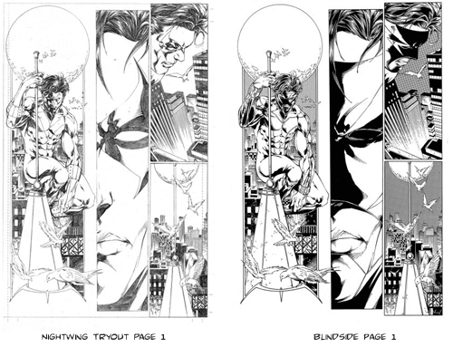
You say Nightwing, I say Blindside. Potato, potahto.

I felt kind of bad trashing Marat Mychaels in the Caption Contest post, so I thought I should look him up online and see what he's been up to since 1992, when the Brigade issue in question was printed. I mean, 17 years is a long time, I figured he'd probably improved since then.

Which, clearly, he has, as you can see at his web site.

But while poking around, I noticed a page from his Store, titled "Nightwing Tryout Page 1" (already sold) that looked an awful lot -- an AWFUL lot -- like his gallery page of Blindside. Whoever the heck that is.

For your convenience, here they are side-by-side:

nightwing-blindside

Look, I'm the last person in the world to cast aspersions on someone for re-using art -- I do it all the time -- but damn. I assume the Blindside work came first, and then was later redrawn with Nightwing's costume as sample submission. But why bother? If you're already a published artist, why do you need to try out for something? And if it was the tryout that came first, did he use that basic script later for Blindside?

There's nothing unethical about any of this as far as I can see (assuming the Nightwing tryout didn't come with a pre-written script), it's just kind of weird. I don't know Marat Mychaels at all, I'd never even heard of him until this morning. His art's gotten much better, and he's a published, successful comic book artist, which is far more than I can say. So props to him for that.

It just seems weird, is all.

(All images © Marat Mychaels.)

Caption Contest 45: Group action

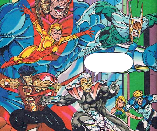
Who doesn't love a good group scene? I know I do! Thus your challenge for this week's caption contest is from the pages of Image Comics' "Brigade", issue 2:

brigade-2-groupshot

Come up with the funniest/best replacement dialog for the balloon and you'll receive a free black and white illustration of whatever you like from yours truly, so put on that thinking cap and get busy! Keep it to no more than three total entries per person, left in the comments to this post, and relatively clean and you’re home free.

Good luck everyone!

(P.S. I can't post this image without pointing out that the artist is Marat Mychaels, who can only be described as a Liefeld Wannabe. In other words, he is an even worse illustrator than Rob, and yet someday aspires to be just like him. You can certainly see that wordless longing in the way the figures all seem to have their feet (off-panel, naturally) at different levels. Seriously, they'd all have to be standing on different stages for this to make sense. And the giant in the background either has his feet crammed into his buttocks or he's standing in a well. Which of the two foreground figures, and which of the two flying figures, is in front of the other? Can you tell? I can't. Add in the horrible coloring, the amateurish inking, and the awful character design, and you have the only thing worse than a pure Rob Liefeld drawing -- someone who wishes they were Rob Liefeld but isn't as talented as he is! Oy.)

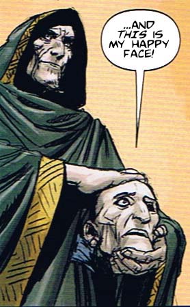
Caption Contest 44 Winner

I am happy to announce that the winner of Caption Contest 44 is ... Cory!

contest44-winner

Something about headless Conan enemies seems to bring out the best in people, so I thought something happy as the winner was appropriate. A number of other entries were also very funny, including the following Honorable Mentions:

  1. marx: Frankincense, Myrrh, Gold–those are traditional gifts from a wise man to a king. But this… this is just creepy.
  2. Frankie: “Yes, yes. (sigh) I’m indeed his ‘little friend’.
  3. Zorbas The Awesome: Before you say anything….yes I AM his One-Eyed-Willy
  4. Danny Beaty: Jenny Craig helped me lose over 170 lbs.!
  5. Malachi the great: *Never* agree to the magic trick.

Many thanks to everyone who entered. For coming up with the winning entry, Cory will win a custom black and white illustration of whatever he likes (within reason). Keep your eyes peeled to HeroMachine.com for your chance to win with the next Caption Contest!