Category Archives: Character of the Week

Character Of The Week: Altalyrius by Blastermasterism324 & Amanacer-Fiend0

So, not often I do one of these anymore, but sometimes a piece comes along that just blows me away so much that I feel the need to showcase it. Well, here's one of those:

Now, there is a lot I could talk about when it comes to this picture. The head, with a mixture of masking (the helmet) and resizing (the tusks) shows how you can make an effective 3/4 turned head without it looking a mess, or how I love the contrasting colours between the foreground character and the background that really make the character pop. Also, the backstory these guys  came up with adds so much to the character.

But what really tips this over the edge for me into exceptional territory is the background and lighting effects. I mean, wow. One of the most eyecatching and well executed backgrounds I have ever seen in heromachine, based purely on the sky alone. The mixing of the cooler blues and purples being (literally) outshone by the central white, that then fades outwards with the sky then becoming enveloped by the green glow and the green clouds that eminate from the ground level area of the background. The colour composition is excellent. It really sells the alienness of the world. Also, neat little bit I only noticed after reading the story, the buildings in the background have an in story reason for being all over the place (and it's not just because the buildings do be like that in heromachine), it's because the area the picture is set in is called "The Ever-Changing City", the city is constantly changing, so the buildings look like they're shifting (I hope this was diliberate and I haven't just made this up, because it's such a cool way to work within the limitations of the program).

Anyway, if you want to check the guys out, here are their links:

Amanacer-Fiend0: Deviantart

Blastermasterism324- Forums & Deviantart

Character Of The Week: Livewire by nerd0and0proud

Ok, first off, no. This is a one off, COTW isn't coming back full time. I honestly don't have the time, there's a reason lists only happen every other week. But I wanted to showcase this because it makes a good example of how small changes and improvements can make a character go from good to excellent.

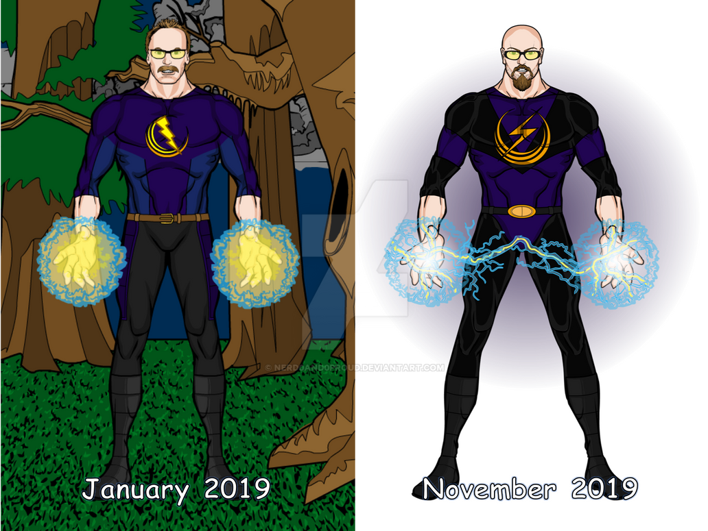
So, as we can see, we have two pictures of the same character from different points of the year side-by-side. You can immediately tell it's the same character, the colour scheme is the same, the face is still recognisable and we have broadly the same pose with the characters powers on display. However, each of those things has also been tweeked to give the character that little bit more... well, character.

Pose wise, the characters arms and legs are now slightly further apart, giving a wider stance which suggests power, authority and readiness, this guy is here and in control of whatever situation he has found himself in. We also have an extension to the display of his energy powers as well, which add a nice little bit of life to a static (no-pun) picture.

Facially there have been some more obvious changes, most obvious being the transferral of hair from the scalp to the chin. Maybe this is just personal taste ut superheroes with moustaches never really worked for me, they always made it harder to take the character seriously. Villains, on the otherhand, suit moustaches down to the ground, but that might just be because they always have magnificent facial adornments. Anyway, bit off topic there, but yeah, switching from 'tache to goatee and losing the receeding hairline has really done wonders, as has the switch to thicker framed glasses, which look much more practical for action (well, as practical as glasses can be in a fight, but at least with sturdy rims you aren't going to have to worry about getting glass in your eye if you get punched in the face). Also, the previous glasses were positioned in such a way that they covered up the eyebrows too much, where as the new pair have been positioned to show the eyebrows more, adding a more agressive facial expression that was hidden behind moustache and glasses in the older version.

And then we have the costume. Whilst the colour scheme may have stayed the same, the usage certainly hasn't. A more liberal use of darker tones and the accentuating black, once again, gives a more agressive, action-like feel to the character and really sets off the lighter colours of the energy in front of the character, making it really pop and add extra depth without needing to do much, if any shading to the actual character. The new costume design is also more cohesive, the old version had that shirt and trousers look with the legs being a different colour to the top and, whilst that can work, it gives the character a slightly dated look. The new design, with all colours consistant on both top and bottom, flows so much better, following the sort of design philosophy you see in classic costumes from heros such as Green Lantern or Spider-Man, one main colour, one accent and an eye-catching logo of a third colour and that's all you need. Oh and big props for masking spandex to the logo so the highlight/lowlight shading of the tops are continuous, it's one of my favourite techniques and one a lot of people should look into doing more often, it makes the logo look like part of the costume rather than floating on top of it.

And lastly we must talk about the change in background, because it's obviously the biggest and most obvious change. Full colour scenery backgrounds are often very awkward in heromachine, unless done right and very subtly they can almost swamp the character, especially when using flat colours. This is why you'll see a lot of people only use white (myself included) and nerd0and0proud has gone for the simpler approach in this redesing, though, to his credit, he has done something in the background. He's only added a shading circle of lavender and reduced the opacity a little bit, but considering that the characters costume is dark and the energy effect is very light, what we have in the background is a perfect middle ground, it's not so dark that it merges with the costume and not so light that it swamps the energy. It just makes both stand out even more than they would if it was only them on a plain background. It's just a really simple and subtle thing that easily could have been left out, but wasn't and it completes the picture.

And what really amazes me is that these two pictures were done only 10 months appart. Personally, I find that very impressive. That's the sort of improvement I'd expect to see after a few years.

And with that

JR out.

Characters Of The Week: DeliriousAl- Haze The Pix and Alsatia

So, DeliriousAl did a comeback earlier this week in case people didn't notice. If you don't know why this is something worth celebrating, take a look at these.

haze_the_pix_by_deliriousal-daeoe1u

blackdancer_by_deliriousal-daeoej0.png

The dude is quite literally insane. And his pictures are pretty good as well.

Character Of The Week: AMS- Dama De Cobre

Ok, haven't done one of these in a long time and can't promise they'll be coming back with any regularity, but this picture needs to be showcased.

Obviously, being an AMS picture, we must talk about the shading, because it is excellent, especially on the face, chest and stomach areas of the character. It really accentuates the non-standard skin colour and gives an unnatural glow that makes the character seem to be made of some sort of plasma or similar substance. I also really like the costume, the red detailing on the top and leggings are very well executed and I love how the boots have been done. Making use of solid black on a costume can be very difficult to get right, so using it in such a confined area really grabs the attention. And of course, as one should expect from AMS, the face has such character, which is accentuated by the powerful and confident pose. Sublime.

Character Of The Week: Linea24- Merti

So, in case anyone didn't know, Linea's back in action after a few months absence and it seems to have done her some good. The picture I'm featuring this week is a remake of a picture from a few years ago and if you compare the two on her thread you can see the improvement. But taking it as it's own picture, rather than a remake, there is still a lot to commend. The costume (love the colours, the purple is very delicate and it really sets off the vibrant blue), the item usage (see the cape used as a dress so it matches the pose), the expression and the wings (very subtle, almost fading away into the background, which really fits the fairy idea, especially with insectoid wings which are usually semi transparent).

Gallery: Linea's Astra Universe

Continue reading

Character Of The Week: Lull-Carae- Lullasy

Ok guys, time-out quickly. I'd like everyone to just take a moment and take this little nugget of information in. Apparently, Lull did the scales on this characters tail individually. As in, that isn't a pattern masked onto the tail, those are single insignias each placed into position one by one to cover the entire tail. 2 things to note here. 1. How many other people would actually bother to do that (I for one would have died of boredom half way through) and 2. Lull must either be mad, incredibly patient or both (probably both) to do that to himself. I don't even want to ask how long it took. But anyway, moving on from the tail, there's a lot more to like about this than just that. For example, the great use of atmospherics and lighting for the background. Lighting the floor and then fading to black the further into the background you look is a great way to not only make the character stand out more, but also add that extra sense of creepiness and unease to the picture, because you don't know what could be in the darkness. Also, I like the use of shoulder-capes. Granted they are used on the shoulders (a novelty for me to point out an item being used for what it's actually meant to be used for), but the positioning and sizing really fills out the costume, continuing the hood without meaning that the character has to be wearing this long cape or cloak. And finally the expression. The look on the characters face is an interesting mix of sinister and inviting. This is even more noticeable on the alternate version Lull posted which is very much more over-the-top than this version, but the expression is very understated and furthers the air of mystery that the character has.

Gallery: Lull-carae's works

Continue reading

Character Of The Week: Suleman- Melly Mellon

Ok, COTW is back. Sorry about missing two weeks, I had serious computer issues, as you are no doubt aware if you've been paying attention to the CDC's. But I'm back now. I'm not going to do a bumped COTW including pics from the previous weeks I missed, because that's just too much I.M.O. Instead, here's some Suleman.

I dunno, it just feels special. The item usage (e.g. the hat, the noose/ grip, the belts at the bottom of the trousers etc.) and the effects, such as the horses breath (which is awesome btw). Plus the backstory Suleman gave is really fun.

Gallery: Suleman's Creations

Continue reading

Character Of The Week: CantDraw- Shall We Get Going

Ok, I will get this out of the way straight away. This is CantDraw's version of one of my pictures. But that is not why I'm putting it as COTW. No, why I am putting it as COTW is because it is quite possibly the best thing I've seen done in Heromachine, and that is including Hall Of Fame stuff like SeanDavidRoss' "Portrait Of Nimble Jack" or Valyndirl's "Post-Apocalyptic Children". CantDraw, like all the best 'machiners, has a style all of his own. However, I defy anyone to even come close to replicating it. The way he shades is incredible. You want an example, well, if you excuse the meme, look at dat ass. If we just focus on the shading (and not how fine the aforementioned posterior is) you will notice how the shading is used to mimic real-life fabric, which is a very under-utilised technique of multilayered shading, further accentuated by tattoo patterns underneath the larger shading circles (something which carries on down the legs).  And after the shading we come to the pose and can we all just agree that CantDraw is too good at this. I'd love to explain how he manages to get such seemless custom poses, but to be honest I have no idea. When it comes to certain poses from other 'machiners, there are usually some clues as to how the pose is made up because you can see what items they've used. With this one though. Nope. I'm not even sure if the head is custom made or not (I'd think that it wasn't, but he's covered it so well that I can't tell *bars*). I also have to give a mention to the custom backwards facing high-heels CantDraw magicked up. Pretty nice.

Gallery- CantDraw Gallery Of Amazing Art

Continue reading

Character Of The Week: DeliriousAl- Wizdal

So, someone else decided to make a comeback this week and I'll bet half of you didn't realise, probably because he hasn't found his way back to the forums yet (he's probably got lost or something). Yes, DeliriousAl has (sort of) returned and the result is much as you would expect, striking visuals, intense colour combinations and madness, lots of madness. Apparently this is supposed to be a wizardfied versions of him, so all I can say is, if this was ever entered in the Creators Club, I'd give up with bothering to remove any backgrounds.

Gallery- DeliriousAl on DeviantArt

Continue reading

Creators Club Poster 2016

CCP Final

(Open In New Tab To Enbiggen)

I think we can draw the safe conclusion that I am not as good at this as MadJack, but oh well. Thanks to everyone who entered this year, I know this poster is missing a few people (in particular Stulte for obvious reasons. Hope you come back to us soon dude, I'll replace this version with your version), but it's the best I could do on such short notice. Also, sorry for all the debacle with getting everyone to resubmit, but at least we got it done.

Cheers.

JR out.

Continue reading