Sisterly Reunion

Sisterly Reunion

By: Andrew Hines

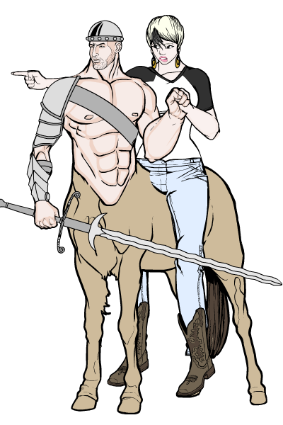
Since the beginning of this series, we've seen Jason and Kori break Roy out of a Quraci prison in the middle of nowhere, seen them fight the undead members of the Untitled, and witnessed the unlikelihood of Jason actually helping out Batman in his fight against the Court of Owls. There have certainly been some twists in the stories brought to you by Scott Lobdell. None of them, however, flips the old DCU relationships as we know them on their head quite like this issue. For one, the main focus of this issue, isn't so much the space battle, or Jason's quest for redemption as it is Kori and  her sister's relationship. Add to that the fact that Roy is somehow the hero and you get one giant headache. I mean, seriously Scott, what the hell, man?!

Scott Lobdell continues his now year-long run on this title and delivers a surprising 180 in regard to the Starfire/Blackfire relationship. To write that, and make it not only plausible, but ultimately, believable takes tremendous talent. The pacing is decent, but not his best. The the only truly believable interaction is that between Jason and Isabel, the girl they unwittingly abducted and brought with them on this interstellar journey. The real test will be how the sisters' relationship turns out in October's Red Hood & the Outlaws #13. For that little shake-up, this gets a minor de-merit. Wait...people still do "de-merits", right? Anywho, the point is he gets knocked down to a silver star rather than a gold one. Still, a decent job.

Timothy Green II's artwork is really good and quite similar to that of the previous artist, Kenneth Rocafort. Actually it's more a mix of Rocafort and Ryan Ottley of Invincible fame. Despite the overly complicated nature of the suit designs in the comic, I'm surprised it was done on time. Impracticality aside, the artwork is good, though not exactly up to the par that Rocafort set on the previous 11 issues of the title. Blond's colors are great, still. There really isn't much that's missing or overdone, except that I don't recall Starfire's eyes resembling an anime character, but hey, what do I know? Anyway, we can still see Rocafort's artwork on the cover, along with more of Blond's fantastic coloring, which really translates better when paired with the cover artist.

This is a good title and I'm glad to not see quite as much of Jason as I do of the rest in this one. All things being equal, this earns a "B," putting it right up there with Nightwing this week. Yes, I know it would piss off Jason to be compared to Dick, but then what doesn't annoy that guy?


META: Layout tweaks and ads

Hopefully it won't be noticeable at all, but I increased the width of the right column to 300 pixels wide to accommodate the better-performing Google AdWords 300x250 ad instead of the previous 200x200 ad.

I also started running an ad in the HeroMachine 2.5 application.

Finally, I'm working on a method for running an ad in the designated HeroMachine 3 space, so be forewarned. I tried this before, but had trouble getting the ad to not show when you're in widescreen mode. But I'm working on it.

Character Design Challenge 98: Electrifying!

Your Character Design Challenge this week is to create the most awesome illustration possible featuring a redesign of an electrical character from the Electrical Heroes section of Public Domain Super Heroes.

You have 23 characters from which to choose. You can either stick with their original story and concept, or completely revamp it for a modern audience. You can change genders and more if you like, but the "essence" of the character should stay.

I'll pick my personal favorites when the week is over, with the one I like best being featured in the right column for the week. The rules otherwise are the same as always:

  • All entries must be in JPG or PNG form (BMPs are too big), posted to a publicly accessible website (like the HeroMachine forums, ImageShack, PhotoBucket, or whatever);
  • Entries must be made as a comment or comments to this post, containing a link directly to the image and the character name;
  • The image cannot have been used in any previous HeroMachine challenge;
  • Please name your files as [your name]-[character name].[file extension] before you upload it. So DiCicatriz, for instance, would save his "Bayou Belle" character image as DiCicatriz-BayouBelle.png.
  • Please make the link go directly to the image (like this) and not to a hosting jump page (like this). See this post on how to get the direct link for most sites.
  • All entries must be in by next Monday, when I'll choose my personal favorites.

No limit on entries this week, so knock yourselves out. Just make them good!

Caption Challenge 127 Results

We had a ton of very funny entries for our last Caption Challenge, thank you! And I just realized that I neglected to credit the always awesome Glenn3's "Say What?" PhotoBucket site for the original image:

Some entries tickled my funny bone a little more than others, and I gladly present them to you forthwith:

Continue reading

SOD – Laundry Day

"Maintaining your Secret ID For Dummies"

Pop Quiz 23 Results

Many thanks to the folks who entered yesterday's Pop Quiz! Since we had a relatively small pool, here they all are:

Man, these are all so good! All of the usual suspects hit it out of the park, from Lime and Kytana to djuby and Atomic Punk and ... well hell, EVERYONE did amazing work this time around, seriously. I really hesitate to pick just one. But, that's how the game is played, I suppose, so just going with my own personal knee-jerk response, I'm going to pick Scatman as my personal favorite:

Mostly because besides being a nice, tight illustration, it gave me a chuckle. And I kind of needed a chuckle today.

But honestly, there were twenty others just as good that I could have gone with, you all completely outdid yourselves. Thank you so much for sharing your creativity with us!

And since I shouldn't have to be the only one to agonize over a hard decision today, please speak up in the comments and let us know which one YOU would choose as your personal favorite, or any others that you care to remark on.

SOD – Say what?!

Downfall of the Republic…of Tomorrow

Downfall of the Republic...of Tomorrow

By: Andrew Hines

Dick Grayson, is easily my favorite of the sidekicks, any sidekick. Okay, scratch that, any former sidekick. He's a great character on his own as well, which makes him all the better. He doesn't rely on the lead character to make him seem useful. In his own way, he's almost a match for Batman. When it gets down to it, they're very close to being the same person. Both lost their parents to violent deaths at an early age, both are trained fighters and detectives and they both help the innocents of Gotham.  The biggest difference is that Dick enjoys being a costumed crime-fighter. Bats does it out of a sense of duty. Nightwing finally puts the pieces of the puzzle together and has a knockdown, drag out fight with Paragon, the leader of the Republic of Tomorrow.

Kyle Higgins continues an awesome run on Nightwing #12. Having never read much of Higgins' work prior to the New 52, I gotta say, the dude knows what he's doing. Turning the former Boy Wonder into a character that I can't wait to read about every month. On top of that, he weaves wonderful yarns that help explain who Dick Grayson has become. He separates Nightwing from legend of the former Boy Wonder and shows how he's become a different man. He's grown up in some respects, but he's never lost his faith in people the way that Bruce, Jason and Damian have. Showing that in every issue is what makes Higgins a name to look for.

This is one more title where the art is a team sport. The pencils have been done by Andres Guinaldo, who I'm not too familiar with. It's really pretty cool, not exactly "A" material, more like a "B+". The action sequences are good, with almost no dead space. A few panels, such as Dick's expression on the last page, are slightly off, but otherwise, it's pretty good work. The inking from Raul Fernandez and Mark Irwin is good, but not over-the-top fantastic. Rod Reis' colors are pretty good, especially when partnered with Eddy Barrows' pencils and inks on the cover. The covers have been the most stand-out part of this series,  aside from Higgins' script.

All things considered, it's a "B". The script, as I said, is good but that alone can't carry the whole weight of the issue. That being said, I still can't wait for the next regular issue of the series in August and the "0" issue next month.

SOD – Self Portrait

I drew this earlier this morning for the Daily Sketch subreddit. The green gradient either represents a deep philosophical statement on the antagonism between the external Superman self (as represented by the shirt) and the inner death of Kryptonite, or I just like green.