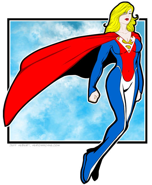
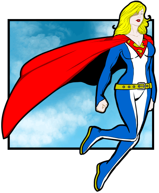
I got a little carried away with the Sketch of the Day this time around, as you can see:

Cory Walker has been doing a new Supergirl redesign every Wednesday as part of his “Sketch of the Day” series, which is probably where I got the impetus to do this one. Originally it was supposed to just be a regular quick black and white sketch like the others, but I just couldn’t leave it alone until I finally settled on what you see.
Along the way I went back through the “Project: Rooftop” Supergirl contest, a retrospective of various Supergirl costumes at Girl-Wonder.org, and a quick review of some lesser-known designs at MaidOfMight.net.
I took a slightly different tack with my attempt, choosing to design something for Superwoman instead of Supergirl. The classic mini-skirt red-and-blue original costume, its red-skirt heir, and the great Bruce Timm Animated Universe white-tee-shirt with denim skirt looks definitely emphasize the “girl” part of the character, which is entirely appropriate. Part of what makes her interesting is her youth, having these great powers while dealing with being a female child in a culture (both real-world and comics-fans) that’s still very much dominated by men. A young and hip look is, I think, key to her appeal.
But I was thinking about what happens to her later, after she’s no longer a teenager but living in an adult world with adult responsibilities. What would she look like then? What fashion choices would she make in her public persona, and what would they say about her personality?
I definitely wanted to keep the basic red, yellow, and blue Superman look, complete with the big chest-symbol “S”. I think she’d want to continue honoring what her cousin (or whatever that relationship is nowadays) had done in the past. But, I also wanted her to keep some aspects of her more youthful look. To that end, I wanted to incorporate some white into the design, honoring her white tee-shirt.
To age her up a bit, I went for a longer, fuller cloak, as I suspect she’d be less about zipping around like a hummingbird and more about raw power the older she got. Patience for games and frippery tends to lessen over time, and I think she’d probably be a lot more direct. That lends itself to a big billowing cape that enhances your presence.
I also wanted to use the long-sleeved, long-cuffed Kryptonian element from Byrne’s “Man of Steel” reboot. Something about long sleeves seems more adult to me.
I didn’t want her to be completely wrapped-up, though, so I introduced a more plunging vee-neckline, sporting a bit of cleavage, cutting into the chest insignia. Not too much, though — this isn’t burlesque.
One of the major changes I introduced was to do away with the skirt. I would argue that skirt was the key part of her old costume, the main ingredient that set her apart. It might be a mistake to lose it, but I thought it was the most dramatic way to mark a departure from childhood and clearly demarcate a new phase of her life. Mini skirts are for girls out to play, not for women getting a job done.
Not that I’m against mini-skirts in the workplace, mind you. Definitely carry on with that, ladies.
However, losing the skirt made for a major problem with her waist. Namely, if you don’t have anything to hold up, you don’t need a belt. And without a belt, what do you do with the area of her costume normally constrained thereby? Originally I addressed the issue by ignoring it:

Luckily my friend John was able to point out that a big useless belt like that was positively Liefeldian, so I removed it. In its place I tried various pseudo-belt treatments, but ultimately decided that if she’s going to be female, she should be able to do away with the straight lines and geometries of Superman, so I added the curving lines over the hips instead.
Anyway, hope you enjoyed the attempt at a redesign and reimagining of the character. I don’t think this approach would be good for Supergirl, but I do like it for Superwoman, and hope you do too.


@Jeff: Great re-design! I like the costume without the belt and the yellow. I’m curious, aren’t you taking a chance of facing the wrath of the legal department of DC?
I don’t think so Danny, it’s not in the nature of a commercial enterprise or anything, just a fanciful fan drawing.
@ the good Mr. Hebert: That’s good. I thought the reason we are discouraged from making (or remaking) copyrighted characters with HM3 is that doing so would violate copyright laws.
Yes, that’s part of it, but another part is that I don’t want to piss off the powers-that-be at DC or Marvel or whatnot by making them think I have copyrightable items in the program or that it’s intended specifically to allow people to reproduce copyrighted characters. I very much want to avoid even the appearance of that. Me hand-drawing something from scratch is different than, for instance, putting the Superman logo in HeroMachine for anyone to use to make their own Superman. Which is why (in addition to a logo being copyright-able in a way a generic cape that can be colored red if the user wants is not) I don’t have a Superman logo in any HeroMachine version.
I feel confident any such lawsuit, like the one Marvel tried to pursue with NCSoft that was, I believe, settled out of court, would not be successful in court, but I want to avoid the hassle and expense and negative publicity that would accompany such a thing, so I do everything I can to avoid even the appearance with the actual HeroMachine program.
My admittedly poor layman’s understanding of copyright law is that it allows usage like what I have in this post for discussion purposes or as examples, so long as the image isn’t represented as belonging to the responsible creative agent, or used directly for profit. Here, I’m just talking about the costume design, theorizing about the character’s personality, and suggesting a new costume, but am not trying to pass her off as my own. It’s to illustrate a discussion about their character, not to take it for my own.
Like I said, I’m no lawyer, but that’s been my operating principle. Plus, there’s no harm done to DC with this sort of thing, or with Project:Rooftop style redesign contests. On the contrary, I would think it enhances DC’s property by increasing awareness and generating interest. So even if they could technically sue over something like these efforts, they’d be foolish to do so.
Long story short, there’s a difference between hand drawing something for discussion, and being seen as trying to encourage the use of HM for copyright-violating characters.
@Jeff: I understand. Thanks for clearing that up.
Outstanding redesign, sir. Very very cool. My only quibble is not with the costume, but with the face. She looks a bit pale, as if she needed some more time in our yellow Terran sun. But that’s just me. Other than that, first rate!
@Danny: What he’s doing is called Fair Use. If he were to try to sell anything bearing that character’s likeness, he would face the full-on wrath of the DC Comics legal department.
Cautionary tale: A friend of mine runs an online garment store and she designed a character called “Super-Mom”, who just happened to have a red-and-yellow shield emblem on her chest. DC issued her a cease-and-desist order. They take this stuff seriously.
All that aside, Jeff, I love the look. I’d be interested to see you do a series of redesigning looks for other well-known characters.
@Ian: I assume Fair Use is why people can make fanfilms of Batman, Spiderman, or whoever (but don’t charge people money to see them and give props to the characters respective copyright holder), and not get sued by DC and Marvel.
Fair Use is one reason why they can TRY to do that sort of thing, but even then — even if ultimately a court of law would rule in the fan’s favor — that wouldn’t necessarily mean anything. It doesn’t do you any good to win the court case if the cost of defending yourself bankrupts you, for instance. Which is a lot of times why people like that (or like me) would often just fold up shop and go home rather than try to fight it out. Better to avoid the fight altogether, in most cases.
To me, it’s a vicious circle, and one the big companies are as much victims of as willing participants in. If they don’t defend their copyrights they risk losing them ultimately. But in the course of aggressively defending them, they end up shutting down and discouraging the very people who make the copyright valuable in the first place — their fans.
Copyrights and intellectual property issues in this country are a very odd jumble of often self-contradictory impulses and regulations.
So, back on topic — what do you think of using the red in the upper stripe in the top image, versus using white all the way down like in the bottom one? And using white instead of red for the logo “S” portion.
As i said earlier, I like the costume without the yellow. It has a smooth, clean flow to it. Also, considering Superwoman is not a gadget oriented crimefighter (such as Batman) she has no need for a belt. Again, excellent job Jeff.
I like the final version. But I’d like to see a short sleeve or sleevless version, so we could see if she’s got great “Guns” like the First Lady. Nothing more attractive than a Woman with great “ARMS.”
I Love Supergirl More Then Superman, Even If There Overrated.
But I’d Say Underrated.
I really like this one. And I enjoy the color aspect. Maybe you should do this some more. And I also do think this is better than any of Cory’s, apologies to him.
Only belatedly did I realize this is a two-fer with two possible designs. I think I like the second one better. The white S against the yellow background just isn’t as vivid as the red against yellow. But the red upper half and the white lower half just look a little busy–a little chaotic. I think the red S and the white stripe all the way down make for a cleaner, bolder look.
Jeez, I had no idea I was such a fashionista! 🙂
I’d also like to see more of your full-color sketches, Jeff. How are the HM 3 updates coming? (Hint, hint!)
Honestly? I like the lower design better, but without the belt. Something about the other one, the red upper and white lower halves, just doesn’t look right.
I definitely like changing up Supergirl/woman’s logo up so that it’s a variation of Superman, gold and white instead of red and gold. I love the curving pseudobelt visually, but my seamstress’s brain has can’t get a grip on a universe where that seam doesn’t pucker, so I’m just going to assume it’s a two-piece.
Please tell me, which Hero Machine version did you use?