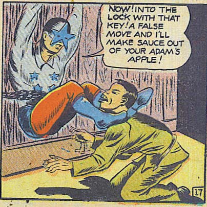
(From "Four Favorites" number 14.)
Sponsored Links (which Premium Members will never see):

(From "Four Favorites" number 14.)
Comments Off on RP: Safe word! Safe word!!
Posted in Daily Random Panel
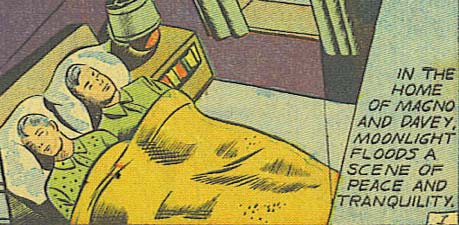
(From "Four Favorites" number 14, 1944(?).)
Comments Off on RP: Wait, they share a BED?! Call Michael Jackson, STAT!
Posted in Daily Random Panel
Take a look at this panel from Marvel's "World War Hulk", showing Iron Man in one of his innumerable armor variations (featuring such fan favorites as "Arctic Armor", "Space Armor", "Going To Get the Paper Armor", and more!)" punching Hulk in the stomach:
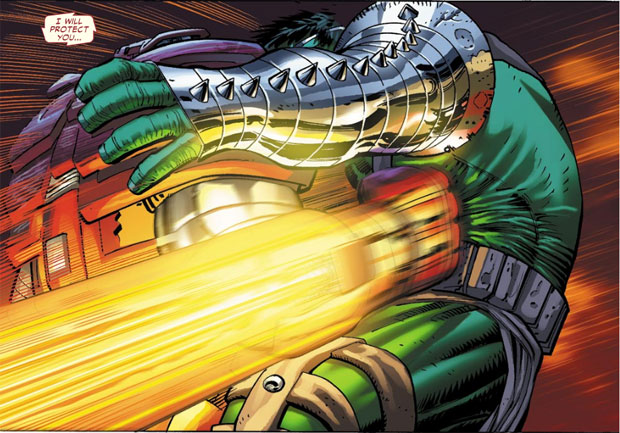
The underlying great penciling and outstanding inking set the stage, but for my money, it's the coloring of Christina Strain that takes this otherwise very good sequence to the next level. When you're looking at a traditional comic in your hands, printed on paper, the colorist doesn't get to shine (literally). But when you're looking at a digital comic, you get treated to a level of quality usually only approachable on the most expensive prints on the most expensive paper.
It begins with the incredible rendering of the Hulk's metallic arm band. (We'll skip the question for the moment of "Why does the Hulk need armor when he can shrug off nukes wearing nothing but a smile".) I love the brush work inking on the sections and the highlight line left behind each band, details that completely sell the idea of metal. And believe me, coming up with the proper ink rendering of various real-world materials is not easy.
But what I absolutely love about that arm band is the reflected yellow highlighting from the thruster-fist. Ink rendering gets you most of the way to believing that's metal, but accurately capturing the way light reflects off of a surface like that pushes it over the goal line.
Then look at how the colorist has introduced a darker green into the folds of Hulk's shirt, complemented by a yellowish green on the raised wrinkles. Follow that color from the arm band and how it looks against metal, to how it arcs around his torso and how it reflects off of cloth, and then on down to the belt and the leather leg bands and finally his green flesh.
Each color is slightly different, and reflects that material difference shown in the color of the light, sealing the conceptions that a giant rocket is going off. In essence you have a halo effect surrounding the point of impact, all done purely with color. Brilliant.
Throw in the great blurring effect on the fist and the multiple bands of yellows and oranges in the contrail, the way the red of Iron Man's armor changes to purple in shadows, and you've got one of the best-colored comics panels I've ever seen. I love, love, love it.
We tend to focus on the writing and the penciler first when it comes to comics, with the inker and colorist a distant second if they come to mind at all. Which is as big a mistake as discounting the horn section of an orchestra because they're not as "important" as the conductor or the strings. A modern comic is more than just the lines and the words; when done well, color brings it all to life and adds a dimension to the entire enterprise that simply isn't possible any other way.
So hats off to Christina Strain and all the other unsung heroes of hue out there! Now go out and hug a colorist, y'all!
(Image from "World War Hulk" number 1, ©2007, Marvel Comics.)
Comments Off on RP: The underappreciated role of the comics colorist
Posted in Things I Like
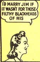
(From "The Secret Voice" number 1, 1945.)
Comments Off on RP: As opposed to my delightfully pure missing nostrils
Posted in Daily Random Panel
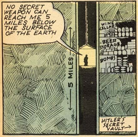
(From "The Secret Voice" number 1, 1945.)
Comments Off on RP: Hitler’s priorities according to comics
Posted in Daily Random Panel
Many thanks to Imp for putting together this most excellent guide to posing a character in HM3 with the classic "one leg propped up" pose. Be sure to let him know in the comments if you find this helpful!
Comments Off on Recipe: Captain Morgan
Posted in Recipes, Tips & Tricks
It's time once again for another Open Critique Day.
If you have a HeroMachine illustration or another piece of artwork you've done that you'd like some help with, post a link to it in comments along with your thoughts on it -- what you think is working, what you're struggling with, etc. I will post my critique of the piece, hopefully giving some tips on how to improve it.
Of course everyone is welcome to post their critiques as well, keeping in mind the following rules:
That's it! Hopefully we can get some good interaction going here and help everyone (me included!) learn a little bit today.

Comments Off on Open Critique Day 7
Posted in Open Critique Day
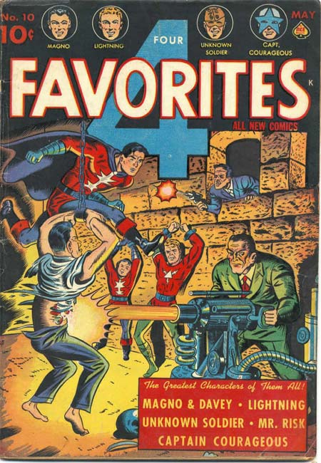
(From "Four Favorites" number 10, 1942.)
Comments Off on RP: Life before the Comics Code Authority
Posted in Daily Random Panel
I've published the first two items from the "replacement contest prize" list to the HeroMachine 3 Alpha, a raptor helmet in HeadgearStandard:

And a whip sword in ItemRightBladesTwo:
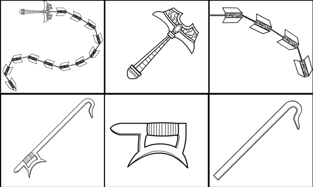
Enjoy!
Comments Off on HM3: Raptor helmet and whip sword
Posted in Challenge Prizes, Challenges