Category Archives: Things I Like

Characters Of The Week: Anarchangel- Various Characters

Well, this week I'm reeeeeeeally gonna stretch my own rules. Whilst, there have been numerous artworks this week that I could have talked about (COTW regular RobM coming closest, go check out the latest work on his thread, it's pretty damn sweet), one person has been being consistently amazing with practically everything he's submitted this week that I felt I had to cover him. But when it came down to it, I'm an indecisive bugger, so guess what I'm gonna do.


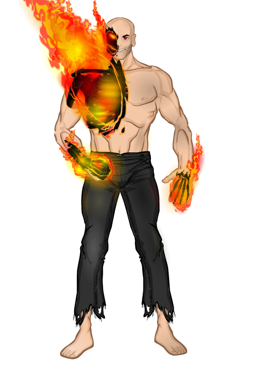
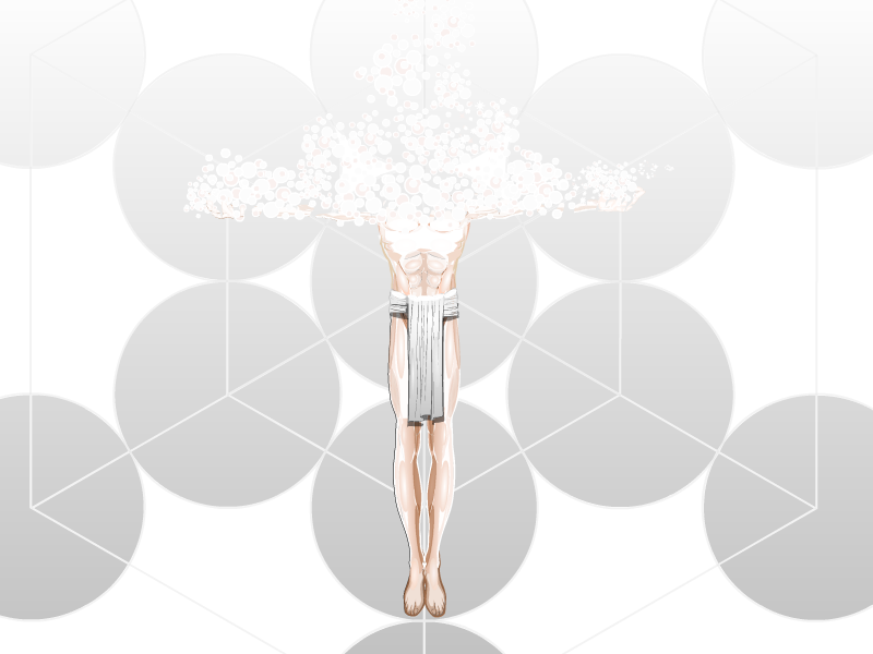
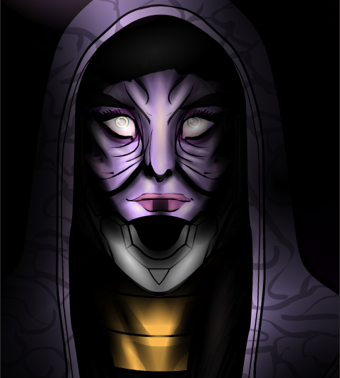
Now, why am I covering multiple characters in a post that usually only covers one picture. Well, I have some very important points to make and Anarchangel is the best 'machiner to use when demonstrating all of those points at once.

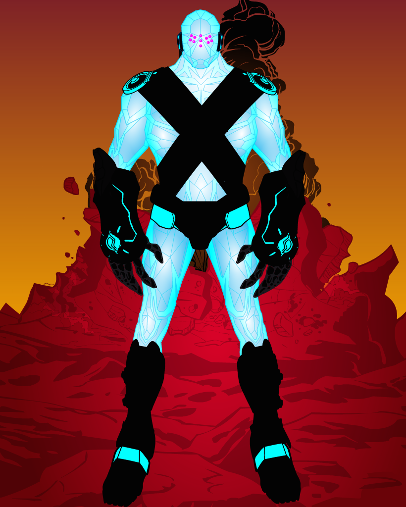
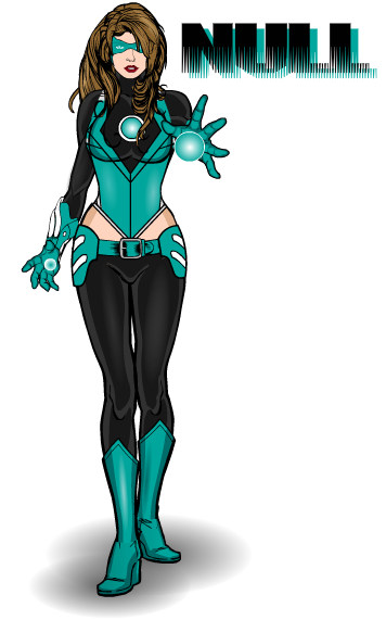
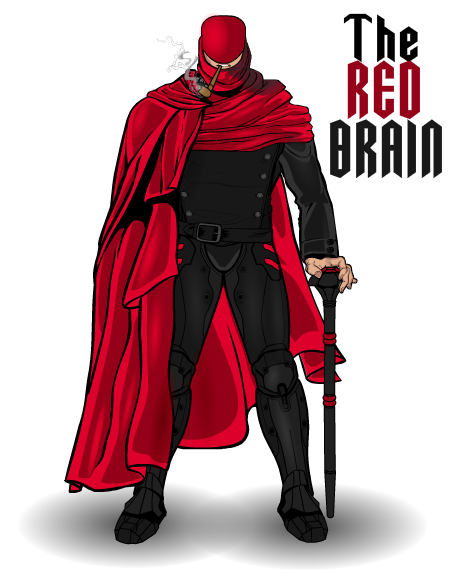
First off we have a definite sense of style. If you look at all of these pictures together, it is immediately recognisable who did them, by certain defining factors. The shading style is very distinctive, very subtle, not overused or overshadowing the design, more of an enhancement of what is already there than a stand-out eye-catch. Which really works for Anarchangels style. He has a definite knowledge of light sources. If you look at his work you can see exactly where the light is coming from, because he's made it blatantly obvious.

Then we have inventive and well worked costumes. Two words I can use to describe these are cohesive and stylish. They look like they could actually be from comics or cartoons, even from a live-action movie. Anarchangel has a way of coming up with these really cool looking patterns with masking and insignias that other people wouldn't think of (best example here is Tokyo Rose). And then we have the colour schemes. Simple, clean and effective. You don't need to use more than 3 colours, maybe a 4th for detailing, but that's the limit. The only one of the above characters that uses that 4th colour is Aeon, and that is for two small aspects of the costume, and they all look fabulous.

Lastly, we have an attitude to the characters. You don't have to be the worlds greatest poser or face-maker to get across a character's personality, you just need to have an idea of it and see where it takes you. All of these characters has a definite character despite being in pretty much the standard face-forward pose and most of their faces covered, just by moving the hands a bit here, changing the position of the leg there and a bit of shading on an eye to finish it off. By just tweaking certain things you can change a characters personality from serious to silly, suspicious to incensed. You can imply action, movement or power through a simple hand gesture. All you need to do is look and think, "how can I say this with what I have".

Creators Club 2015

Hey guys JR here, bringing you the formal announcement of this years Creators Club poster, something which we are trying to get to be an annual thing.

This years poster will be done by MadJack who came up with the idea of doing a Days Of Future Past cover themed poster. Since we haven't done a superhero themed poster, I thought this would be a good theme (especially considering a certain film that came out last year). So, the idea is this; you guys have to create a self-portrait, either realistic or idealised, of yourself as a superhero. You can show powers and have poses other than the standard straight-on pose if you wish (zypping is also optional), but we must insist on two things. 1: Your character's face must be forward facing and 2: No Masks, we want to see all of your wonderful faces. Also, no backgrounds, MadJack will deal with all of that stuff when he puts the poster together.

For your entry to be acceptable you must complete the following criteria. If you don't then you don't get on the poster.

1. Your entry must be in .png format. You must title it in standard contest entry style i.e. Username- Creators Club Poster (for example I would title mine JR19759- Creators Club Poster). Don't screenshot the picture and send that in, export it as a .png please.

2. You MUST include the text for your entry. Mandatory. This is incase MadJack needs to re-export any of the files in a bigger or smaller format. You can include it as an attachment in the email or just paste it into the email, but you have to have the text accessible.

3. Your email has to be titled something applicable to the Creators Club, so its easy to recognise as not-spam.

4. You only have one entry, so make sure you're happy with it before you send it in. It doesn't have to be the worlds best creation, this is only for fun after all, but we don't want endless revisions.

Once you've met all of those criteria, send your entries to MadJack at madjack@starnberg-mail.de. Submissions will be open from today until February 10th 2015. This is open to everyone in the community, you don't have to be especially prolific or a Power User or anything, you just have to be a part of the Heromachine community. And remember, this isn't a challenge, so just have fun with it.

If MadJack wants to add anything, then I'm sure he'll do so in the comments, but other than that. JR out.

JReviews- Doctor Who: Last Christmas (2014 Xmas Special)

Merry Christmas y'all, hope everyone has had a Merry Christmas. So, with the pleasantries out of the way, let's get down to business.

Continue reading

Kaldath’s Corner: DC Digital Sale

DC comics is running a sales on Digital Graphic Novels for the holidays and when I saw this I figured at least some of you out there in the Heromachine community would love to learn of this and so here I am Sharing it with you !


https://www.readdcentertainment.com/DC-Essential-Graphic-Novels-Sale/page/4719/

Character Of The Week: Vampyrist- Effigy

I originally wasn't planning to do a COTW this week, I figured most people would be too busy with festive pursuits to have time to spare, especially considering its Friday. However, it would seem Vampyrist has other ideas. I nip on to the forums for a quick look, to see if anything has been posted whilst I was having my dinner and this is what I was greeted with.

Vampyrist is one of those classic 'machiners (not a term I tend to throw around lightly) who have a style that is truly their own, much like AMS or dblade, you can try and copy it as much as you like, but you'll never get it exactly right, it will never look as good as what he does. And this is as fine an example of the breed as I have ever seen.

If we just set the obvious aside for the moment, we'll kick off with something that has always impressed me about Vampyrist's work. He always seems to do very minimal shading at first glance, you notice a few sports of highlighting on the pants, the glow from the flames that is reflected off the leg, and you don't really think too much more of it. Then you look again and you notice the very subtle shadowing on the left foot, then the chin and the stomach and then the arm and chest. His subtlety with shading on his characters always gets me. It shows you don't have to use masses upon masses of light and shadow to get the result.

And now that that's out of the way, we can move on to the obvious. Masking the skeleton onto the flame effect (*wheels out COTW slogan board*)- simple but so effective. Now this is where you use masses and masses of light and shadow to get the result. I'm not even going to bother trying to count the layers of colour here, it would be pointless, but you have to give Vamp massive props for how good this looks. The fire looks so real and alive, you can feel the heat, and the black, almost charcoal look, of the bones in the flames contrasts so wonderfully against the vivid colour engulfing them. Best examples, just look at the right hand. And that right eye looks positively evil (as I'm sure was the intent). If people are still umping and erring over what to nominate for the Hall Of Fame (nominations are still open btw), you could do a lot worse than to nominate this.

Note: Obviously there won't be a COTW next week, I doubt much will be popping up on the forums next week and anyway, I'll be too busy to write it. Though you can of course expect a review of the Doctor Who Christmas Special on Thursday.

Character Of The Week: RobM- Sublimation Silver

This weeks COTW was a hard one to decide. There were a few that at different points of the week I was planning to write this post about. In the end I had to go back and go through them all and basically see which one I would have the most to say about. And this wonderful piece of surrealism came out on top.

Now, obviously the most striking thing about this piece, is the fact that his head and shoulders have been reduced to bubbles. If you just look at the lowest bubbles, you can see where Rob has masked the hands and arms to the energy. Plus the fact that some of the bubbles are skin coloured, you really do get the impression that this person is actually dissolving.

And then, once again, Rob is being sneaky and testing me on my skills in try to explain how he does these effects. I am of course talking about the white shine he has created on the chest and legs. And I'm kinda at a loss. I at least figured out that the abs come from the really muscular Male-Alternate body and the glow effect on them is the shading circle set to colour 1 as the skin colour and colour 2 as white, but I actually have no idea how he did the chest. Rob, once again I must ask you to explain your methods.

Now, I have literally now just spotted one thing that needs to be changed on this piece before I could truly say its perfect. The feet. They aren't the same colour as the rest of the skin. It's not that noticeable when you first look, what with everything else going on in this picture, but now that I've noticed it, it's really nagging me. But otherwise, I would have to say that this picture is sublime (if you'll excuse the pun).

Kaldath’s Corner: Suicide Squad Casting


The Casting for the DC Comics Movie Suicide Squad has been announced and I figured I'd share this news with you all ! The biggest surprise in my opinion is the casting of Will Smith as Deadshot.

Read about it  Here

Character Of The Week: Candruth- Alien Woman Portrait

It's funny, I always try to feature different people for CotW, just so I'm not repeating myself. However, I'm spectacularly bad at it, as I'm sure those of you who remember the original run will know. But it seems there is one person who I just can't stop featuring, as this will be their 3rd or 4th time getting CotW.

Ok, I will say straight off, this isn't as good as the last of Candruths works we featured on CotW, but that one was a masterpiece. But I have to feature it, simply for the same exact reason I always feature Candruths art, the flipping' attention to detail on the shading and highlighting. If I could just draw your attention to the wrinkles around the nose and the mouth. Look at that lighting, really properly look. You have the base purple skin colour, then you have a slightly lighter violet colour, then that cream colour for highlights. Add the black shadow shading and then you have another purple to accentuate the contrast in colour (though this could be a mixture of the lighter purple and the black, but it looks to me like another colour). Most people just have base colour, highlight colour, shade colour, done. But obviously not Candruth. And then you have those eyes. Not only are they superbly creepy, but they also seem to have at least 5 different colours in there for shading and highlighting (green, cream, pink, very light purple, white and a darker purple) added onto the base colours. Honestly, Candruth does more shading on her characters eyes than I do on my whole characters. And that's saying something. And just when I think I can stop going on about the shading, I see the neck. And the shadows on the hood, making it melt seamlessly into the background. God, so good.

Oh, and does anyone else think Star Wars when they see this picture, or is it just me?

Character Of The Week: DiCicatriz- Crag

Now there's a very particular reason I chose this weeks COTW and I want to see if anyone realises before they get to the end of the post. So, everyone, please take a look at this.

Ok, well for a start it's DiCicatriz, so that means the shading is awesome. You can just feel the cold emanating from him, with those icy blues and the stark white highlights. But that's not the reason.

Then we have the contrast of the picture. The cold blues and whites of the foreground character stand out brilliantly against the warm reds oranges and browns of the background. Still not the reason though.

Then we have the costume. Admittedly I would have preferred it if the pure black didn't make up most of the colour for the costume, it does mean much of the detail is lost, but it works against the very light body colours. I do like the fact that DiCi has used some of the lesser seen items, the disk shoulder pads (not sure what they're called) and the giant clawed gauntlets. It makes the piece stand out more. But again, that's not the reason.

The reason I chose to feature this picture, is because of his face. He's Regice 😉 . Ok not really, but he looks quite like him. Seems like someone else is as hyped as I am for the new Pokemon games 😉  .

JRoundup- Pokemon Omega Ruby & Alpha Sapphire

In lieu of a Big Question this week, and because I'm a massive Pokemon fanboy, I'm going to be taking a look at the soon to be released 3rd Gen Pokemon remakes. I apologise to all of you who aren't Pokemon fans, normal service will be resumed next week (because I won't have got the games by then so I can't do a review of them, thank you Gamefreak and your stupid police of giving Europe the games a week after everyone else).

Anyway, on with the show.

Continue reading