Category Archives: Things I Like

Character Of The Week: Nug- Cyber Mask

Difficult decision this week. There's been at least 3, maybe 4 pictures that could have been featured this week, but I'm going to go with this one by Nug because it gives me a bit more to talk about.

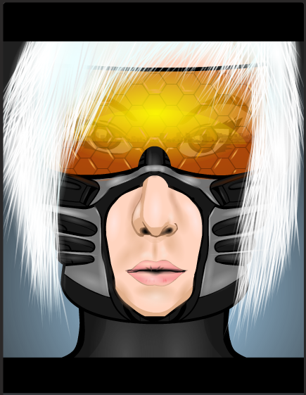
Lets kick off with the best bit shall we. As I'm sure everyone has noticed, the colour on the visor here is truly stunning. The warmth and the depth is gorgeous, it really adds to the sunrise reflection effect that is being portrayed here. It also doesn't drown out the rest of the reflection, nor the face beneath the visor, which is good, making the image seem more realistic. I also like the fact that Nug put small highlighting shines in some of the hexagons on the visor. It's a little detail that just adds that little bit of polish to the image and just takes it that little bit further.

Nug said on his thread that he wasn't to happy with the hair on this picture. I personally can't see the problem. The slight glow that he has added makes the hair seem more natural than it would if it were just left unshaded. That combined with the fact that you can actually see the individual hairs for the most part gives a natural looking hair style with an un-natural edge, a very pleasant and eye-pleasing juxtaposition.

However, we now come to something I haven't done in a while, what's wrong with the picture. Nug is right, this picture isn't perfect, it could be improved. And for me, it's the jaw line. The metal part of the helmet is made from a cyber-torso, which is fine and the item works well for its purpose, but I don't like how Nug just left the bottom edge as it was. It gives the character an oddly shaped square jaw and it looks odd when you look at the characters chin. If he had masked the torso item to the same female head he had used for the chin, Nug may have been on to a real winner here. But just that one bit makes it fall short of perfection. But only just.

JReviews: Doctor Who Series 8 Episode 12- Death In Heaven

I'm actually on time this week. Which is good. But was the episode?

Continue reading

Encourage An Artist

Our esteemed founder Mr Hebert posted this over on the Heromachine Facebook page earlier today and I thought I might as well share it here, because he's right, it does perfectly encapsulate what this community is all about.

There's no such thing as bad art, just unimaginative critics.

Character Of The Week: RobM- Monument Builders Of Sirius

Ok, I've gone and broken my own rules again, because this picture was actually posted last week. But I already had written last weeks COTW post when this was uploaded and when I went back and looked at it again I thought to myself "I should probably feature this one next week". So I'm going to.

It's not  often that we get a picture where I actually have to go into Heromachine to try and figure out how it was made and then, an hour later, I come out none the wiser. Rob if you could enlighten us as to how you managed to blend the grey portion of the face so seamlessly with the rock face, as well as how you managed to get the grey sections patterned without the white bits being patterned also, because I couldn't get it to work when I tried to do the same, I'd be very grateful. It's such a great effect  and it really annoys me that I can't explain it….

Hang on. I just zoomed in on Preview and had a look at the face more closely. Are those background-floors? You sneaky bugger. Those are the wood/ stone texture uneven floors turned sideways! *facepalms* How did I miss that? Time to whip out the COTW slogan of "simple but effective" once again.

Anyway, my favourite part of this image  isn't actually the planetoid face, it's the character carving it. Rob was the person who, if not created, at least made known the technique of backlighting with his CDC33 winning entry Moonsrise. And he's used the effect to great… effect (?) again here. The effect is, once again, stupidly simple, you create and pose a character and then make the colour full black, so the character is a silhouette. Then you make duplicates of the items/ body parts that you want to be backlit, and make the copies slightly bigger than the originals, place them behind the original body parts so that they are slightly showing, and change the colour so it is the colour you want (in this case yellow, but white is more striking). The effect can be quite stunning when done well, as Rob shows us here.

JReviews- Doctor Who Series 8 Episode 11: Dark Water

Sorry this wasn't up yesterday guys, I promise I'm not trying to make a habit of it. Yesterday I was out all day and I got back just before the show started but I was just too tired to even watch it. So it's going up today.

Continue reading

Character Of The Week: Zyp- Katana

I will apologise for the excessive amount of hyperbole and fanspazzing in this weeks post, however, if you look at the title of this post, look at the name, who it is that is being featured, I'm sure you'll understand.

Yes, that's right, after an extended absence, "the man after whom the technique of shading on heromachine is named after" has returned. Zyp is back. And he immediately makes everyone else look amateurish. Apparently this was meant to be an entry for the Going Japanese contest, but he missed the deadline, zypping probably. All I can say is, if this had been an entry, it probably would have been a much closer contest.

Anyway, onto the actual justification bit. And, although the picture its self should provide justification enough, I feel compelled to talk at length about it (so what else is new?). We'll kick of with the character. The pose just screams badass, she looks at the ready to slice and dice with that katana and the expression on the face would suggest that she couldn't care less who said katana slices and dices. It's such a wonderfully aggressive expression. It basically sets the scene for the picture, gives it the depth needed for the rest of the image to tell a story.

Next we have the composition of the picture, by which I mean the background elements, the angle of the focus and the colours. I love the fact that this picture is on a slant. It means that the focus of the picture is not centred, which draws your eyes around the image more than having a straight central focus would.  Your eyes are drawn from their default centred position to the right so you see the face, then you are drawn around the picture in a clockwise motion, down the body, around the floor and up the sword until you reach the sky, then back to the face. It's so easy to take in the entire picture just by following the elements that make it up. This is helped by the wonderful use of soft and warm colours. The pinks and yellows of the sky set of the greens and greys of the middle focus perfectly, and the two contrasting colour schemes are combined on the main focus, the character, in such a way that they don't clash or contrast but work together, making all three layers of the image fit together so naturally. I must also mention the fact that Zyp has changed the line colour of some items where he is including the reflection of the sunset on the character. I know I say this a lot on these posts, but it's such a simple idea that works so well. Attention to detail and a bit of extra creativity can turn a picture from a great one to a masterpiece.

And finally, the obvious thing that one has to talk about when critiquing a work by Zyp. Really what do you want me to say. He's Zyp, you expect me to trash talk his shading? Look at that freakin' sword. The subtleness of the colour differentiation on the clothes. The block shadows on the arms. That sky. And of course the aforementioned sunset reflections. *shakes head* What am I meant to say.

"We are not worthy" *throws self to floor Waynes World style*

JReviews: Doctor Who Series 8 Episode 10- In The Forest Of The Night

Sorry this wasn't up on Saturday guys, I've had a rough couple of days with IRL stuff and I haven't had a chance to actually watch the episode until today.

Anyway, on with the review.

Continue reading

Character Of The Week: Candruth- Portrait of a Blue Eyed Woman

I fear I would be neglecting my duty if I didn't showcase this picture for this weeks COTW, even though it was originally posted last friday, just before the last COTW went up. But, technically, I pre-schedule these posts the day before, so I couldn't have featured it last week, so I can feature it this week. So for those of you who missed it, here's Candruth's latest piece of Art.

Anyone remember that amazing portrait SeanDavidRoss did for the faces contest a couple of years back? It's in the Hall of Fame, so if you don't, go find it. This piece reminds me of that, and that is very high praise indeed. There's not very much to the picture apart from the shading/ lighting, so that's what draws your eyes. And it just looks gorgeous. Ok there are some messy bits, some of the shading does spill over into the eyes, but the lighting looks so natural and realistic that it doesn't seem to matter so much. The attention to detail is stunning. It took me a few minutes to realise "hey hang on, there's something going on with those eyes, I don't remember seeing eyes with pupils like that in heromachine before". And I was right. Canruth has actually done minute dots of colour and shade in the pupils, which just adds that much more depth to the look of the piece. Even those little fleshy bits in the corner of the eye that no-one knows what they're called (in before someone says it in the comments) look like they've been shaded. And there's the extra bottom lashes. And the shading around the cheek bones. I'd hate to think how long this whole thing took, or how many layers the final piece came to. Well done Candruth.

JReviews: Doctor Who Series 8 Episode 9- Flatline

So, time for our pseudo-traditional "problem without the Doctor" episode. How does it fare?

Continue reading

JReviews: Doctor Who Series 8 Episode 8- Mummy On The Orient Express

It's review time.

Continue reading