Home › Forums › The HeroMachine Art Gallery › Dionne Jinn Style
- This topic has 157 replies, 26 voices, and was last updated 12 years, 2 months ago by
Weilyn.
-
AuthorPosts
-
January 5, 2013 at 1:02 pm #16689
Dionne JinnMemberThanks, headless. It is stange to look at the picture with a different computer. The colours are all a little bit different…
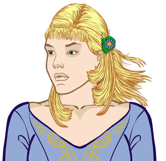
Anyway… Here is my hair design for the contest.
 January 7, 2013 at 1:42 pm #16831
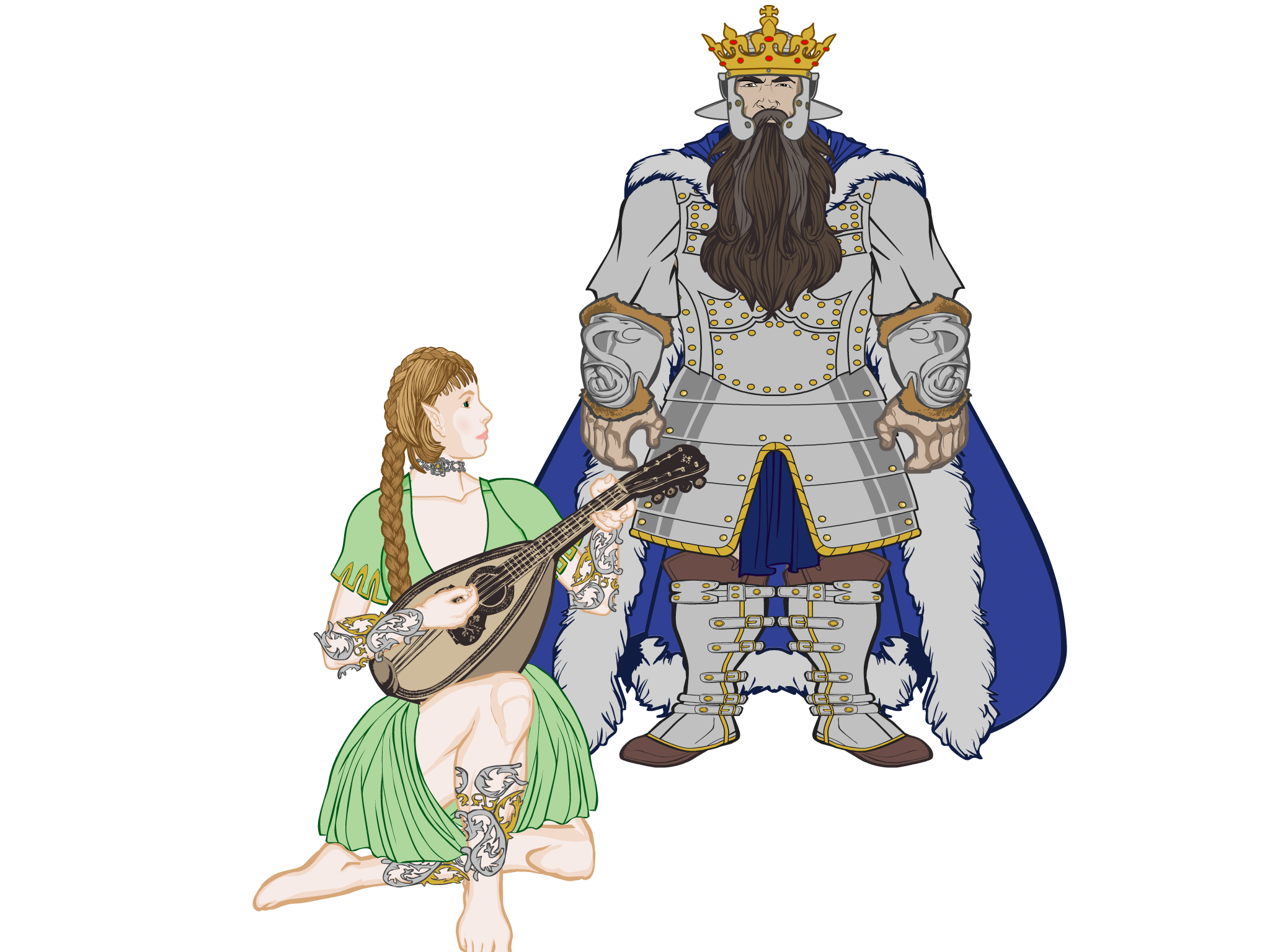
Dionne JinnMemberOkay… Here is what my tired mind came up with yesterday after first going to watch the Hobbit and then coming home and watching Dances With Wolves on telly. I somehow started to think what kind of a story you might get from using the story elements from the Western in a story set into a fantasy world.
Dwarfs would replace the Sioux/Lakota tribe (the “good Indians”), orcs/goblins would – of course – be the Pawnees (the “bad Indians”), Kicking Bird would be the dwarf king and Stands with a Fist an elven girl rescued by dwarfs from their common enemy. I’m not yet sure who Dances with Wolves would be, probably a human ranger…

Oh, and while I openly identify the sources of my inspiration here, I don’t believe this is a copy-violation because dwarfs and elves and orcs are pretty universal nowadays, and the story line I’ve been using from Dances with Wolves isn’t really that original in the first place.
January 7, 2013 at 11:22 pm #16862
Dionne JinnMemberI’m surprised no one has told me yet that it has been done. Foolish me! It was done by R. A. Salvatore, of all writers! Only he had a human woman and an elf ranger. And not just an elf ranger, but a dark elf ranger. I realized this about ten seconds after I turned my computer off last night, but was too tired to turn it on again so I could point it out.
It still escapes me why I didn’t think of Bruenor – Catti-Brie – Drizzt combination being essentially the same than the idea I had. Geez, I’ve lost count how many times I’ve read Dark Elf Trilogy and Icewind Dale Trilogy, so I should have noticed sooner. Oh, well, it is still not copyvio, because as I said the story line I’m thinking is not that original…
Here is an updated picture.
 January 8, 2013 at 7:52 am #16870
Dionne JinnMemberVol. #3. I’ve started zypping the pic (and started to regret choosing to do so!), but I’m not half done yet. Current number of layers is 250 and counting…
 January 11, 2013 at 7:46 am #17061
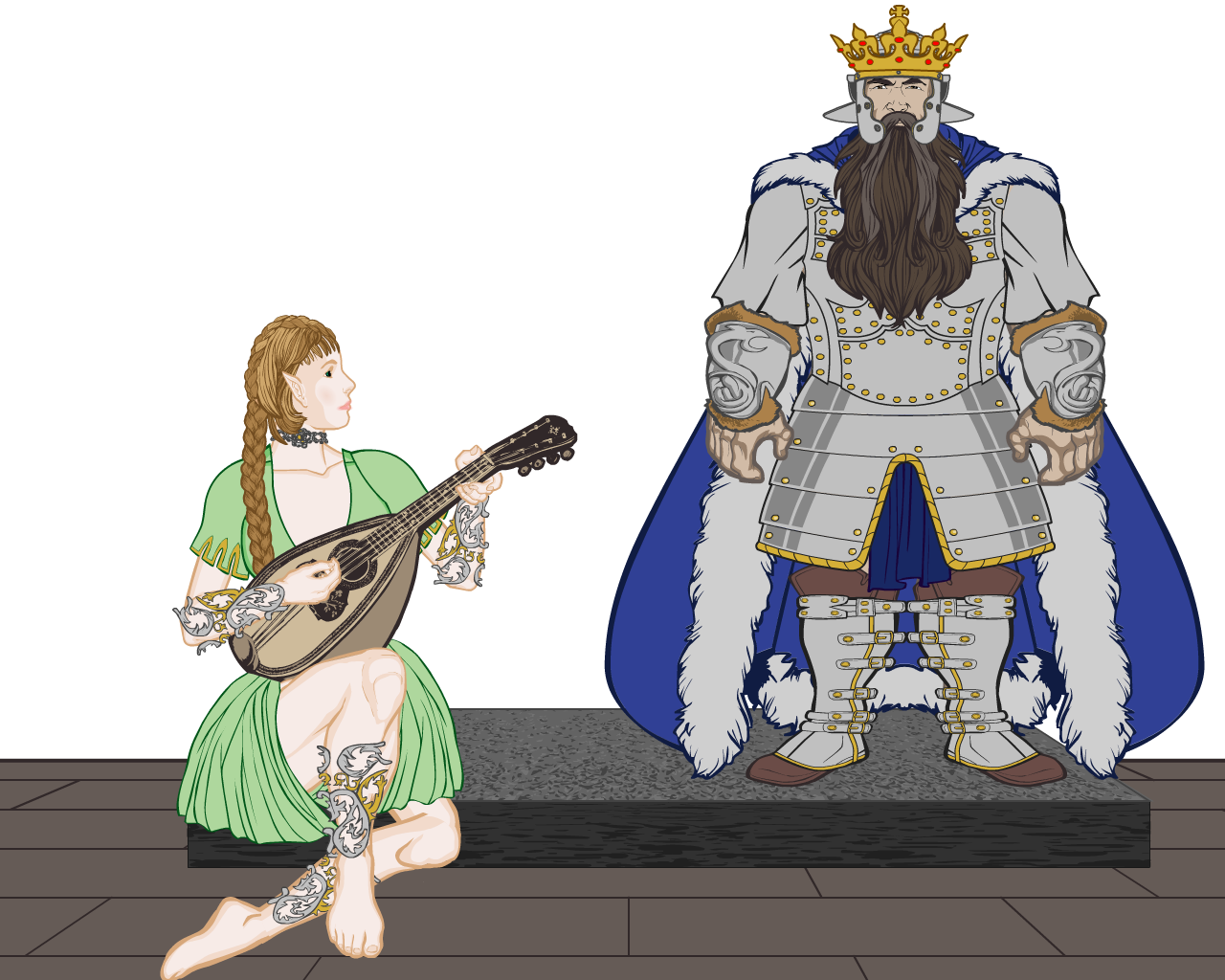
Dionne JinnMemberOkay. Uhm… This is the current (and could be the final) version of that elf-dwarf image I’ve been working on… Current number of layers is 406, which is my new record (almost doubling the previous one, which was something over 200) and over 280 of those are only used for zypping…

Note to self: do not do zypping on any Sandokan pictures ever!.
EDIT: I apparently can’t stop tinkering with this image. Now there is 410 layers!
January 11, 2013 at 5:16 pm #17085
ScatmanMemberAHHHHHHH she is caught in a ZYPPING TRIP!!She is ZYPPING her face off!!!I know the feeling all too well!
January 16, 2013 at 3:34 pm #17446
Dionne JinnMemberYes, she is, Scat! And blaming Zyp for ever creating the technique in the first place… Nah. Not really. It makes images look good, but is damn frustrating to do on a large pic.
January 16, 2013 at 4:15 pm #17447
WeilynMemberOnce again you push the boundaries for what the machine is capable of.
Awesome work! Herrejävlar, it’s freaking awesome!January 17, 2013 at 12:06 am #17470
Dionne JinnMemberTack ska du ha, Weilyn. Thank you.
January 17, 2013 at 12:49 pm #17507
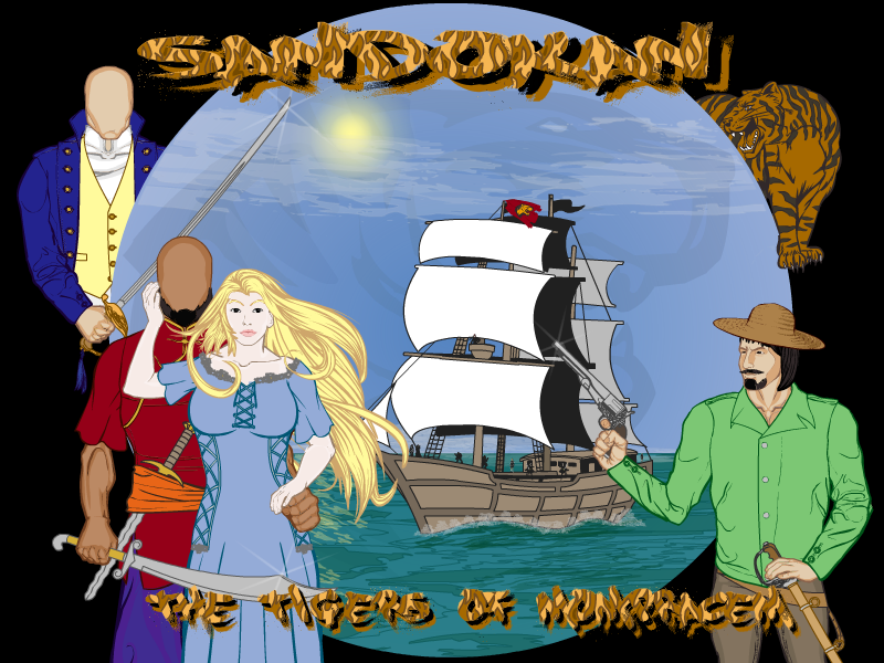
Dionne JinnMemberAfter noticing that we have OCD today, I put this out here even when it is not really ready. I’ve seen some amazing cover designs around HM lately, and decided to try one for Sandokan set… Currently I’m working on the missing faces and thinking if I should add some kind of decorative element between the blue and black background elements.
 January 17, 2013 at 1:56 pm #17510
Kaylin88100ParticipantVery nice! My only issue is that the font is a little hard to read – particularly the last word, of which I can only decipher half the letters.
January 17, 2013 at 2:03 pm #17511
Dionne JinnMemberThe final word is “Mompracem”, but you are right. The pattern combined to letters make it a bit hard to read.
January 17, 2013 at 3:54 pm #17528
HammerknightParticipantI almost always put color 1 and color 2 to 0% transparent, I think it looks better and makes it easier to read.
January 23, 2013 at 1:46 pm #17809
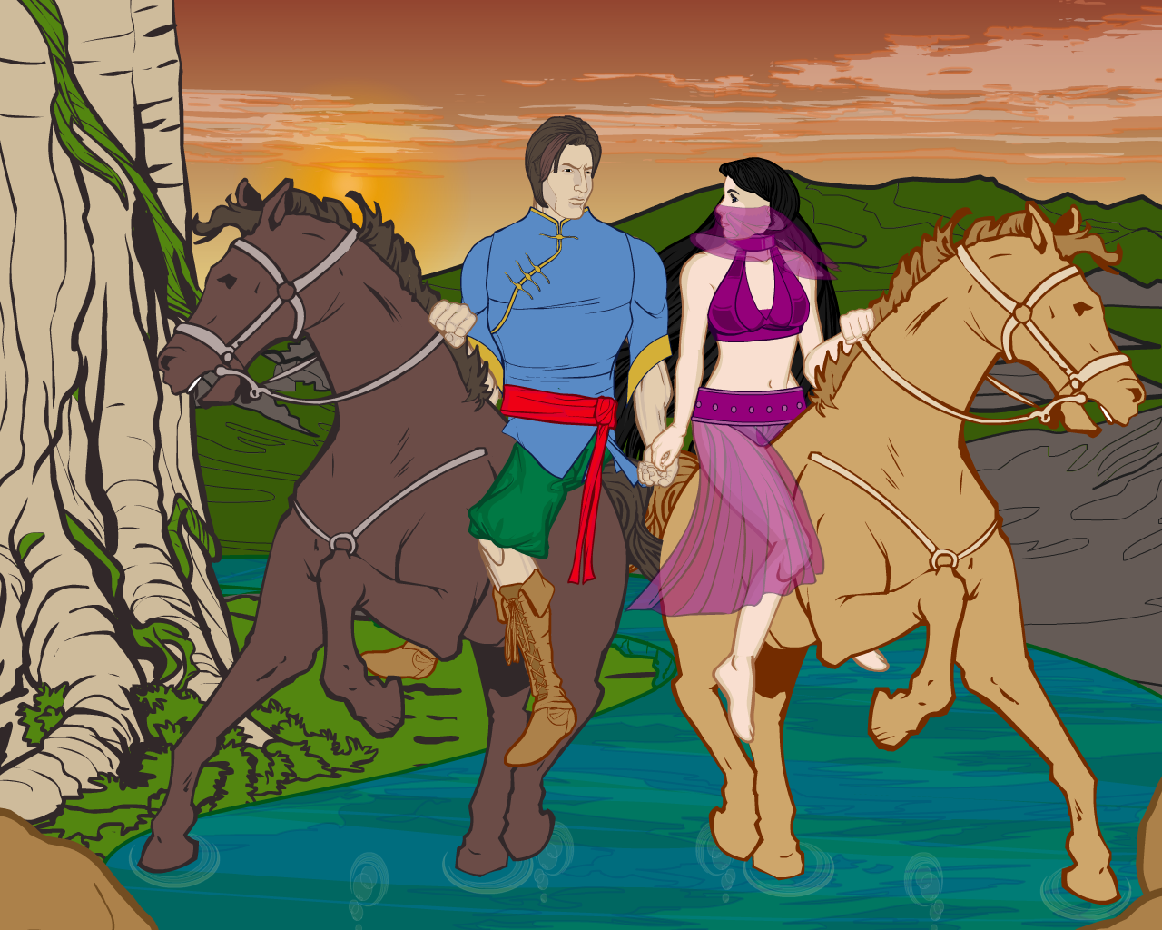
Dionne JinnMemberThis is something I’ve wanted to do with HM3 for a long time. Finally got to try it…
There is this old Finnish song (I think it was our Eurovision song contest entry way back before I was even born, or something) I remember from very young age. It is called “Neidonryöstö” (literal translation would be something like “Abducting a Maiden”) and tells a story of two riders trying to escape. Here is my very bad attempt to translate the lyrics of the chorus, which acted as the inspiration for the following image:
“Two horses are crossing the stream
Two riders are growing tired
Maiden’s hand touches him
Silent man laughsTwo horses are crossing the stream
One way, one morning
The water splashes in the stream
Land shines in midsummer”
EDIT: Okay, if I said my translation was bad, this is even worse!
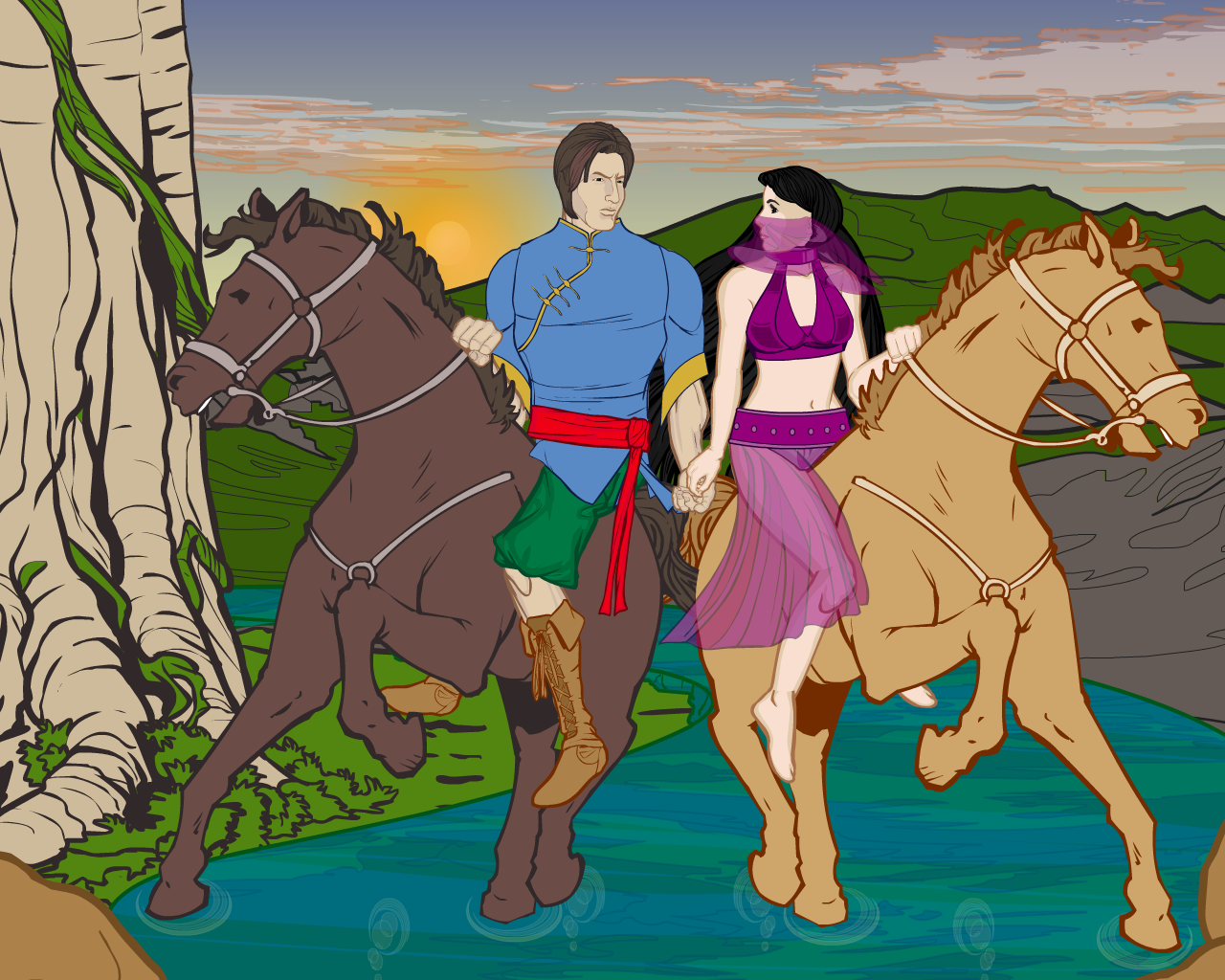
EDIT2: Here is an alternate version, with blue sky:
 January 23, 2013 at 5:44 pm #17827
WeilynMemberAmazing work! I especially love the posing and the water effects!
Pretty cool song, too.
-
AuthorPosts
You must be logged in to reply to this topic.

