Category Archives: Bad Super Costumes

Dy-No-MITE!

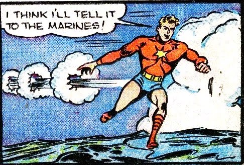
I am turning over today's installment of "Bad Super-Hero Costumes" to Brian Hughes at "Again With the Comics" for his most excellent run-down of two-issue Golden Age sensation "Dynamite Thor", who is every bit as awesome as you would expect from a guy whose "power" is throwing dynamite at anything getting in his way.

dt-marines

Head on over to Brian's place and check out the full article, it's really a hoot. Or, rather, it's dynamite!

Bad non-costumes

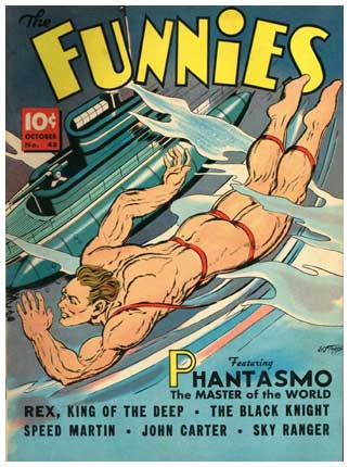
For the first time, we at HeroMachine.com are proud to bring you the previously untold story of how Namor lost his "Worst Dressed Aquatic Hero" award:

stoner_ec_phantasmo

Look, ribbons may count as a "sport" in the eyes of the International Summer Olympic Committee, but in no way should they be considered as substitutes for an actual costume in the annals of super-heroic adventuring, a memo Phantasmo clearly missed. I just thank whatever deities may exist that we are exposed only to his dorsal view, because I have no desire to see what that ribbon is doing on the flipside.

More like “Thud” than “Boom”

I think, if you're going to have a super-power that involves exploding things, that you should carry that theme through to the absolute extreme. Name, costume, effects, everything should be an assault on the senses so violent that you are forced to cover your eyes and look away in horror at the resulting carnage.

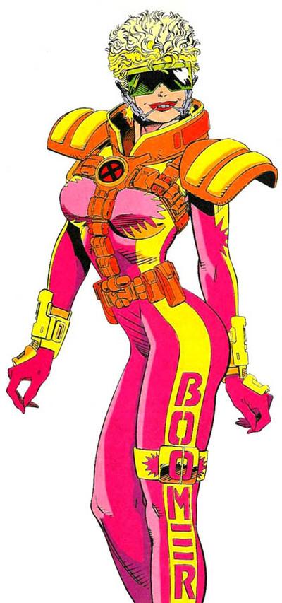
You know, like "Boom Boom", aka "Boomer", aka "Time Bomb" aka "A lame character by any other name is still lame":

bad-costume-boom-boom

Tell me you can look at that costume in those colors and not think something blew up. I dare you.

Note how thoroughly this to-the-max redesign pounds the metaphor home. From the hair that looks like it is currently in the midst of a nuclear blast to the bomb-shelter high collar to the massive eye protection, they don't miss a beat. But in case the reader is dumber than a sack of hammers, they also threw in some explosion logos on her boobs (because let's be honest, that's immediately where most fan-boys' eyes go), arms, and leg strap thingie.

And just in case that wasn't overkill enough, they also wrote her name down her leg. Which, honestly, was a great idea, because given the artistic team on X-Men at that time, it could be really hard to tell one character from another. This approach narrowly beat out the other idea of having them toting little name-signs a la Wile E. Coyote.

Without a doubt, though, what really brings this baby home is the color scheme. I can't remember the last time I saw such an ... innovative use of neon pink, day-glo yellow, and radiation orange.

No, wait, yes I can -- I suddenly realized where James Cameron got the color scheme for Pandora's jungles. Well done, sir.

My only criticism of this otherwise stellar outfit is that they made her keep her headgear retainer on. That's just cruel. We understand that dental work is a delicate thing and that teens often struggle with it, but come on, she's a crime fighter! Let the poor girl leave the acne cream and external dentifrice at home already.

(Character and image © Marvel Comcis, Inc.)

It’s ugly, but invisible

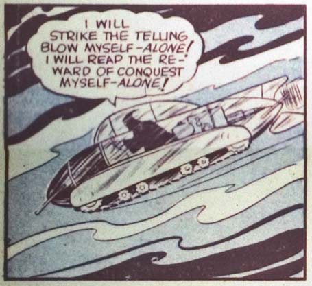
Although not technically a costume, I feel the following vehicle qualifies as fodder for Bad Costume Wednesday:

abc-1-1941-invisiblesub

For those of you scoring at home, that's an invisible submarine tank crawler. Because sometimes you want to be underwater, and sometimes you want to crawl along the ground, you always want to be invisible. Except for the bits inside, but come on, who is going to see you in your big scary black robe or, in the case of Wonder Woman, with your breasts barely contained in shiny red, blue, and gold, right?

Just because you can make it invisible, doesn't make ugly go away.*

(From "America's Greatest Comics" number 1, 1941.)

* This motto coming soon to an After School Special near you!

Unfortunate adventures in super-patriotism

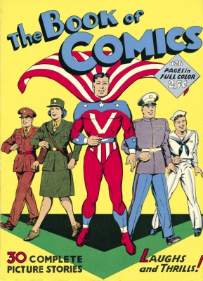
I'm going to go out on a limb here and suggest that perhaps wearing a costume that looks like someone's given you an atomic wedgie of such massive proportions that your underwear actually forms a cape is not the best way to inspire awe in the Enemies of Freedom:

captainv

Throw in the way his head seems to be floating, severed, over the obnoxious underwear cape and the always-hated greaves-not-boots footwear and this is not America's proudest moment. Plus, as frequent reader and gift-from-above-contributor Kate put it when she sent me the image:

"It gives me unsavory mental images of Captain V asking women if they'd like to lick his peppermint stick."

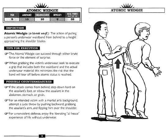
On that note, have a Happy New Year full of randomness and bad super hero costumes, everyone! And because we're all about the education here at HeroMachine, allow me to share with you a tip from the book "Atomic Wedgies, Wet Willies, & Other Acts of Roguery" on how to avoid an atomic wedgie. If only this helpful tome had been around in the Forties for Captain V!

atomicwedgie_001

Always bet on Black. And pop collars.

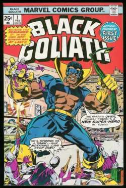
Marvel gets dinged twice on this one, once for the compulsive labeling of Black characters by putting "Black" in their name, and again for indulging their penchant for bad costumes:

blackgoliath1

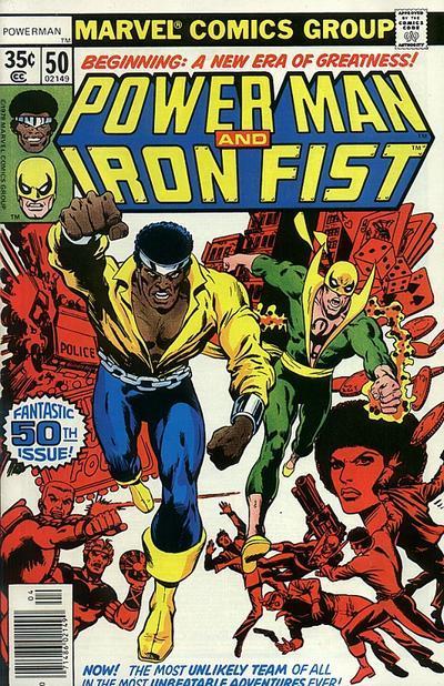
Memo to all you aspiring super-heroes out there: Popped collars are not cool. Especially when there's no cape attached. You can't totally blame Black Goliath for this, of course, since he was just going by the modest success of Iron Fist and his outfit:

16539-2959-18426-1-power-man-and-iron-f_super

Of course, Iron Fist has other problems to deal with, notably the fact that he's running around in green Capri pants and slippers, so maybe he just hadn't noticed yet what was going on with his fake cape collar.

Black Goliath, however, has no excuse for that abdominal cut-out look he's got going on. Girlfriend, that's just sad. Even though at his size his six-pack abs are more like kegs, there's just no way that kind of thing makes sense. How does it stay stuck to his pecs, for one thing? And in what kind of temperature profile is something with that design comfortable? Maybe if you have super-sensitive nips and pits, you'd want something like this, but otherwise I don't see it.

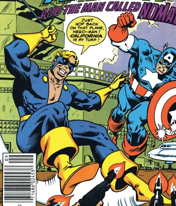
Sadly, Black Goliath never really took off as a mainstream character, due either to his incredibly redundant power set, his obnoxious name, or (most likely) that costume. At least you'd think the costume was key to his demise, but don't put anything past old-school Marvel, because like an unwanted zombie guest at your wedding, the outfit rose from the dead at least once:

nomad_ferbel001

Of course Nomad was also canceled, so maybe we can credit Marvel's audience with good fashion sense, even if the Bullpen struck out.

(All characters and images are copyright Marvel Entertainment Group, Inc.)

The fall of Britain

Once the mightiest empire in the world, Great Britain's fortunes have ebbed and flowed over the centuries, so it's only appropriate that their national super hero has as well. I don't know that any character, however, has hit the extremes in terms of costume design like Captain Britain has. He started out pretty bad, with this muddle of an outfit:

Continue reading

Look away

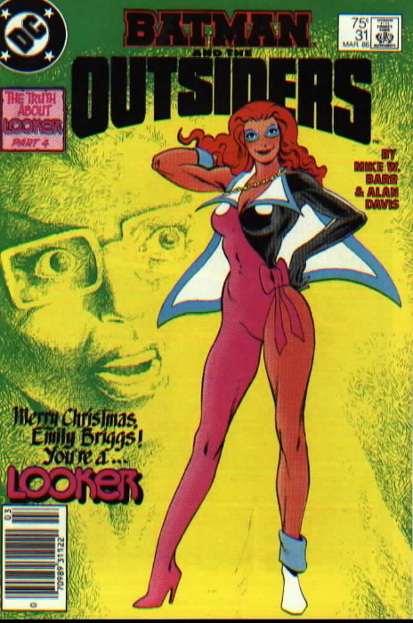
You rarely get honesty in comic covers, which is what makes the look of horror on the face in this background so refreshing:

outsiders31

I like how she's drawn inspiration from so many different sources for her ensemble. And by "drawn" I mean "stolen", and then "changed to make even worse".

For instance, she's somehow ripped off Captain Marvel's cape and slapped gigantic lapels onto it. I defy you to name one piece of clothing ever improved by adding lapels.

Michael Jackson had the idea for wearing only one, glittery, glove, and had Looker stopped there all might have been forgiven. But no. Not content with just swiping the concept, she took it up a notch by wearing just one boot. One pink boot. The other foot looks to be clad in nothing but a sock and a floppy powder-blue towel. Whatever else you want to say about the unfortunate Mr. Jackson, dude never went out in terry cloth.

At least Captain Marvel and Michael Jackson were well-dressed, A-List type guys. You can't blame an up and coming super-hero for borrowing inspiration from them, but frankly there's no excuse for raiding the D-List. And by D I mean Dazzler, who is going to be hard-pressed to keep her secret ID secret without her powder blue faux-eye-makeup mask. Even then, she's not going to be nearly as pissed as Sailor Moon will be upon discovering her hair bow is now bedecking the lone orange legging on this unpleasant tramp's jaunty hip.

Given this bizarre melange of magpie-like thievery and eye-bleeding color choices, you're hard pressed to pick out just one element as "the worst". Luckily Looker has thought of that, and helped us out by thoughtfully having gigantic white nipples sewn to her breasts. That kind of altruism will go far in your heroic career, Ms. Briggs.

Regardless, you have to admit this costume would certainly make you look. Granted, you'd be looking in horror, but you'd be looking. And as Paris Hilton has proven to our dismay, that's pretty much all it takes nowadays to be a "success".

Reader Kate was nice enough to send this suggestion in, and I thank her both for the idea and for summing up this travesty so perfectly: "It looks like an explosion in the Good'n'Plenty factory." I could've saved us all several hundred words by just pasting that sentence, but then that wouldn't really be in the "obnoxious excess" spirit of "Looker" -- or all of DC in the Eighties, for that matter -- now would it?

(Image and character ©1986, DC Comics, Inc. Many thanks again to reader Kate for the contribution!)

Second acts

For all the fun I poke at the "Bulletman" comics of the early 1940's, I have developed a real fondness for the book and characters. And although I have spent the last few months reading all of his early adventures, I was surprised to learn recently that in my childhood years Bulletman staged a comback to, of all things, join the Army:

Not only did he get a dunk in the Fountain of Youth thirty years after his apparent demise, he also got an image makeover! Next time, though, maybe he should contract with the nice people at "Project Runway" instead of the Army, because this remake doesn't fly with me.

Look, call me old-fashioned, but I think the only Bullet character with long, sexy, exposed legs should be Bulletgirl. And maybe Bulletdog, depending on the day.

As it stands, the combination of the metallic arms with the bare legs on this 1976 revamp is just odd. I also find the eye-covering helmet unsettling for some reason ... maybe it's that with the original, it looks like he's wearing a bullet on his head, but here it look like his head is in a bullet. A subtle, but vital difference, if you're the one with your cranium so ensconced.

I also liked the original color scheme better. The yellow tights and wrist bands, with the red aviator-type jacket capped with a blue helmet was striking. I find the updated version a bit dull, the red jarring against the silver and skin. Plus it's just spandex, unlike the bulkier top he used to wear, which I always thought made sense given the amount of debris he generates flinging his head through walls.

Finally, I hate the logo. Is it not clear enough that we are dealing with a projectile-based fellow here, what with the big silver bullet on his head? Do we really need a big graphic to back the point up?

I particularly find the faux explosion behind the graphic distracting. That's a comic-book convention, used to add dynamism to a panel in a static medium. But in theory this is a real guy doing actual real things, he doesn't need graphic enhancement to punctuate his wall-crushing. He just, you know, crushes the wall and the explosions take care of themselves.

In any event, I thank the GI Joe team for trying to bring Bulletman back for the Super Adventure Club (not to be confused with Scientologists; although both sometimes get involved with aliens, relatively few Scientologists fly around in underwear, dragged by the neck).

Wait, that's "Super Adventure Team", not Club.

Whatever, he needs to get a refund on that costume redesign, or else stand real close to Scruffy Beard GI Joe (later revealed to be not just a Fidel Castro lookalike, but the actual Fidel Castro) so he looks better by comparison.

(Image @copy;1976, Hasbro.)
Bad costumes, Babewatch edition

Because of the short holiday week I haven't had a chance to put together a "Bad Costume" post for today. Instead I recruited my six year old nephew and farmed the assignment out to him after he saw this image in my stack of Bad Image Ninenties Comics:

Continue reading