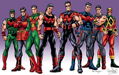
I would argue that no character in comicdom has a worse fashion history than Wonder Man. I've talked before about his penchant for hideous costumes, but just to refresh your memory, here's a retrospective of the character's modern incarnation:
But did you know that Wonder Man's sartorial suckage is not just bad, but historically bad? And I mean that literally, because this is how the very first incarnation of the character appeared in 1944:
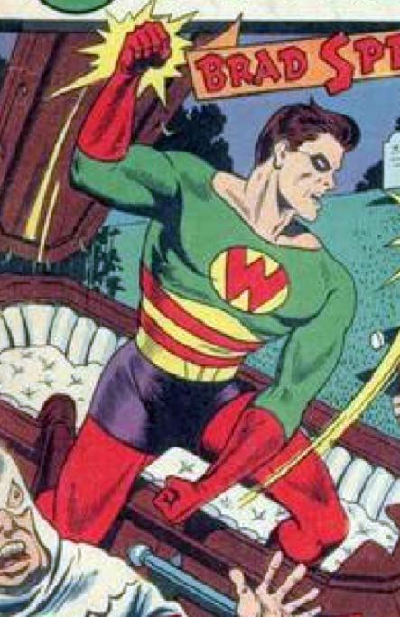
They were called "Four Color" comics for a long time, and you can see the tragedy that results when a hero flaunts that convention and puts together a five color costume. For the record, that's red, green, yellow, purple, and (though it's not visible here), brown for the boots. And those mutually clashing colors are cleverly arranged to cause maximum visual carnage. I can't figure out why you'd have horizontal red and yellow stripes, topped with an inverted yellow chevron just below the pecs, all on a field of green atop a set of purple biker shorts.
I've said it before and I'll say it again, but in light of this new historical evidence it bears repeating: Wonder Man richly deserves a Lifetime Achievement Award in Serial Bad Costuming. That's sixty-seven years of looking like a fool, folks! The only real wonder here is how he manages to keep looking terrible despite that many decades of retcons.
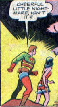
But I'll give the Wonder Man himself the final word on how to judge this little ensemble:
I’d love some context for that first picture, Jeff, because it almost looks like he’s jumping out of a coffin to random beat up some guys, and that can’t be right, can it?
*randomly
Do you think that’s why in the Avengers cartoon they just made him purple energy?
We should have a famous character redesign contest, like choose a famous character and design them with a new look, just leave them recognizable.
and who could forget him in the “Guardians of the Galaxy” storyline as HOLLYWOOD, one of the “Galactic Guardians”
aka Grizzly Adams in a generic spandex
Of all his costumes, the only one that is even close to being ok is the one in the forefront of the group shot, and that’s even ruined by the big red W. He only had it for a short time, because someone realized he would just look better as purple energy. As lame as that sounds, it a million time better than any of those costumes. I honestly think that’s why I hate that character. He could be interesting, but intsead he is just given one trainwreck after another. Add the lame-ass movie star story line, and you get the turd sandwich that is Wonder Man.
I actually kind of liked his red coat costume, but thats just me…also I’m glad he is purple energy now, It looks more menacing. Now he can even knock out Thor in one punch π
Jeff, speaking of things that are terrible, did you see the Liefeld cover for the new Hawk & Dove #1 yet? Scroll down for it. http://www.comicsalliance.com/2011/06/08/dc-comics-announces-new-teen-titles-tim-drake-sighted/
Thanks Dan, I didn’t see that before! You know, I learn something new from every Liefeld cover I see. For instance, in this one I learned that the deltoid muscles join the arm right smack dab in the middle of the biceps. It’s anatomastic!
@Dan(8): I just saw it myself. I was really looking forward to the series until I saw the artist. Then I cried.
oh, and look at Dove. It’s like he modeled her after a disfigured Barbie doll π
one more critique and I’ll be done. Look at Hawks face in the background. Now tell me that is not a classic Liefeld expression: angry face, open mouth, more teeth than humanly possible…
Jeff, knowing that you’re a fan of the Legion, what are your thoughts on their new looks? And what of the new Teen Titans?
Personally, as far as the Titans, I like the looks of Red Robin and Kid Flash. I’m on the fence with Superboy, but don’t really like the looks of the others. Of course, it’d be better in an action shot, but who knows?
Here’s the link: http://io9.com/5809827/exclusive-dc-gives-us-a-first-look-at-the-new-teen-titans-legion-of-superheroes-and-more
oh, and Dove’s mask has a beak. On the BRIDGE OF HER NOSE!!!!!! I need to stop looking at this, it’ll give me a panic attack
@McKnight57(13): Really? I love Wonder Girl’s outfit, it is so much better than jeans. Also, I love the overall red, black, and yellow color scheme, it makes them look more unified, like a team (this makes me think of how the X Men costumes are sorta similar). Really worried about Tim Drake (my absolute favorite character) though. I hope he stays part of the Bat Family, because it seems like he is getting a new backstory π
Dang, lost my whole comment — feh. Anyway, love Red Robin’s look, the other Titans not so much. I hate messing with the Flash’s costume, it was just so perfect. When you get too much jazz going on in it, you lose the whole “sleek speedster” effect.
As for the Legion, they look OK if a bit X-Manish. I’m curious as to why Wildfire has hair, since he was always pure energy last I remember, but no big deal there. I don’t care for Chameleon’s arm turning into a gun, just because that’s about the lamest thing ever. And it’s been done before, plenty of other times. Plus, Cham turns into organic beings, not metal or weapons. But the look in general for the team seems OK.
@ajw I was thinking the same thing. I would love to have a new look at some of these bad costumes.
@Zaheelee, sweet jesus, I didn’t even see that. I was so focused on Hawk’s bizarrely shaped torso and Dove’s…um..chest region. What the blue blazes is going on there? It’s like those old seek and find pictures from kid’s magazines. See how many things you can find wrong in this picture.
Zaheelee (15): It’s not the outfit that actually bothers me about Wonder Girl. Upon a second look, I do like it but still, an action sht would be better. My problem with her is that she’s being made into a reformed (I assume) thief. And yes, I have the same reservations you do about Tim. Also, look at yesterday’s news about Nightwing on the DC site and tell me that suit doesn’t make you think of Jason Todd.
It’s a good idea ajw, but I just don’t want to go near any copyrighted characters on any officially-sanctioned site. What is fine for not-for-profit individual use is a little dicier for a for-profit enterprise like UGO. If we run something like that encouraging the use of the program to create infringing images, on sites that we own and profit from, then it could be argued that the purpose of the software is to create copyright violations. I think that’s nonsense personally, but better safe that sorry from a corporate standpoint.
Zaheelee, I think I can feel the first “I Hate Rob Liefeld’s Art Friday” post in a long time looming on the horizon. That beak … the huge eyeholes that put her eyes actually in the blue part instead of the clear part, the mismatched “wing string” attachment points on Hawk’s chest, the gape-mouthed, tooth-filled mandibles, the neck veins … I agree with you, this is definitely anxiety-producing.
We need to see the front of Superboy, but it looks like another dud. Black muscle shirt with what looks like a scrap of white cloth with an S taped on the back? And an S tattoo? Can he be the next inductee into the Bad Costume Hall of Shame?
Why does Liefeld always draw fingers going from longest to shortest? Does he have some kind of disfigurment himself that he just thinks is normal and no one ever called him on? Also, the guy really needs to work on making things symmetrical. Hawk’s little streamer things are coming from two completely different points on their respective sides of his chest, about a foot off from eachother, and Dove somehow ended up with a breast under each arm instead of next to eachother on her chest. Plus, as was mentioned above, Hawk has about 50 teeth too many in his mouth, and Dove’s Spiderman-ripoff mask appears to be blinding her…
Don’t worry folks, its Hawk and Dove! That book will get canceled in 4 issues and old Mr Liefeld will be back in line in the soup kitchen. By the way I really like Red Robin’s new look. And yes Wonder Man does look better as a purple energy people eater.
I think that the black and red are ok but yes the others are bad lol.
I’m always amazed personally with who Liefeld can team up with lately. I mean, for Hawk and Dove he’s teaming with Jim Lee, which makes some kind of perverse sense in that Jim Lee has a style that Liefeld seems to try to emulate, but fails miserably at. And then teaming up with Robert Kirkman for The Infinity. Robert Kirkman! Writer of Invincible and The Walking Dead. I almost want to buy this book, but then I get worried that it will be like reading Deadpool Corp where I will enjoy the story, and look past the art for so long, until I happen upon a panel so mangled, I have to shut it, unable to go on. And the weird part is Liefeld is actually improving. Only slightly, and still horribly, horribly flawed. But his stuff is a little easier to look at than back in the ’90s. I sound like a damn Liefeld apologist. *smashes head into keyboard*
Jeff, quick question before I get back on topic. What’s your thought on DC rebooting (again)?
Okay, so I went looking into this historic, 1944 version of Wonder Man, who is obviously not Simon Williams. This was swiped from ComicVine.
Hmmmm, seems like Marvel did a bit of P-Diddy style sampling…
Also found some other previous incarnations of Wonder Man
For example, there’s this Will Eisner creation for Fox comics:
http://www.comicvine.com/wonder-man/29-73295/
And DC came up with a Wonder Man 1-shot here:
http://www.comicvine.com/wonder-man/29-39248/
@Myro(26): Is it just me, or does the Wonder Man from Fox Comics (the first link) have the same costume as Deadman, but with underwear on the outside (of course) and a “W” instead of a “D”?
Also, I wanted to ask all you DC fans: What do you think of the reboot? What revamps do you love? Which ones do you hate? Personally, I absolutely HATE how Stephanie Brown is no longer Batgirl. I will really miss that comic… But I am really happy about Red Hood and the Outlaws, Nightwing (even though the red makes him look like Jason Todd), Catwoman, Batwoman (finally!), Batman and Robin, you catch my drift.
…to say nothing of one’s lats wrapping all the way around one’s ribcage, as demonstrated by Hawk’s left flank (on the viewer’s right side).
…or that a woman’s breasts are actually stapled to her collarbone.
…or that said female apparently has no neck.
…or…
…or…
…oh, I give up.
Holy crap, I just noticed that HAWK HAS A WEIRD TINY BEAK TOO!!!!!!!!!!!!!!!
Seriously, whose idea was that? Liefeld can’t be THAT stupid… oh, I forgot, he can.
Zaheelee (27): Now that you mention it, with the red color and that collar, it does look like Deadman’s costume. I missed that first time around.
As for the reboot, with my sporadic comic reading (and the fact that I’m more of a Marvel guy, but not exclusively so), means I haven’t been as thoroughly exposed to it yet, so I can’t really answer that question. I do tend to cynically believe that DC just reboots everything whenever sales start dropping in order to generate buzz.
I’m kinda with Myro on this. It just feels like another attempt to DC to grab some headlines, instead of an actual attempt to do good storytelling. I think that Crisis On Infanite Earths had a purpose. I think that Zero Hour was a crossover gimick that tried to have a purpose. All of these other “clean-up” crossovers that have come out since 1994 have just been cashgrabs that promise “major shake-ups” the in the end are meaningless. Not saying Marvel is innocent in this, but at least when Marvel does it, they don’t eradicate 70 years of continuity for a sales gimick that in 3 years time will be meaningless.
@Zaheelee–Dear god, look at the hawk’s head in the background! Was it too much to ask for Liefled to use a reference photo when drawing the hawk? I know most comic artists can’t draw decent birds for some reason, but dammit, this is the cover! Best foot forward, and all that.
My memory of Wonder Man (furthest on the left) is that he is actually a re-animated corpse of the original WWII Wonder Man. He struggles with his past life as… basically, a reject of Captain America. So he has all these personal issues coupled with being a Reagan Era protest vote.
Which is also a great fit and more into the 1980s in-depth exploration of character and motivation. All the re-vamps done with the Demon (Etrigan), the introduction of Lobo, Guy Gardner, the exquisite re-vamp of Sandman from cliff-hanger detective to brooding netherworlder (which is my goth nod to the gas mask). Mmmmm… goth chicks.
Props to Stan Lee for Spider-Man and all. But the becoming of comics and “realism” for me was the mid- and late-1980s when they delved into individuality, motivation, awkwardness, cynicism, optimism, and guts.
My mind, 1980s Wonder Man uencapsulates that. Yes, I can do without the latter black leotard incarnations.
“After a time he finds how to recreate what gave him his powers and his girlfriend Carol Paige becomes Wonder Girl”–so, his girlfriend can also be hard as steel? I had no idea the 40s were such an open-minded era!
The reboot’s kind of losing me. Don’t get me wrong, I’ll still pick up Batwoman (obviously) and as long as it still exists (and Simone is still writing it) I’ll keep reading Secret Six. But I don’t like playing the “what’s in continuity now?” guessing game. Also some of the new titles/teams kind of confuse me. What’s the point of Birds of Prey with no Oracle, for instance? And do we really need another book about young heroes with chips on their shoulders?
I admit I’ll probably look at Red Hood and the Outlaws (scroll to the bottom), though, to resolve one burning question: the Red Hood wears a plain brown leather jacket over his spandex; Arsenal tops his old outfit with a trucker cap; what random piece of everyday clothing is Starfire going to wear over her costume? The suspense is killing me!
I kinda like the two black and red versions, even the ones with a bit of blue are ok. My biggest issue is the red and green combos. I mean, unless Wonder Man’s alter ego is Kris Kringle these colors just do NOT work!
That picture of the rebooted Teen Titans is pissing me off. It stinks of 90s-era Xtreeeeme! bullcrap.
Here’s another cover for Teen Titans, and as I suspected, Superboy’s costume does indeed suck eggs.
https://www.facebook.com/#!/photo.php?fbid=10150319630338496&set=a.10150093744423496.289675.125598298495&type=1&theater
Just saw the new stuff they announced today. Looks interesting, especially the Grifter solo comic, plus the Blackhawks. With Grifter seeing the Daemonites, I wonder if Voodoo will be able to as well, since that was always her unique thing.
Oh, my bad, here’s the link to that one.
http://comics.ign.com/articles/117/1174851p1.html
The Blackhawks’ costumes look pretty good, but I can’t help but prefer the WWII billcap-greatcoat-and-jodhpurs look.
X-stacy (34) thay’ll probably go for the redneck trifecta. She’ll have her usual swimsuit looking costume with cutoff jeans. And maybe flip flops. I wonder if they can come up with a way to do thigh high flip flops?
Okay, that hurt. Hopefully, I’m making that up. Need to change the subject…
I have a theory about Wonderman’s bad costumes. His whole schtick s that he’s a wannabe actor, right? So, as a point of characterization, he spends a lot of effort and time looking for the perfect superhero costume. He’s just not very good at it.