X-Mas in Summer?! Erm, well ... something like that. I was bored and so I added "a few" new items to the 'machine.
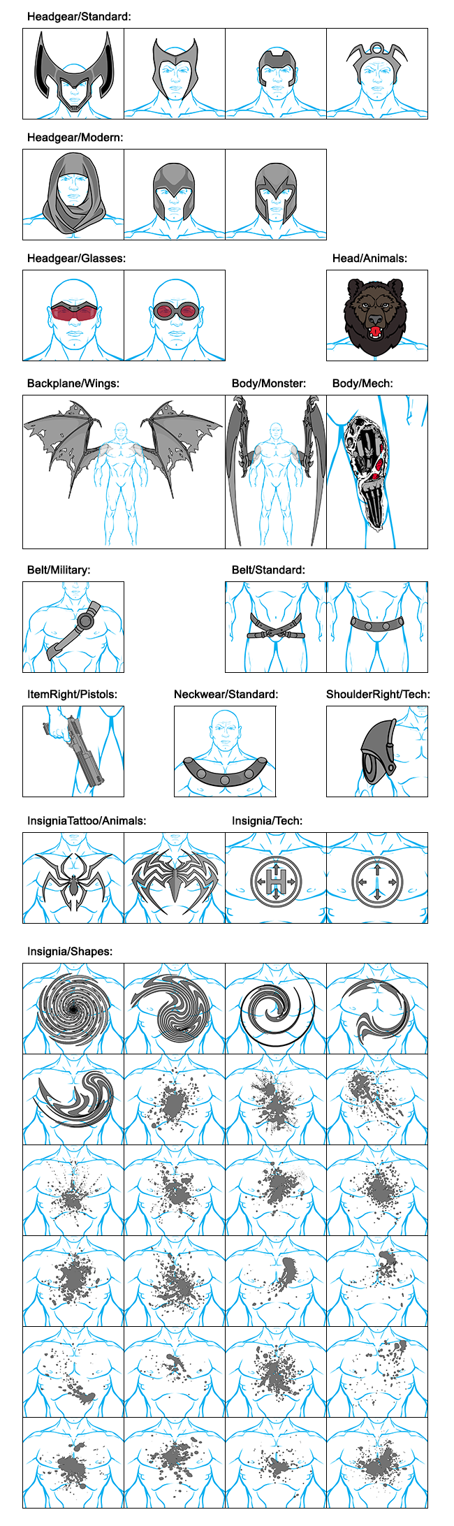
And now enjoy - that's an order! 😉
(As usual it's strongly recommended to clear your browser cache to see the new items ...)

Sponsored Links (which Premium Members will never see):
X-Mas in Summer?! Erm, well ... something like that. I was bored and so I added "a few" new items to the 'machine.
And now enjoy - that's an order! 😉
(As usual it's strongly recommended to clear your browser cache to see the new items ...)
Comments Off on HOHOHO! MERRY CHR…. WAIT! WHAT?!
Posted in HeroMachine 3, New Item Releases, News & Updates


(open in new tab to enbiggen)
download instruction links: Cover, wallpaper (warning clicking on characters in the poster/ wallpaper after following these links will result in rapid explosion of your skull, please make sure to wear a helmet before attempting. Oh and make sure you download the Zip file containing all the covers).
I have to say, MadJack seriously knocked this one not only out of the park, but possibly into orbit. Show him much love in the comments people. Also, I have to give a big hand to everyone who got themselves on the poster, everyones work looks incredible. Sorry that a few of you had to die during the creation of the poster, but just know that your sacrifice was not in vain and you shall be avenged.
We will of course be doing another one next year, so long as someone is brave enough to try and follow this, so if you didn't make it on to this years poster, make sure you're here next year.
But with that, once again thanks to MadJack for his work, and JR out.
Comments Off on Creators Club Poster 2015
Posted in Character of the Week, Cool Characters, HeroMachine 3, Super-Hero Stuff, Things I Like
You know, sometimes my own rules do kinda get in the way in terms of this post. The rule about not including entries for current CDC's was included because I didn't want to sway the votes at all, but this week the one image I wanted to feature was an entry for the current contest. But, I don't want to remove it from the contest (despite the creator giving me their permission to do so) because it will probably win. So instead let's have a look at another piece which, while I don't have as much to say about it, is just as good.
Last week, I mentioned about how certain 'machiners have their own styles that make them stand out. Well this is another case in point. All of Al's signatures are present and correct, dynamic pose, moody background with gradient effect sky and awesome energy effect. I will say, the bottom of the character is rather hard to make out against the background, but it doesn't make the pose any less striking.
The colour coordination really works as well and is a good example of defining layers in a picture. You have the dark colours of the character, which comprise the first layer, which merge with the colours of the third layer, being the background. Now if it were just those two layers, the picture would be very dark, dreary and dull, despite the posing prowess. But then you have the vibrant greens and blues of the energy effect, the second layer, that sits in-between these two layers and spaces them out, adding depth to the image and breaking up the dark hues. And then it's tops off with the back-most layer, the sky, which has a light colour at its lowest point, the point where it meets the layer in front and then becomes darker at its highest point, the point where it diverges from the forward layer. I must also say, I love the neon lines that Al has included in the background layer to break up the black. I love how on the floor they change from purple to green at random points and are then blue for the background . Apart from breaking up the black, they also provide a really interesting eye-catch, and complement the energy effects quite nicely as well.
Mod Note: Quick question you guys. When it comes to this post, are you actually interested in what I have to say about the art? Because sometimes it's quite hard to write these posts because I feel like I'm just repeating myself. I always talk about the same things. And the intros are horrible to write. So do you guys want me to keep the text part of the post, or would you mind if I just showcased the pictures instead?
Comments Off on Character Of The Week: Delirious Al- Hummingbird
Posted in Character of the Week, Cool Characters, HeroMachine 3, Things I Like
Well, this week I'm reeeeeeeally gonna stretch my own rules. Whilst, there have been numerous artworks this week that I could have talked about (COTW regular RobM coming closest, go check out the latest work on his thread, it's pretty damn sweet), one person has been being consistently amazing with practically everything he's submitted this week that I felt I had to cover him. But when it came down to it, I'm an indecisive bugger, so guess what I'm gonna do.


Now, why am I covering multiple characters in a post that usually only covers one picture. Well, I have some very important points to make and Anarchangel is the best 'machiner to use when demonstrating all of those points at once.
First off we have a definite sense of style. If you look at all of these pictures together, it is immediately recognisable who did them, by certain defining factors. The shading style is very distinctive, very subtle, not overused or overshadowing the design, more of an enhancement of what is already there than a stand-out eye-catch. Which really works for Anarchangels style. He has a definite knowledge of light sources. If you look at his work you can see exactly where the light is coming from, because he's made it blatantly obvious.
Then we have inventive and well worked costumes. Two words I can use to describe these are cohesive and stylish. They look like they could actually be from comics or cartoons, even from a live-action movie. Anarchangel has a way of coming up with these really cool looking patterns with masking and insignias that other people wouldn't think of (best example here is Tokyo Rose). And then we have the colour schemes. Simple, clean and effective. You don't need to use more than 3 colours, maybe a 4th for detailing, but that's the limit. The only one of the above characters that uses that 4th colour is Aeon, and that is for two small aspects of the costume, and they all look fabulous.
Lastly, we have an attitude to the characters. You don't have to be the worlds greatest poser or face-maker to get across a character's personality, you just need to have an idea of it and see where it takes you. All of these characters has a definite character despite being in pretty much the standard face-forward pose and most of their faces covered, just by moving the hands a bit here, changing the position of the leg there and a bit of shading on an eye to finish it off. By just tweaking certain things you can change a characters personality from serious to silly, suspicious to incensed. You can imply action, movement or power through a simple hand gesture. All you need to do is look and think, "how can I say this with what I have".
Comments Off on Characters Of The Week: Anarchangel- Various Characters
Posted in Character of the Week, Cool Characters, HeroMachine 3, Super-Hero Stuff, Things I Like
COTW is back for the new year and we're going to kick it off in style with this wonderful piece of landscape work by Linea.

I'm a sucker for a good picture that dispenses with a character and instead just focuses solely on the background, and that is just what this is. Of course, the sunset dominates the picture, the almost golden, orange glow being the central focus here, giving the picture a gorgeous warm feel. This warmth is amplified by the rest of the colours in the far back areas of the image, deep blues, greens, oranges and purples making for a rich and inviting background scenery, without a cold colour in sight.
Then we come to the foreground. With its dull greys and muted browns, it is a perfect contrast to the warm and vibrant background, but even here Linea has managed to add a bit of warmth, with the reflection of the sunset on the rocks and trees. Of course, I've mentioned before in COTW's past how I love Linea's shading style. In some cases, such as this one, it almost looks like the shadows were done using charcoals (best example would be the two dark branches on the right hand side of the picture). This gives the shading such brilliant depth, and really sets off the rest of the picture.
Comments Off on Character Of The Week: Linea24- Twilight Sky
Posted in Character of the Week, Cool Characters, HeroMachine 3
https://www.youtube.com/watch?v=ulS1_SxRENE&list=UU98Hr4hPYfI7Znt8rm48veQ
Remember guys this is the last Character Building tutorial video I am planning to do, so if you have any ideas for replacement posts for the Tuesday blog slot in the new year, leave them in the comments below. Hope this series was helpful for some of you.
Comments Off on Character Building with JR19759
Posted in HeroMachine 3, Tips & Tricks
Ho ho ho! Christmas is coming and Santa Jack brings you some gifts. For, as the saying goes, it is more blessed to give than to receive.
I've put a "few" new items in the 'machine, but since my usual preview picture would probably go beyond the constraints of the blog, I've posted it after the jump ... 😉
Comments Off on HM3: Merry X-Mas Possums!!!
Posted in HeroMachine 3, New Item Releases, News & Updates
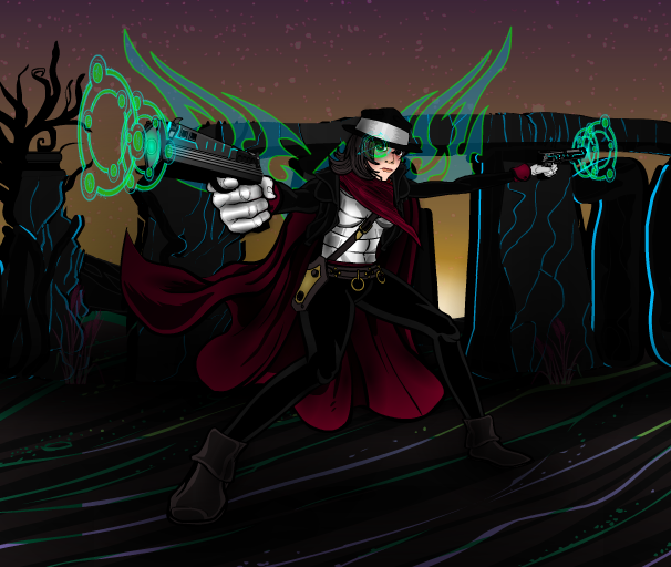
I originally wasn't planning to do a COTW this week, I figured most people would be too busy with festive pursuits to have time to spare, especially considering its Friday. However, it would seem Vampyrist has other ideas. I nip on to the forums for a quick look, to see if anything has been posted whilst I was having my dinner and this is what I was greeted with.
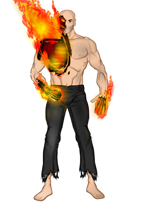
Vampyrist is one of those classic 'machiners (not a term I tend to throw around lightly) who have a style that is truly their own, much like AMS or dblade, you can try and copy it as much as you like, but you'll never get it exactly right, it will never look as good as what he does. And this is as fine an example of the breed as I have ever seen.
If we just set the obvious aside for the moment, we'll kick off with something that has always impressed me about Vampyrist's work. He always seems to do very minimal shading at first glance, you notice a few sports of highlighting on the pants, the glow from the flames that is reflected off the leg, and you don't really think too much more of it. Then you look again and you notice the very subtle shadowing on the left foot, then the chin and the stomach and then the arm and chest. His subtlety with shading on his characters always gets me. It shows you don't have to use masses upon masses of light and shadow to get the result.
And now that that's out of the way, we can move on to the obvious. Masking the skeleton onto the flame effect (*wheels out COTW slogan board*)- simple but so effective. Now this is where you use masses and masses of light and shadow to get the result. I'm not even going to bother trying to count the layers of colour here, it would be pointless, but you have to give Vamp massive props for how good this looks. The fire looks so real and alive, you can feel the heat, and the black, almost charcoal look, of the bones in the flames contrasts so wonderfully against the vivid colour engulfing them. Best examples, just look at the right hand. And that right eye looks positively evil (as I'm sure was the intent). If people are still umping and erring over what to nominate for the Hall Of Fame (nominations are still open btw), you could do a lot worse than to nominate this.
Note: Obviously there won't be a COTW next week, I doubt much will be popping up on the forums next week and anyway, I'll be too busy to write it. Though you can of course expect a review of the Doctor Who Christmas Special on Thursday.
Comments Off on Character Of The Week: Vampyrist- Effigy
Posted in Character of the Week, Cool Characters, HeroMachine 3, Things I Like
https://www.youtube.com/watch?v=Tny1uRr2-Pg&feature=youtu.be
Sorry that the audio and video aren't synched properly on this one guys. I think I might have cropped the audio clip a bit much, but it doesn't make a huge difference, I'm still talking about all the right things in all the right places.
As I say in the video, next week is shading and it will also be the last video of the series. If you have any suggestions for future projects, if you want to see other video tutorials on stuff I haven't covered in these videos, or if you want to see something different, leave you ideas down in the comments below.
Comments Off on Character Building with JR19759
Posted in HeroMachine 3, Tips & Tricks
 Three middle-aged nerds (including yours truly!) review all of the MCU movies in chronological order. Short, funny, and full of good vibes, check it out and let us know what you think!
Nerdmudgeon.com
Three middle-aged nerds (including yours truly!) review all of the MCU movies in chronological order. Short, funny, and full of good vibes, check it out and let us know what you think!
Nerdmudgeon.com