Many thanks to Hammerknight for putting together the following handy guide to the physical size your character image translates to when using the Export option.
Click on any one to see at a larger size.
Sponsored Links (which Premium Members will never see):
Many thanks to Hammerknight for putting together the following handy guide to the physical size your character image translates to when using the Export option.
Click on any one to see at a larger size.
Comments Off on Size matters
Posted in HeroMachine 3, Recipes
My apologies for skipping our "Return to the Cave of Time" episode last week. I plead "Coding Fog" as my excuse. Luckily, even though I was asleep at the wheel, our intrepid time traveller (and you, his controlling public) were not sitting around idle -- we decided we should send him scampering up the cliff wall after our Neolithic compatriot in an attempt to avoid the clutches of the savage cave bear:
You leap high against the cave wall, grab a handhold, dig the toe of your right foot into a tiny niche, and begin to climb. Looking over your shoulder, you see the bear lumbering toward you, grunting and snorting.
You're able to climb a few feet higher, but the wall becomes even steeper above you. Your feet are still within the bear's reach, and you can't find a higher handhold! Suddenly your wrist is seized in a tight grip, and you feel yourself rising, then being hauled onto a ledge. Only then does the grip release you. Aching and sore, you look into the smiling eyes of Iaark, then back at the claws of the bear raking the lip of the ledge, trying to reach you.
"Aug," says Iaark. He starts crawling ahead into a dark tunnel.
You wonder whether to follow him. He saved your life, so you're pretty sure you can trust him, but you don't know anything about him except that he's tremendously strong.
This is the choice page from the eBook; I'm assuming that's Iaark there at the bottom, looking up like some kind of prehistoric fountainhead. I just thought you might want a look at who we're supposed to be following:
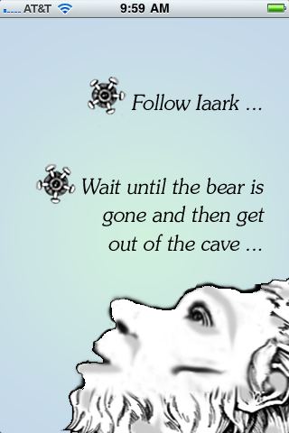
I think the narrator did a pretty good job of summing up our options on this one. So what'll it be, intrepid explorers, do we follow our muscular but likely pre-human Mr. Muscle into the deep, dark recesses of the cave, or do we lam out on our own?
Comments Off on To Follow or Flee?
Posted in Return to the Cave of Time, RPG Corner

(From "Mr. Muscles" number 22, 1956.)
Comments Off on Either way, avoid the showers.
Posted in Daily Random Panel
When last we saw Angel, he was flitting about in one of the worst costumes to sport suspenders since Mork from Ork graced our national airwaves. Sadly for Warren Worthington III, his lifetime sentence of doom was not suspended, as he later was seen in this outfit:
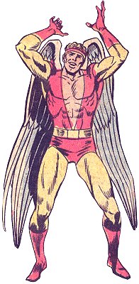
Nothing says "Powerful Hero" like a low-cut shirt that reveals your navel while hiding your nipples.
At least his color sense is a bit less offensive, which in a different world would help absolve him for that ludicrous Eighties-vintage headband. Since this is not a different world, however, I have no choice but to mock it. Mock mock mock.
Which, oddly enough, sounds a lot like what appears to be coming from his mouth in this pose. It's bad enough they make him go out in public dressed like this, but then to draw him standing with that "I got the bad weed at Woodstock" expression and cockeyed stance, still dressed in yellow, that's just begging for more chicken jokes. To wit:
I better stop now before I get arrested for Egregious Punning in a Public Forum. It's just good to know that no matter how lame my jokes are, they're still not as lame as Warren Worthington III's costumes.
(Image © Marvel Comics.)
Comments Off on Hippie chic rarely helps
Posted in Bad Super Costumes
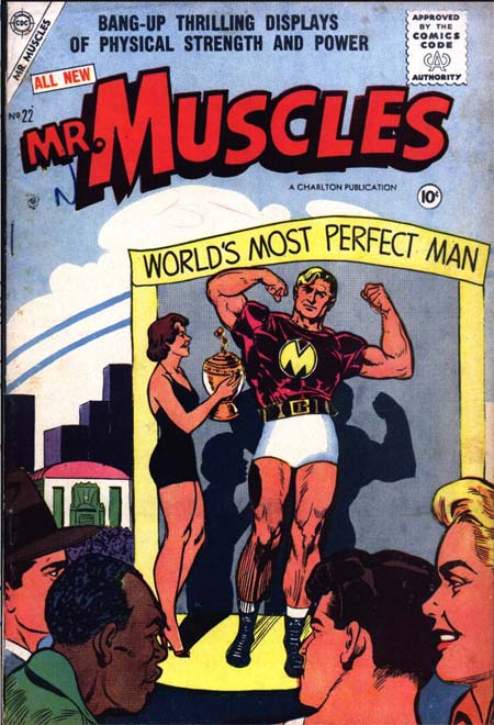
(From "Mr. Muscles" number 22, 1956.)
Comments Off on Apparently real men wear granny-panties
Posted in Daily Random Panel
Most great super-hero costumes (our stock and trade here at HeroMachine.com) rely on a distinctive chest insignia or logo. Which brings us to this week's question:
For me, a great logo must do three things:
I've put together a list of logos that I think accomplish all three of these criteria, along with a brief discussion of each.
Continue reading
Comments Off on Poll Position: Leggo’a My Logo!
Posted in Uncategorized
I just uploaded a minor update to the HeroMachine 3 Alpha. First, I've introduced a "Current Layer" indicator in the Layering box (Transform tab) showing which layer the current item is on. It should update automatically as you raise or lower the current item's layer.
Second, I've added a "minimize" button to the "view" toolbar just below the character creation canvas:

It's a little hard to see, which I may tweak down the line, but clicking it hides the view toolbar, leaving just the button. So now you can have the entire left side of the screen for character viewing.
I want to thank Worf for pointing out this problem -- the toolbar was hiding the very bottom of the illustration, so if you wanted to do a screen capture you'd lose that bottom portion. Hopefully this will resolve that issue.
Comments Off on HM3 Update (A.23)
Posted in HeroMachine 3, News & Updates
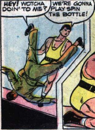
(From "Mr. Muscles" number 22, 1956.)
Comments Off on Next on “Sidekicks Gone Wild”!
Posted in Daily Random Panel
Your character design challenge for this week is to take a character designed originally in HeroMachine 2 and redesign it using HeroMachine 3. You'll need to explain your concept behind the redesign, why you made the choices you did and why you think they're an improvement. In other words, this isn't just remaking the exact same character's look using a new version of the software, it's taking the concept of the character and updating it with your own vision.
You can choose one of your old designs if you like, or you can choose any one from the HeroMachine Facebook page. Why the Facebook page? Because I am still hell-bent on catching up to UGO's fan numbers, that's why! So if you aren't already a fan of my page there, please take a moment to do so even if you're not using an image from the Photos archive.
Edited to Add:
OK, I think I am not being clear here.
The point of this is not to recreate the character in version 3. The point is to take an existing character and redesign it completely. Like when Iron Man went from the big gray tank armor to the silver and gold. Like when Superman went from the red-and-blues to the blue lightning bolt costume. Like when Spider-Man went from the red-and-blues to the black.
Your mission here is to reimagine a character, as if you were an artist working for DC or Marvel and your editor came to you and said "Hey, we're relaunching 'The Black Terror' but we need to completely redo it. Come up with something cool."
The goal is not to see how close you can get to making something done in HM2 look exactly the same, only done in HM3.
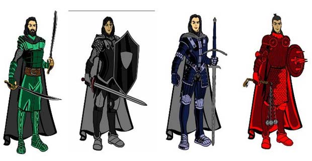
Now, how do you tell if an image is from HeroMachine 2? It's easy -- there's only one pose and it looks like this for the male:
And like this for the female:
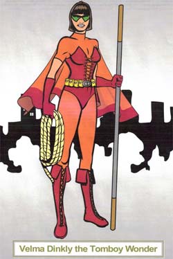
They're all three-quarters' view with the left arm tucked up behind the torso and the hand jutting off horizontally.
The contest rules are the same as usual, except in addition to a link to your main entry, I'll also need a link to the 2.0 design you're revising.
No limit on entries this week, so knock yourselves out. Good luck everyone!
Comments Off on Character Contest 60: Revamp 2.0
Posted in Challenges, Character Design Challenges