I think, if you're going to have a super-power that involves exploding things, that you should carry that theme through to the absolute extreme. Name, costume, effects, everything should be an assault on the senses so violent that you are forced to cover your eyes and look away in horror at the resulting carnage.
You know, like "Boom Boom", aka "Boomer", aka "Time Bomb" aka "A lame character by any other name is still lame":
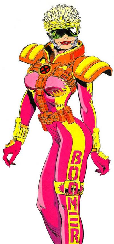
Tell me you can look at that costume in those colors and not think something blew up. I dare you.
Note how thoroughly this to-the-max redesign pounds the metaphor home. From the hair that looks like it is currently in the midst of a nuclear blast to the bomb-shelter high collar to the massive eye protection, they don't miss a beat. But in case the reader is dumber than a sack of hammers, they also threw in some explosion logos on her boobs (because let's be honest, that's immediately where most fan-boys' eyes go), arms, and leg strap thingie.
And just in case that wasn't overkill enough, they also wrote her name down her leg. Which, honestly, was a great idea, because given the artistic team on X-Men at that time, it could be really hard to tell one character from another. This approach narrowly beat out the other idea of having them toting little name-signs a la Wile E. Coyote.
Without a doubt, though, what really brings this baby home is the color scheme. I can't remember the last time I saw such an ... innovative use of neon pink, day-glo yellow, and radiation orange.
No, wait, yes I can -- I suddenly realized where James Cameron got the color scheme for Pandora's jungles. Well done, sir.
My only criticism of this otherwise stellar outfit is that they made her keep her headgear retainer on. That's just cruel. We understand that dental work is a delicate thing and that teens often struggle with it, but come on, she's a crime fighter! Let the poor girl leave the acne cream and external dentifrice at home already.
(Character and image © Marvel Comcis, Inc.)
Looks Like She Roller Disco’s
“Tell me you can look at that costume in those colors and not think something blew up.” That made me lol.
You did, however, forget to mention the large and tacky starburst/exploding earrings – at least I assume they’re earrings, they might be attached to her neck or headgear.
Dang, I missed those Jester. Good catch!
I had the page on autorefresh and when that popped up I actually muttered “Good Lord!” it was so bad.
Perhaps the artist (Giordano maybe) was going for that middle school skibunny look. If so this would still be an epic fail due to the utterly superfluous shoulder pads that would make her top heavy, catch on trees and bushes, and generally keep the pigeons from crapping on her shoulders.
and what’s with all the pouches? If she has mutant powers to make exploding something or anothers, why does she need more pouches than a marsupial navy seal? esp. up ABOVE her ribcage where they are deucedly hard to get at in combat (even if they do enhance her prepubescent booziasms)?
Finally, the pink, orange, yellow I can handle; but green wraparound skiglasses???? What in the name of Krispy Kreme is that crud? Green is a cool color. At last get your temperature schemes right, toots.
I’m pretty sure this was a Liefeld-era creation and drawing. Not certain, but I think that’s who did it.
Oh. Well then, that explains everything.
One last thing, doesn’t boomer also refer to flatulence? Wouldn’t that be a problem? I mean, if your superhero name were, like, Loogey or Dribbler or The Creamer wouldn’t you wnat a different name?
This is the only other boomer with which I’m familiar:
http://media.photobucket.com/image/boomer/left4dead411/boomer1.jpg
Is her civilian alter-ego a skier or a speed skater? Because that’s the ONLY way I can see this costume remotely making sense. And even IF you could rationalize the unitard, the costume has already died the death of bad accessorizing.
I was a big X-Force fan back in the days, but mostly during the Adam Pollina run, when they all wore mostly civilian clothes. Tabitha Smith was so cool. This dress on the other hand… big no-no!
“No, wait, yes I can โ I suddenly realized where James Cameron got the color scheme for Pandoraโs jungles. Well done, sir.”
I lol’ed ๐
For some reason I think nascar, when I look at this. Granted it has many flaws, and call me crazy, but I think the general outfit has potential. The shoulder pads, and harness don’t really fit. The collar needs to be smaller, The mouth thingy is terrible. There are other flaws, but I think the general idea was good.
@MartianBlue: You’re dead to me.
(Kidding!)
Am I totally stupid? Because when I read this first time through I couldn’t detect the sarcasm.
Is there even any sarcasm? If so it’s so discreet that it made me look to the comments to justify the title. Well played.
@Jeff, well if that’s the case, then I’ll just take my HM3 program and be on my way ๐
I admit that the outtfit here was pretty ridiculous, but then Boom-Boom (Tabitha Smith)was the kind of girl to sport the most eye-bleeding color schemes in the comics. Just my opinion regarding the costume shown. She was the loudest of the X-girls.
Sorry Tabitha. I actually find Anna Marie much more intsresting.
Perhaps, Jigglypuff, perhaps – but even the loudest of the X-girls still has to make a reckoning for her ludicrous bird perchers and the ubiquity of useless pouches. Teenagers never were ridiculous ill-matched clothing that makes them look malformed and… wait a minute.
“wear” – sorry.
@Bill: I think you have underestimated my sneakiness. (So I like Adam Sandler movies, sue me!)
Apart from the eye bleeding ugliness of the suit (pouches, so many pouches), it throws the entire original concept of the character out the window. When she was introduced back in Secret Wars 2 (Yes, I am that old), she was a typical whiny teen making a living as one of the Vanisher’s thieves. She was plain looking and wore pretty typical Madonna-wannabe clothing. Her brashness came from a depth of pain most teens did not go through. She was lonely and abused by her family. She was the one who taught the Beyonder about real emotional pain from a youth’s point of view. To turn her into the 90’s version of hot just flies in the face of who she was supposed to be. One more piece of evidence that Liefeld & crew were the kings of crap. I almost went DC in the Nineties. Almost.
Agreed! Liefield’s art was the most painful and eye-bleeding, especially with the big hair, useless pouches and the not-quite-holding-that-sword grip. Also I curse some of the numerous anatomy errors, malformed women he drew and the dozen of comic covers he spat up during the ’90s!
I remember reading this issue when it first came out. The mouthpiece is because in the previous issue her jaw was broken, so that mouthpiece is supposed to, I don’t know, hold it in place or something like that. I think in this exact scene, she’s admiring herself in the mirror while talking with a broken jaw and a rigid mouthpiece to hold the jaw in place. Some other character actually chides her for possibly making her injury worse by continuing to talk out loud.
That is the ONLY thing I remember from Liefeld-era XForce besides the really ridonkulous hair designs. And how I wish I could have those memory cells back, to use for other, more important purposes.
Your disclaimer at the end of the piece attributes rights to “Marvel Comcis.” Sorry again for the late response.