Guide for the color blind

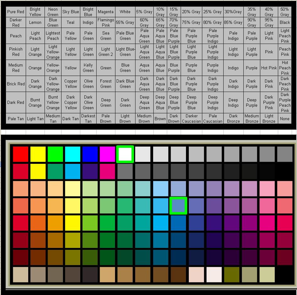
A long time ago, I had a request to make a color guide for the standard color swatches in HeroMachine 2 for someone who was color blind. I just stumbled upon the file on my hard drive, and thought I should re-post it here so it would have a final home in case other color-blind users might find it useful. Click on the image below for the larger, more legible sized version.

HeroMachine Color Chart

4 Responses to “Guide for the color blind”

  1. Eric Says:

    “Dark purple peach pink”? try saying that 10 times fast.

  2. Ashton Jakobson Says:

    Thats really thoughtful of you Jeff, I’m constantly surprised at the lengths that you are willing to go to, to please your customers. So Thank you.

  3. Jeff Hebert Says:

    Eric, I feel your pain. Trying to come up with descriptive names for colors that vary by only very small tonal differences was a bear. I didn’t want to go with something like “coral” or “beachcomber” that wouldn’t really tell a color-blind person what sort of color they were looking at, but I did unfortunately end up with some tongue-twisters like “dark purple peach pink”.

    Or I might possibly have been drunk when I wrote that, I dunno. No, wait — I don’t drink so that can’t be it. Give me a few days to come up with a better excuse, I am sure I can think of something …

  4. Me Says:

    Two items which may assist those pushing color:
    ColorZilla for Firefox >>
    http://addons.mozilla.org/firefox/addon/271

    Kuler by Adobe >>
    http://kuler.adobe.com/

Leave a Reply


HeroMachine Poll
You have the power to bring one super hero to life in the real world for one 24 hour period. Who do you choose?
View Results
View all previous poll results