Good cover

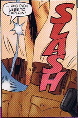
His animation makes me weep, but "Jonny Quest" the comic book cheered me up at once thanks to this stellar cover for issue number three:

jonnyquest-3-a-cover.jpg

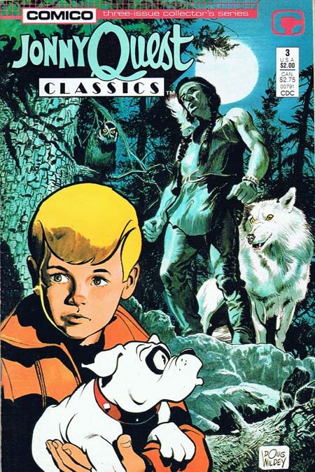
I love the way the illustration style goes from extremely realistic in the background, to more abstract and cartoony with Jonny in the middle-ground, to very cartoonish with Bandit the dog in the foreground. You rarely see this kind of layering of abstraction in American comics, where the style tends to remain the same throughout. You feel more sympathy for and empathy with more abstract, more cartoonish characters like Bandit, while the more realistic Indian and his wolf -- being more concrete and visually informed -- are scarier. Look at the detailed line work of the tree, for instance, compared to the completely linear and hatch-free inking on Bandit.

The coloring takes this even further. Jonny gets some nice color shading, halfway between the very tonal background and the stark black and white of the dog. I also love the use of cool blue tones for the background layer, progressing to warmer reds and oranges in the foreground. Color itself provides movement, pushing the background further back and pulling the foreground further forward, ironically making this cover more animated than most of the t.v. show's moments.

An excellent cover by one of illustration's icons, Doug Wildey. I also appreciate that Comico opens the issue with an inside-front-cover short biography of Wildey, and couples that with a lengthy three-page interview with him in the back. There's one particularly good bit where Wildey (who was the main designer for all of the Quest characters) talks about Jonny's lack of a hair part, and what a pain it was for the animators.

Perhaps those elements contribute to the book's "hand-crafted" feel, something completely lacking in the animated series; you get the sense that this has been produced by someone who cares about what he does, a far cry from the soulless corporate hackery that doomed so many of Hanna-Barbera's offerings.

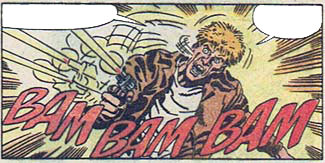
The story itself is just so-so, featuring gold-smuggling Canadian loggers dressing up as werewolves, and ... wait a minute, now that I write that out, it sounds awesome! Go Jonny!

(Cover and characters ©1987, Hanna-Barbera Productions, Inc.)

OnomontoPOWia meets onomatopoeia

In actual English, onomatopoeia means both "a word with way too many vowels in a row" and "the formation of a word, as cuckoo or boom, by imitation of a sound". Changing that to onomontoPOWia eliminates excess vowels from the concept (which, given the critical shortage of vowels in many former Eastern Bloc nations is the responsible thing to do), and narrows the concept down to mean sound words used as visual effects in comic books. Sometimes, though, the two cross over, as we see in these panels from "Sovereign Seven" number 20 (©1997, DC Comics):

Slash
s7-20-gloop.jpg

Both "slash" and "gloop" are legitimate words with recognized meanings that arguably originated by naming the sounds for which they stand. In that sense, both of these onomontoPOWias are actual onomatopoeias. They ultimately both fail as onomontoPOWias, though, and here's why.

While I can buy a knife going "slash" as it swings, it does nothing to mark the different ways a leather belt, a cloth shirt, and denim pants would sound as they rip. It's just a ploy to clear the way for one skin-tight-suit-wearing ninja woman to cut the clothes off an unnaturally lithe and winsome country female sheriff.

The second panel fails because while "gloop" is probably the right sound that biogenetic slime makes when flung onto a newly-naked sheriff, the dialog and the art are at complete odds with each other. Her words say she's angry and surprised, but the expression on her face is right out of a bad porn flick.

On balance, though, they fail because the sound effects do not enhance the action or the story in any way. They're just lazy window dressing, when they could have been much more.

Regardless, of course, I think we can all agree that using hot athletic ninja women slicing the clothes off of authoritative assertive in-charge chief female sheriffs so they can leap around in skin-tight biogenetic combat suits kicking the crap out of bad guys is yet another example of why they ought to ditch "Dick and Jane" in our public schools and teach with comic books instead. I can guarantee you more boys would start reading.

Random Panel: The newest Rice Krispies trio from comicdom

They should totally put steroids in breakfast cereal.

J3er1ch0

Grizz and I have completed the prize for his winning Caption Contest 10 entry, the armor-clad J3er1ch0:

j3er1ch0-web.png

If you want to win your own custom black and white illustration of whatever you like (within reason), now's your chance: Caption Contest 12 is going on now, so put on your creative thinking cap and make your entry today!

Random Panel: That's why you need a "safe word"

“Oooh, you look good”?! Who writes this dialog, Bruno from Dancing with the Stars?!

I won something!

With many thanks to Johanna Draper-Carlson, the commenters both here and at ComicsWorthReading.com, and the other entrants, I am delighted to have been chosen as the winner of the "Men of the DC Universe" Poster Contest. Thanks everyone, especially to Johanna for coming up with such a fun idea in the first place. Being the "I am the crappiest artist ever" type of artist rather than the "I am Lord of All Creation" type, this meant a lot to me.

The Kurse of a bad outfit

I love Walt Simonson, but he was smoking some serious rock when he came up with Kurse:

Kurse

Moving from top to bottom, what the heck is a magnet doing sticking up out of his head? I thought maybe they were curved horns, but does anyone -- even an Asgardian god-type bad guy -- need three sets of horns jutting out of his noggin?

Maybe, if he's constantly getting picked on by the other gods for wearing a veil.

I mean honestly, what self-respecting immortal embodiment of bad-assery tricks himself out in bridal wear? I keep thinking I should look for something old, something new, and something borrowed, but if he thinks those pale blue skull-eyes on his abs count as something blue, he's one misguided cross-dresser.

Moving on, I never want to make a bad guy feel he shouldn't wear skulls. Bonery has a long and honored tradition in the super villain world, and goodness knows I honor our great fashion forefathers like the Red Skull. But Kurse, baby, don't you think two skulls are a little much? Especially when one of them is apparently from a reindeer?

Sort of the whole point of wearing the bones of your fallen foes is to strike fear in the hearts of your other enemies, to brag of your battle prowess. But who exactly is supposed to be impressed that you killed an antelope?

And don't get me started on why the second set of skull appears to be munching on his groin. I don't even want to know. Maybe he and Prince Chaos go to the same designer? There must be something about having super powers that makes you want to have a tiny little man staring out from your crotch.

I've never been a big fan of characters having random bits jutting out of their outfits as we see on Kurse's legs here. I think Walt Simonson is one of the all-time greats, but the only guy who could routinely pull off this sort of fluff was Jack Kirby. Here, it just looks like he raided an Amish warehouse of stocks.

Kurse is supposed to be awesomely powerful, going toe-to-toe with the likes of Thor (and the Power Puff Pack kids!), so I understand the impulse to include all kinds of scary bits on his outfit, but it all just comes off as too much. Sometimes less is more.

Random Panel: Great moments in Joker misogyny

I’d say I thought this was really, really funny, but my wife would cream me.

New ad structure

The day has finally arrived, and integrated ads are now part of the free online HeroMachine 2.5 application. I rearranged the controls to fit it in, trying to strike a balance between keeping the maximum amount of space for the character view, and keeping the controls usable. I hope it's not too distracting. The powers that be at UGO are keeping an eye on things, and I'll be happy to pass along your impressions and feedback on the change.

The Desktop Edition remains the same, with the old-style no-ad interface.

Caption Contest 12: Vegetarian revenge

The last few panels might not have been the best for good lines, so this week I'm offering you a choice. The best caption for either of these two panels wins a free custom black and white illustration of whatever you like (within reason). Hopefully one of the two at least will appeal to you and inspire something great. And even though there are two panels, there will be just one winner -- whatever caption is funniest wins, with the other panel doomed to a captionless existence forever. How sad!

Here's your first option:

Alien Carnivorous Plants

A sample caption might be "I said do NOT feed the animals to the plants!"

And here's the second one:

The background music of a hail of gunfire

A sample caption here might be:

Balloon1: I think this faux finish bullet hole motif is gonna look great in this room!!
Balloon2: I wonder what "faux" means?

As always, the rules are 1) keep it suitable for a broadcast sitcom, 2) a limit of three entries per person, and 3) leave your entry in the comments to this post.

Good luck everyone!