
(From “Cat-Man Comics” volume 2, number 5, 1941.)

(From “Cat-Man Comics” volume 2, number 5, 1941.)
Posted in Daily Random Panel
Here’s my entry for Day Six of the 30 Characters in 30 Days Challenge, alien ruler Kai-Sar:

Posted in 30 Characters Challenge, Sketch of the Day

I would bet I am not alone, at least among my United States readers, in desperately looking for a place to avoid politics today. So instead of forcing you to hash out tired arguments about which part is better, I instead offer you the following creative conundrum: Who’s a better creator of speculative fiction, Stephen King or Alan Moore?
King is one of the greatest supernatural writers of all time, having sold over 350 million copies of his books. His work has been turned into television productions, movies, and comics. He’s won awards from pretty much every writing group out there. You may know him from such works as “The Stand”, “The Shining”, “Carrie”, and many, many more. But he’s also moved outside of purely speculative fiction to write such masterpieces as “The Shawshank Redemption” and “Stand By Me”.
Alan Moore is best known for writing comics, and arguably is the genre’s greatest modern storyteller. He’s responsible for stories that have made the leap from the four color page to the world of motion pictures, from “The Watchmen” to “V For Vendetta” to “From Hell” to “The League of Extraordinary Gentlemen”. He’s controversial, dark, effective, and phenomenally successful.
So which of these two literary titans gets your vote today, and why?
[polldaddy poll=”6668506″]
Posted in Versus

(From “Cat-Man Comics” volume 2, number 5, 1941.)
Posted in Daily Random Panel
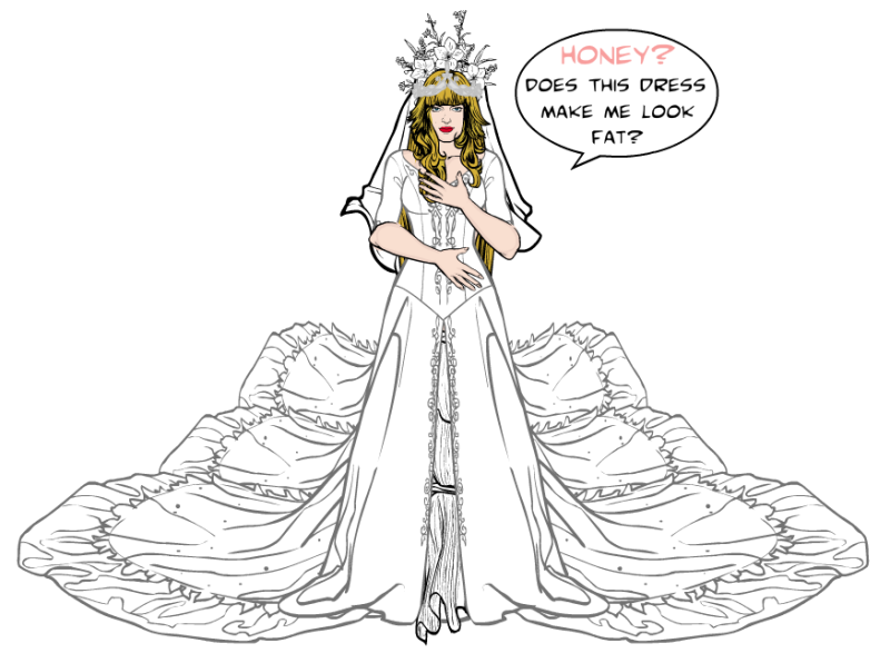
It’s time for another new Caption Challenge! This week you’re tasked with coming up with the best replacement dialog for this comics panel:

I’ll pick out some as my personal favorites to highlight in a post next Monday, and then I’ll choose one of those to bear the standard as the “Featured Creator of the Week” atop the right column.
All entries must be left as a comment (or comments) to this post. Keep ‘em clean (appropriate for a late-night broadcast TV show), but most importantly, keep ‘em funny!
No limit to entries, but please, self-edit and only put up ones you genuinely think are good!
(Original image from The-Gutters.com.)
Posted in Caption Challenges, Challenges
Many thanks to everyone who took on the “Scary” character challenge last week. We had some great entries and I encourage you to check out the comments of the original post to see them all.
I went through and picked out some of my favorites to share with you here:
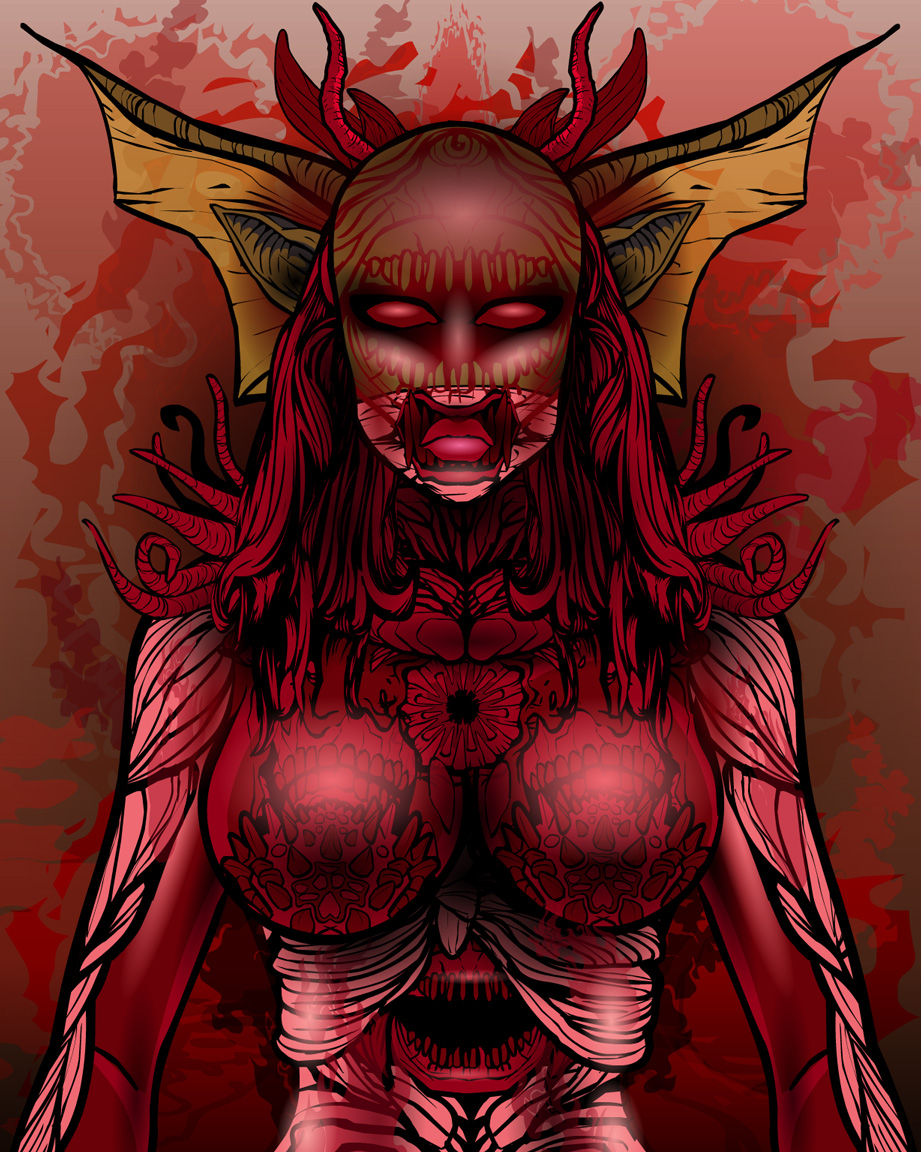
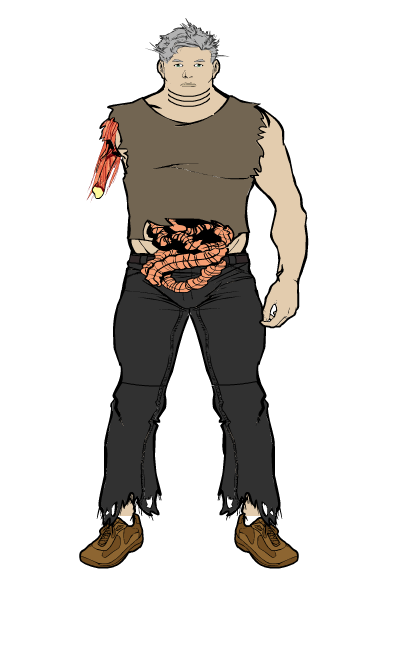
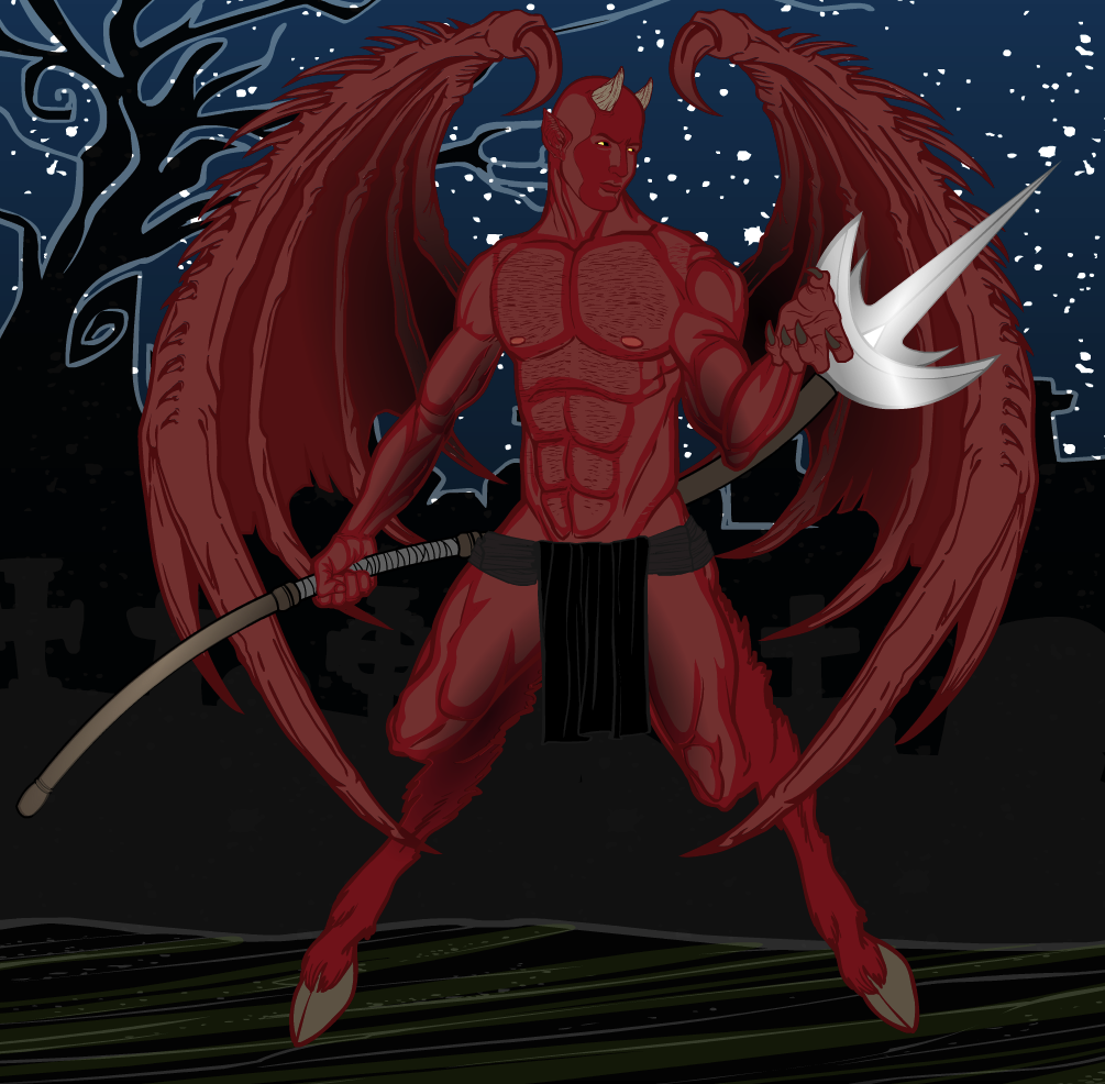
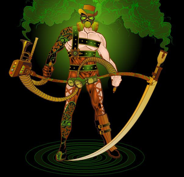

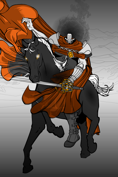


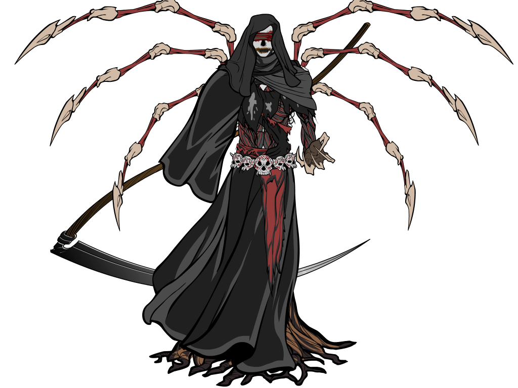
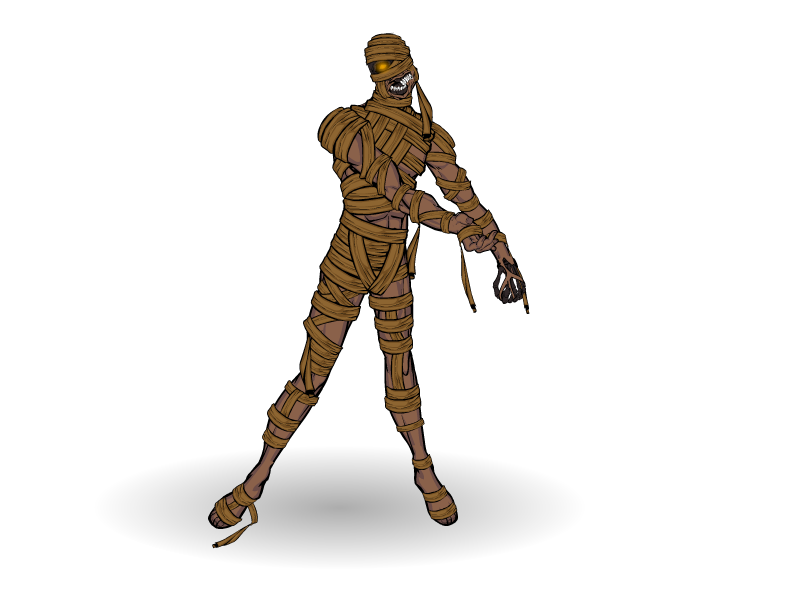
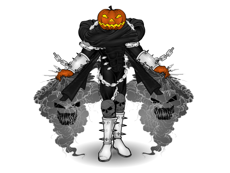
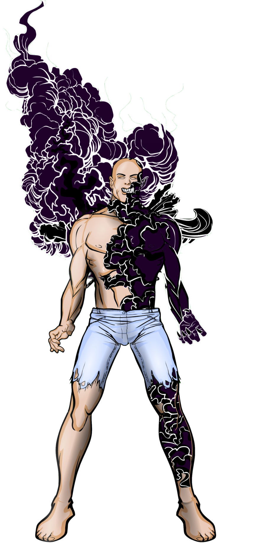
I was pretty selective this time, so all of these are really great in my opinion. Picking just one is particularly difficult, which surprises me because, frankly, horror stuff isn’t really my thing. But especially among djuby, Marquis Samedi, dblade, Thundersong, nha247 & jr19759 (both of which I think might have been entered before?) and Iscarioto, I had a tough time picking just one overall favorite to highlight.
It might be because my first few “30 Character” submissions have leaned towards the Steampunk end of things, but I find myself ultimately selecting djuby’s way cool “Steam Ripper”. Both in concept and execution I think it’s stellar:
Sincere thanks again to everyone who entered for sharing your creativity and time with us!
Posted in Challenge Favorites
Thanks to everyone who took up the last Pop Quiz, which challenged you to come up with a cool clown. Unfortunately the entries by Kellkin and Shadowmancer weren’t named properly and won’t count. But, here they all are:
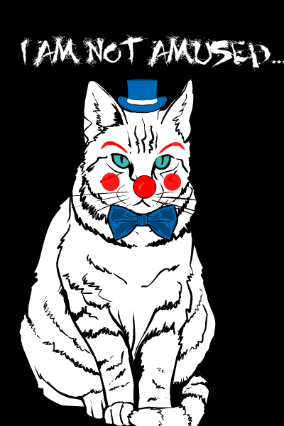
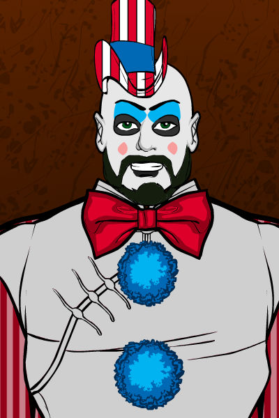
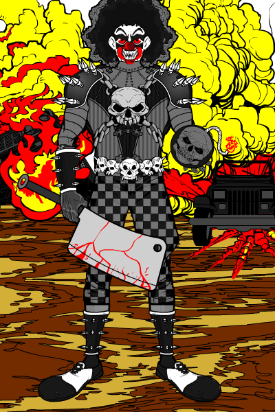
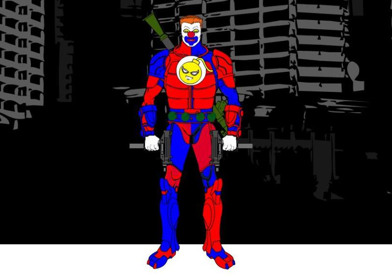
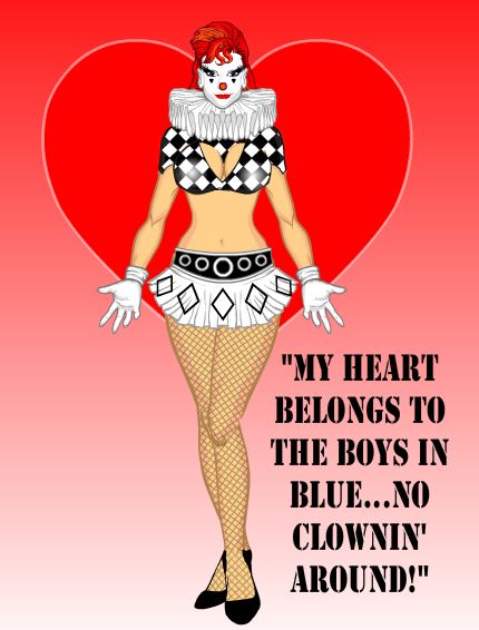

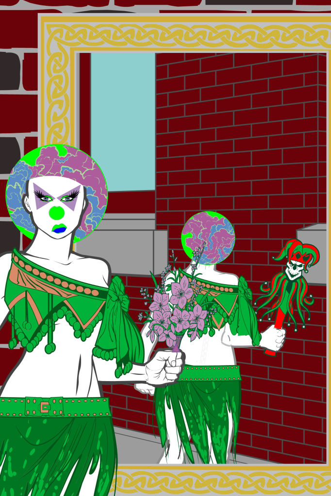
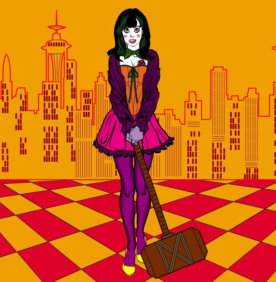
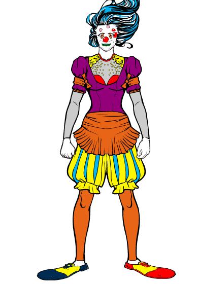
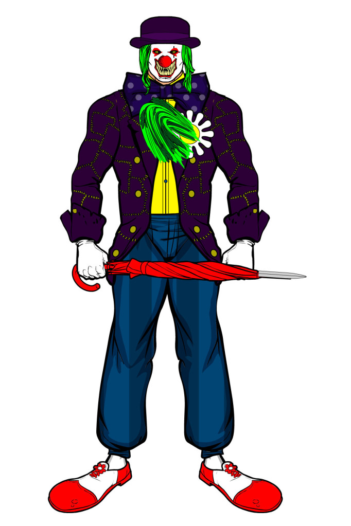

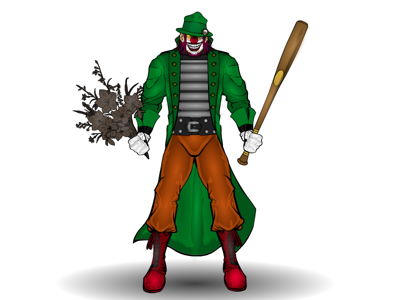
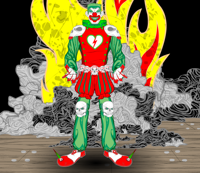
There are some great ones in there, but I’m going with Harlequin’s on this one.
Thanks again, everyone!
Posted in Challenge Favorites
“30 Characters in 30 Days Challenge” number 4, Tommy Two-Top and Tripod:

Posted in 30 Characters Challenge, Sketch of the Day
 Three middle-aged nerds (including yours truly!) review all of the MCU movies in chronological order. Short, funny, and full of good vibes, check it out and let us know what you think!
Nerdmudgeon.com
Three middle-aged nerds (including yours truly!) review all of the MCU movies in chronological order. Short, funny, and full of good vibes, check it out and let us know what you think!
Nerdmudgeon.com
