
- This topic has 191 replies, 2 voices.
-
AuthorPosts
-
September 5, 2016 at 12:39 pm #138059

TiberiusMemberYeah, that’s pretty sweet. A totally different view with awesome effects, very well done! It looks like you made the lighting a bit brighter in the last one, which I think made it look even better.
September 9, 2016 at 10:32 pm #138237
cliffParticipantYou have a wonderful diversity of creation.
Xephrin is just great. Perfect shading and choice and placement/ Gotta like the half black katana.
RPG-Character-Select. Great use of Companions, and with addition of very little else is a pretty kewl pic.
Bert-the-Turtle is friggin brilliant and cute.
Destroyer is woderful, some of the outstanding points, are the flag, the spikes, great fire effect, the cross, the stance and boots, the tribal background
War-Chief is a bit drk for my eyesight, but looks good for what I can see.
Anubis is pretty kewl in an evil way.
September 10, 2016 at 9:40 am #138302
LullabyOfTheSinParticipantLoving light effect in the Burning Veins
The flames shape is so beutyfull in my opinion
And finally, a lot of darkness, that is what i love!
(+1,5) for you, Hawk!
October 23, 2016 at 12:34 pm #139710
hawk007ParticipantA zombie mask for the Eeeek! pop quiz, cause why not.
 October 27, 2016 at 3:44 pm #139795
hawk007ParticipantWARNING: This one’s pretty graphic (for me at least). Just saying.
“Just a Flesh Wound”. This went in a COMPLETELY different direction than I originally anticipated, but I still think it looks pretty cool. I was going to add a background, but I thought the white added nicely to the effect.
 October 27, 2016 at 3:55 pm #139799
JR19759KeymasterI’m sure you already know what my critique is going to be. The hand. You’ve kinda missed one. 😉
But yeah, seriously, I understand what you were going for with the left hand and it is annoying that there isn’t the right item for it, but it really doesn’t work. Not when you can tell the fingers are bending the wrong way. You could try the hand 2nd along on the bottom row of the 2nd to last page of hands-right if you masked the fingers, that would be my suggestion. Otherwise, looks pretty good and I’ll give the graphicness of it a pass because the character isn’t “realistic”, as it were. Nice job.
October 27, 2016 at 4:25 pm #139802
hawk007ParticipantThanks JR! I thought I’d try it to see if it worked, but was kinda expecting it not to.
Here’s a redo of the hand.
October 27, 2016 at 11:09 pm #139807
VengeanceParticipantgood very good
October 28, 2016 at 1:08 am #139810
JR19759KeymasterYeah, looks much better.
October 28, 2016 at 3:09 pm #139821
VampyristParticipantThat’s great!
November 6, 2016 at 5:41 pm #139954
Herr DParticipantLefty IS looking better. Did he also talk to the wrong old guy in the cantina in Mos Eisley?
December 3, 2016 at 7:18 pm #140596
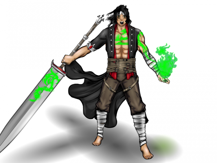
hawk007ParticipantMy entry for the 197th character design contest.
Tower. Frozen magically…somehow…for thousands of years, was a warrior reawakened in a highly advanced future. One reincarnation of many of an ancient soldier destined to defeat an evil being, he uses his legendary sword, Heavenbreaker, and is the strongest being to currently exist, having even sliced a mountain in one blow with his blade.

(P.S. Sorry for all the errors)
 December 4, 2016 at 7:02 am #140611
darkvaticanMemberWhoa. O_O Very cool!
December 4, 2016 at 10:27 am #140613
hawk007ParticipantHaha, thanks man!
December 6, 2016 at 4:07 am #140660
Herr DParticipantA sliced mountain would make a neat background for him.
-
AuthorPosts


You must be logged in to reply to this topic.
