
Home › Forums › The HeroMachine Art Gallery › Dionne Jinn Style
- This topic has 157 replies, 26 voices, and was last updated 12 years, 11 months ago by
 Weilyn.
-
AuthorPosts
-
January 24, 2013 at 12:49 am #17854

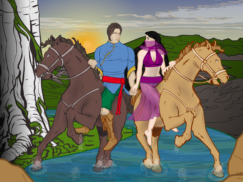
Dionne JinnMemberThanks, Weilyn. I think there should be a way to improve that water effect by sinking the hooves into the water. Now they look like they are standing on water…
January 24, 2013 at 1:16 am #17856
Herr DParticipantYou’ve already done it with your ship. Splashing hooves create more fine splatter at different angles than waves against a ship. Try pushing water against the side of a bathtub and punching your fist one inch into the water as a comparison. Love the blue sky more–love that veil most.
 January 24, 2013 at 1:24 am #17857
Dionne JinnMemberThanks, but the ship was different case. It already had that wavy edge and I just needed to add a lot of tiny clouds to make that effect. And I like the blue sky more, too. Getting that veil to work gave me a lot of trouble. I was trying both turned female heads and what felt like every Backplane-cape item differently sized before I hit this combination and it just worked perfectly without any masking or other tricky things.
EDIT: And then she said the famous last words “I won’t be zypping this, I’ll just add a couple of shadows…”
January 24, 2013 at 11:52 am #17907
Dionne JinnMemberAnd here is the OCD edition:
 January 24, 2013 at 3:16 pm #17916
WeilynMemberSublime! Again, the water effects. Holy Christ, I am already mentally stealing that, just a heads up.
January 24, 2013 at 3:22 pm #17918
JR19759KeymasterDon’t know why you submitted it to the OCD, I can’t see anything that could possibly be improved. Beautiful work, especially the sky and floor.
January 24, 2013 at 3:45 pm #17919
Dionne JinnMemberMaybe because I’m little perfectionist and nothing I do is ever good enough for me. And I know there are things I could and should improve…
January 24, 2013 at 4:11 pm #17920
JR19759Keymaster@Dionne Jinn said:
Maybe because I’m little perfectionist and nothing I do is ever good enough for me. And I know there are things I could and should improve…
Know the feeling.
January 27, 2013 at 6:03 am #18082
XwingMemberWhoa… All those faces and little details… incredible. I’m out of words.
January 27, 2013 at 6:21 am #18087
Dionne JinnMemberThanks, man.
January 29, 2013 at 1:18 pm #18258
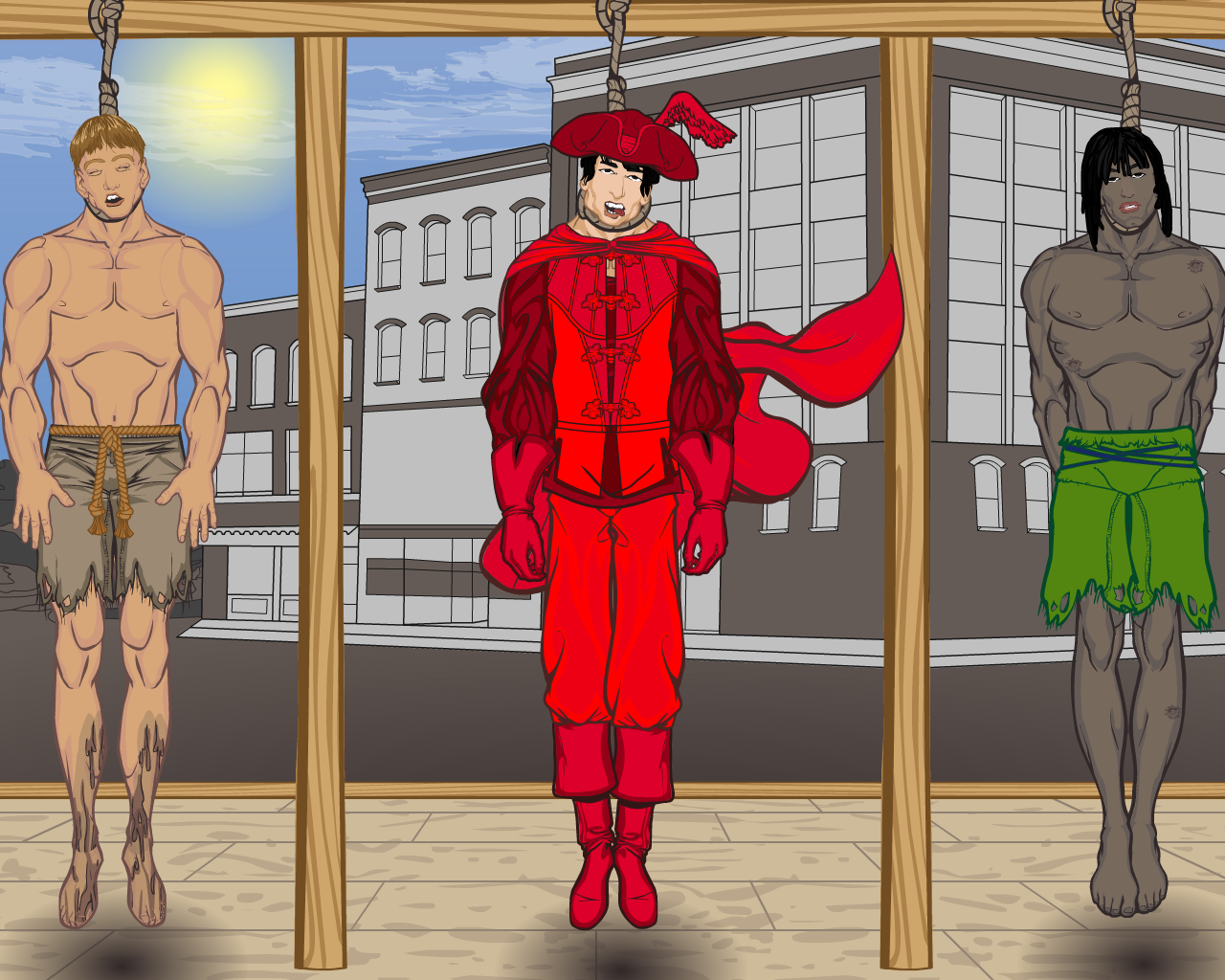
Dionne JinnMemberSome of you old faces might remember this guy (the one in the middle) from my early days with HM. Or you might not… Even I had almost completely forgotten him until a few days ago when I chatted with a friend of mine about Emilio Salgari’s novels. He asked me if I had done anything from Il Corsaro Nero (The Black Corsair) with HeroMachine. I have, but I was never really happy about what I came up with, so I decided to go back to them and rework my picture of the Red Corsair (“Corsaro Rosso”, the brother of the Black Corsair) hanging from the gallows…
 January 29, 2013 at 4:27 pm #18275
HarlekinMemberHmmm.
Little bit vulgar meaning but perfectly execution. Nice work
January 30, 2013 at 12:38 am #18305
Dionne JinnMemberWas that pun intended? And I know it is a bit grotesque, but Red Corsair’s hanging is an important part of the story… And anyway it can’t all be pretty all the time.
January 30, 2013 at 8:52 am #18329
HarlekinMemberBecause i wrote down stupidity what i want to wrote down is the word morbid not the vulgar, and you absolutly right the life is not always pretty.
But i wrote down the execution is great of the picture.January 30, 2013 at 9:14 am #18333
Dionne JinnMemberI actually meant the “execution”. Pun, like a word game. Execution meaning the “execution of prisoners” (in this case by hanging)…
-
AuthorPosts
You must be logged in to reply to this topic.
