Home › Forums › The HeroMachine Art Gallery › CantDraw Gallery of Bad Art
- This topic has 659 replies, 67 voices.
-
AuthorPosts
-
April 20, 2013 at 3:57 pm #22900
WeilynMemberThat is a great face
April 20, 2013 at 9:04 pm #22920
CantDrawParticipantThank you. A little zypping goes a long way.
April 22, 2013 at 8:33 am #23009
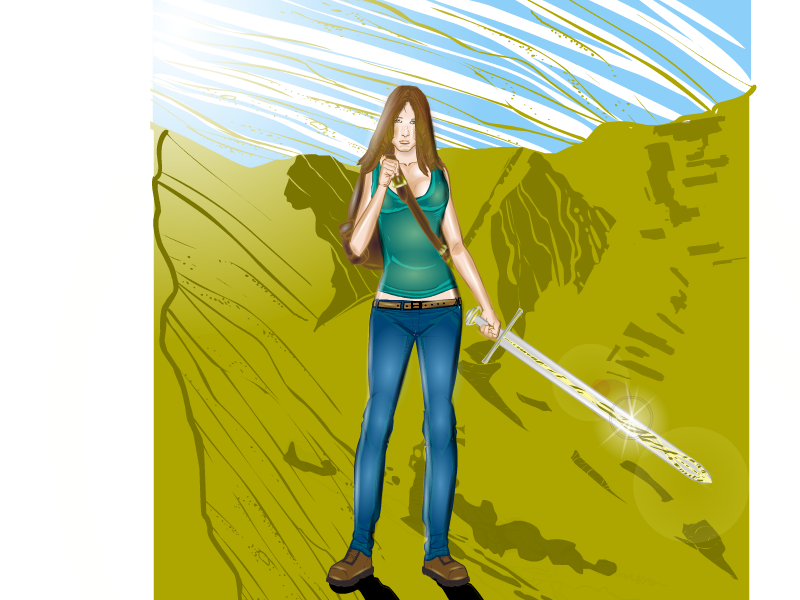
CantDrawParticipantI’ve added a desert scene for Anna:
 April 24, 2013 at 8:43 am #23130
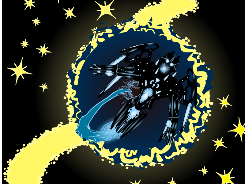
CantDrawParticipantCorps Contest:

In the partially distant future, Earth’s Robotic Space Exploration Corps will traverse vast distances to explore where no human has gone before or probably ever will since it’s so far away.
April 25, 2013 at 9:56 am #23180
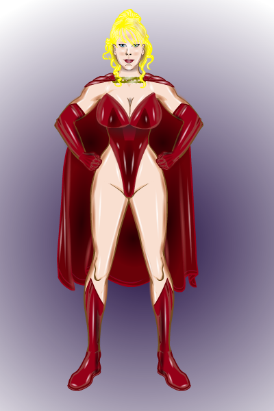
CantDrawParticipantJust having some fun with zypping:

BIO:
With superhuman strength, the awesome Aussie leaps to great heights as the Red Kangaroo!I had a lot of fun creating the shiny, leathery look.
April 25, 2013 at 11:10 am #23184
DiCicatrizParticipantAmazing lighting on that one! You can definitely see the texture of the leather/vinyl/shiny stuff.
April 25, 2013 at 1:17 pm #23187
fuzztoneMemberOh, that’s interesting. I’ve seen people do metallic effects before, but never plastic. Good job!
April 25, 2013 at 1:52 pm #23189
CantDrawParticipantI think “plastic” is a good description for this character in general. The cool thing about zypping to make this particular look is that it isn’t hard, it just takes a while, but I have fun doing it.
April 26, 2013 at 4:16 pm #23226
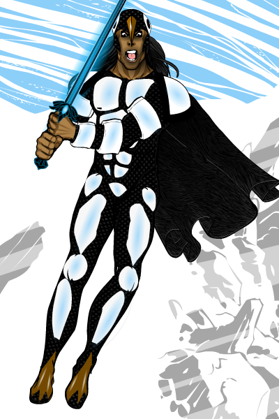
CantDrawParticipantAs promised, my HM3 redesign of Penguin Paladin:
 April 27, 2013 at 12:36 am #23235
Herr DParticipantTHAT looks more like a mantle designed in medieval times. **(suggested edit: ANTarctic people, polar people, etc.)
April 27, 2013 at 7:05 am #23241
CantDrawParticipantI think I’ll go with Antarctic people. That way, Antarctica could be the lost kingdom of his tribe. I could even throw in aliens and Atlantis into the back story. What’s funny is this character was just a quick design for a contest based on a name that popped in my head, and now, he’s probably my favorite.
April 27, 2013 at 9:16 am #23246
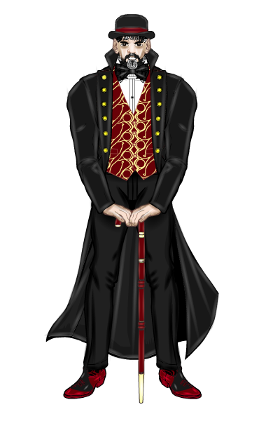
CantDrawParticipantI posted this the JR19759’s Redesign Contest recently (he supplied the picture and I colored it):

My favorite parts on this are the face (including the beard), the coat, and especially the shoes.
April 27, 2013 at 10:02 am #23248
WeilynMemberGreat idea to highlight the black leather ad shade the black cloth. Awesome colouring!
April 27, 2013 at 12:42 pm #23257
CantDrawParticipantI started to highlight the slacks, then I thought he might look silly wearing leather pants. He doesn’t seem the type.
 April 29, 2013 at 12:41 pm #23407
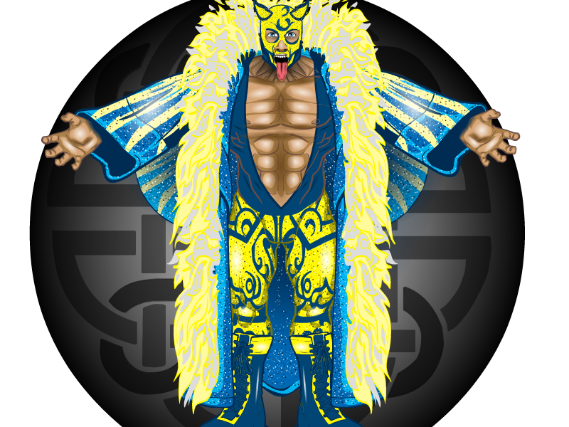
CantDrawParticipantHere’s my redesign of Mister Fancy Pants from the Hero 2.5 contest:

-
AuthorPosts
You must be logged in to reply to this topic.

