Category Archives: Meta

META: Artists

As you can tell, UGO has become interested in what more they can do to get people excited about HeroMachine, which is great in all kinds of ways. One of the ideas we're floating (still very much just an idea at this point) is to have "Artist Collections", item sets designed and drawn by specific comic book illustrators. So for instance, you might get a bunch of sets designed by "Invincible" artist Ryan Ottley, or Rob Liefeld (ha!), or Bryan Hitch of the Ultimates, etc.

Would that be interesting to you? If so, what current comics artists would you most want to see put together their own HM sets?

META: Show me the money

If it turned out that I had a (very!) modest amount of money available via the nice folks at UGO to award as prizes for the weekly contests, would you be interested in that? And if so, what sorts of things would you like as prizes? Just some possibilities off the top of my head would be things like a $10 certificate to iTunes, or a discount on merchandise from Amazon.com, a signed copy of a comic book by the author and or artist, that kind of thing.

I'd love to hear your input on that -- are monetary prizes a good thing, would they make you more excited about the contests, if so what would you want, etc. etc.

Thanks!

META: Site problems

We've been having trouble since last night with the site going up and down. DreamHost is looking into it, my apologies for the frustration.

Dick Giordano dies at 77

Very sad news for any of us old-time comics fans, as comics titan Dick Giordano died yesterday at the age of 77. Check the Comic Book Resources link for more info on Mr. Giordano's career, but suffice it to say he was responsible as either inker or editor for some of my favorite comics growing up.

META: Out for most of the day

We've got a sick equine out here at the ranch and need to take him to the vet way off in the other middle of nowhere, so I won't be back till this afternoon at the earliest. Play nice and consider this an open thread.

HeroMachine 2 new layout

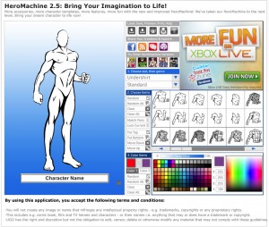
I've been asked by UGO to redesign the page for HeroMachine 2.5, which still gets the bulk of the visits. Obviously the whole UGO.com site has been redesigned, and the old comic-booky type feel just doesn't work any more. And the 2.5 version, while pretty much retired, is starting to look dated.

Plus, the new UGO pages are much wider than they used to be, which gives me more room to put stuff. Part of the frustration in the current layout is how tight the space was between that big honkin' ad in the upper right corner and the character window. Plus, I was never happy with how the controls were labeled, I thought they weren't very intuitive with just the icons. I was also asked to keep the links to the other HM versions (currently living outside the application itself) and the social networking links UGO now has on all their pages.

So, here's my first attempt at a full-width version. I am also working on one that would fit in the left-center wide column of the basic UGO page, with a right column for their usual assortment of links and features. That one's not ready yet, but I wanted to get some feedback on this one if possible before I submit it. Let me know what you think. The "new", default UGO header would be at the top, from the black bar down to the main big ad.

Open Thread

Have at it, feel free to discuss whatever you like, whether it be comics or movies or super-heroes or Lady Ga-Ga or anything you like.

META: Redesign 2

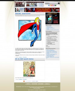
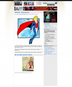
Here's the second pass at the site redesign, taking into account the feedback from the last time around. Changes include:

  • new treatment in the top nav bar, including appropriate images for the three main HM versions;
  • different color treatment for the main logo;
  • icons for the "get connected" area below the search bar;
  • Dateline below the headline for each entry;
  • Tag line beneath each entry with links to comments and categories;
  • Bottom UGO links area.
hmblog-redesign-2010-top-nav-v2
(Click to embiggen.)

I'm feeling pretty good about this iteration, I'll incorporate whatever good suggestions come up in comments, then write it up and send it to UGO for feedback. There's still an awful lot of bright in-your-face color going on at the top thanks to the ads, but there's not really a way around that unless I go total grayscale for the top area, and I'm not willing to de-emphasize the links to the other HM versions enough for that.

META: Site redesign

So I've been unhappy for a while with the design of the site. Originally, when UGO first re-designed it after bringing the application completely in-house, HeroMachine.com was just a landing page, whose only purpose was to give general information about what the program was, and to move people on to the live HeroMachine 2.5 application.

Over the last few years, though, since that time, I launched the interactive blog part of the site and I think the main program has gotten on its legs enough that it doesn't need to be the main focus any longer. Plus, UGO.com recently relaunched itself with a much cleaner, nicer front-end. Finally, the bright colors the daily panels, the character posts, and some of the other blog content have come to compete with the bright four-color overall blog design and the ads, making a bit of a muddle visually.

I finally sat down over the weekend and put together a first pass at a proposed site redesign. The goals are:

  • Make the main points of interest (links to the various HeroMachine versions; the ads; and the blog content) easier to focus on;
  • Build the site around the idea that this is an interactive blog site, not just an intermediate landing/launching page;
  • Keep the visual interest on the content, not the surrounding design elements;
  • Make it obviously part of the UGO family, without looking like just a sub-page.

To that end, here's the first pass of many. Keeping in mind there are lots of changes and iterations to go through, I wanted to get your feedback on the overall direction and concept. Any comments, positive or negative, are very welcome. I haven't passed this by UGO yet, I am still in the ideation phase, and wanted to make sure the most important people of all -- you guys -- had the chance to tear into it from the ground up.

The "Follow us" widget just below the Search box needs a lot of changes. The words will probably go away, or at least change drastically, and the icons will be for Facebook, RSS, Forums (looks like a double word balloon), FAQ (question mark), and Contact Us (envelope).

I also have to figure out how to format the date on the posts, as well as the other per-post information like categories and such. I did away with the small banner that says "HeroMachine Blog" because I figured that should be obvious. I also don't think the big colorful date mini-banner above every post is necessary.

META: Out till late

I'll be away from any computer access pretty much all day doing my civic duty and working a local election. Be good!

Consider this an open thread to discuss whatever you want, from possible Poll Position questions to HM stuff to the Olympics to, well, whatever you like!