Author Archives: JR19759

Creators Club Reminder

Hey guys, JR here again. Just posting up a quick reminder for y'all about this years Creators Club Poster. MadJack is still accepting submissions for the poster so make sure you get in there for your chance to be immortalised as a member of the Heromachine Community of this year. We've already had some awesome creators submit their entries, so get yours entered.

You can find the submission rules and stuff here: http://www.heromachine.com/2015/01/13/creators-club-2015/

You have under 2 weeks left to get on the poster, otherwise you'll have to wait another year for your chance, so don't miss out.

And with that. JR out.

Character Of The Week: Delirious Al- Hummingbird

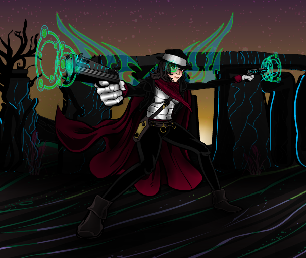
You know, sometimes my own rules do kinda get in the way in terms of this post. The rule about not including entries for current CDC's was included because I didn't want to sway the votes at all, but this week the one image I wanted to feature was an entry for the current contest. But, I don't want to remove it from the contest (despite the creator giving me their permission to do so) because it will probably win. So instead let's have a look at another piece which, while I don't have as much to say about it, is just as good.

Last week, I mentioned about how certain 'machiners have their own styles that make them stand out. Well this is another case in point. All of Al's signatures are present and correct, dynamic pose, moody background with gradient effect sky and awesome energy effect. I will say, the bottom of the character is rather hard to make out against the background, but it doesn't make the pose any less striking.

The colour coordination really works as well and is a good example of defining layers in a picture. You have the dark colours of the character, which comprise the first layer, which merge with the colours of the third layer, being the background. Now if it were just those two layers, the picture would be very dark, dreary and dull, despite the posing prowess. But then you have the vibrant greens and blues of the energy effect, the second layer, that sits in-between these two layers and spaces them out, adding depth to the image and breaking up the dark hues. And then it's tops off with the back-most layer, the sky, which has a light colour at its lowest point, the point where it meets the layer in front and then becomes darker at its highest point, the point where it diverges from the forward layer. I must also say, I love the neon lines that Al has included in the background layer to break up the black. I love how on the floor they change from purple to green at random points and are then blue for the background . Apart from breaking up the black, they also provide a really interesting eye-catch, and complement the energy effects quite nicely as well.


Mod Note: Quick question you guys. When it comes to this post, are you actually interested in what I have to say about the art? Because sometimes it's quite hard to write these posts because I feel like I'm just repeating myself. I always talk about the same things. And the intros are horrible to write. So do you guys want me to keep the text part of the post, or would you mind if I just showcased the pictures instead?

Geek Quiz ♯8: Marvel Comics Edition

This weeks quiz is going to be focusing on everyones favourite comics hype machine (and occasional producer of decent comics), Marvel. However, don't expect questions on characters like Spider-Man, The Hulk or Captain America. This quiz is to find out how much you know or can guess about the company its self. So have fun. Oh and obviously Wikipedia is not allowed. 'Nuff said.

As per usual, 10 questions with a total of 20 points to get and don’t post answers in the comments, just your scores. The answers will be below a jump from the post whilst on the main blog page, so if you don’t want to be spoiled, take a look at the questions on the blog first.

1. Who was the first Marvel (at the time called Timely) character to star in their own self-titled comic? (1 Point)

2. Which of these was not a Timely Comics title during the 1940's? (1 Point)

a) Joker Comics                  b) Gay Comics

c) All Funny Comics            d) Comedy Comics

3. In what year did National Periodical Publications (aka DC) acquire the distribution rights to Atlas' (later Marvel) comic book divisions output? (1 Point)

Bonus- In what year did this deal end? (1 Point)

4. What baseball term has famously been used by Stan Lee to describe Marvels staff of artists, writers and editors? (1 Point)

5. Who originally held the position of publisher of Timely Comics when the company started in 1939? (1 Point)

6. Who is the company's current Editor-In-Chief? (1 Point)

7. In the 1940's, what famous New York building were the Timely Comics offices based in? (1 Point)

8. In what year did Marvel go bankrupt? (1 Point)

Bonus- Who owned the company at the time? (1 Point)

9. Which Marvel character was the first to star in a feature length, non-serialised film? (1 Point)

Bonus- What year was it released? (1 Point)

10. Where is The Avengers currently on the list of Highest Grossing Films Of All Time? (1 Point)

Bonus- Which Marvel film is next highest up on the standings and what position does it hold? (1 Point)

Continue reading

Character Design Contest ♯105- Cyborgs

Yeah, no cryptic titles this week. For this weeks challenge you must design a character that is part organic and part mechanical. The character doesn't have to be human, but they have to be cyberneticaly enhanced in some way and these enhancements must be visible, so if you are planning some form of cyber-endoskeleton (e.g. The Terminator T-800) you must show it in some form.

As per usual, no limits on entries this week and the contest will close at midnight Saturday (blog time).  Please read the contest rules before entering, have fun and good luck.

Rules for posts, contests, and challenges that I am hosting: Original characters only, no copyrighted characters, no characters based on copyrighted characters, no characters based on RPG’s or other games. The characters must be your own design and not based on any character that might be copyrighted in any way. I have the right to delete any post that I believe crosses this line without warnings. Only post pictures and images that you have either created for this contest specifically or you know for certain have never been entered to a contest before. If you aren’t certain, don’t enter it, because I’m not going to go back through all of the contests and check.

Character Design Contest ♯104 (Random Names) Poll

[polldaddy poll="8591946"]

Character Design Contest ♯103 (Party Time)- Winner

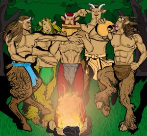
It's been a while since we've had a back to back winner, even though it may not feel like these two victories are back to back, considering the break we took in the CDC's over Christmas. But the person who won the last CDC poll was also victorious this time out as well. And that person is Cliff for his Party Animals piece. Congratulations Cliff and well done to everyone who entered.

103 Cliff- PartyAnimals

I don’t want those images in my head thanks

Characters Of The Week: Anarchangel- Various Characters

Well, this week I'm reeeeeeeally gonna stretch my own rules. Whilst, there have been numerous artworks this week that I could have talked about (COTW regular RobM coming closest, go check out the latest work on his thread, it's pretty damn sweet), one person has been being consistently amazing with practically everything he's submitted this week that I felt I had to cover him. But when it came down to it, I'm an indecisive bugger, so guess what I'm gonna do.


Now, why am I covering multiple characters in a post that usually only covers one picture. Well, I have some very important points to make and Anarchangel is the best 'machiner to use when demonstrating all of those points at once.

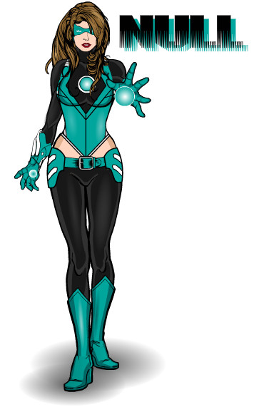
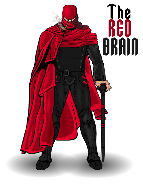
First off we have a definite sense of style. If you look at all of these pictures together, it is immediately recognisable who did them, by certain defining factors. The shading style is very distinctive, very subtle, not overused or overshadowing the design, more of an enhancement of what is already there than a stand-out eye-catch. Which really works for Anarchangels style. He has a definite knowledge of light sources. If you look at his work you can see exactly where the light is coming from, because he's made it blatantly obvious.

Then we have inventive and well worked costumes. Two words I can use to describe these are cohesive and stylish. They look like they could actually be from comics or cartoons, even from a live-action movie. Anarchangel has a way of coming up with these really cool looking patterns with masking and insignias that other people wouldn't think of (best example here is Tokyo Rose). And then we have the colour schemes. Simple, clean and effective. You don't need to use more than 3 colours, maybe a 4th for detailing, but that's the limit. The only one of the above characters that uses that 4th colour is Aeon, and that is for two small aspects of the costume, and they all look fabulous.

Lastly, we have an attitude to the characters. You don't have to be the worlds greatest poser or face-maker to get across a character's personality, you just need to have an idea of it and see where it takes you. All of these characters has a definite character despite being in pretty much the standard face-forward pose and most of their faces covered, just by moving the hands a bit here, changing the position of the leg there and a bit of shading on an eye to finish it off. By just tweaking certain things you can change a characters personality from serious to silly, suspicious to incensed. You can imply action, movement or power through a simple hand gesture. All you need to do is look and think, "how can I say this with what I have".

Geek Quiz ♯7: Batman Edition

It's simple, you answer questions about the Batman. As per usual, 10 questions with a total of 20 points to get and don’t post answers in the comments, just your scores. The answers will be below a jump from the post whilst on the main blog page, so if you don’t want to be spoiled, take a look at the questions on the blog first.

1. How many months after Superman did Batman debut? (1 Point)

2. Put these famous citizens of Gotham in order of debut (first to last)? (1 Point)

a) Dick Greyson                             c) Jim Gordon

b) Harvey Dent                             d) Alfred Pennyworth

3. Which Green Lantern villain is named in honour of one of the original creative team behind Batman? (1 Point)

4. What is the name of the corrupt Police Commissioner of Gotham in Batman: Year One? (1 Point)

5. What is the name of Jim Gordon's successor as Police Commissioner in The Dark Knight Returns? (1 Point)

6. Who teamed up with Batman in Issue 59 of The Brave & The Bold, the first issue to instigate the Batman team-up theme that would come to define the title. (1 Point)

7. What year did Bane debut? (1 Point)

8. In 1983, Batman left the Justice League to form The Outsiders. Excluding Batman, name the original line-up of the team. (1 point per person, 5 points)

9. Name all of the men to have played Batman in a live action film (not including Ben Affleck, whose debut as Batman has yet to be released). (1 point per person, 7 points)

10. In 1979, the original Batman from Earth-2 was killed. Who killed him? (1 Point)

Continue reading

Creators Club 2015

Hey guys JR here, bringing you the formal announcement of this years Creators Club poster, something which we are trying to get to be an annual thing.

This years poster will be done by MadJack who came up with the idea of doing a Days Of Future Past cover themed poster. Since we haven't done a superhero themed poster, I thought this would be a good theme (especially considering a certain film that came out last year). So, the idea is this; you guys have to create a self-portrait, either realistic or idealised, of yourself as a superhero. You can show powers and have poses other than the standard straight-on pose if you wish (zypping is also optional), but we must insist on two things. 1: Your character's face must be forward facing and 2: No Masks, we want to see all of your wonderful faces. Also, no backgrounds, MadJack will deal with all of that stuff when he puts the poster together.

For your entry to be acceptable you must complete the following criteria. If you don't then you don't get on the poster.

1. Your entry must be in .png format. You must title it in standard contest entry style i.e. Username- Creators Club Poster (for example I would title mine JR19759- Creators Club Poster). Don't screenshot the picture and send that in, export it as a .png please.

2. You MUST include the text for your entry. Mandatory. This is incase MadJack needs to re-export any of the files in a bigger or smaller format. You can include it as an attachment in the email or just paste it into the email, but you have to have the text accessible.

3. Your email has to be titled something applicable to the Creators Club, so its easy to recognise as not-spam.

4. You only have one entry, so make sure you're happy with it before you send it in. It doesn't have to be the worlds best creation, this is only for fun after all, but we don't want endless revisions.

Once you've met all of those criteria, send your entries to MadJack at madjack@starnberg-mail.de. Submissions will be open from today until February 10th 2015. This is open to everyone in the community, you don't have to be especially prolific or a Power User or anything, you just have to be a part of the Heromachine community. And remember, this isn't a challenge, so just have fun with it.

If MadJack wants to add anything, then I'm sure he'll do so in the comments, but other than that. JR out.