
Ok, I’ll admit I was a tad mean with this weeks CDC curveball, but it’s not fun to be predictable. But the fact that he couldn’t enter it into the contest didn’t stop AMS from carrying on his redesigns of his character The Ankh, whom he entered into the HM1 contest and then recreated for the HM2.5 Contest.
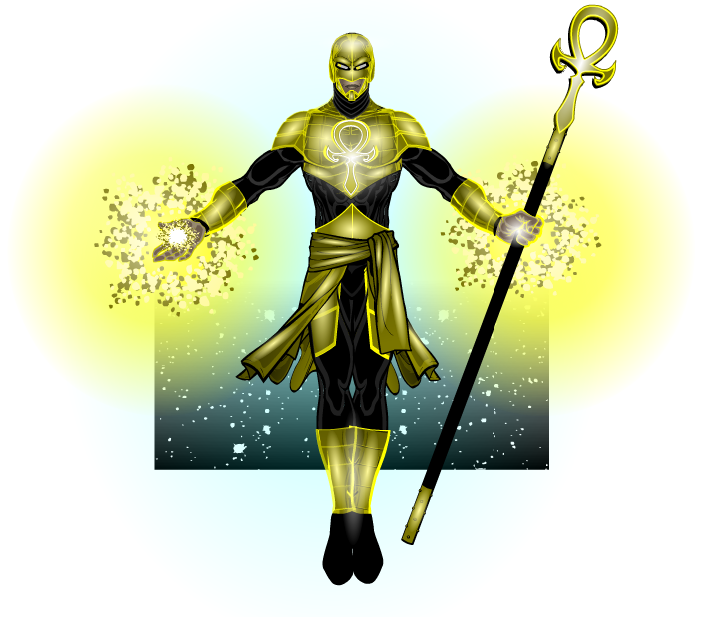
So, it’s an AMS picture, y’all know what to expect. Fantastically simple costumes that still manage to knock your socks off (see the top, which is a nice combination of two tops and some shoulder items, masked so they all fit together like they were a single item), peerless shading (do I need to give examples here?), posing and expression (look how fierce the expression is) and that finishing touch that just takes his work that extra little way (in this case the background, which appears to be a combination of three different background techniques. The first being the stars, which are masked to a background square. Then you have a gradient circle, which is also masked to a background square, to give the black corners. Then finally, over the top of the previous two elements, there is the gradient square, which is set to Colour 2 as White and Colour 1 is set to 0% alpha, then flipped upside down, so it looks like the background is fading into the white base. Well, that’s how I’d do it anyway). So yeah, your standard AMS work. That is to say, it’s freakin’ sublime.

Super Awesome!
Thanks for the nom this week JR! Feels good to have this recognized because I have been feeling in a creative slump lately. The contests you posted were a great way to create a base concept and expand on it every venture. The beginnings of the character were created on the fly with the first HM 1 challenge and evolved through the next stages. For the final product, I actually went away from my traditional (boring?) 3/4 turn and went with a head on pose. Backgrounds were added (which I hardly do anymore) which with the contrasting “colder” colors makes the man subject pop more.
I also had a “happy” accident that gave me the final look for the pic. When I was finished(or thought), the character looked like this… https://www.heromachine.com/wp-content/uploads/2014/11/THE-ANKH-black-lines.png
Before saving, I was fiddling around with the chest ankh insignia and accidently change the chest armor’s outlines to bright yellow. Seeing the awesome look to the armor, I quickly changed all the armor pieces’ outlines to yellow and knew this was the final draft. I think this change was what I was looking for in the character being powerful and luminous.
Thanks again and Cheers!
*slow clap* Bravo! That looks awesome!
I’m sure he’s happy with his upgrades. He might spare you for them.