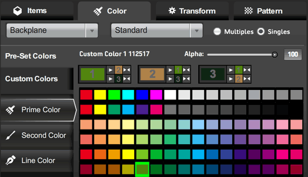
I’ve just updated the HeroMachine 3 Alpha with the long-requested Color Swapping feature! Here’s how it looks:

I’m dubious I’ve nailed the best possible arrangement here, but this is at least functional. That new row below the color name and alpha slider shows all three color areas, appropriately numbered in the big color swatch.
Each of the three blocks has three parts to it: The big current color swatch for that color area; smaller color swatches for each of the other two color areas (again, appropriately numbered); and buttons for either copying the main color (one arrow) or swapping the main color and one of the other colors (two arrows).
Look at the first main box, labeled with a big “1” in the light green swatch:
- If you were to click the the top button having only one arrow, that light green would get copied to color 2, currently a tannish-brown.
- If you were to click the bottom button having only one arrow, the light green would get copied to color 3 (line color), currently a very dark green.
- If you were to click the top double-headed arrow, color 1 and color 2 would swap, so color 1 would become tannish-brown and color 2 would become light green.
- If you were to click the bottom double-headed arrow, color 1 and color 3 (line color) would swap, so color 1 would become very dark green and color 3 would become light green.
It looks confusing, but I think once you’ve used it for a minute or two it’ll make sense. Note that clicking any of these new buttons does not change which color is currently active, as indicated in the buttons to the left with the white outline around them (“Prime Color” in the screen capture).
One question I have for you obviously is, does this work? But I also would like to know if you think it makes sense or is too confusing. Should I add numbers so the selection tabs read “Prime Color (1)”, “Second Color (2)”, and “Line Color (3)” or something?
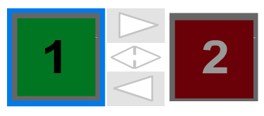
Just as a reminder, here’s the color swap box in HeroMachine 2:

With three colors, I couldn’t do this exact layout, but the basics are the same — big color swatch, one-headed arrow for copying color from one to the other, and a double-headed arrow for swapping them.
Thanks in advance for your feedback and patience as we all continue working together to improve the program!


Fantastic! I can see this coming esp handy when it comes to experimenting with skin tone shading.
Haven’t actually tried it out yet to say if there are any bugs or not, but the layout itself is perfect to my eyes. Didn’t need an explaination to understand it, it’s just intiuitive and simple.
Woohoo! Haven’t played with it much yet, but it looks great!
Every time I’ve wanted to switch colors, it’s been between 1&2, even tho I am a faithful follower of not-black outlines. I think a big color switch like HM2.5, and then smaller ones for the line color.
I really could have used this last night.
I played around a little with these controls, and they work rather well! Being able to clone colors is quite practical and removes a ton of mouse clicks when trying out many different colors.
Here’s the thing though. I IMMEDIATELY tried clicking the big color swatches to change active color. It just seemed very natural and intuitive.
This should be handy. And the button layout iis easy to follow and makes sense. Thanks Jeff.
Panner, I had that exact same feeling. I briefly looked into it, and still might do it if it’s relatively easy. It DOES seem intuitive to do it that way, and in fact that’s how 2.x works.
Oh, also, I forgot — the manual color entry for Alpha value is fixed now too. It was indeed applying that alpha value to the entire item until it was moused over, you were right Panner.
Fixed now, though.
Interesting.
New version uploaded just now, which adds the ability to click on one of the three big “Current Color” swatches to switch to working on that color. Note that this is only for the big swatches, the two little ones off to the side of each control aren’t active. Also, you can’t click directly on the number, which is aggravating. You have to click on the colored area that’s not the number.
Also, the version number is back, in the bottom right-hand corner. And there was much rejoicing.
@Jeff: Very Cool. As far as the version number goes, once you actually implement the help, you should move it to the “about” portion of the help. Otherwise love the new twitch to the color screen.
Oh and BTW, are you sure this is STILL Version A.20? 😉
Nothing to add but thank you! Was just thinking last night how much I missed color swap.
Yep, these new controls are looking really, really good. Showing alpha level on the color swatches makes a big difference for quick color checks. Two thumbs up for that one!
Love the new option, it is great to have more variablility when changing colours. Neat! For me it might take some time to get used to the new location for Pre-set colours and Custom colours (I kept hitting Custom colour tab, when trying to change from main colour to the highlights), but that layout does make sense.
Oh yeah, I forgot to mention the new “Custom/Pre-Set” location. People kept remarking that they were too hard to find down there at the bottom, so I thought a more prominent placement would help. But I agree, that bar is now a little crowded and I can see how it’d be easy to mis-click.
Great!!! I keep running into this problem; I’m glad someone else noticed, and made the suggestion.
HM3 is getting better by the second!