
Forum Replies Created
-
AuthorPosts
-

SulemanParticipantGreat work, man! Really impressive, and you keep getting even better.
Great costume work, details and absolutely fabulous colors on ReJen, very gritty stuff. The bullet holes look neat and the action pose in the second one tells their story in a cool way. The blood spatters are also well done.
King Solomon has a fantastic pose, it immediately tells a story. I’ve always been fond of heromachine characters sitting on chairs or thrones, it’s not trivial to do and generally looks cool.
SulemanParticipant
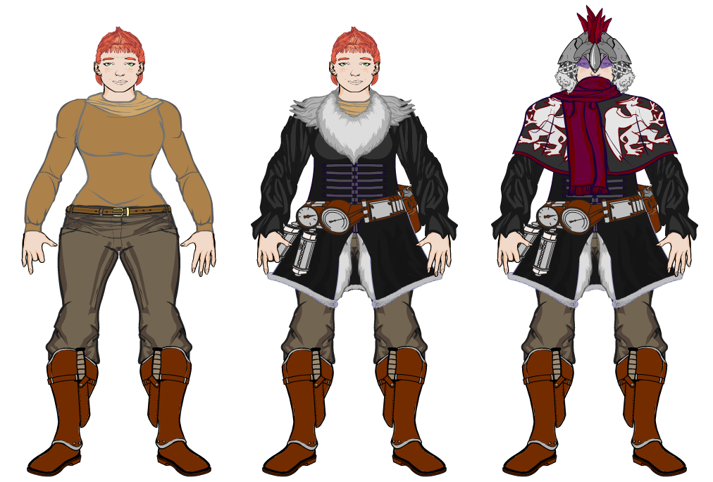
I was pondering a little bit about how the Gryphon Rider’s outfit would work in the previous picture I posted, so I painstakingly reconstructed the character in a front-facing view. That’s about all there is to this. This is pretty rough and has no shading, but not everything needs to be so pointlessly detailed.
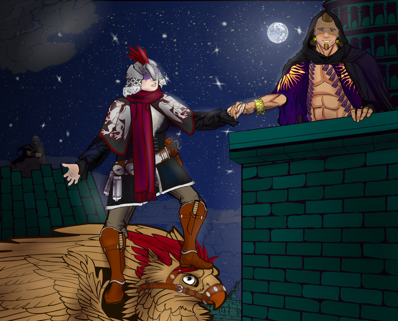
SulemanParticipantThe dashing Gryphon Rider hitting on a young nobleman. She can show you the woooorld.
The Gryphon Rider is, technically speaking, opposed to the evil Empress. However, she is way too busy doing things like this to actually be very useful to the cause.
She is driven by her own moral code and libido, and is thus blinded to the plights of the common folk.I have no idea how this design ended up like this. I just wanted to make an opera singer, and suddenly she’s standing on a gryphon for some reason? All I wanted was a ladder!
SulemanParticipantThanks, both of you! I had a fair amount of trouble getting the ground under Boneface right, eventually I just gave up. I do agree that it could look better.
This is a return to a more simple time. It’s a design for a space fighter flightsuit in a friend’s roleplaying game campaign. Nothing fancy.
SulemanParticipantIngwe’s pose is really great! His design is nice in general, nice of of color and patterns, pretty clean and elegant. Nitpick: it’s always a bit weird to me when supposedly agile characters wear metal boots or gauntlets, I know from personal experience that those limit your movement surprisingly much.
The gradients you use are a little bit brighter than I probably would, but that’s purely a matter of personal taste. Carry on, you’re doing good work!
SulemanParticipantJeez, you learn fast! The first ones were already very well composed, but the last two show some very advanced posing and color work. Very impressive!
I really like the hair of the female character, the crouching pose of the last one, and the use of color gradients in both of them.
One feature you haven’t played with yet is line color. You’ve got a lot of the advanced techniques down already, I think you could have fun if you tried using different line colors here and there.
SulemanParticipantThe Queen Of Karate
She can’t stop kicking things into smaller things!
This was mostly an exercise in posing and making backgrounds.
SulemanParticipantOh hey, it’s Boneface and his alien cyborg horse.
…I don’t even know. I’ve got a major cold and my head barely works at all.
SulemanParticipantThe Autumn Archer is well-camouflaged.
I just felt like doing some heromachine stuff again, and I happened to think of an archery pose. The rest was just going with the september mood.
SulemanParticipantThese are all pretty solid! I appreciate the effort you put into posing your characters.
The background colors are really nice, I especially appreciate the backgrounds you made for Kanna, Midori, Dewasenja and Inazuma. I default to blue skies a bit too often, I should try different colors sometimes as well.
Kanna’s sitting pose is great! That skirt must have been tricky.
In “Revenge”, the framing is done really well! I like how you posed the characters relative to each other. The guy is holding the sword in a rather weird way, usually you’d want to hold the sword closer to the handguard.
I like the pose and clothing you made for Inazuma. The wind blowing the front part of the skirt and the vest is cool. The arrows in the tree are also a great touch. I think the weakest part of the image right now is Inazuma’s lack of chin. Right now, thanks to how the face is placed looking to the side, it looks like he has a really weak chin and a flabby neck. Maybe play around with the different head shapes and rotate them around a bit? I’ve had this problem as well, it’s not easy to solve. Anyway, I like the picture overall!
SulemanParticipantYeah, I considered using some more complicated piece of clothing, but the t-shirt was just the easiest way to go.
In other news, here’s Count Dorian, as part of an art trade.
The original can be found here.
SulemanParticipantOoh. These are nice, clean designs. I appreciate the color choices and how the designs are super clear even in thumbnail form. I dig these!
SulemanParticipantI can’t see it. The forums have a weird habit of eating posts sometimes, I recommend you contact the admins.
SulemanParticipantYeah, I checked both the hand category and the companions-humanoids category and couldn’t find a great fit. Rather frustrating.
It might be possible to use an open hand like this, since we’re looking at him from below, but it’d take some experimentation.
Attachments:
You must be logged in to view attached files.
SulemanParticipantDang! That’s superb!
The dynamic pose, the well-designed but simple out fit, the background that fades away in the distance, the foreground with the perspective that is just right, the speed effect AND all of those things working together. Great concept, brilliant execution.
The fingers of his left hand look a little bit awkward, but that’s literally the only problem I could think of. Great job.
-
AuthorPosts


