
(From "Cat-Man Comics" number 2, 1942.)

Sponsored Links (which Premium Members will never see):
(From "Cat-Man Comics" number 2, 1942.)
Comments Off on That's a lot of innuendo for just one panel
Posted in Daily Random Panel
By: Andrew Hines
 This has been good book from the start. I mean, I know we were all shocked by the way Kori was dressed in the first few issues, but thankfully that's been changed in the last few issues. There's a great team dynamic here in the fact that while nobody but Roy would admit it, they really do need each other in order to stay focused and grounded. There've certainly been some changes in their relationships with the Bat-Family and even their own, but the new normal is starting to grow on me. It just all seems to work much better now.
Scott Lobdell's been doing a great job on the writing since the first issue. I wasn't sure where it was going at first, but it looks like the only origin story left to tackle is Roy's. Again, character interaction and their relationships with the others on the "team" is interesting. I like the way they're headed with Starfire's story. Hopefully we get to see more of Tamaran in the future. The pacing has been good in this issue and it ends on a sort of bittersweet note. It doesn't seem at all clichéd, which is a rarity these days. The dialogue is good as is Roy's narrative intro. We don't see as much of Jason this time, though, which makes me sort of sad. That's really the only thing wrong with the writing here. Not enough Jason, but then this was intended to be a very Kori-centric issue, so I'll allow it.
 Timothy Green II's artwork, combined with Blond's colors is pretty good, as you can see at right. The whole thing looks quite similar to Kenneth Rocafort's style, if slightly heavy on inks. This is one of the few titles where there isn't an additional name to work on inks. It's just the artist and the colorist, who work well together. This first page is a good example of that, at least in my opinion. The shadows are a nice effect here and the lighting is great throughout the issue. The effects in general are pretty impressive. I'd love to keep going on this, but if you can see what i'm talking about, just in the first page, do I really need to?
This gets an "A-", primarily because the cover's quite misleading. Well, there's that and I know that with "Death of the Family" around the corner, it's gonna be a whole lot better.
Comments Off on End of the Starfire
Posted in Cool Characters, Super-Hero Stuff
Rather than focusing on a fight between two factions, this week I want to take a look at costume design. Specifically, what makes a good patriotic super-hero outfit? Our competitors are:

Captain America has had a number of subtle but important costume changes over the last decade or so after remaining essentially static for forty years prior, but the essentials are still there. I chose this specific version because I think it retains all the classic elements while still having a few modern touches to make it relevant.
Similarly, Captain Britain has had a number of incarnations, but this is the one that for me is the most iconic.
So what makes a patriotic super hero uniform work?
First, it has to have the nation's colors in it. Both meet that criteria with red, white, and blue in abundance.
Second, it ought to have some bit of national iconography on it, which both do, from the big stars and stripes on Captain America to the Union Jack on Captain Britain.
Third, ideally you'll get some sense of the flag's design reflected in the costume. Again, the stars and stripes layout works on the one and the x-shaped pattern for the other.
Finally, obviously, it needs to look cool. I think both of these gentlemen have nailed that as well.
So we come down to specifics, namely specific things I don't like. I have never been a fan of Captain America's silly head wings, and giant thigh boots on men just look dorky to me. I actually prefer Captain Britain's headgear to Captain America's, but the former's lack of a belt seems weird.
At the end of the day, the deciding factor for me is Captain America's shield. I think the character design needs to reflect something about how that country sees itself. These are patriotic super heroes, meaning they ought to represent the very best of the idealized version of their nations. And for the United States, that's the idea that we are the world's protector, that we act in defense and not in aggression (yes, I know, but this is comic books, people, not reality). The shield is a great way of getting that point across.
Unfortunately Captain Britain doesn't have anything like that. I don't know exactly what it would be, but a helmet isn't it.
So while I think I actually prefer Captain Britain's overall look, I'm going to say that Captain America better sums up the patriotic version of his country.
What about you, what do you think?
[polldaddy poll="6631116"]Comments Off on Captain America vs. Captain Britain. Who has a better costume?
Posted in Versus

(From "Cat-Man Comics" number 2, 1942.)
Comments Off on When men were men and insults were insults!
Posted in Daily Random Panel
It's time for another new Caption Challenge! This week you're tasked with coming up with the best replacement dialog for this comics panel:

I'll pick out some as my personal favorites to highlight in a post next Monday, and then I'll choose one of those to bear the standard as the "Featured Creator of the Week" atop the right column.
All entries must be left as a comment (or comments) to this post. Keep ‘em clean (appropriate for a late-night broadcast TV show), but most importantly, keep ‘em funny!
No limit to entries, but please, self-edit and only put up ones you genuinely think are good!
Comments Off on Caption Challenge 132: Dooplicitous
Posted in Caption Challenges, Challenges
Many thanks to everyone who entered Character Challenge 102! Speedsters are tough to do since the base body in the program is so static. But once again you all rose to the occasion and produced some outstanding work. My personal favorites are below but I definitely encourage you to check out the original set of entries in the contest comments.
Comments Off on Character Challenge 102 Results
Posted in Challenge Favorites
Many thanks to everyone who entered our Halloween Pop Quiz! Your challenge was to design a mask like you might see someone wearing at a Halloween party, and you all did a great job:
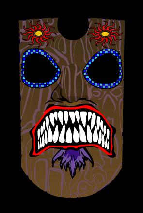
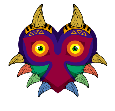
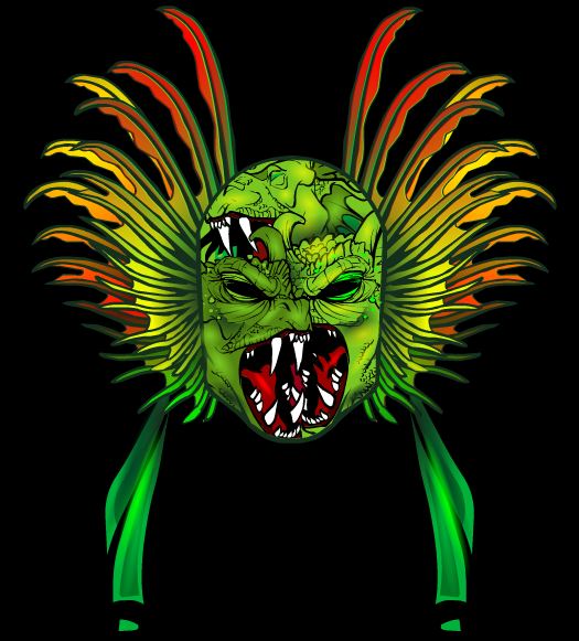
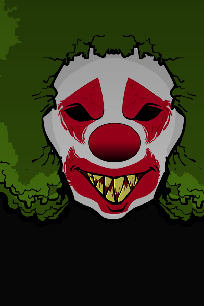
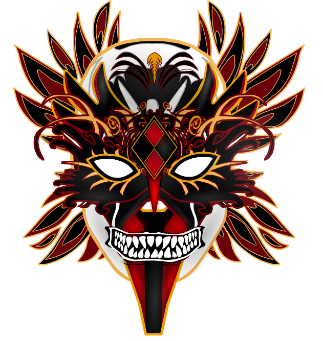

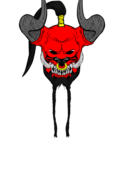
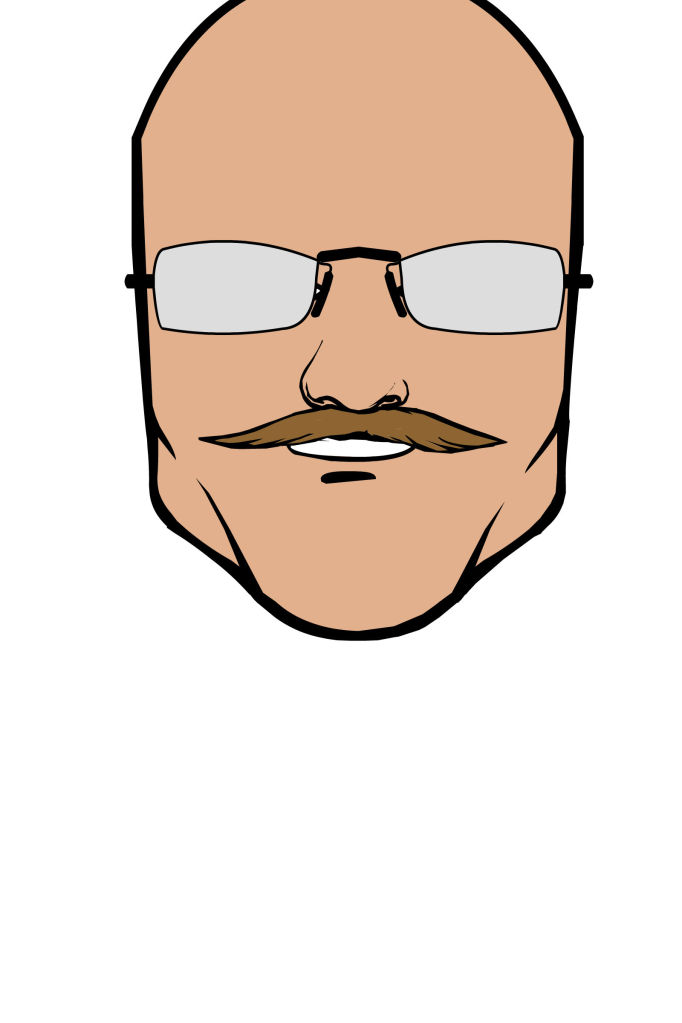
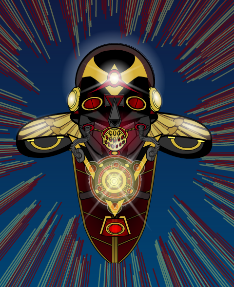
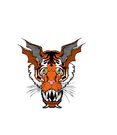
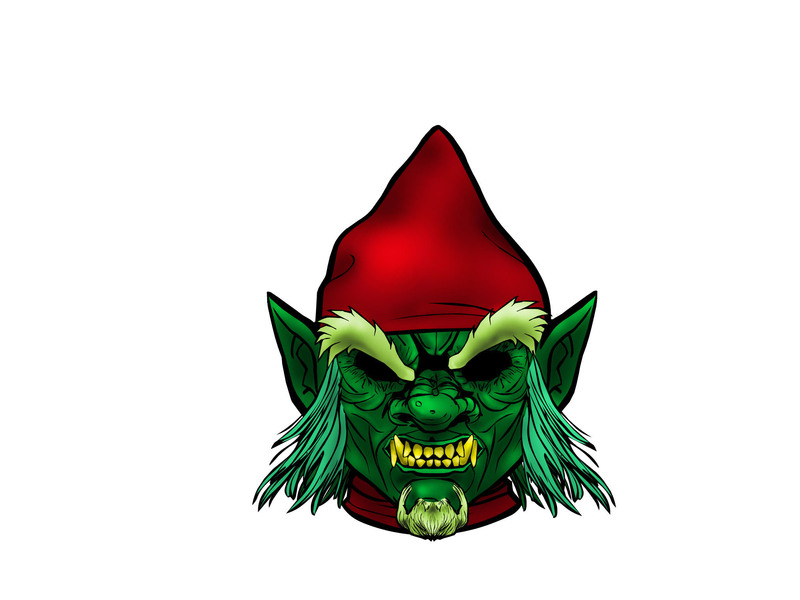
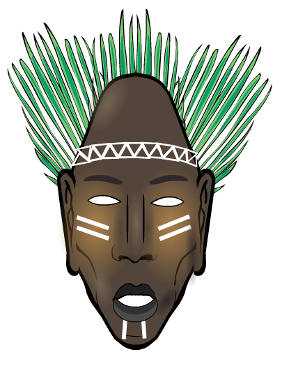
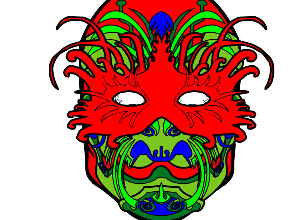
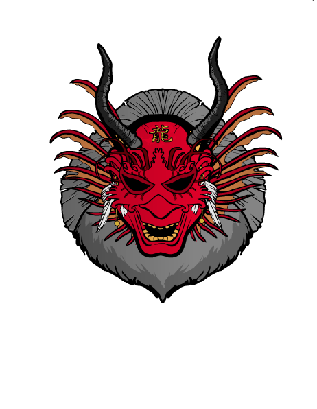
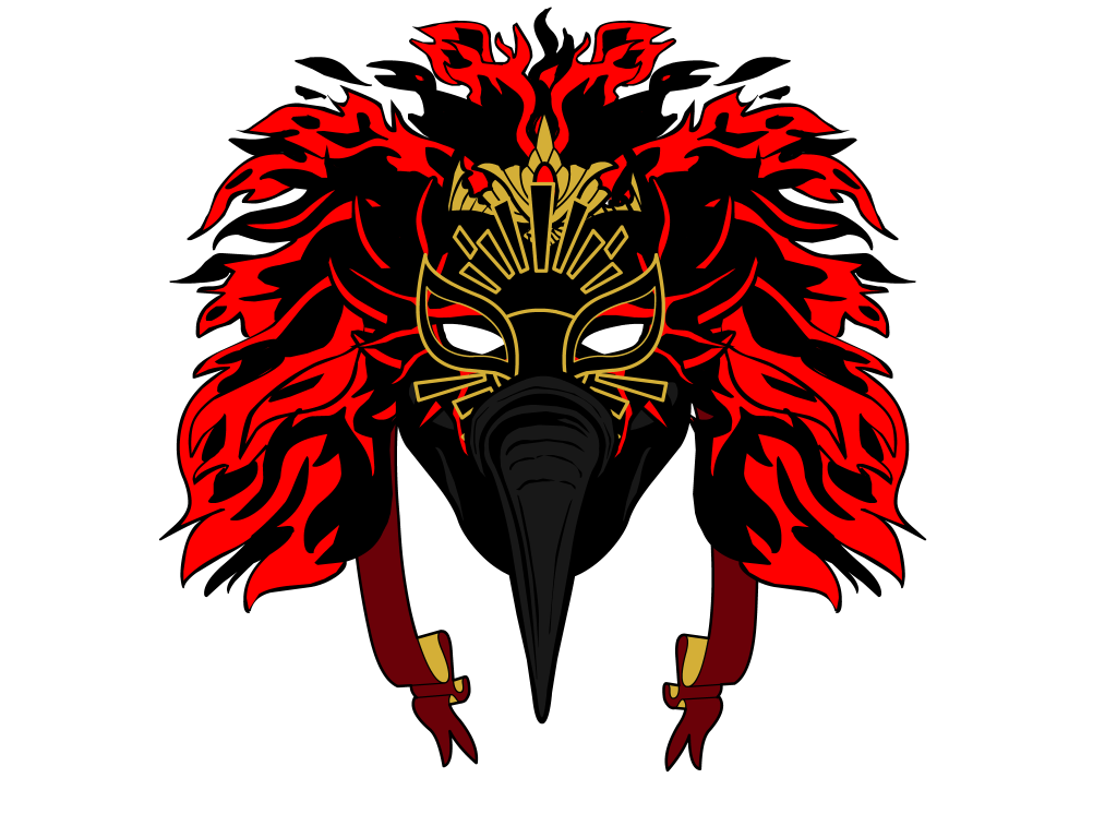
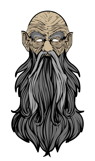
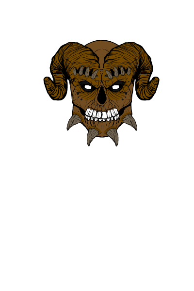
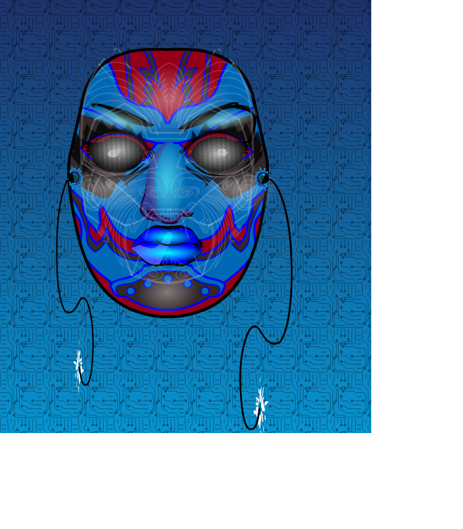
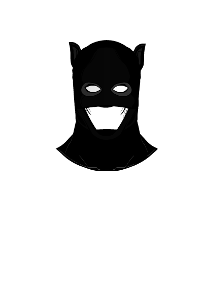
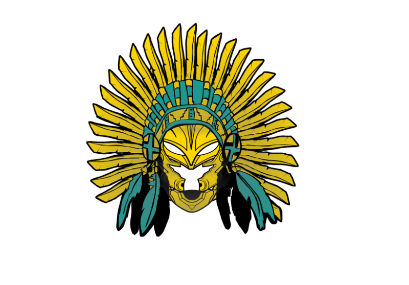
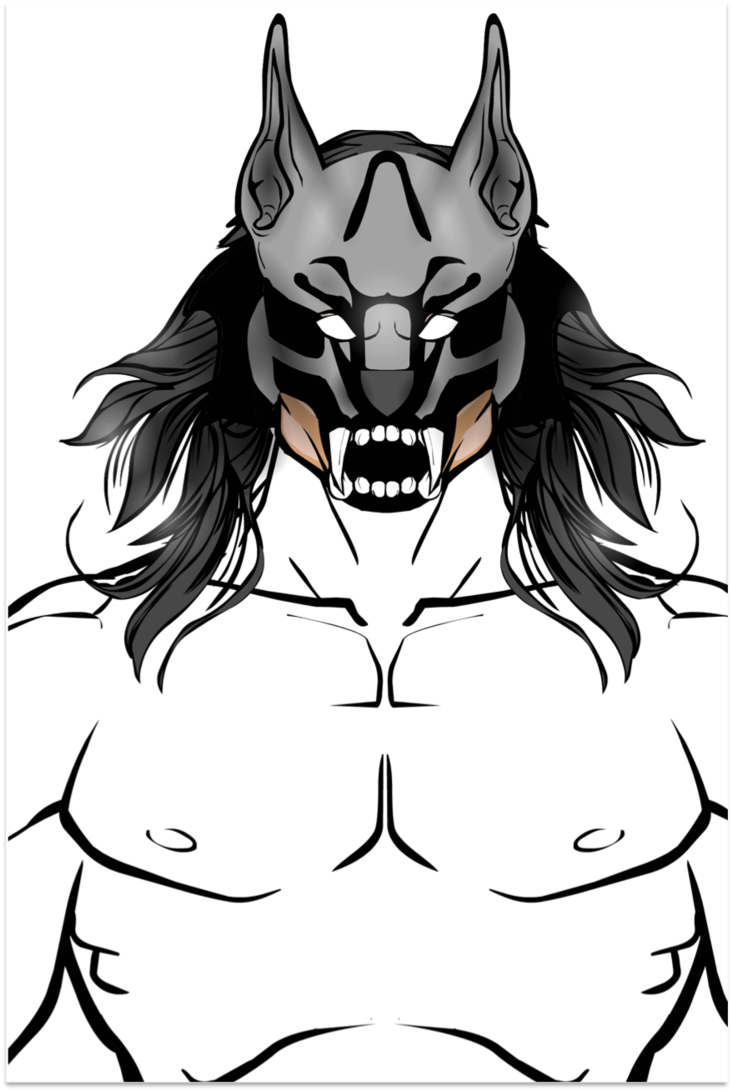
While I think all of these are really well done, a few did jump out as particularly impressive. In no particular order, they were Debochira, djuby, Harlequin, Keith Kanin, and Scatman.
Out of those, I'm going with Scatman's as my personal favorite:

Thanks again everyone!
Comments Off on Pop Quiz 32 Results
Posted in Challenge Favorites
By: Andrew Hines
 The great thing about DCU Presents is that you can just pick out the few with a storyline and characters that grab your attention. It's perfect for the picky completist in all of us comic geeks. This one in particular gives us two cool bench warmer heroes in one great starter issue. Blue Devil and Black Lightning have been relative unknowns for a while, with the exception of the latter's appearance in Final Crisis. I really can't recall much about Blue Devil, save for the fact that I always loved the idea of him. He was mentioned a bit in Infinite Crisis, but hasn't had a starring role in quite a while. Anyway, this might be the time to learn more about him.
Marc Andreyko's writing here is very good. The pacing is great as are the character introductions, both in and out of "costume". The setting of Los Angeles is really cool and not something we've seen yet in the New 52. Then there's the inclusion of what looks like both Spanish and Portuguese. That alone is more than other writers have done in a long time. The interaction between Daniel Cassidy (Blue Devil) and Jefferson Pierce (Black Lightning) is about what you'd expect when a new superhero meets someone dressed like the devil. It ain't pretty. Again, gotta say that the pacing is pretty good for a four-part story arc such as this.

This ends up just being a great issue and a wonderful start to what could be the best DC Universe Presents storyline so far. This get's a straight "A".
Comments Off on And Now For Something Completely Different
Posted in Cool Characters, Super-Hero Stuff
There seems to be a misunderstanding about who does the reviews. While Jeff takes care of the site and the regular posts, I (Andy aka McKnight57) write and post all of the reviews. There seem to be a few comments to these reviews that are addressing Jeff. Just wanted to be clear on that. I'm not annoyed so much as I honestly don't know if he's reading all of the comics that are being reviewed here.
Comments Off on Gotta Clear This Up
Posted in News & Updates
By: Andrew Hines
 There's been a lot going on in Dick's life since #1. His old "home" came back to town. (The dude grew up in the circus. It's complicated.) His old buddy came back from the dead, became a freelance assassin and came after Dick. Then, Mr. Grayson got handed ownership of Haly's Circus. He wants to employ everyone in a concrete location at the old amusement park of Gotham. Add to that someone framing Nightwing/Dick Grayson for a double homicide. That's where things get tricky. He's thwarted that and now two of his deadliest enemies have returned to Gotham.
Let's have a moment of silence for Kyle Higgins leaving Nightwing for this issue and the next. . . . Okay, now let's deal with Tom DeFalco's writing. Suffice it to say, it's average. Better than even the writing of Liefeld, but then again, it's Liefeld. DeFalco gives us some interesting pages, but it's not the best pacing. The dialogue is alright, but only really shines in a few panels. The action sequences are written well, but then we're partly back to the issue of pacing. Then there's the fact that the issue is supposed to be about Lady Shivabeing back in Gotham. She's only there for a page or two and has absolutely no lines. The writing could be a lot better, so here's me looking forward to issue 15.

Andres Guinaldo's art is pretty good and feels pretty consistent from issue to issue. the pencils are great and the different angles don't really change the look of the character much. For some artists, this is a problem, but Guinaldo, as I said, is quite consistent. Mark Irwin's inks lend themselves nicely to the nourish setting of Gotham. It pulls the pencils and colds together pretty well. This leads me to Rod Reis' colors, which are superb as usual. The dude rarely misses a beat. He really puts his all into it as is shown in the lighting on the page shown at right.
All things considered, this issue earns a "B-", which is probably the lowest grade I've given an issue of Nightwing to date. I say buy it if you're a completist or for the artwork, not the writing.
Comments Off on Return of Lady Shiva
Posted in Cool Characters, Super-Hero Stuff
 Three middle-aged nerds (including yours truly!) review all of the MCU movies in chronological order. Short, funny, and full of good vibes, check it out and let us know what you think!
Nerdmudgeon.com
Three middle-aged nerds (including yours truly!) review all of the MCU movies in chronological order. Short, funny, and full of good vibes, check it out and let us know what you think!
Nerdmudgeon.com