
(From "Super Mystery Comics", volume 2, number 3, 1941.)
Sponsored Links (which Premium Members will never see):

(From "Super Mystery Comics", volume 2, number 3, 1941.)
Comments Off on Hence, the Comics Code Authority.
Posted in Daily Random Panel
It's time once again for another Open Critique Day!

If you have a HeroMachine illustration or another piece of artwork you've done that you'd like some help with, post a link to it in comments along with your thoughts on it -- what you think is working, what you're struggling with, etc. I will post my critique of the piece, hopefully giving some tips on how to improve it.
Of course everyone is welcome to post their critiques as well, keeping in mind the following rules:
That's it! Hopefully we can get some good interaction going here and help everyone (me included!) learn a little bit today.
(Image via NaniScribbles.)
Comments Off on Open Critique Day #14
Posted in Open Critique Day
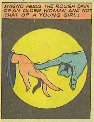
(From "Super Mystery Comics" volume 2, number 3, 1941.)
Comments Off on Magno vs. The Cougar!
Posted in Daily Random Panel
I've just updated the HeroMachine 3 Alpha with the long-requested Color Swapping feature! Here's how it looks:
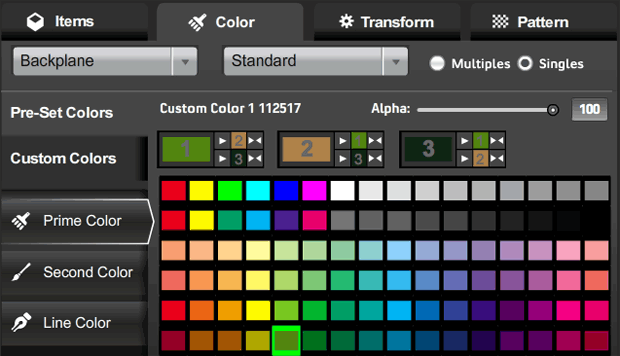
I'm dubious I've nailed the best possible arrangement here, but this is at least functional. That new row below the color name and alpha slider shows all three color areas, appropriately numbered in the big color swatch.
Each of the three blocks has three parts to it: The big current color swatch for that color area; smaller color swatches for each of the other two color areas (again, appropriately numbered); and buttons for either copying the main color (one arrow) or swapping the main color and one of the other colors (two arrows).
Look at the first main box, labeled with a big "1" in the light green swatch:
It looks confusing, but I think once you've used it for a minute or two it'll make sense. Note that clicking any of these new buttons does not change which color is currently active, as indicated in the buttons to the left with the white outline around them ("Prime Color" in the screen capture).
One question I have for you obviously is, does this work? But I also would like to know if you think it makes sense or is too confusing. Should I add numbers so the selection tabs read "Prime Color (1)", "Second Color (2)", and "Line Color (3)" or something?
Just as a reminder, here's the color swap box in HeroMachine 2:

With three colors, I couldn't do this exact layout, but the basics are the same -- big color swatch, one-headed arrow for copying color from one to the other, and a double-headed arrow for swapping them.
Thanks in advance for your feedback and patience as we all continue working together to improve the program!
Comments Off on HM3 Color Swapping now live
Posted in HeroMachine 3, News & Updates
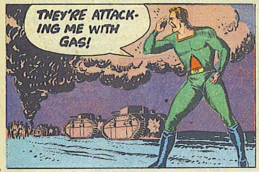
(From "Super Mystery Comics", volume 2, number 3, 1941.)
Comments Off on Reporters make lousy super-heroes
Posted in Daily Random Panel
I've just updated the main HeroMachine 3 Alpha version with the latest User Interface. Holler if you have any problems with it! This should not affect your saved characters in any way.
Comments Off on HM3 new UI now Live!
Posted in HeroMachine 3, News & Updates
Picking on the mutant X-Man known originally as Angel feels a little bit unfair, because let's be honest, you can't exactly get your clothes off the rack when you're sporting a huge pair of wings from your back. On the other hand, he's a millionaire, so I declare him fair game.
All I can say is, if I saw this flying overhead:
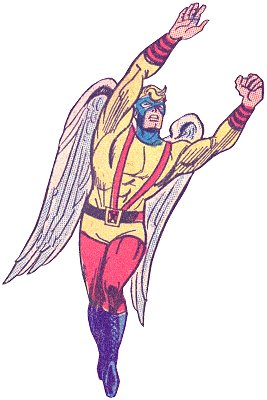
I'd declare Open Season on flying mutants just to protect America from being subjected to such a heinous costume. How can an outfit using most of the same colors as Superman's look so completely hideous? One word:
Suspenders.
Can you recall ever being intimidated by anyone in a non-Deliverance fashion who was wearing suspenders? Seriously. My biggest worry would be that he might pull out some chewing tobacco and spit at me, or threaten to date his own sister. And the fact that they meet at his navel frankly makes me wonder just what they're holding up. Surely he doesn't need that much over-the-shoulder holding power just for those awkward 1950's style swimming trunks.
Also, it might be cool when you're five years old to cut up your older brother's tube socks to wear as handless gloves, but on a grown man (especially in this post-Flashdance era) it just looks ridiculous. I can just hear his theme song now:
I'm a maniac, MAAAAAAAANIAC,
In the skyyyyy-i-yyyy.
And these suspendered short-shorts pull my
stockings way up hiiiiiiiiggh.
Cap off this sartorial wonder with a hideous yellow-bellied color scheme (seriously, if you fly and have wings you should never wear yellow, or you deserve every "chicken" joke you get) and red stockings with combat boots and you quickly see why he's closer to fashion Satan than fashion Angel.
Comments Off on Not exactly Angelic
Posted in Bad Super Costumes
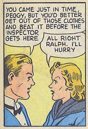
(From "Super Mystery Comics", volume 2, number 3, 1941.)
Comments Off on Next on “Double Entendre Theater”
Posted in Daily Random Panel
With thanks to LogosGal for the question in our last "Sharing Day" thread, I present to you our almost-too-late Poll Position this week!
I'm leaving this one open to your entries, so please be responsible with any responses you add to it. Discussion to follow ... after the jump!
Comments Off on Poll Position: We’re gonna need a bigger boat
Posted in Versus
If you're feeling particularly brave, you might check out the new layout I've been coding for HeroMachine 3. It's based on the excellent work of Mark Shute, who did a wonderful usability test for me a while back, and Jim Marcus of LiquidCrack.com who actually designed the whole thing (which I posted about in September). BIG thanks to both of those guys!
Here are a couple of screen grabs for those of you who can't or don't want to visit the live preview directly:
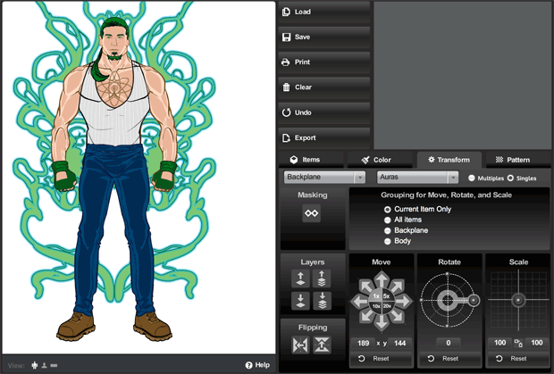
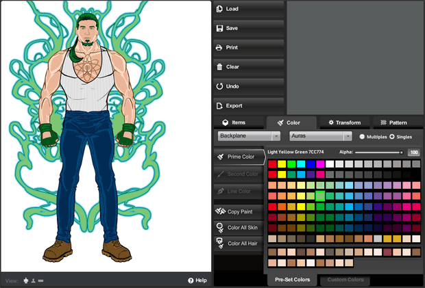
As you can see, it's a lot slicker and more modern. The old gold and brown color scheme and layout were always intended as nothing more than placeholders for whatever design we ultimately settled on. And it's certainly possible that at the end of the day, UGO will have their in-house design team do something different altogether.
In addition to the look-and-feel update, I've also moved some buttons around in an effort to group like-functions together more clearly and to make the initial user interface cleaner and less confusing. To that end I've moved the "Color All Skin/Hair" buttons to the new unified Color tab. I moved the "Flip" and "Mask" buttons to the Transform tab. I removed the "outline" feature since no one ever seems to use it, and it didn't really work like I'd hoped.
I also added a few new features. For instance, you can now flip items vertically in addition to flipping them horizontally. Not sure how useful that'll be, but it's fun! I removed the "arrow action" buttons that were intended to be what you'd click to make the manual entries for alpha, location, rotation, and scale take effect, but which were rarely understood or used. Instead, you now just enter your value and either tab out of the box, or click on some other part of the screen, or hit ENTER, and whatever you typed in there will be implemented.
I also updated some of the more irritating text box limitations. For instance you can now manually enter a location figure up to 1000 if you want (note that this would put the item completely off-screen). And you can now enter negative numbers in the Rotate box.
Please give it a look-see and let me know what you think, any major bugs you find that weren't there before, good and bad on the layout or control locations or really anything else you can think of. Thanks in advance for your feedback!
Comments Off on HM3 New Layout Test
Posted in HeroMachine 3, News & Updates, Previews