Going nuclear

"Superman IV" may be the worst super-hero movie of all time, next to "Superman III". And "Catwoman". Also, "Daredevil" ...

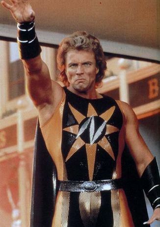
OK, look, "Superman IV" is a bad movie, so quit messing with my brain, Anonymous Internet Ranking Argument Person Who Only Lives In My Head! Part of the blame for that epic fail has to rest with the villain "Nuclear Man" and his wretched costume:

I have to -- reluctantly -- give him a pass for the hair, because it was 1987 and frankly the entire follicle world was pretty messed up. I mean, mullets were on the horizon, you know? It wasn't a pretty time. So I can forgive him for looking like Mrs. Brady after a bad day at the salon. But it doesn't help.

Not that anything could help this outfit all that much. I can't decide if my favorite bit is the crotch-enhancing gold area, surrounded by black so it really pops, or the sloppy starburst and puffy "N" on his chest. Seriously, it looks like a sixth-grade tweener spray-painted this onto her favorite stretchy top after an all-nighter of binging on "Twilight" and Twinkies. The rays aren't even, the whole thing says "puffy" instead of "radiation", and you can't even tell for sure if it's supposed to be an "N" or a lazy "Z".

However, I think the winning element in this pre-Apocalyptic disaster has to be the fingernails. I grant you, fingernails aren't generally considered to be part of the costume per se, but then again you don't see a lot of male super-villains with four-inch metallic-silver jobbies either. I believe later we discover that Lex Luthor funded the creation of his Superman-beating villain through his line of Korean nail salons.

I'm also always interested in how belts are used in these costumes. I mean, in the original Superman design, they were there to hold up his big ol' circus shorts, and you could see the loops that the belt went through in order to provide the support. But here, you've clearly got a one-piece leotard (sparkly, no less!), which doesn't need a belt, because there's no separate pants element to hold up. So why is it there? Because, that's why, and don't question your mullet-headed, puffy-lettered betters, punk!

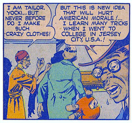
"Jersey Shore" was a WWII Japanese plot!

(From "Airboy" number 11, 1945.)

Poll Position: Hawkeye vs. Green Arrow

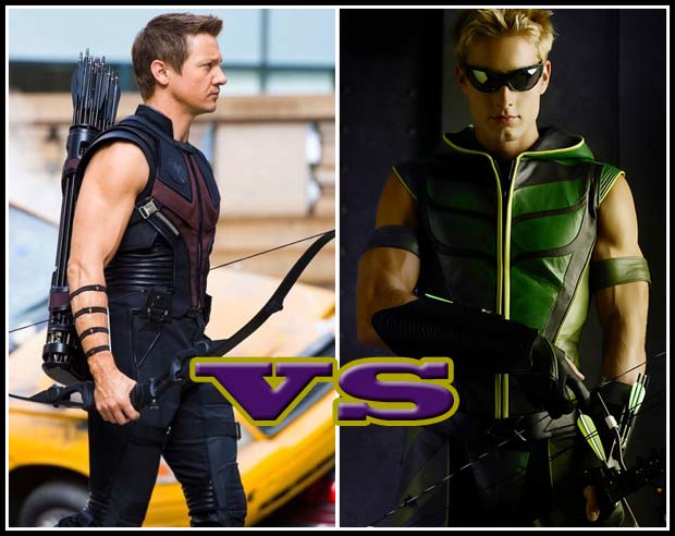
This week, I give you two characters who are virtually identical in concept, neither of whom anyone gives a crap about. To make it (slightly) more compelling, the visuals are from the live-action versions of them both. Ladies and gentlemen, I present "Hawkeye vs. Green Arrow", aka "The Carnival of Suckage":

{democracy:208}

Going purely by the costume design of these two incarnations, I have to go Green Arrow. And that was done with a TV show budget, folks. I dig the shades, I think they're the ideal replacement for the traditional domino mask. Of course, that innovation derives partly from Millar and Hitch's "Ultimates" version of Hawkeye, by way of the Matrix. Come to think of it, a lot of that series was Neo-flavored ...

I also like GA's bow better. Those compound pulleys rock. And the green and yellow look more super-heroish as contrasted to the by-now-boring black leather of movie Hawkeye.

Getting beyond the movies, here they are in their more traditional comic book guises:

Continue reading

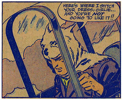
Project Runway goes butch

(From "Airboy" number 11, 1945.)

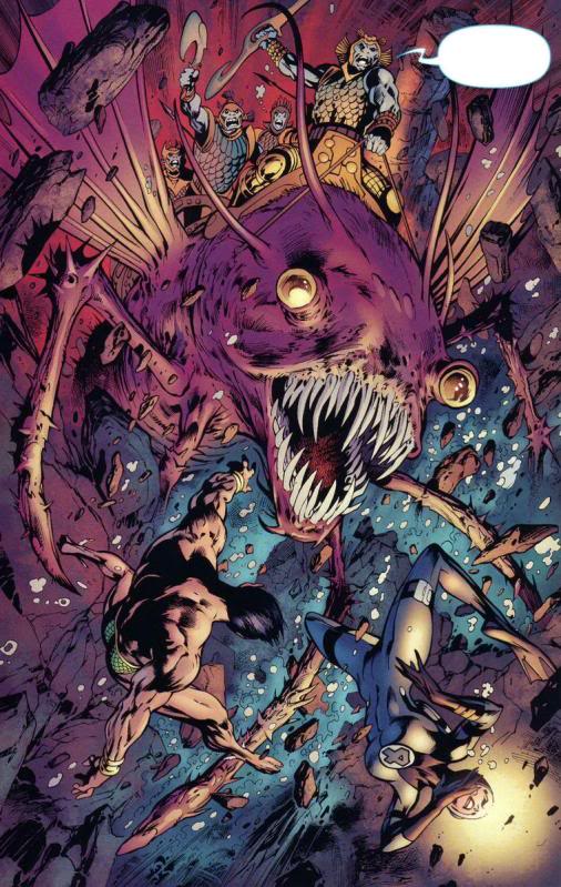
Caption Contest 111: Extremely Fishy Violence!

With hearty thanks once again to Glenn3's "Say What? Pictures" for the panel, your challenge this week is to come up with the best replacement dialog for this comics panel:

We haven't had a hyper-violent one in a while, so I thought we should get back to our roots.

The best entry (as judged by yours truly) wins the author's choice of either any item they like or any portrait to be included in HeroMachine 3′s final release, or a custom black and white “Sketch of the Day” style illustration (you pick the subject, I draw it however I like).

All entries must be left as a comment (or comments) to this post. Keep ‘em clean (appropriate for a late-night broadcast TV show), but most importantly, keep ‘em funny!

This week we have a cap of no more than five (5) entries per person, so make 'em your best!

Character Design Contest 76 Winners!

We had some excellent entries for our Animalia II contest! So without further ado, here are the ones that had a little something extra special about them.

Continue reading

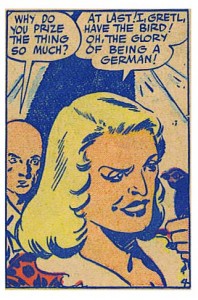
Flip a German the bird and they LIKE it

(From "Airboy" number 11, 1945.)

Power User Profile: Asder

Our Power User to profile this week is the winner of Character Design Contest 49 (Scorpio) and the producer of consistently outstanding work: Asder! I love how many of our active and awesome users come from outside of the U.S., that's truly amazing to me, and I'm profoundly grateful that you all struggle through a foreign language to not only create, but participate. Thank you!

Continue reading

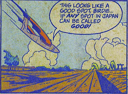
Being a travel blogger is hard

(From "Airboy", volume 2, number 11, 1945.)

Highway Holocaust Happy Adventure Time GO!

Last week we spent some time deciding what skills and gear our "Freeway Warrior" would sport. We decided to put two points into Shooting, one point into Perception, and one point into Fieldcraft. Being on the wimpy side of the Endurance scale, apparently we thought that it would be better to stay far away from danger by toting a rifle, being smart enough to see trouble coming before it gets close, and wilderness savvy enough to hide if it comes down to it.

To that end we settled on a compass so we know which way to run, binoculars so we can see our enemies at even longer distances, three square meals (running burns calories, folks!), and a geiger counter. Here's how our character sheet looks:

Continue reading