We're dead.

With only one entry in our "You're Going To Die" series, I think we will have to call a halt to the endeavor. I really enjoyed it, I just wish it had picked up more momentum and participation. Oh well. Thanks to the handful of folks who were chiming in and / or following along.

Feel free to use this space to discuss why you think it didn't work, if we should keep doing something like it, or if we should go back to a generic "CYOA" story. Or if we should do nothing at all.

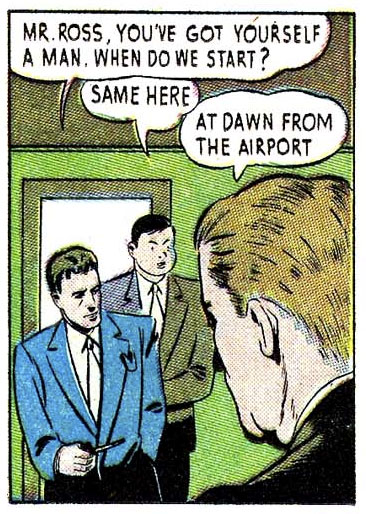
And wear a stewardess uniform! Something pretty.

(From "Cat-Man Comics" number 2, 1942.)

Human projectiles

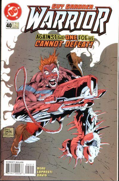
Having a big gun is great if you're a comics fan because big guns are cool. But guns can be taken away, which is not cool, because then how can you shoot things? Luckily a grateful comics nation long ago arrived at a solution for this conundrum -- make a gun out of yourself! The glorious breakthrough is exemplified in this Guy "Extreme Nineties Spokeslantern" Gardner cover:

This isn't really a "costume" per se, but it's definitely "bad" and he's a "super" if not necessarily a "hero". And "scare" quotes are "scary" and "irritating".

But aside from the obsession with guns so intense it causes you to actually become a gun, and ignoring the spikes (EXTREME!!) and Unhinged Giant Snake Jaw (©Image Comics), what really bugs me about all of these integrated biological firearms (get it, fireARMS?) is, what do they shoot, exactly?

I'll pause while you think about this.

The only stuff it can fire is stuff that the body itself creates. So at the end of an extended firefight this guy ought to be a withered husk lying smoking on the ground. Granted, there is precedence for humans creating excess material but most of it is disgusting. Which is a nice way of saying that if Guy Gardner comes after me with his giant gun arm shooting snot bullets at me, he wins on gross-out points alone. But I'd sure kick his ass first, because that's just wrong.

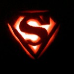
The Pumpkin of Justice!

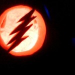
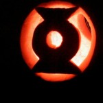
Genius creator Blue Blazer just sent me these awesome photos of his Justice League inspired Halloween pumpkin carving. He did these himself and I think they turned out great! At least, if I were an evil spirit or hulking zombie thinking of invading a house protected by a pumpkin like this, I'd certainly move along to someone less intimidating.

Click any one of these to embiggen in a slideshow.

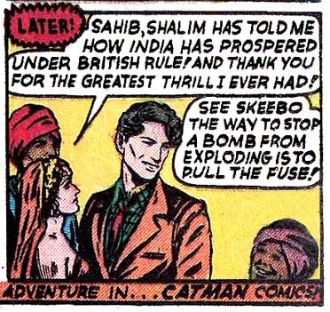
That's a lot of innuendo for just one panel

(From "Cat-Man Comics" number 2, 1942.)

End of the Starfire

End Of The Starfire

By: Andrew Hines

This has been  good book from the start. I mean, I know we were all shocked by the way Kori was dressed in the first few issues, but thankfully that's been changed in the last few issues. There's a great team dynamic here in the fact that while nobody but Roy would admit it, they really do need each other in order to stay focused and grounded. There've certainly been some changes in their relationships with the Bat-Family and even their own, but the new normal is starting to grow on me. It just all seems to work much better now.

Scott Lobdell's been doing a great job on the writing since the first issue. I wasn't sure where it was going at first, but it looks like the only origin story left to tackle is Roy's. Again, character interaction and their relationships with the others on the "team" is interesting. I like the way they're headed with Starfire's story. Hopefully we get to see more of Tamaran in the future. The pacing has been good in this issue and it ends on a sort of bittersweet note. It doesn't seem at all clichéd, which is a rarity these days. The dialogue is good as is Roy's narrative intro. We don't see as much of Jason this time, though, which makes me sort of sad. That's really the only thing wrong with the writing here. Not enough Jason, but then this was intended to be a very Kori-centric issue, so I'll allow it.

Timothy Green II's artwork, combined with Blond's colors is pretty good, as you can see at right. The whole thing looks quite similar to Kenneth Rocafort's style, if slightly heavy on inks. This is one of the few titles where there isn't an additional name to work on inks. It's just the artist and the colorist, who work well together. This first page is a good example of that, at least in my opinion. The shadows are a nice effect here and the lighting is great throughout the issue. The effects in general are pretty impressive. I'd love to keep going on this, but if you can see what i'm talking about, just in the first page, do I really need to?

This gets an "A-", primarily because the cover's quite misleading. Well, there's that and I know that with "Death of the Family" around the corner, it's gonna be a whole lot better.

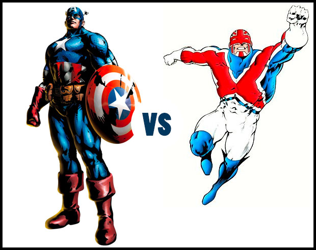
Captain America vs. Captain Britain. Who has a better costume?

Rather than focusing on a fight between two factions, this week I want to take a look at costume design. Specifically, what makes a good patriotic super-hero outfit? Our competitors are:

Captain America has had a number of subtle but important costume changes over the last decade or so after remaining essentially static for forty years prior, but the essentials are still there. I chose this specific version because I think it retains all the classic elements while still having a few modern touches to make it relevant.

Similarly, Captain Britain has had a number of incarnations, but this is the one that for me is the most iconic.

So what makes a patriotic super hero uniform work?

First, it has to have the nation's colors in it. Both meet that criteria with red, white, and blue in abundance.

Second, it ought to have some bit of national iconography on it, which both do, from the big stars and stripes on Captain America to the Union Jack on Captain Britain.

Third, ideally you'll get some sense of the flag's design reflected in the costume. Again, the stars and stripes layout works on the one and the x-shaped pattern for the other.

Finally, obviously, it needs to look cool. I think both of these gentlemen have nailed that as well.

So we come down to specifics, namely specific things I don't like. I have never been a fan of Captain America's silly head wings, and giant thigh boots on men just look dorky to me. I actually prefer Captain Britain's headgear to Captain America's, but the former's lack of a belt seems weird.

At the end of the day, the deciding factor for me is Captain America's shield. I think the character design needs to reflect something about how that country sees itself. These are patriotic super heroes, meaning they ought to represent the very best of the idealized version of their nations. And for the United States, that's the idea that we are the world's protector, that we act in defense and not in aggression (yes, I know, but this is comic books, people, not reality). The shield is a great way of getting that point across.

Unfortunately Captain Britain doesn't have anything like that. I don't know exactly what it would be, but a helmet isn't it.

So while I think I actually prefer Captain Britain's overall look, I'm going to say that Captain America better sums up the patriotic version of his country.

What about you, what do you think?

[polldaddy poll="6631116"]

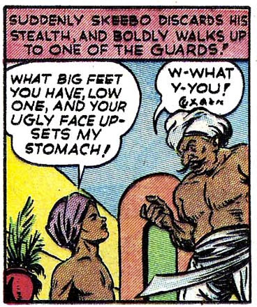
When men were men and insults were insults!

(From "Cat-Man Comics" number 2, 1942.)

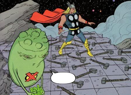
Caption Challenge 132: Dooplicitous

It's time for another new Caption Challenge! This week you're tasked with coming up with the best replacement dialog for this comics panel:

I'll pick out some as my personal favorites to highlight in a post next Monday, and then I'll choose one of those to bear the standard as the "Featured Creator of the Week" atop the right column.

All entries must be left as a comment (or comments) to this post. Keep ‘em clean (appropriate for a late-night broadcast TV show), but most importantly, keep ‘em funny!

No limit to entries, but please, self-edit and only put up ones you genuinely think are good!

Character Challenge 102 Results

Many thanks to everyone who entered Character Challenge 102! Speedsters are tough to do since the base body in the program is so static. But once again you all rose to the occasion and produced some outstanding work. My personal favorites are below but I definitely encourage you to check out the original set of entries in the contest comments.

Continue reading