
(Characters & image ©2012, DC Comics.)

(Characters & image ©2012, DC Comics.)
Posted in Daily Random Panel

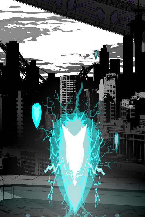
Two cowled, other-worldly menaces from the biggest movie (and book) franchises in modern history face off in this week’s “Versus”. Each have one foot in the material plane and the other firmly planted in something closely resembling Hell. Both give our heroes a run for their money and serve a master of evil. At some point, they’ve all been mistaken for curtains. So who would win in a fight?
A dementor’s main power is to suck the soul from its target, which raises the first question of whether or not Nazgûl even have souls. From the reading I’ve done, I think they do — they’re still mortals, just with their lives stretched far beyond that of normal men by the power of the Ring. There is something for the dementors to eat, therefore.
The Nazgûl have some powerful magic of their own, of course, including their own rings of power. Would those have any effect on dementors?
I don’t know, that’s why I am asking you! Sound off in the comments about which of these evil henchmen would defeat the other in an all-out battle.
Posted in Versus
It’s time for another new Caption Contest! Your challenge this week is to come up with the best replacement dialog for this comics panel (I’ll make the balloon as big as it needs to be since it’s so small in the actual production):

I’ll pick out some as my personal favorites to highlight in a post next Monday, and then I’ll choose one of those to bear the standard as the “Featured Creator of the Week” atop the right tool bar.
All entries must be left as a comment (or comments) to this post. Keep ‘em clean (appropriate for a late-night broadcast TV show), but most importantly, keep ‘em funny!
No limit to entries, but please, self-edit and only put up ones you genuinely think are good!
Posted in Caption Challenges, Challenges
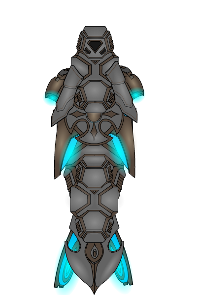
We got some kick-ass entries for our last Character Design Challenge, which tasked you with coming up with heroes (or villains) whose costumes were made up of everyday clothing items instead of spandex and capes. Without further ado, here are some of my personal favorites:
Posted in Challenge Favorites

(From “Captain Midnight” number 56, 1947.)
Posted in Daily Random Panel
Thanks to everyone who entered the last Pop Quiz, which challenged you to come up with a space ship. Here are all of the entries:
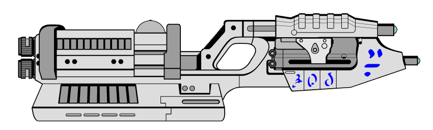
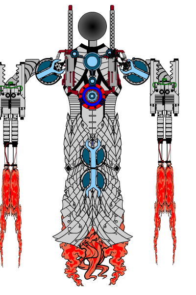

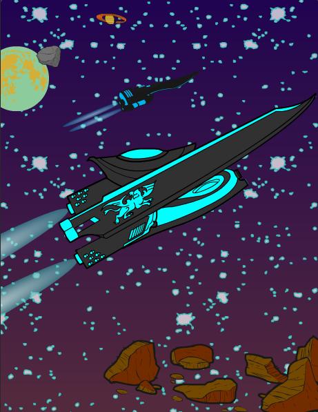
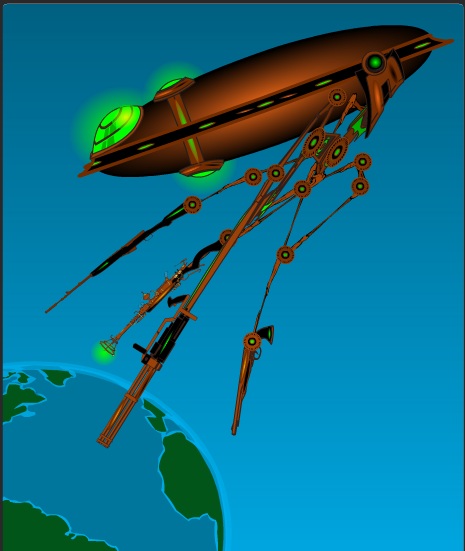
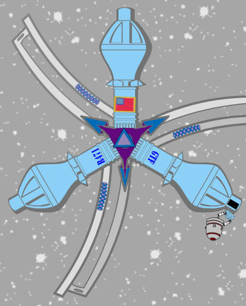
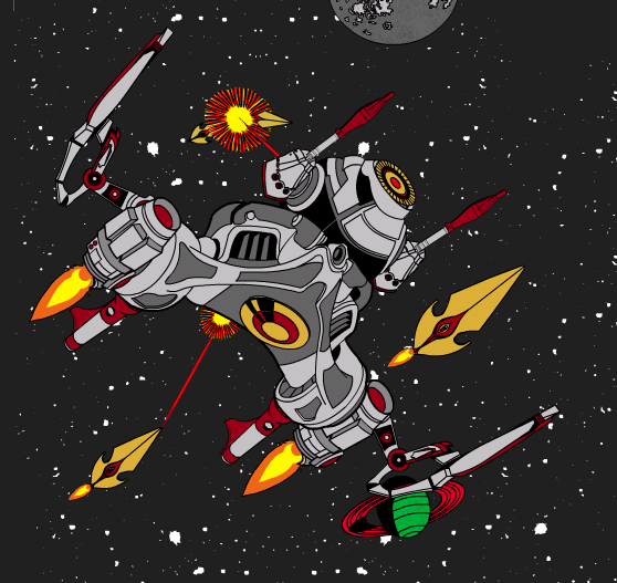
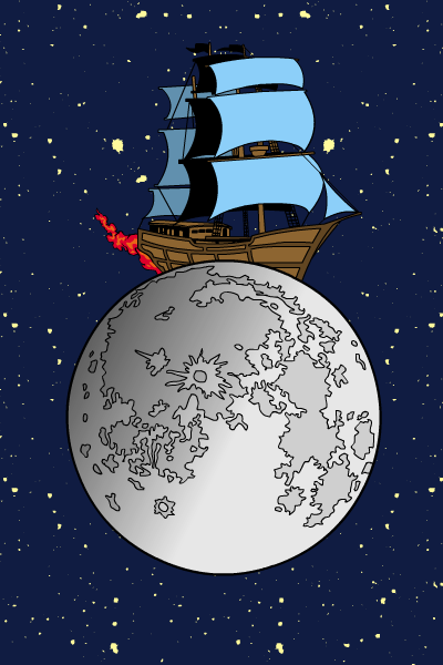
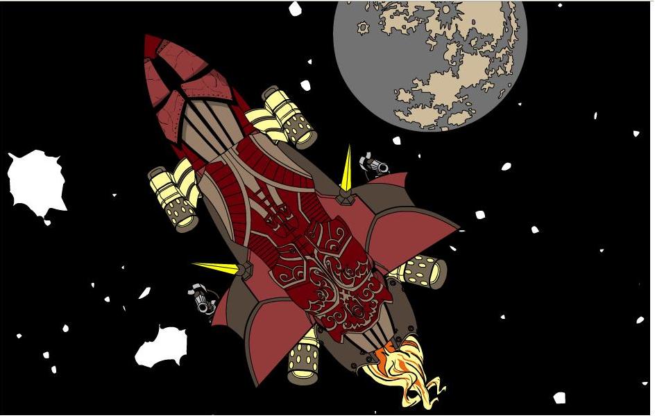
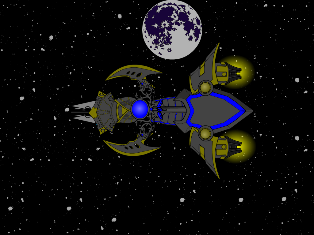
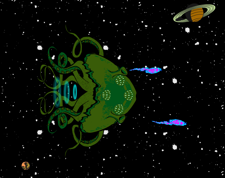
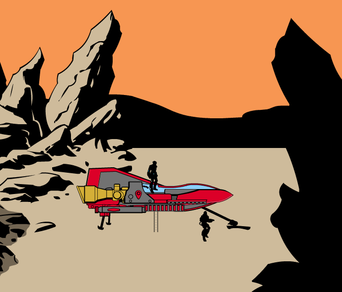
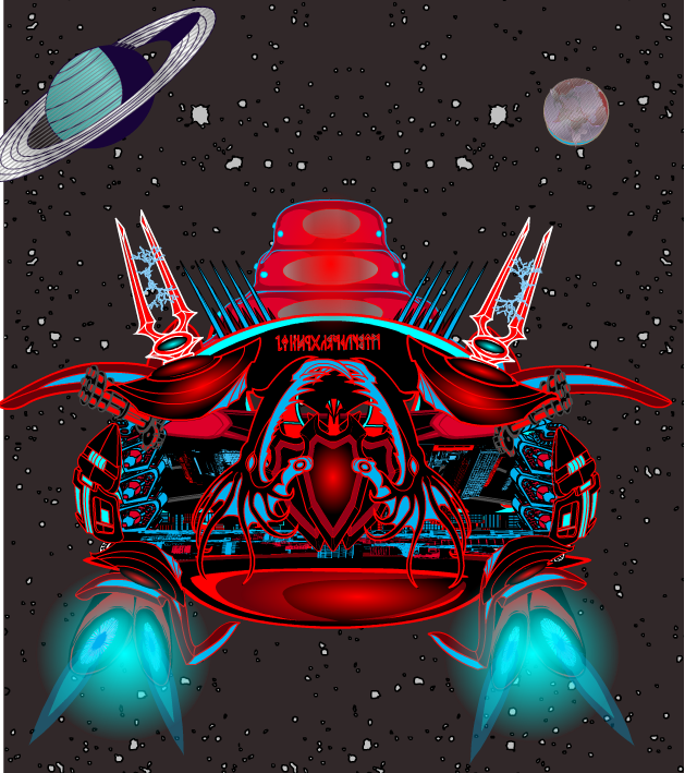
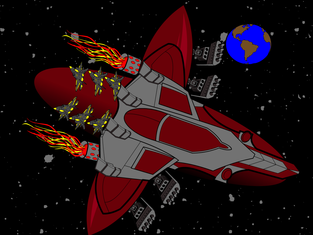
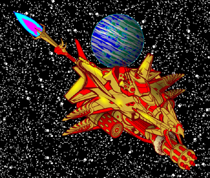
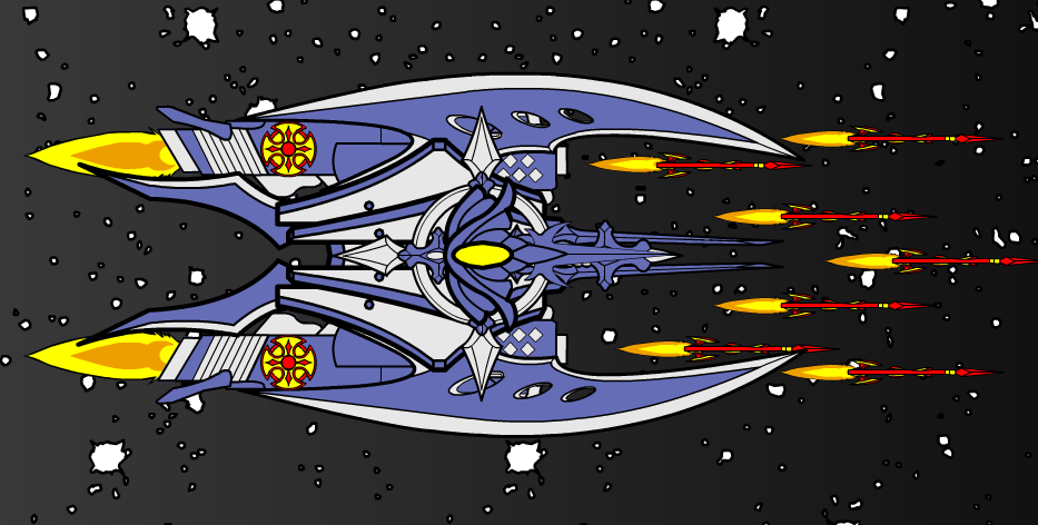
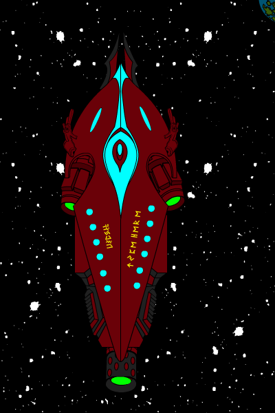
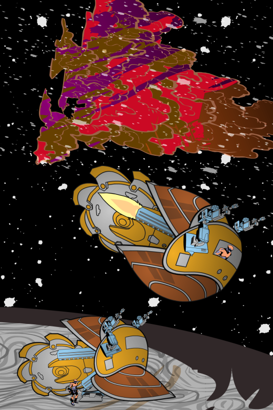
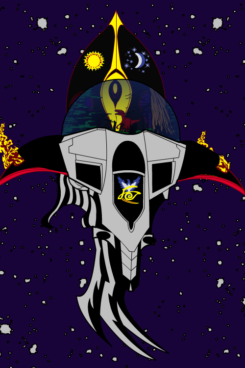
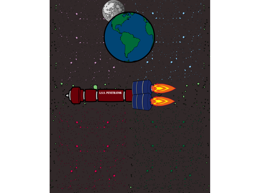
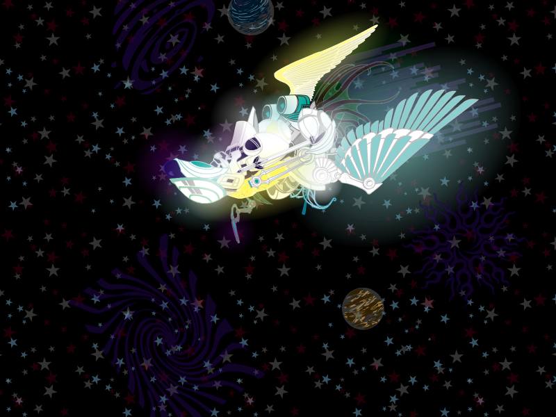
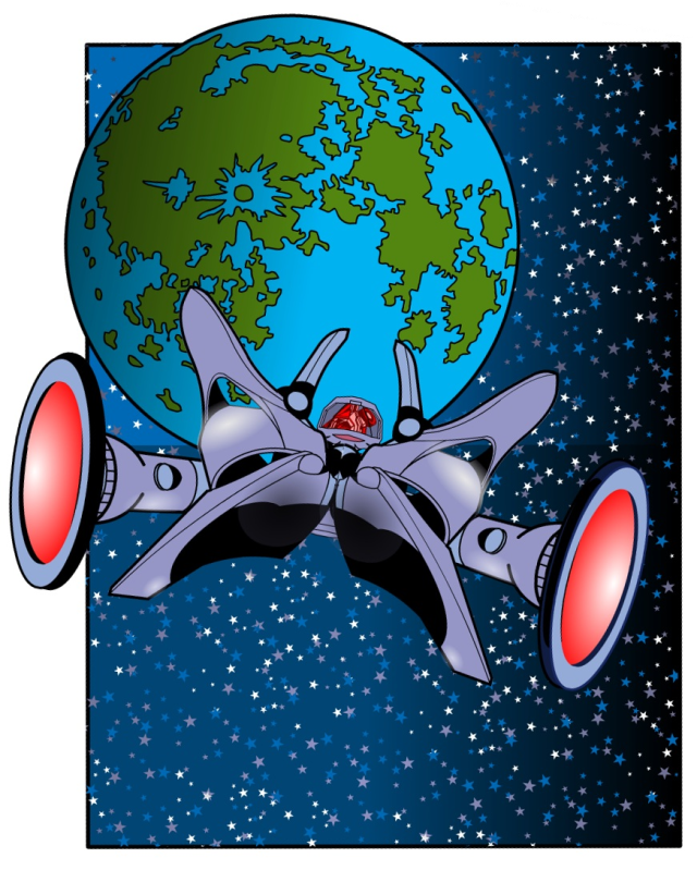
As for my personal favorite, I’m going to go with Skybandit. I liked the ship design the most, though the background and the planet I think aren’t as successful as they could have been. But it’s not a background challenge, it’s about the ship, and I thought this one worked great.
Congratulations to Skybandit and thanks to everyone who took the time to play along!
Posted in Challenge Favorites

Happy Saturday, folks! Your one-day quick-fire challenge today is to create a spaceship! Think the USS Enterprise, the Death Star, X-Wing Fighters, Martian saucers, huge interstellar gas harvesters, anything at all you can imagine that’s designed for travel outside of planetary gravity wells.
You only get one entry — that’s right, just one! So make it your best. Most of the other rules are the same as for a regular challenge, but instead of a whole week I’ll announce my favorites either tonight or tomorrow morning. Elaborate backgrounds aren’t necessary, though if you’ve got one it’s fine.
I’ll pick one entry as my personal favorite, which will get to be featured in the side bar to the right for ultimate glory! As a bonus you’re allowed to say you won the Internet for a few days.
Good luck!
(Image via Star Trek Minutiae.)
Posted in Challenges, Pop Quiz

(From “Captain Midnight” number 56, 1947.)
Posted in Daily Random Panel
By: Andrew Hines
 Cole Cash has long been a favorite of mine since he was created by Jim Lee (imagine that). Before he got canned with the rest of WildStorm, he was a real badass with a silver tongue and all the ammo he could carry. He ended up being a rather intriguing character during James Robinson’s run on WildC.A.T.s, due to his dealings with boss Jacob Marlowe. As I recall, he was also the only full-blooded human on the team of Kherubim-Daemonite hybrids. It seemed to be like putting Batman, a normal person without powers or special jewelry, in the ranks of the Justice League. So, you know, there’s that. The higher-ups at DC have begun integrating the Daemonites into the standard DCnU.
As much as it pains (and surprises) me to say, Rob Liefeld’s writing is actually better than his art, which is unfortunately still on the cover. This is actually the issue that brings out my inner geek to the X-TREEEEMMME!!! Sorry, I had to. Anyway, this is actually a decent issue as far as writing goes, but since it’s Liefeld it can definitely be better. I want to like it, because it’s Grifter, but for some strange reason it falls slightly short. Liefeld apparently couldn’t even be bothered to write the dialogue, which was done by Frank Tieri. You can sort of let that one speak for itself.
The art is decent, because it’s not whatshisname. Instead, the pencils were done by Scott Clark and the inks by Dave Beaty and colors were by Andrew Dalhouse. Like I said, the art is decent, not exceptional in anyway. I’d really like for something to stand out here, but it just doesn’t. Really, the only good piece of art is the cover, which is done by Liefeld. The colors are about the only really good thing in terms of artwork.
This earns a B-. I like where the story ends and hoe we can see more of it when Liefeld’s finished. It’s good if you know the characters, but if you’re just starting to know anything about Grifter or anyone from WildStorm, then check in later.
Posted in Super-Hero Stuff
 Three middle-aged nerds (including yours truly!) review all of the MCU movies in chronological order. Short, funny, and full of good vibes, check it out and let us know what you think!
Nerdmudgeon.com
Three middle-aged nerds (including yours truly!) review all of the MCU movies in chronological order. Short, funny, and full of good vibes, check it out and let us know what you think!
Nerdmudgeon.com