The results of this weeks poll were close guys, only one vote in it. But, of course, it doesn’t matter in the end how close it was because, as they say in Highlander- There can be only one! And this week that one is Anarchangel for Rhapsody.


The results of this weeks poll were close guys, only one vote in it. But, of course, it doesn’t matter in the end how close it was because, as they say in Highlander- There can be only one! And this week that one is Anarchangel for Rhapsody.
Posted in Challenge Favorites
For this week’s character of the week we’ll take a look at Torog’s Brain-Bot-3.0.

The thing that attracted me to this is the attention to detail used when constructing the subject. This is especially prevalent around the centre of the picture, the rocket mechanism made from the glove and shoulder items. The masking here really works, sometimes masking to join two items together can leave a mismatched line along the join, but here there doesn’t appear to be one.
Also, the design is very well thought out, it looks like it could conceivably be used in either a comic or a sci-fi movie. The item choices work well together and nothing seems out of place. There is also a menacing quality to the machine, having no face (the essential part of the anatomy for human interaction, without it there is no emotion, something which is inherently unnerving to us) as well as the large, fearsome looking claws, which, coupled with the non-humanoid body structure, suggests something alien and antagonistic.
The final thing I like about this piece is how it is finished. The colour choices for the body help the menacing aura, being dark and dingy. This is nicely juxtaposed against the bright and brilliant flame from the booster, although this may have been enhanced if there was some sort of reflective glow on the adjacent bodywork. Finally, the shading is very effective, especially on the claws and head. There are still some bits that could have been shaded where they aren’t, but there is a very good contrast between light and dark, especially as the dark seems to be more prevalent on the main body whilst the light is more noticeable on the extremities, such as the head, booster and claws.
Posted in Character of the Week, Things I Like
This week, I want you to come up with the best bit of replacement dialogue for this picture

Remember, keep it clean. You have until next Wednesday.
Posted in Caption Challenges
Hi everyone, JR here. As Kaldath is taking some time off from the blog, I’m going to fill in for him for his Wednesday posts this week (we’ll see what’s going on next week before I completely take over). I apologise about the following post, I haven’t watched as much anime as Kaldath so some of my examples may seem a bit different to what he usually puts.
This week we’ll talk about something that’s loosely related to what Kaldath was talking about last week; Shipping. In basic terms, Shipping is a fan term for the belief that two characters are/ should/ could be in a relationship (the term coming from the ship in relationship). The term was originally used for Mulder and Scully from X-Files, but has migrated to the world of anime, and also to other serials (the Harry Potter series for example).
The names of ships can vary, with there being lots of different ways to name a ship. You can have the names of the two characters with a / between (character1/character2), a word followed by the word shipping (e.g. Rocketshipping from the Pokemon franchise), portmanteau combinations of the two characters (e.g. Narusaku- Naruto and Sakura from Naruto) being the main ones used.
Of course, not all ships are canon, and many spring up through casual (sometimes unintentional or even dub edited) hints or through pure fan fantasy. Shipping is especially prevalent in series with multiple lead characters (often when there is one lead male and many female leads like in the harem genre), and often leads to rivalries between supporters of the different ships, especially if the issue of romance in the series isn’t resolved.
Now that we know a little bit more about it, what are your opinions on shipping? Any ships you support? Discussion below.
Posted in Anime

For this weeks challenge I want you to create a family based superhero team (like the one shown above).
Rules Specific For This Week: Each submission picture must include at least 2 characters that are related to each other in some way (Husband/ Wife, Brother/ Sister, Grandparent/ Grandchild, Parent/ Child), larger group shots are allowed. I will allow the use of external programs to put together larger group shots (more than 3 people), but ONLY for that purpose, not for effects and shading. Anyone taking liberties with this will be disqualified (believe me when I say I will be able to tell).
Please make sure you have read the rules before entering. As usual, no limit on entries, so have fun and good luck.
Rules for posts, contests, and challenges that I am hosting: Original characters only, no copyrighted characters, no characters based on copyrighted characters, no characters based on RPG’s or other games. The characters must be your own design and not based on any character that might be copyrighted in any way. I have the right to delete any post that I believe crosses this line without warnings. Only post characters that you have either created for this contest specifically or you know for certain have never been entered to a contest before. If you aren’t certain, don’t enter it, because I’m not going to go back through all of the contests and check.
Posted in Character Design Challenges
The winner of this weeks poll (getting nearly 50% of the vote I might add) is Can’t Draw for his Texan superhero Lone Star
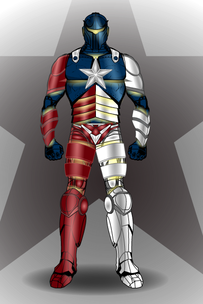
Posted in Challenge Favorites
This week, we’re going to look at not so much a character, more a scene by the master of Heromachine comic covers; RobM.
Incoming Message
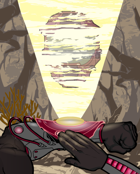
Now, the main thing that attracted me to this piece was the lighting, especially on the wrist projector and the right hand. There are some good hints here on how to get really bold lighting effects, so I asked Rob about how he did them and hopefully he won’t mind if I put up here what he said in reply:
“The wrist protector is one item from ItemRight Polearms with one gradient background shape masked to it and another laid on top. The masked gradient background shape has 25% second color and 0% line color. The pink glowing line color on the wrist protector is a result of the 25% darker magenta red gradient combining with the item’s 65% gray line color. Then there’s a second gradient background shape (the brighter gradient under the yellow disk) at 50% x 20% size laid on top.
The right hand is actually two hands. I masked the bottom portion with the thumb to an insignia so that I could use the darker prime color on the hand’s under side. The layer below is a full hand where I used a lighter color for the prime color. Then I laid gradient background shapes over each finger at strategic places with the prime and second colors at 50%. It’s tough to do shading on hands because masking works differently for hands than it does for other items.”
Whilst these might be the most striking aspects of the picture, it wouldn’t be half as good with out some of the finer details, such as the glow on the glove item underneath and to the side of the projection (especially on the wires, which can be very easy to overlook).
Also the projection its self is very well thought out. By a combination of a slightly transparent main focus (the helmet) along with the horizontal line effect and the clouds from the background items (masked to the beam) gives a very good impression of static interferance as usually seen in sci-fi war hologram communications.
Finally we come to the background. The best thing about this is that it doesn’t distract attention from the main focus of the piece in the foreground. By using earthy, dull tones and a lighter than black line colour, it contrasts with the clear, bold and precise foreground to give a distinct feeling of depth to the picture and suggest a murky, mysterious and dirty world beyond what we can see.
Very well executed.
Posted in Character of the Week, Things I Like, Tips & Tricks
Last week I ask you to caption this image:

and after combing through the entries I have picked out the following as my top five.
DC-Lover
Honey I can explain…I wanted to feel pretty
Calvary_Red
At least it’s not purple.
On second thought, I pick “Truth.”
Scatman
What did you mean about get out of the closet already?It took 15 minutes to find these outrageous boots!
Linea24
Yes, I know I look good. Now may I get out of this getup?
and of those five I have decided the winner shall be…………….
Calvary_Red

Posted in Caption Challenges
 Three middle-aged nerds (including yours truly!) review all of the MCU movies in chronological order. Short, funny, and full of good vibes, check it out and let us know what you think!
Nerdmudgeon.com
Three middle-aged nerds (including yours truly!) review all of the MCU movies in chronological order. Short, funny, and full of good vibes, check it out and let us know what you think!
Nerdmudgeon.com