
- This topic has 828 replies, 42 voices.
-
AuthorPosts
-
February 11, 2017 at 9:09 pm #142016

Christi SParticipantHeyall, sorry for the disappearing act! 2017 did not arrive quietly for me lol
But things should be calming down now (I think/hope) so Ima try n jump into this again soonish! ^_^
February 12, 2017 at 5:38 pm #142113
Christi SParticipantAnd this is me jumping in again!
For the extra half-point: My guess is Aladdin & Jasmine! And there’s a tower silhouetted against the moon out one of the windows.
For my entry: I did the scene that made me think Aladdin lol
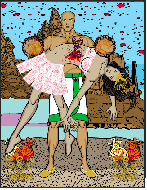
For my pieces: I did it musical chairs style! I used the snake as sand, the sand as fire, and the fire as the snake! =P
[img]https://s17.postimg.org/c8gslvudb/Screenshot_2017_02_12_at_4_34_35_PM.png[/img]
February 13, 2017 at 12:14 am #142121
KericParticipantYeah, I’m thinking he wanted people to guess Indiana Jones.
I call my piece a healing in the floating desert.
Breakdown: the floor is of course the floor AND the girls outfit, the fire is the fire AND the girls crown and the snake is the form the poison takes as it leaves her body, AND the containers for the fire.
(I looked at Christi’s pick~ yeah, I’d vote for it!)
 February 13, 2017 at 2:18 am #142123
Christi SParticipantIndiana Jones? Yeah, if your’e right, I was never gonna get that lol. I watched Indiana Jones just once when I was in like 5th grade and spent the whole movie preemptively trying to hide my eyes (but low-key, so no one noticed) because I’d been told someone’s heart got ripped out in a gruesome way at some point in the movie >_< (turns out that was actually in one of the sequels or something? Iunno)
I’m a bit less squeamish now tho so I can actually appreciate your piece Keric =P Its very cool, if more than a lil creepy/disturbing lol
Also… Pick? Vote? Whahahappen??
February 14, 2017 at 12:59 am #142194
KericParticipantpick is short for picture
Vote~ there was a time when the CDC~ a blog wide challenge was decided by vote. This challenge is still decided by the judge, basically what I am saying is, If you win, I can see why!
I think that you could maybe watch Indiana Jones now, because the effects not as shocking now a days, but if you do, maybe you should tell your friend that that part freaks you out, and to skip that part.
February 21, 2017 at 2:07 pm #142639
Herr DParticipantCharacterizing this week, I’d say K did some original thinking and CS did loads and loads of polish on a (an?) homage.
Keric ‘formalized the existence’ of his backstory with a presented title. Good story there. Christie’s background had depth in spades (see what I did there?) Had the stars been more diverse, or the walls had battle damage or something it might’ve fived. Keric’s background was a little flat, but the content was great. Floating land masses will do that.
Homages are nice but seem to produce a muted emotional effect in me. Keric’s piece had some ambiguity, so the emotional and items’ story category came out as a tie.
Bells and whistles were where CS really shone. K’s placement of two-toned fire was good, just ritually symmetrical enough that being identical was a problem. Otherwise it would’ve taken the category with that difficult posing. What really hurt him in Whistles was that second left hand. Snakelike would’ve meant it was part of her affliction. Translucent would’ve been a twitch effect. It looked like an error. CS’s lighting and depth took that.
I’m having trouble posting–continued in another post block.
February 21, 2017 at 2:39 pm #142642
Herr DParticipantItems: Musical chairs style was ambitious, and congratulations on doing so well with it. I almost wish I had a built-in bonus for that, but I doubt it will come up often. Fire as snake put in shadow was the right call, made it less awkward. I put it on par with the fire as a crown and two-toned ritual-affected fire. The sand as fire was more plasma wave with glowing embers, but fire, yes. And on par with the sand as not only sand but an interesting ensemble minus smoothness value. (Keric, if you had made that one ‘strip’ droop like cloth, you’d have fived that and gone up in Whistles. Now snake as sand on condensation residue, very believable, but that made the danger less real. Putting more sand above it would’ve also raised Emo val for you. Keric won that category with snake tat as a magical poison emanation AND the ritual cairn-altar-pieces. Double the misuses without a smoothness dock is pretty much an auto-five and a ‘sorry-I-can’t-give-more.’ It’s a ‘high-five.’ Heh, heh.
Bonus: CS–Aladdin and Jasmine were it. Two towers, one inside and one outside. Those items WERE obstacles for IJ:RotLA, but not so close to Indiana’s final gambit. Who’d’ve thought eyelids were so powerful?
Christie! Pick 3 and set a deadline!
Breakdown in next post.
BTW? Does anyone know why I can’t copy-paste pretyped text here? What’s so ‘dangerous’ about it? 403 danger . . . forbidden?
February 21, 2017 at 2:43 pm #142643
Herr DParticipantBkstory: C0, K2
Bkgd: ….C4.5, K3
ITEM1, SNAKETAT: C4,K5
ITEM2, SAND: C4, K4
ITEM3, FIRE: C4, K4
BELLS: C4, K3
WHISTLES: C4, K2
Items-story: C3.5, K4
Emotional: C3, K2.5
Bonus: C0.5, K0
Total: C by 2
February 21, 2017 at 6:32 pm #142655
Christi SParticipantAh, well thanx for both the edification and the compliment, Keric! N lol, I’m really not so squeamish anymore, I’ve just never taken the time to go back n re-watch it.
Its ‘an’, Herr D; silent consonants don’t count towards that particular grammatical rule. And yeah hahah… I myself took a look at my piece n was like; ‘there’s not enough sand in that hourglass for her to be in any kind of actual danger’. But I got lazy so left it.
Not sure about the copy/pasting text issue. I don’t have any trouble doing so. It could be because this site isn’t behind an SSL certificate and, depending on what browser/security you’re using, it doesn’t trust it to access your clipboard as a result? Maybe check the log on your browser and/or security and manually greenlight it for the future? Just hazarding a guess though. Could be way off.
Anywho, here are yall’s items! (with text in-image this time, because I finally learned fonts)
[img]https://s13.postimg.org/8ryrxnxev/Screenshot_2017_02_21_at_5_19_30_PM.png[/img]
Just as a refresher, I will be judging the entries by the same criteria/scoring system as the last time I did this:
1. Composition: The overall quality of the style/technique used in the piece. 2 points!
2. Element Composition: How well the items were used/fit in to the piece. 3 points!
3. Creativity: How well the items were MISUSED in the piece. 3 points!
4. Aesthetics: Which piece I think just has the better overall finished product. 1 point!
February 27, 2017 at 9:42 pm #142901
KericParticipantSetting a bar here… (First!)
I present a still from the “video” Strange train by Strange train.
The train- is the train, the tower is the fez, and the ruffle is the ruffle on the pink dress.
 March 3, 2017 at 1:59 pm #143087
Herr DParticipantOlga stood out when she applied to the old bindery. Russian accent, punk haircut, biceps bigger than Dave’s–not to mention first female mechanic we ever had. Mike gave her the usual tests, including the mystery gear. She was holding it, looking confused at it, when the greeting card spinner started burying her in those stupid art prints from the Widow Jefferies. He laughed about it and said she wouldn’t last when she didn’t give up on it after a month. Six months later, she figured out it wasn’t ours at all. It wasn’t. It came from an antique meat grinder that Sal’s Deli uses to hold up the corner of their shed roof.
She was so mad! Yelled at Mike in Russian while he stood there stunned for a minute. Then went dead quiet as he held out his hand to shake hers in admiration. He told her then, that no other mechanic had ever figured it out, and that she was ready to work unsupervised. You’ve never seen such a smile!
http://i1067.photobucket.com/albums/u438/jamais5/2017hm/HerrD-OlgaOnMikesTest_zpsy7ofjiah.png
*train as bindery engines, ruff as paper on cutting tower, tower as armatures, cutting tower, pieces of tower as switchplate and fluttering art prints.
March 7, 2017 at 12:31 am #143174
Christi SParticipantI forgot to set a deadline again, I’m sorry!
Lets make it the 15th
March 15, 2017 at 10:19 am #143461
Christi SParticipantAlrighty, it is the 15th! To the judgment!
1. Composition: The overall quality of the style/technique used in the piece. 2 points!
– Keric: Everything fits really well; definitely looks like a music video. The only thing that feels a little off is the perspective; maybe if the floor panels got smaller more rapidly? Or if the sizing/positioning of the figures was a bit more linear?
1/2
– Herr D: Love the sense of motion in the image; you always seem to capture that well. And the shadows are fantastic! Love the glint on the blade too! I would have liked to see some more gradients of gray and/or simply more colors though; right now it feels like the foreground is much more 3-dimensional than the background. The way the paper seems to bisect her arm, going behind the forearm but in front of the bicep is a bit awkward as well.
1/22. Element Composition: How well the items were used/fit in to the piece. 3 points!
– Keric: No complaints here whatsoever. Everything fits perfectly with the image; just looks very natural to the picture and not at all shoe-horned in.
3/3
– Herr D: The tower and the ruffles are awesome! Really great usage! And I definitely like the train as the machine, but the perspective doesn’t quite fit with the straight-on angle of the rest of the image. Maybe if you’d masked it as two different pieces and done the front part somewhat wider than the back?
2/33. Creativity: How well the items were MISUSED in the piece. 3 points!
– Keric: The tower as the fez is AMAZEBALLS hahah! I really adore that; looks great! The train and ruffles look good too, but weren’t really re-purposed.
1/3
– Herr D: Here too, I feel like the tower was the best misused. It fits so well with the second train piece and really looks like a turning device; again, great implied motion. The ruffles as reams of paper are also super smooth and flawless and a great idea I wouldn’t have thought of personally. Once again, though I like the intent with the train, I just feel like it came across kind of awkward.
2/34. Aesthetics: Which piece I think just has the better overall finished product. 1 point!
Both pieces communicate their story/setting very well, the expression in Herr D’s is especially fitting, but I’m going to have to give this point to Keric as I actually found myself trying to google Strange Train because I totally thought this was a homage to a real music video or album cover lmao!Final Score:
Keric: 6
Herr D: 5Keric takes it by 1! Pick your items!
March 15, 2017 at 5:09 pm #143466
KericParticipantOk, I did not expect a win! I set judgement time for the 31st, with these pieces …
 March 16, 2017 at 10:17 pm #144483
Christi SParticipantJust to shake things up, thought I’d actually do a superhero submission for once lol
I call him “Rook”:
[img]https://s16.postimg.org/xowpwswut/Screenshot_2017_03_16_at_5_42_49_PM.png[/img]
[i]Shoulder is the soles of his boots, blade item is his belt, and blunt item is his ship.[/i] -
AuthorPosts


You must be logged in to reply to this topic.
