Home › Forums › The HeroMachine Art Gallery › Lightningsword’s Superhero HQ
- This topic has 324 replies, 32 voices, and was last updated 4 years, 8 months ago by
JR19759.
-
AuthorPosts
-
August 3, 2013 at 1:54 am #28999
LightningswordParticipantIs this better?
 August 3, 2013 at 2:22 am #29001
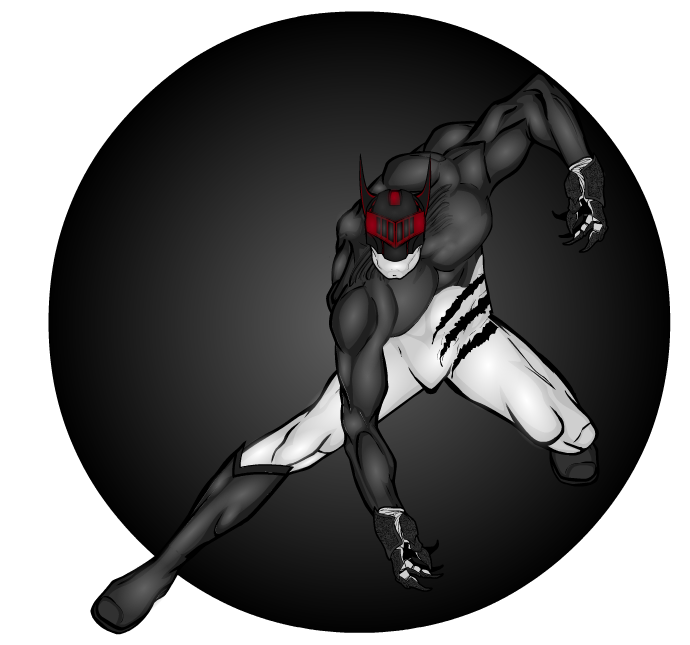
MaazParticipantSeriously lovin’ draken. And the more contrasting zypping on him looks cool too. Sweet work!
August 3, 2013 at 6:26 am #29009
The Atomic PunkParticipantFunny thing… on my work laptop (IBM ThinkPad T42), the “polka dots” are visible on the first version of Draken. On my home laptop (Lenovo Edge E531) not so much. I’ll keep in mind that the display that I’m looking at does affect the picture. That said… yes, the second version really pops.
Thanks for the compliment, LS. You made me blush.
August 3, 2013 at 7:45 am #29017
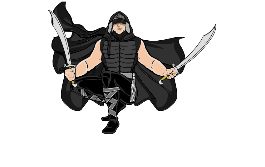
LightningswordParticipantThanks guys! if you were wondering, here’s the pose:
Download Draken.txtAugust 3, 2013 at 9:15 am #29024
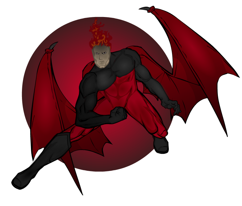
LightningswordParticipantName: Hellburn or Hellsburn
ALIAS: Guard of the Gate of Fire
TEAM: Villains, Warriors of Chaos
Hellsburn was Chaos’ right hand and adviser. Hellsburn was chosen by Chaos to seek for the other 8 who can be true Warriors of Chaos. The firs four were the 3 sons of Chaos; War, Death and Destruction and the fourth one was Hellsburn himself. He has now found six of the chosen ones and only two remain on Chaos’ list.
I’m starting to actually like complicated poses!August 3, 2013 at 9:41 am #29026
HarlekinMemberA simple advice.
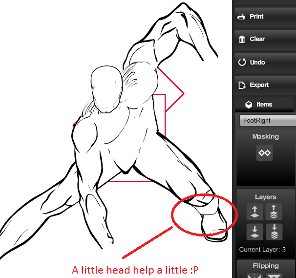
I think the pose is good for first time. But with the right leg (in front of the monitor) i miss the calf. If you give a head, that helps a little. Keep on going here is what i think. Nice attempt, i really interesting what you make in the future.

(44 kb
 nice my works usually 500K
  )August 3, 2013 at 11:36 am #29034
GuyGenesisParticipant@Lightningsword said:
BTW, a quick challenge: see if you can do a redesign on Nir Nallah, I personally don’t love it that much. And the best one will star on my group shot!
I’ll upload the text later if you like it
Attachments:
You must be logged in to view attached files.August 3, 2013 at 2:24 pm #29057
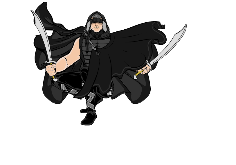
WMDBASSPLAYERParticipantReally cool poses and I dig the characters. One little thing though. David Flash is shirtless, so what is the cape held by? How about a rope or chain, whether from neckwear or an improvised part, around the neck to support the cape.
August 3, 2013 at 2:36 pm #29058
WMDBASSPLAYERParticipantGlad you liked the idea for the two winged characters, and pretty cool what you did with it! I’m going to take a shot at redesigning Nir.
August 3, 2013 at 2:45 pm #29061
JeimuzuParticipantReally nice job on Draken, everything from the pose to the costume is so VERY cool.
August 3, 2013 at 3:39 pm #29064
WMDBASSPLAYERParticipantHope you like my take on Nir Nallah. I did two because I like the first one but the overflowing blocks the view of the sash. I might do a shaded/highlighted version later.

 August 3, 2013 at 3:41 pm #29065
WMDBASSPLAYERParticipantBTW, I forgot to say I really like your character, Death. The design is just so totally different from what the name brings to mind and from any version of a character named Death that I have ever seen.
August 3, 2013 at 3:49 pm #29067
WMDBASSPLAYERParticipantAlso, suggestion for Korin Thos; make the energy more transparent because right now it looks like he only has one arm. I saw the hand in the closeup.
August 3, 2013 at 7:55 pm #29098
LightningswordParticipant@Harlekin: thanks for the tip! I’ll be sure to remember that!
@GuyGenesis: AWESOME! Great illustration! I want that txt file!
@WMDBASSPLAYER: Ah, detail. BTW, great redesign! Will you post the txt file for me please?
@Jeimuzu: Thanks!August 3, 2013 at 8:41 pm #29107
GuyGenesisParticipantGlad you like it, friend. Text uploaded to (character) post
-
AuthorPosts
You must be logged in to reply to this topic.

