Author Archives: mcknight57

Earning the Mantle

Earning the Mantle

By: Andrew Hines

Holy salted anchovies, there's been a lot of stuff going on for Arthur and company. This has been a much darker, more aggressive book than most in the New 52. It's not as dark as others like I, Vampire or Swamp Thing, but it's a hell of a change for Aquaman. This is a wrap up of the Others story arc. Bringing together Arthur's original team, this has been a wonderful run. We see Arthur finally confronting Black Manta and getting to the root of his anger. Before I start sounding like Dr. Phil, after that comment, I want to get into the actual review.

Geoff Johns has continued to do the unthinkable by making Aquaman a true badass and a hero of his own accord. The first part I should tackle was the pacing, which was perfect. Usually we see it go close to what the story should be or it'll sort of ebb and flow. Here, however, the story hits every marker right on time. The dialogue is great, without having too much or too little. The character interaction, especially between Aquaman and Black Manta is awesome. Everyone seems to play their parts perfectly and no expository stone is left unturned. Thankfully he didn't use a bulldozer to do the turning, though. The story is a fantastic conclusion to The Others storyline.

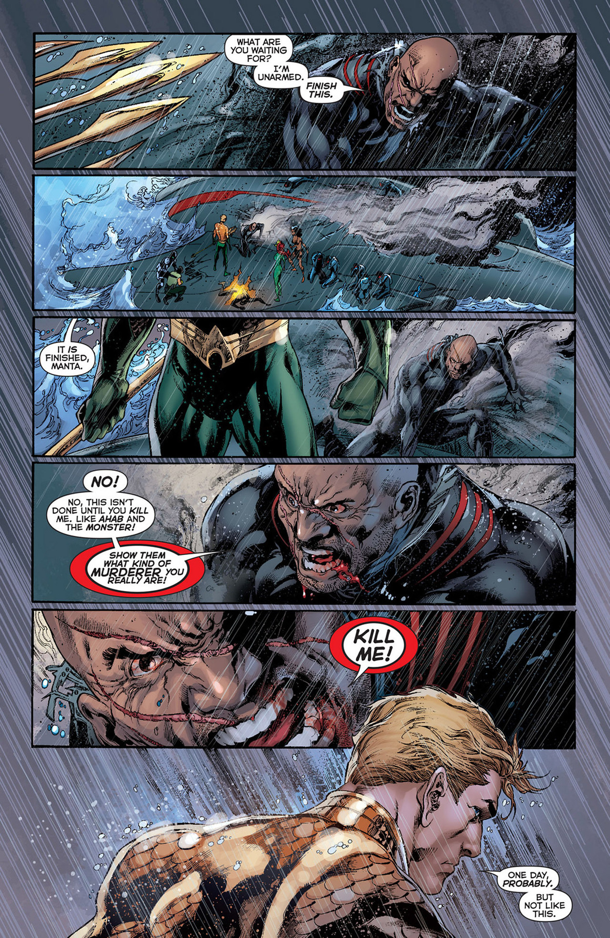
The usual art team is intact for this issue, with Ivan Reis on pencils, Joe Prado taking care of inks and Rod Reis doing the coloring here. The art is spectacular. It may seem like I'm being overly optimistic, but this team makes my definition of fine art. You can see it on the cover just as well as on the interior pages, such as the one at right. How many other art teams can capture the emotion and inherent danger of the storm raging on this page? The effects, such as the rain hitting Arthur's back and shoulders, are brilliant. It feels like a still from an action movie. The only way it could be more picturesque is if it were illustrated by Alex Ross. I really can't say much more about this, except that the colors are as fantastic as the line work.

This deserves an "A+". I have trouble finding anything wrong with this and looked through this with a fine-toothed comb. It's Aquaman. I wanted to find something that didn't work, but there was nothing. The ending was great and really made it seem more like a movie. I can't wait for the trade so I can read/watch the story in its entirety. Go out and buy the whole series if you haven't started on this.

More Power!!

More Power!!

By: Andrew Hines

If you've read Superman: Earth One already, you'll understand when I say that this is a worthy follow up to that first volume. Not only did it give us an updated origin for the Man of Steel, but we got to see what some of his other job options were. In this we get to see Superman and Clark both develop as people. There are some moral choices he'll make that may leave you stunned. There's a classic villain in there that many should instantly recognize. Even the question Superman vs the bedroom is tackled. That alone gives one of the greatest lines in all of recent comics.

That brings us to the writer of this fine piece of graphic novel goodness, J. Michael Straczynski. The starting point of this issue is quite clever and the way that Clark is depicted is interesting. The way that he depicts Clark in his younger years is probably the best way the character's been handled in the last few years. The character interaction overall is good, with everything being sort of tied together. The best part is that you don't really get that feeling until the very end of the book. It's not entirely "true" to the characters as Jimmy acts slightly more confident than he's typically written. Lois and Perry, however are probably written better than  they have been in the last ten years if not longer.

The pencils from Shane Davis are awesome, and make up a fantastic base for Sandra Hope's inks. Even uncolored, this would be wonderful art. Barbara Ciardo's colors work well and actually give us really cool lighting effects. Than can be seen in the electricity that Parasite is daring from the room and the lighting on Superman's face, arms and torso. Davis' design for Parasite is a great treat by itself. Especially in his powered-up state, he really looks like the classic villain. I'm just happy that they did away with the white stripes on his costume, which I never really understood anyway. I can't really say enough about the art in here, but I don't want to seem redundant. Suffice it to say that the art is as good if not slightly better than  Volume 1.

The graphic novel gets an "A", partly because it gives us samples of what would be both Clark and Lois' writing styles. That was always what helped make some of my favorite Superman stories. Really the fact that everything comes about as being sort of tied together or at least contrasted with an other piece of the story is fantastic. This, above almost anything else in DC, I urge you to go buy. If you don't have Volume 1, get that first and then buy this.

Avenging the Broodling

Avenging the Broodling

By: Andrew Hines

Apparently Wolverine's popularity is tied to his healing factor somehow.   He's been running a school for the last 19 issues. It's been his place to finally put his decades (more like a century) of knowledge and experience to good use. There've been some developments and I'm not even talking about Kitty being "pregnant". Well, I guess I am now. I mean before that, there was the Hellfire Club ('s children) attacking the school. Then we found out that a Krakoa was the school grounds, Angel came back all amnesiac and finally normal-looking-ish and Broo was shot in the head last issue. Any questions?

Jason Aaron has been doing a bang-up job of writing this series. This one, however was a little clunkier than the rest have been. It's mostly because he doesn't follow one simple storyline in this issue. The issue is broken up into three overlapping parts, with Kitty taking a more administrative role by interviewing prospective instructors, Beast doing his medical stuff and Logan doing "what he does best". The dialogue is good and fitting of every character, which seems to be something Aaron does rather well. The pacing is good and the ending gives us all just what we need. It's a good continuation of the events from the previous issue and a great lead into what could be one of the best arcs of this title.

The art from Nick Bradshaw, shown at right without any text, is actually as good as any of the previous issues. The way he depicts everyone is actually pretty cool, especially Beast and Iceman. I have a hard time not liking his art in general. Then there's the inks from Walden Wong, which are good and allow the colors to really pop. That brings us to colorist, Laura 'DePuy' Martin. Really, the colors she brings really bring out the effects. Even something as simple as the solution that Bro's lying in is wonderfully colored. It's little touches like that that really bring a page to life. The art here is damned good.

With that, I have to give this another "A-". There doesn't seem to be anything really missing from the issue. Even the very end is amazing. Oh, and did I mention that there's a classic X-Men member joining the teaching staff? That's kind of important. For that surprise and the great writing and artwork, you should really pick this up.

Enter the Man of Green

Enter the Man of Green

By: Andrew Hines

The annuals are still coming along. The great thing about this one is that involves a new villain that we've never seen before with a very personal grudge against the Man of Steel. Then there's the return appearances of Lex Luthor, General Lane, and John Henry Irons. This seems to be one of those "return of the supporting character" issues. It's fun to see all of these characters in the same place, just over a year after the introduction of the New 52. This may be one of the few annual issues that acts as both a standalone comic and a continuation of  events in Action Comics.

Sholly Fisch (yes, that's his real name) has penned a great annual issue here. Introducing a new version of the old and fairly obscure Kryptonite Man, he also brings in some old favorite supporting characters, as previously mentioned. Being as it's an annual issue with more pages than a regular, there was more room to be creative and write a great issue. That seems to have been more or less accomplished. You get a lot more for your money here. There's a better intro for the villain and with references to the first eight issues of the title. The dialogue is decent and the panel/page transitions are pretty good. Honestly, the greatest part of this issue was the tie-in to the original Action Comics #1 back in 1938, in Superman's original debut.

The art from Cully Hamner is good, for the most part. I actually like Hamner's art quite a bit. He was the concept artist for many of the New 52 costume designs. The art is great and somewhat simplistic due to Hamner pulling an artistic hat trick (triple-threat, trifecta, whatever) by putting up the pencils, inks and colors. As you can see at right, there are some great flashback moments here. The art is ink-heavy, but not in an off-putting way. The colors are rich and vibrant in the right places. Honestly, I still think John Henry Irons' (aka the hero formerly known as Steel) suit is a little odd. Not movie version "odd" but still. That design is probably the only artistic problem of this issue.

This comic has some great elements, both in the writing and the art. Therefore, it deserves an "A-". This could have been a little better, but not my too much. I definitely recommend that you buy this if you're a Superman fan or a completist.

P.S. I also recommend viewing the silent backup story here written by Max Landis and illustrated by Ryan Sook. We see a classic Superman villain being "born". He'll be quite interesting to see in later issues.

Day of the Hobgoblins

Day of the Hobgoblins

By: Andrew Hines

With the end of the current series fast approaching, Peter Parker is in for what may be one of the craziest adventures of his tenure as Spider-Man. We've already seen him put the end of the world on the back burner (ba-dum tssss), possibly cure Dr. Connors for good and put the world's worst sidekick in a permanent time-out. Now, with both his life and identity on the line, two hobgoblins dueling it out and Madame Web seeing visions of a dark future, this is the beginning of the end for our web-headed friend.

Dan Slott has done a fantastic job in the nearly two years since his run on Amazing Spider-Man began back in 2010. The recent partnership with Christos Gage has been a really good one. There are all kinds of great characters in this issue. The story picks up after the events of #695, and the pacing continues steadily. The dialogue is great and in parts I found myself reading it in the voices of the old animated series of the 90s. The story's good enough and tackles the two-part arc pretty well. The character interaction is pretty good and the ending is just enough of a teaser to keep you interested in the next issue.

This is one of the best single pages of ASM in recent memory. The art team does very well with Giuseppe Camuncoli as the penciller and Dan Green as the inker. Camuncoli's art works well and Antonio Fabela's colors are the dominant force in this issue. This page to the right is one of the greatest intro pages I've seen in a Spider book for quite some time. The best part is the inclusion of the majority of the issue's cast. You really see just how dire it is for Spidey at this point. The framing and the scale of the page are just phenomenal.

This get's an "A-" simply because it's a little on the nose for Haloween being just around the corner. It's a good issue and a great middle point in this three-part arc, but the fact that it is the mid point doesn't help it. Buy this one. At the very least it leads us into the end of ASM. As a piece of that history, it's worth owning.

Avengers vs Punisher

Avengers vs Punisher

By: Andrew Hines

We've seen a lot of the Punisher over the last decade or so. He's had major resurgence after being little more than a rage outlet for close to 40 years when he was introduced in the pages of Amazing Spider-Man #129. He's evolved as a character, somewhat, but his intentions have never wavered. He's still a killing machine and I don't believe that will ever change. That's where we are now. The heroes are at the ends of their collective ropes, Spider-Man especially. He enlists the help of the Avengers to stop Frank Castle once and for all. That's as much as I can say here. Now, on with the review.

Greg Rucka has penned a possible masterwork in the first issue of this five-part limited series. The best part of it is the attention to the story itself rather than simply making it another shoot-anything-that-moves Punisher comic. Whether you've been following Punisher since your momma let you read the big boy comics or if this is your first venture into Frank Castle's world, it's a great place to start. The pacing is fabulous. The dialogue is amazing and character specific. Rucka doesn't give Spidey his usual fight one-liners or witty banter, though there are a few little niblets of that. You can definitely tell that he's had enough. I know I say this from time to time, but the character interaction, particularly with Spider-Man and the Avengers, is phenomenal.

The art by Carmine Di Giandomenico is awesome. I mean, really. It's dark, both in terms of style and lighting. It's just so incredibly fitting that it's awesome to see. I mean that in the truest sense of the word. I am in total awe of the pages. They may not be the most crisp, clean lines anyone's ever seen but they're exactly what the story needs. The inks are heavy in al of the right places, adding more to the necessary shadows. Matt Hollingsworth's colors are great. Again, they're dark, the shading is great and the lighting is just magic. These two combine to make something stunning. I mean, it's sort of hard to see it from just this page, but it's the most I could show without a spoiler or three.

For all of that and more, this comic get's the rather unusual "A+" grade. The writing, the art and the characters themselves make this a can't-miss series if you are a fan of the Punisher, Spider-Man or the Avengers. To give you more incentive, it's even a dollar less than the usual Marvel stuff with its price tag of $2.99. What are you waiting for? Go out and get it.

A Change Is Gonna Come…Right About Now

A Change Is Gonna Come...Right About Now

By: Andrew Hines

If you've read Superman in the last year, you know Big Blue's been through a lot. Let's review. He's faced a being made of fire, an invisible alien monster, a being made of ice and face-off with Helspont. Then there was the whole "visitor from another dimension thing and another run-in with Helspont, which really didn't go too well. To top it off, Lois is in a relationship. That one sort of worked out well, though. After all, it made him available for Wonder Woman.

Scott Lobdell's giving us good writing here. The intro we've seen in all the other comics this week and last is a good start to the issue and brings us a few new developments to the character. The pacing is good, considering the event it's leading into. The dialogue is good and yes, there's a lot of it. Not as much as a Georg Perez script, but still a bit. This shouldn't be surprising though, given that Clark Kent is a newspaper reporter. He's got a lot to say and not just on paper. The writing overall is good, better than Superman's been in a long time.

The art is as good as any Kenneth Rocafort has ever done. As both artist and inker, he does a great job. The designs of Dr. Shay Veritas' suit (right) looks pretty cool. He brings his great eye for costuming to this issue. Then there's all the machinery in the first few pages which is pretty complicated. There's even the panel layouts that are sort of cool. The colors from Blond are pretty good too. He seems to have a unique style that he brings. There's not a lot of really deep color, but you can definitely tell where the light really hits. Some parts are rich and the appropriate areas are more muted. The only really bright parts on the intro pages are her hair and the "shield" on his chest. There's even a little bit of shine in his hair that we don't generally see. The art here really is just that good. These frequent collaborators do a great job on one of the most hit-or-miss books in the New 52.

The end result is one of the best issue of Superman since the reboot. I gig it an "A-", based on the writing and the art working so well together. As with all of Rocafort's work, it's consistent and portrays exactly what the writer seems to want it to. I can say there'll be a big change to the Superman status quo in this issue, but I can't reveal more than that without a pretty massive spoiler. With that being said, go pick this one up or read it online.

End of the Starfire

End Of The Starfire

By: Andrew Hines

This has been  good book from the start. I mean, I know we were all shocked by the way Kori was dressed in the first few issues, but thankfully that's been changed in the last few issues. There's a great team dynamic here in the fact that while nobody but Roy would admit it, they really do need each other in order to stay focused and grounded. There've certainly been some changes in their relationships with the Bat-Family and even their own, but the new normal is starting to grow on me. It just all seems to work much better now.

Scott Lobdell's been doing a great job on the writing since the first issue. I wasn't sure where it was going at first, but it looks like the only origin story left to tackle is Roy's. Again, character interaction and their relationships with the others on the "team" is interesting. I like the way they're headed with Starfire's story. Hopefully we get to see more of Tamaran in the future. The pacing has been good in this issue and it ends on a sort of bittersweet note. It doesn't seem at all clichéd, which is a rarity these days. The dialogue is good as is Roy's narrative intro. We don't see as much of Jason this time, though, which makes me sort of sad. That's really the only thing wrong with the writing here. Not enough Jason, but then this was intended to be a very Kori-centric issue, so I'll allow it.

Timothy Green II's artwork, combined with Blond's colors is pretty good, as you can see at right. The whole thing looks quite similar to Kenneth Rocafort's style, if slightly heavy on inks. This is one of the few titles where there isn't an additional name to work on inks. It's just the artist and the colorist, who work well together. This first page is a good example of that, at least in my opinion. The shadows are a nice effect here and the lighting is great throughout the issue. The effects in general are pretty impressive. I'd love to keep going on this, but if you can see what i'm talking about, just in the first page, do I really need to?

This gets an "A-", primarily because the cover's quite misleading. Well, there's that and I know that with "Death of the Family" around the corner, it's gonna be a whole lot better.

And Now For Something Completely Different

And Now For Something Completely Different

By: Andrew Hines

The great thing about DCU Presents is that you can just pick out the few with a storyline and characters that grab your attention. It's perfect for the picky completist in all of us comic geeks. This one in particular gives us two cool bench warmer heroes in one great starter issue. Blue Devil and Black Lightning have been relative unknowns for a while, with the exception of the latter's appearance in Final Crisis. I really can't recall much about Blue Devil, save for the fact that I always loved the idea of him. He was mentioned a bit in Infinite Crisis, but hasn't had a starring role in quite a while. Anyway, this might be the time to learn more about him.

Marc Andreyko's writing here is very good. The pacing is great as are the character introductions, both in and out of "costume". The setting of Los Angeles is really cool and not something we've seen yet in the New 52. Then there's the inclusion of what looks like both Spanish and Portuguese. That alone is more than other writers have done in a long time. The interaction between Daniel Cassidy (Blue Devil) and Jefferson Pierce (Black Lightning) is about what you'd expect when a new superhero meets someone dressed like the devil. It ain't pretty. Again, gotta say that the pacing is pretty good for a four-part story arc such as this.

The art team is awesome as well. The pencils from Robson Rocha are pretty damn good. The interior page on the right should be all the proof you need. Every other interior page follows this level of awesomeness. As you can see, Oclair Albert's inks work very well with Rocha's art. There's almost exactly the amount of shading you'd expect from late night in L.A. Gabe Eltaeb's colors sort of pull everything together. Even better than this creative team, I think, are the costume designs themselves and the effects that the team has given us. Danny's suit in particular is just a huge step up from the old days. The same can be said for most of Jefferson's costume, with the exception of the Booster Gold-style headgear/glasses.

This ends up just being a great issue and a wonderful start to what could be the best DC Universe Presents storyline so far. This get's a straight "A".

Gotta Clear This Up

There seems to be a misunderstanding about who does the reviews. While Jeff takes care of the site and the regular posts, I (Andy aka McKnight57) write and post all of the reviews. There seem to be a few comments to these reviews that are addressing Jeff. Just wanted to be clear on that. I'm not annoyed so much as I honestly don't know if he's reading all of the comics that are being reviewed here.