I can't say I like this one as much as the first, but it is what it is. Here it is on the challenge site, and here's the original:


Sponsored Links (which Premium Members will never see):
I can't say I like this one as much as the first, but it is what it is. Here it is on the challenge site, and here's the original:
Comments Off on 30 Characters Challenge #2: Space Soldier On Break
Posted in 30 Characters Challenge, Sketch of the Day
By: Andrew Hines
 Holy salted anchovies, there's been a lot of stuff going on for Arthur and company. This has been a much darker, more aggressive book than most in the New 52. It's not as dark as others like I, Vampire or Swamp Thing, but it's a hell of a change for Aquaman. This is a wrap up of the Others story arc. Bringing together Arthur's original team, this has been a wonderful run. We see Arthur finally confronting Black Manta and getting to the root of his anger. Before I start sounding like Dr. Phil, after that comment, I want to get into the actual review.
Geoff Johns has continued to do the unthinkable by making Aquaman a true badass and a hero of his own accord. The first part I should tackle was the pacing, which was perfect. Usually we see it go close to what the story should be or it'll sort of ebb and flow. Here, however, the story hits every marker right on time. The dialogue is great, without having too much or too little. The character interaction, especially between Aquaman and Black Manta is awesome. Everyone seems to play their parts perfectly and no expository stone is left unturned. Thankfully he didn't use a bulldozer to do the turning, though. The story is a fantastic conclusion to The Others storyline.
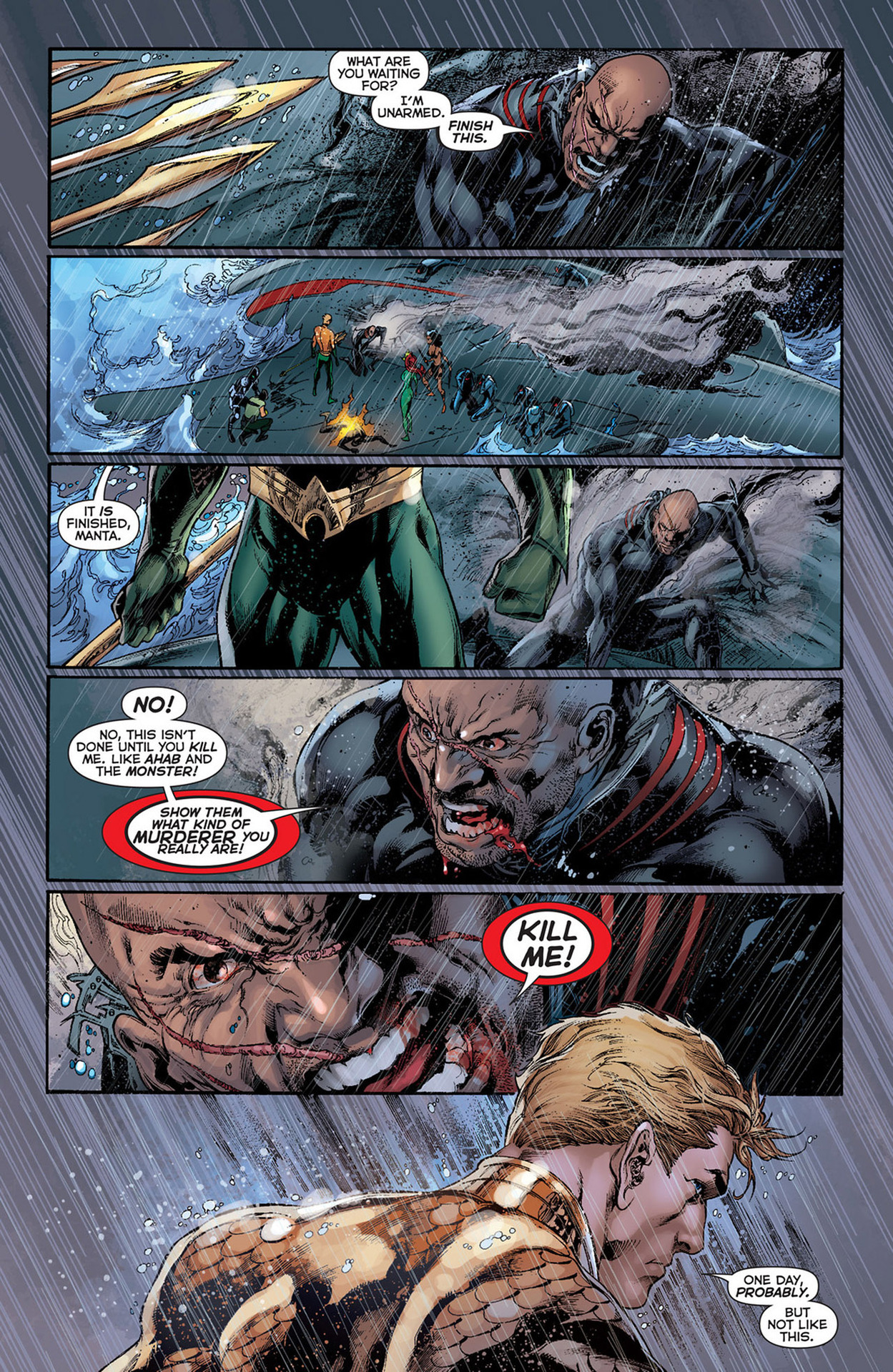
The usual art team is intact for this issue, with Ivan Reis on pencils, Joe Prado taking care of inks and Rod Reis doing the coloring here. The art is spectacular. It may seem like I'm being overly optimistic, but this team makes my definition of fine art. You can see it on the cover just as well as on the interior pages, such as the one at right. How many other art teams can capture the emotion and inherent danger of the storm raging on this page? The effects, such as the rain hitting Arthur's back and shoulders, are brilliant. It feels like a still from an action movie. The only way it could be more picturesque is if it were illustrated by Alex Ross. I really can't say much more about this, except that the colors are as fantastic as the line work.
This deserves an "A+". I have trouble finding anything wrong with this and looked through this with a fine-toothed comb. It's Aquaman. I wanted to find something that didn't work, but there was nothing. The ending was great and really made it seem more like a movie. I can't wait for the trade so I can read/watch the story in its entirety. Go out and buy the whole series if you haven't started on this.
Comments Off on Earning the Mantle
Posted in Cool Characters, Super-Hero Stuff
 My full-time (non-HeroMachine) job might keep me from actually getting to these before this evening, but it's time for another Open Critique Day!
If you have a HeroMachine illustration or another piece of artwork you've done that you'd like some help with, post a link to it in comments along with your thoughts on it -- what you think is working, what you're struggling with, etc. I will post my critique of the piece, hopefully giving some tips on how to improve it.
Of course everyone is welcome to post their critiques as well, keeping in mind the following guidelines:
That's it! Hopefully we can get some good interaction going here and help everyone (me included!) learn a little bit today.
Comments Off on Open Critique Day #49
Posted in Open Critique Day

(From "Cat-Man Comics" volume 2, number 5, 1941.)
Comments Off on In retrospect, "Cosplayers Anonymous" was a bad idea
Posted in Daily Random Panel
By: Andrew Hines
 If you've read Superman: Earth One already, you'll understand when I say that this is a worthy follow up to that first volume. Not only did it give us an updated origin for the Man of Steel, but we got to see what some of his other job options were. In this we get to see Superman and Clark both develop as people. There are some moral choices he'll make that may leave you stunned. There's a classic villain in there that many should instantly recognize. Even the question Superman vs the bedroom is tackled. That alone gives one of the greatest lines in all of recent comics.
That brings us to the writer of this fine piece of graphic novel goodness, J. Michael Straczynski. The starting point of this issue is quite clever and the way that Clark is depicted is interesting. The way that he depicts Clark in his younger years is probably the best way the character's been handled in the last few years. The character interaction overall is good, with everything being sort of tied together. The best part is that you don't really get that feeling until the very end of the book. It's not entirely "true" to the characters as Jimmy acts slightly more confident than he's typically written. Lois and Perry, however are probably written better than they have been in the last ten years if not longer.

The pencils from Shane Davis are awesome, and make up a fantastic base for Sandra Hope's inks. Even uncolored, this would be wonderful art. Barbara Ciardo's colors work well and actually give us really cool lighting effects. Than can be seen in the electricity that Parasite is daring from the room and the lighting on Superman's face, arms and torso. Davis' design for Parasite is a great treat by itself. Especially in his powered-up state, he really looks like the classic villain. I'm just happy that they did away with the white stripes on his costume, which I never really understood anyway. I can't really say enough about the art in here, but I don't want to seem redundant. Suffice it to say that the art is as good if not slightly better than Volume 1.
The graphic novel gets an "A", partly because it gives us samples of what would be both Clark and Lois' writing styles. That was always what helped make some of my favorite Superman stories. Really the fact that everything comes about as being sort of tied together or at least contrasted with an other piece of the story is fantastic. This, above almost anything else in DC, I urge you to go buy. If you don't have Volume 1, get that first and then buy this.
Comments Off on More Power!!
Posted in Cool Characters, Super-Hero Stuff
By: Andrew Hines
 Apparently Wolverine's popularity is tied to his healing factor somehow. He's been running a school for the last 19 issues. It's been his place to finally put his decades (more like a century) of knowledge and experience to good use. There've been some developments and I'm not even talking about Kitty being "pregnant". Well, I guess I am now. I mean before that, there was the Hellfire Club ('s children) attacking the school. Then we found out that a Krakoa was the school grounds, Angel came back all amnesiac and finally normal-looking-ish and Broo was shot in the head last issue. Any questions?
Jason Aaron has been doing a bang-up job of writing this series. This one, however was a little clunkier than the rest have been. It's mostly because he doesn't follow one simple storyline in this issue. The issue is broken up into three overlapping parts, with Kitty taking a more administrative role by interviewing prospective instructors, Beast doing his medical stuff and Logan doing "what he does best". The dialogue is good and fitting of every character, which seems to be something Aaron does rather well. The pacing is good and the ending gives us all just what we need. It's a good continuation of the events from the previous issue and a great lead into what could be one of the best arcs of this title.
 The art from Nick Bradshaw, shown at right without any text, is actually as good as any of the previous issues. The way he depicts everyone is actually pretty cool, especially Beast and Iceman. I have a hard time not liking his art in general. Then there's the inks from Walden Wong, which are good and allow the colors to really pop. That brings us to colorist, Laura 'DePuy' Martin. Really, the colors she brings really bring out the effects. Even something as simple as the solution that Bro's lying in is wonderfully colored. It's little touches like that that really bring a page to life. The art here is damned good.
With that, I have to give this another "A-". There doesn't seem to be anything really missing from the issue. Even the very end is amazing. Oh, and did I mention that there's a classic X-Men member joining the teaching staff? That's kind of important. For that surprise and the great writing and artwork, you should really pick this up.
Comments Off on Avenging the Broodling
Posted in Cool Characters, Super-Hero Stuff
By: Andrew Hines
 The annuals are still coming along. The great thing about this one is that involves a new villain that we've never seen before with a very personal grudge against the Man of Steel. Then there's the return appearances of Lex Luthor, General Lane, and John Henry Irons. This seems to be one of those "return of the supporting character" issues. It's fun to see all of these characters in the same place, just over a year after the introduction of the New 52. This may be one of the few annual issues that acts as both a standalone comic and a continuation of events in Action Comics.
Sholly Fisch (yes, that's his real name) has penned a great annual issue here. Introducing a new version of the old and fairly obscure Kryptonite Man, he also brings in some old favorite supporting characters, as previously mentioned. Being as it's an annual issue with more pages than a regular, there was more room to be creative and write a great issue. That seems to have been more or less accomplished. You get a lot more for your money here. There's a better intro for the villain and with references to the first eight issues of the title. The dialogue is decent and the panel/page transitions are pretty good. Honestly, the greatest part of this issue was the tie-in to the original Action Comics #1 back in 1938, in Superman's original debut.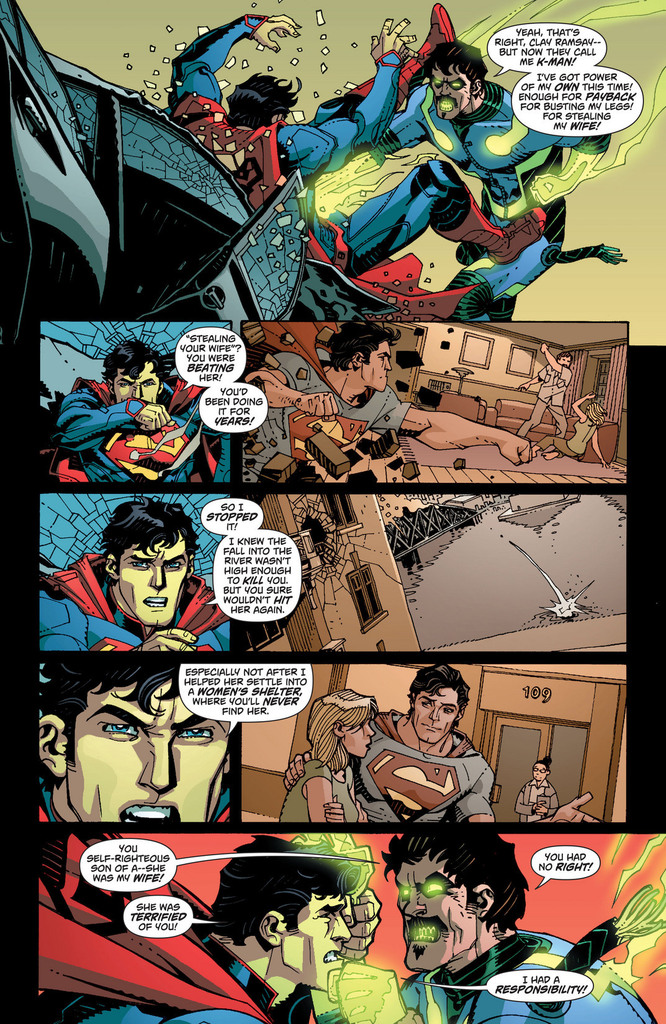
The art from Cully Hamner is good, for the most part. I actually like Hamner's art quite a bit. He was the concept artist for many of the New 52 costume designs. The art is great and somewhat simplistic due to Hamner pulling an artistic hat trick (triple-threat, trifecta, whatever) by putting up the pencils, inks and colors. As you can see at right, there are some great flashback moments here. The art is ink-heavy, but not in an off-putting way. The colors are rich and vibrant in the right places. Honestly, I still think John Henry Irons' (aka the hero formerly known as Steel) suit is a little odd. Not movie version "odd" but still. That design is probably the only artistic problem of this issue.
This comic has some great elements, both in the writing and the art. Therefore, it deserves an "A-". This could have been a little better, but not my too much. I definitely recommend that you buy this if you're a Superman fan or a completist.
P.S. I also recommend viewing the silent backup story here written by Max Landis and illustrated by Ryan Sook. We see a classic Superman villain being "born". He'll be quite interesting to see in later issues.
Comments Off on Enter the Man of Green
Posted in Cool Characters, Super-Hero Stuff
Here's my first entry into the "30 Characters in 30 Days" challenge, Von Goetz, ruthless Aerostadt Commandant of the Fatherland Imperium:

By all means, feel free to post links to your own submissions here as well!
Comments Off on 30Characters #1: Von Goetz
Posted in 30 Characters Challenge

(From "Cat-Man Comics" volume 2, number 5, 1941.)
Comments Off on Worst. Origin. Ever.
Posted in Daily Random Panel
This video features three of my favorite things: Adam Savage (from "Mythbusters"), Patton Oswalt, and comic books. Enjoy!
Comments Off on Adam Savage builds a Dock-Ock-a-Pus Halloween Costume for Patton Oswalt
Posted in Bad Super Costumes, Super-Hero Stuff, Things I Like
 Three middle-aged nerds (including yours truly!) review all of the MCU movies in chronological order. Short, funny, and full of good vibes, check it out and let us know what you think!
Nerdmudgeon.com
Three middle-aged nerds (including yours truly!) review all of the MCU movies in chronological order. Short, funny, and full of good vibes, check it out and let us know what you think!
Nerdmudgeon.com