
Logos are hard to design, requiring a deceptive level of simplicity that can communicate big ideas instantly. I applaud you all for taking a crack at it with our last Pop Quiz, and I am delighted to share the results here for your viewing pleasure:


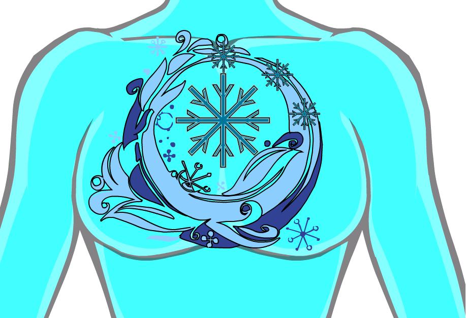
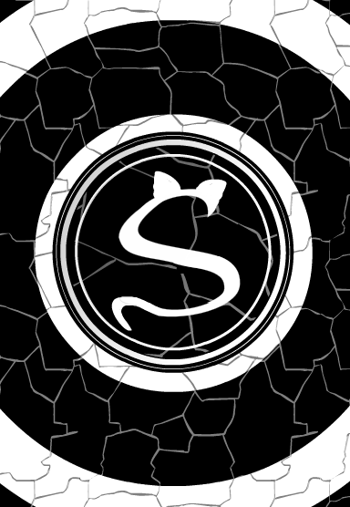
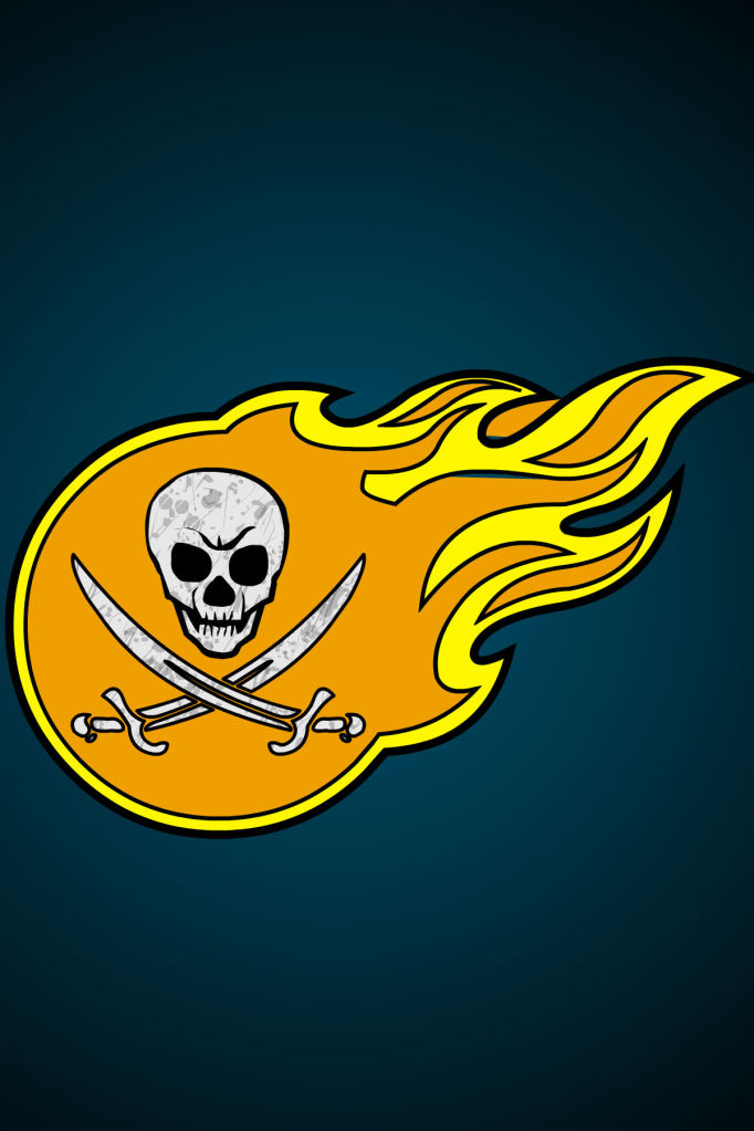
The key to a great insignia is minimalism, keeping it right on the razor edge of too little and too much information, so you get the maximum impact with the simplest shapes. I wanted to call out a few submissions that I thought accomplished this particularly well.
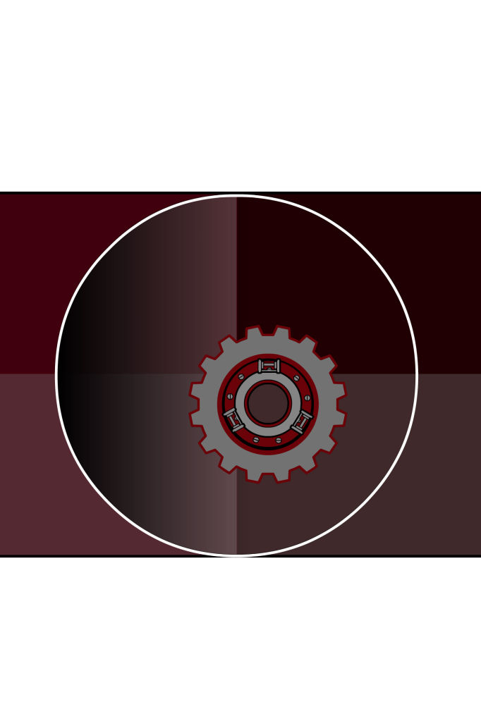
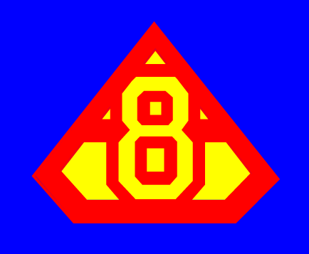
Decatonkeil’s “Merit” made great use of triangular shapes for his stylized “M”:

DiCicatriz’ logo for the group “Spectrum” clearly conveys that this is an LGBT team in a clear way:

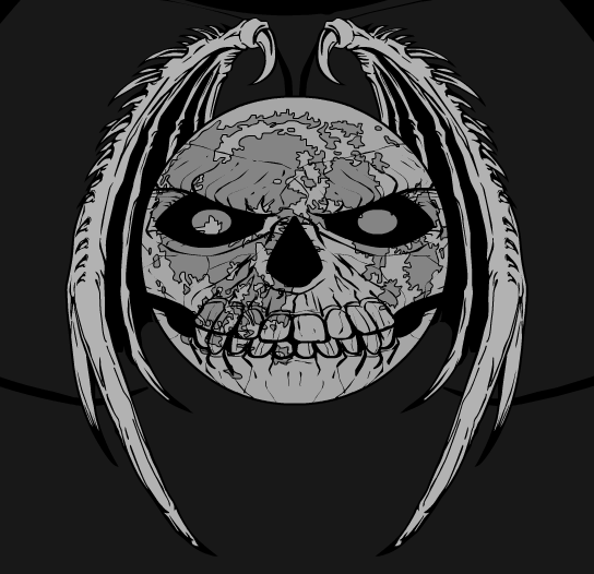
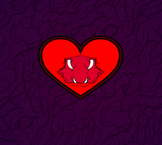
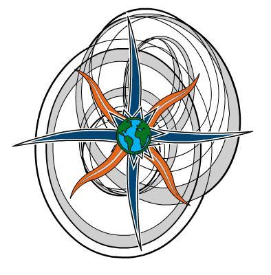
Unfortunately this one isn’t eligible for consideration since the submitter’s identity wasn’t in the file name, but I thought it was really well done:

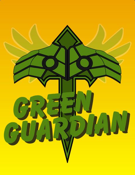
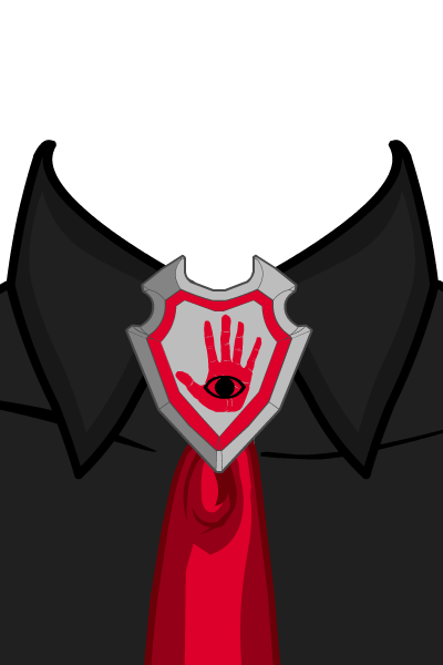
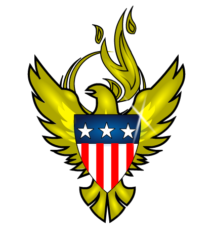
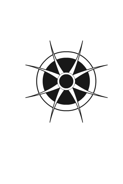
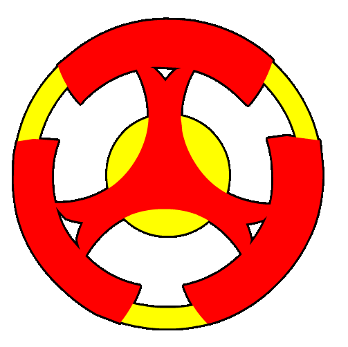
MisterDinoMan’s Apollo insignia is a great idea:

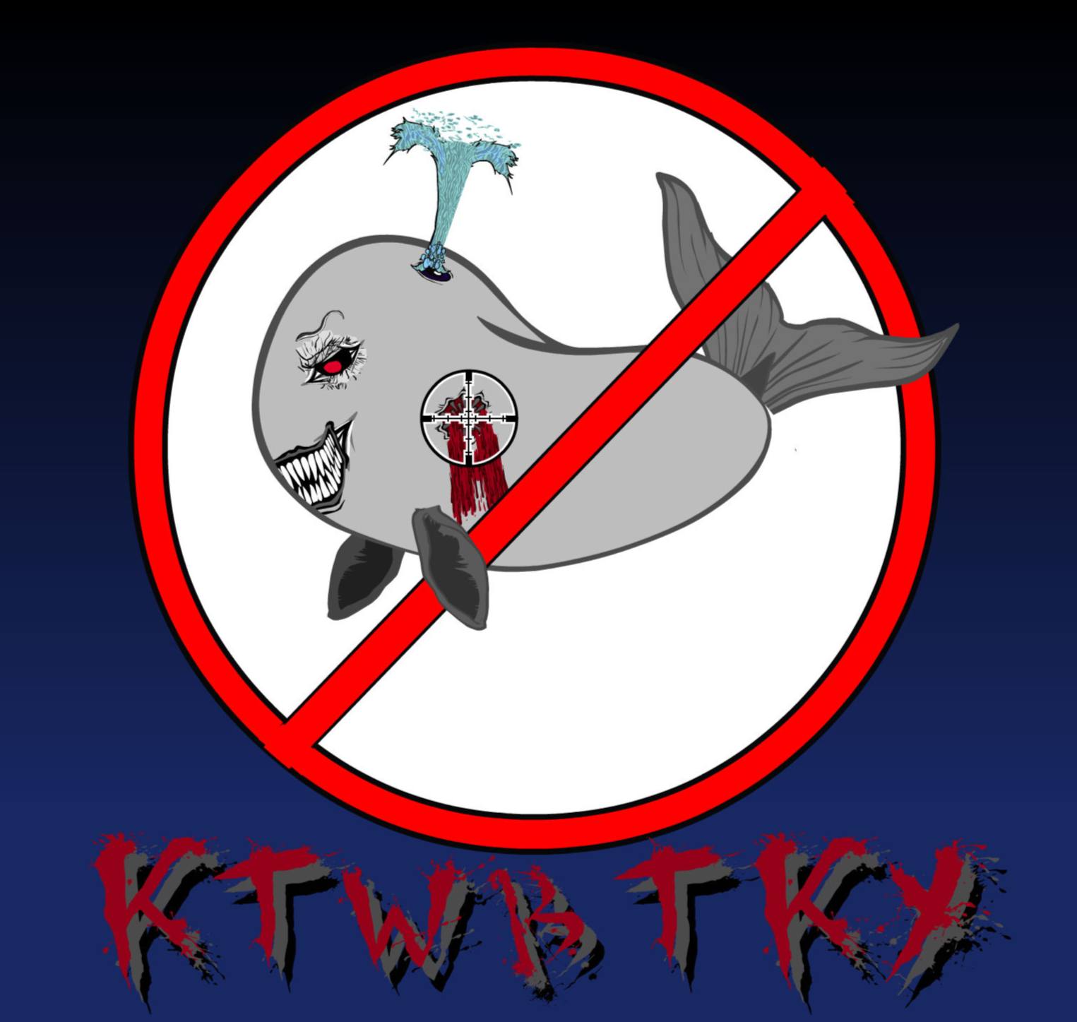
“Bluehawk” by NHA247 makes excellent use of negative space in the logo itself and shows what’s possible with essentially one color:

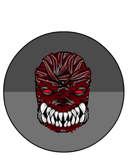
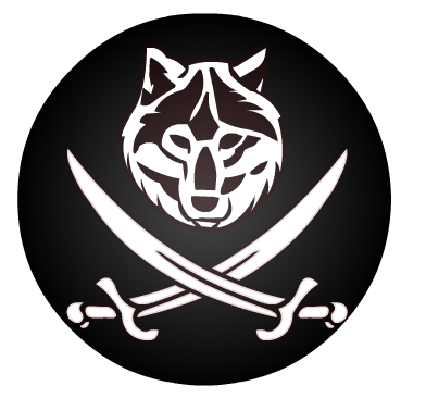
Renxin’s Ookami Jin looks good, too:

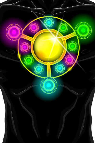
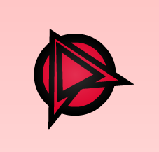
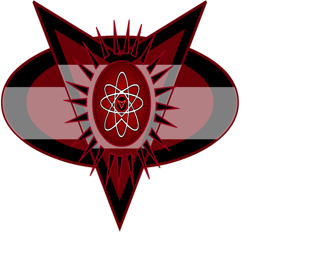
But for me, the best example of an insignia for a super-powered character is FRM’s “Haywire”:

It conveys energy and movement while suggesting both the hero’s name and power set. The colors are clear and sharp, and I could definitely see this on a cover or Haywiremobile or chest. Great job! That’s my personal favorite, but by all means chime in below to share what you think is the best one, and why.
Thanks again to everyone who participated!

love them all! thanks!
Congrats, FRM! “Haywire” is an instant classic.
Decatonkeil’s “Merit” is simple but iconic. One trick would be to mask the shapes to the body. It would give the “M” a form-fitting look.
djuby’s insignia is a little too complex for an insignia but an awesome design.
Fun stuff from all!
congrats to FRM. Some very good icons here. I’d like to see backstories for these.
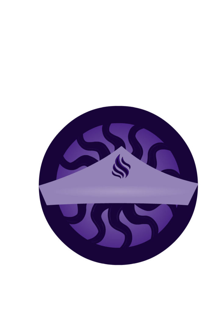
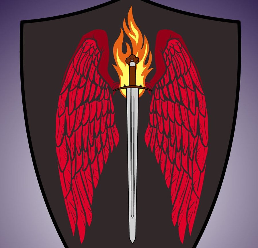
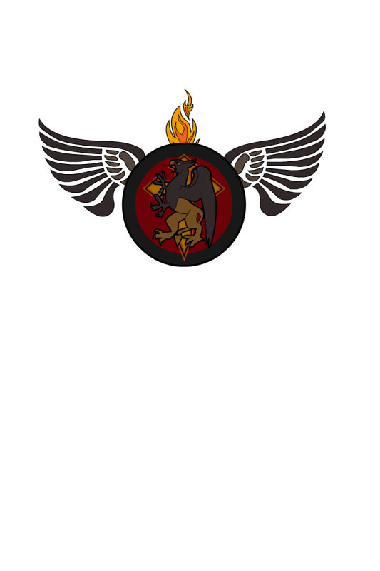
All good stuff; I just wanted to say that Shield of the Fire Clan blew me away.
Thanks Grady, glad you liked it. 😀
And congrats to FRM. There were lots of good ones, and I really liked his and DiCicatriz’s ‘Spectrum’.
Yeah FRM!awesome!
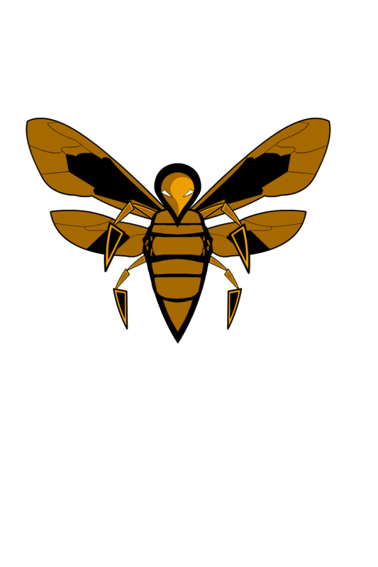
I also REALLy enjoy the way all the components of Alexanderoflimbo’s hornet were unconventional but simple creating what I thought to be a standout hornets logo!
Congrats FRM! I had a feeling yours was a winner when I first saw it. Very cool!
Thanks for the shout out! I’m still designing (and continuously redesigning) the team, but if anybody’s interested I’ll post up a group pic when I’m finished 😀