No character in comics history has had as many distinctive costumes as Wasp from The Avengers. The fashion-forward Janet Van Dyne likes to look good when she walks (or flies) out the door, so you're as likely to see her in the latest haute couture creation from Milan as a powered suit of shrinking armor via Tony Stark. In fact, you can see all of them at this amazing site, comprising page after page of her clothing choices.
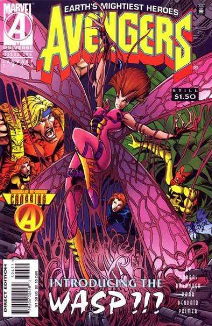
But one character design in particular jumps out as just awful. Apparently she was brought back from the dead somehow (comics, everyone!), only as a result she got transformed into ... well, this:
It reads like a checklist of Image Nineties cliches. Crazy long claw-fingers. Check! Insane, improbable, inexplicable hair. Check! Pointless leg straps. Check! Throw some pouches on that sucker and we're in the money, folks!
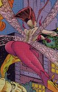
When I say "Insane, improbable, inexplicable hair", I want to be sure you understand what I mean. So I found this great shot from the rear:
Apparently she got too close to The Red Tornado during the last JLA-Avengers crossover and her mohawk got blown sideways. Seriously, you could scoop salsa with that thing.
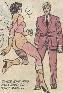
And lest you think this is the most egregious booty call in Wasp costuming history, let me disabuse you of that notion right away:
Despite how it looks, that's actually just the Marvel version of the Cosmic Boy Naked Bustier Effect from the Legion of Super-Heroes at DC. I'm pretty sure if it were what it looks like, it would actually be a better costume design.
So there you have it, people, the worst costume Janet Van Dyne has ever worn. Luckily the madness of the decade eventually passed and we could all get back to her spending more time in Macy's hunting sales than in the Avengers Mansion turning into a bug.
(All images and characters © Marvel Comics.)
Sorry, I couldn’t draw my eyes away from the “still $1.50” on the cover. sigh
Okay. That’s it. Forgetting 90’s Avengers in 3…2…1… So, what were we talking about?
This probably won’t supprise anyone, but this was from the same storyline that gave us S&M Thor and Teen Tony. They only costumes I liked from this whole revamp was Black Widow & Hawkeye. It’s pretty sad that this crap was only wiped out because of Liefeld. Yes, that right. Liefeld actually fixed something. I think I’m gonna be sick now.
Setting Liefeld’s art aside (which I hate), you have to give the guy props for being one of the main instigators of the “creator owned comics” movement. That’s a pretty big deal.
So for me i like a new born i never check the history of Wasp. But that site is awesome. I like the evolution of the costumes.
Yeap that 90’s version is sooo, hmmm how can i tell it. So i don’t like it.
I like this costumes. – But wich is my favourite it’s hard to choose.
Aug 1983, Jul 1977, Apr 1978, May 1988, Aug 1990, Oct 1990, Jul 1991, Feb 1998, Jun 1999, Jun 2001, Aug 2004.
Oh, totally. My main problem with him is that him and the Image guys, who I believe had good intentions with what they wanted, pushed the “EXTREME!!!!!” thing so far that it became a joke. Did they have an impact? Absolutly. But it also resulted in some truly bad comics, and pumped up some of these guys egos to an insane level. One of my favorite comics is Grendel. Grendel has always been controversial, but it never felt like it was put on. The early Image stuff felt like it was 6 guys yelling “LOOK HOW AMAZING WE ARE!!!” And I’m not gonna lie, I was all in at the time. But looking back, it’s some really bad art and storytelling. Liefeld is the poster boy for it, but really Lee, McFarlane, Silvestri and especially Larson were just as bad.
Gary Larson was part of Image comics? Can’t wait to see EXTREME cow tools!
Erik Larsen. The creator of Savage Dragon.
Do you guys wonder what, in ten years, people will be decrying from this era in comics? Is there a style as widespread and egregious as the Image Nineties that we just can’t see because we’re in the middle of it?
Right, with an “e”, not an “o”, so… I guess it wasn’t that funny anyway.
The funniest part of this cover is the text underneath that says “THE WASP!?!”. It tells me that even the illistrator can’t believe the horror of this psycedelic monstrosity. She looks like a bad 60’s album cover. Throw in the stupid looking demonic claws, and Annie Lennox hair it makes me wish I was color blind. Side note, I think that during the 90’s the Marvel team must have had over ordered the fushia dye!
It was a little bit. I was just never a huge fan of Far Side.
He probably thought he was on a bad acid trip or something.
I hit “Continue Reading” and then, MY EYES! MY EYES! THEY’RE BURNING! Even now there are after-images burning into my retinas. Yuck!
What the- what am I looking at?! It’s like bits from bad super costumes everywhere were melted together into this one hideous… thing. Ugh.
I had an action figure of this Wasp
I took one look at this thing and I was all…meh. I mean, I want to summon up some outrage for this, don’t get me wrong. This is hideous. But it’s also Wasp. No character has filled me with such abject apathy as Janet Van Dyne.
Why? Do you hate your eyes that much that you’d willfully subject them to that monstrosity?
It seems her resurrection turned her into a contortionist as well, with a very strange looking backside. No wonder Headband Guy unhinged his jaw at the sight of her.
Good point. As far as I’m concerned, the only other Avenger’s lady to give me that level of “meh” is Scarlet Witch.
Yeah, does anyone know if Miss Van Dine took the brown acid @ Woodstock
Wasp: Her look is so extreme, her teamates and the introduction to her is like “WTF?!”
STILL $1.50!!!
And thanks to Toy Biz, her extreme look is immortalized in plastic!!:
http://images.comiccollectorlive.com/covers/736/73605ac2-85a1-4c20-ba2e-11173ad6b757.jpg
Also…STILL $1.50!!!
It’s more butterfly than Wasp, but at least it’s credibly insectoid….. maybe TOO credible.