Completing our review of the Worst Avenger Designs in honor of the film, we turn at last to the Hulk. Since his entire outfit consistes of miraculously non-bursting purple pants, doing a true fashion review presents a major challenge. So instead, I'm going to pick what I consider the worst overall character design in his history.
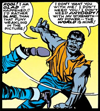
That turns out to be, surprisingly (for me, anyway), his very first incarnation as presented by Jack Kirby, the infamous Gray Hulk:
I'm not sure why both Iron Man and the Hulk were originally gray. Maybe Stan and Jack went through a color-blind phase there for a while? Regardless, besides the obvious non-green color scheme, the body design here is way on the Frankenstein side of the scale. Subtlety was never this creative team's strong suit, mind you, but I think this take goes way too far in beating the viewer over the head with the analogy.
This Hulk sports the body of a fairly typical person, albeit a somewhat muscular one. Not yet present is the gigantic scale, the massively broad chest, even the squared-off, ragged hair. This is just a beefy gray dude. Adding to the ordinariness is a decidedly Jekyll and Hyde aspect with the clear speech and the selfishness. This concept is not the unconstrained rage elemental the Hulk would very rapidly become.
I'm glad that transformation happened, as this is definitely one case where the original vision was inferior to what would follow. Thus, I'll take this as my example of the Worst Hulk Design.
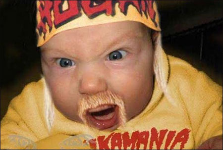
Plus, Original Gray Hulk wasn't even as scary as this version of a more recent Hulk:
'Nuff said.
It’s funny, Beast was originally gray too, when he changed to the furry version.
i mean its hard to bag on an early version of a character like this. i mean look at really old bugs bunny cartoons. he’s way different. that being said I think the worst Hulk design is the sexy “Professor” Hulk from the nineties. Completely not the Hulk. I know David and Frank’s run on that is good but that wasn’t a Hulk comic. My favorite Hulk look is John Buscema’s long haired “barbarian”. Im guessing it is supposed to evoke the show but I always thought of Conan.
Yeah, there was a thing with the color. Don’t recall it well, but there was a problem that forced them to choose grey at first. I’m sure someone here recalls exactly what
Remember also, in those early days Banner turned into The Hulk at sunset, and would revert to human form in daylight: another point that Marvel wisely changed.
I think they re-introduced that aspect of his powers when his Grey persona resurfaced. I seem to recall a Captain Universe empowered Spider-Man punching Mr. Fixit into orbit with the latter being chiefly concerned with drifting to the dayside of the planet and turning human again in the sunlight (also I guess the asphyxiation that would follow). Haven’t seen Grey Hulk in a while though, so I have no idea what the current status is on that…
Jeff! Have you forgotten Hulk’s humble beginnings in the Circus of Crime?
http://i1126.photobucket.com/albums/l607/DiCicatriz/Costume-Hulk.jpg
Elephant-Juggling Clown Hulk could give Grey Frankenstein a run for his money in terms of worst costume 😉
I guess looking back so many years to the origins of the characters, the benefit of hindsight can make things look a bit ridiculous. Anybody remember how sexist Reed Richards used to be? Or the leg-crushing alien Lucifer, nemesis of Professor X?
funny
Seeing a baby with that much facial hair is always scary lol. Seriously though, yeah I’m glad Hulk’s designers got there heads out of where ever they were and changed him into the green massive hulk we all know and love now.
Even better than those, in X-Men # 3 (I think) Professor X has a thougth bubble saying how he’s in love with Jean, but he could never be with her while he was in a wheelchair.
I think, back then, it was cheaper to use the grey ink.(maybe)
I think the grey ink being cheaper or more plentiful holds some weight. I keep hearing stories about how most of Spider-Man’s early villains are usually green because Kirby used most of the blue ink on Fantastic Four, so Ditko only had enough for Spider-Man, and green, being the most abundant color left, was used on the bad guys.
The not-quite-angry, speaking in full sentences part of the Hulk actually seems more off-putting than the color. Even with the current, post World War Hulk version, while capable of speaking like a normal person, you definitely read him as a seething maelstrom of rage and contempt against everyone. This is just…weird.
Ah, yeah, good old sexist reed… Back when the power of his to-be wife was to be invisible…
yeah superman was super-racist. wonder woman used to be the jla’s secretary. green lantern had a side-kick named pie-face. luke cages jive-talk. “sweet christmas!”
The color change was because the Grey look was hard to keep consistent. (You’ll notice that in the panel that’s shown, he looks almost blue) I’m not sure how that affected Iron Man, but they decided to scrap it with the Hulk and go with green.
As for the Frankenstein/Jekyll & Hyde aspects, those were fully intentional. The original character concept was a combination of Jekyll & Hyde, Frankenstein, and The Wolfman.
The grey is bad enough, but what makes this design is his gigantic head, and blue pants and yellow shirt. I expect this crap fro Leifeld not Kerby!
When you partake… when the sun goes down and the moon comes up, I turn into a teenage goo-goo-muck…. (The Cramps)
Where was I going with this… oh, I absolutely love Dr. Banner’s explanation in the Avengers. Very fitting. Love love love the Avengers… it topped The Dark Knight, with the awesomeness of Star Trek, and re-affirmed my fey-crushest for Robert Downey Jr. My brain expoded at the end of the credits.
I think Stan Lee said in a interview there was a printing issue with the gray which is why he’s green, But the gray was to save money or something I can’t remember.
What, you mean you don’t know the story?
Stan Lee originally meant for the Hulk to be gray because he thought it wouldn’t suggest any particular ethnic group. But colorist Stan Goldberg had trouble keeping the shade of gray consistent and the Hulk shifted between several different color shades in the first issue alone. One of those shades happened to be green, and when Stan Lee saw the Hulk with green skin he decided it looked better that way. Thus Green Hulk was born.
As for Iron Man, the reason the first suit was gray was because it was made of, y’know, iron.
I kinda liked the grey Hulk. I remember thinking when the color change happened that green seemed somehow less believable than grey. Somehow. Can’t imagine how. I think it may have been about the same time that I realized the Frankenstein monster was only green on the box illustrations from the Aurora plastic model kits that my brother and I used to build. Not together, separately; his wound up with firecrackers inserted anywhere you could insert a firecracker (the Creature from the Black Lagoon’s mouth was particularly apt) and seriously fragmented. Mine just crumbled over time ’til Mom tossed ’em. Good times, good times…
But, yeah, I have no problem with a grey Hulk.
The problem is not that he’s GRAY, the problem is in the entire character concept, both visually and thematically, as I say in the original piece. A Jekyll and Hyde Frankenstein mashup with a side of werewolf in a regular looking if muscular body isn’t nearly as good a concept — again, either visually or thematically — as the giant rage elemental.