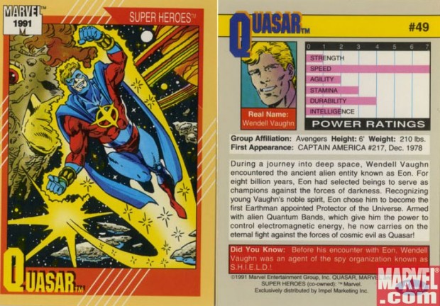
My main problem with Quasar's costume is the combination of the headpiece and the cape:
The cape portion covers his shoulders and upper chest, and looks full, heavy, and massive. Combined with the chin covering I feel like his entire top half is weighted down. Leaving off the crown to expose his hair adds to the confusion: though you'd think it would free up the claustrophobia, in a strange way it contradicts the feeling of the cape and creates some confusion, at least for me.
I do like how the interior of his cape reflects space, as if it's some kind of portal. But otherwise the colors and other bits lack imagination and style, leaving me a bit cold. Plus having bracelets on top of full gloves is weird, like my "two boots" aversion.
Overall I'd give Quasar a "C" for a couple of nice elements offset by a dull design and a suffocating top half. How about you, what would you say about this costume?
My problem with this outfit is the hair. If they covered his hair, or gotten rid of the mask I think this look would have worked, but having both hair and a mask does make him top heavy. I also think the cape is too far down his chest. I also think red, yellow and blue is a terrible color sceme. I think they should have made the blue parts of his costume a darker red instead of blue and the cape dark red too. This would probably help with the weighted feel of his overall costume, and bring more attention to the simple, yet cool looking symbol on his chest. I would change his gold arm bands for sleaker silver ones.
Quasar is a serial offended in the Wonder Man class of bad costumes. The thing about him is that he was supposed to be the replacement for Captain Marvel, so they tried to tie in his colors, but it just didn’t work in the classic way CM’s did. Sadly, this is one of his better costumes. Here’s one of his first costumes. http://www.comicvine.com/quasar/29-3319/all-images/108-209625/136188-quasar/105-111225/
Doesn’t batman have the same problem with the cowl and the cape in most versions? In Nolan’s “Dark Knight” he actually commented to Alfred on how much it bothered him during action, and how he can’t turn his head or something? That’s why he changed the Batman Begins costume to something less restricting.
Well, I’ve never really cared for the top-less face mask. But that’s mostly because I don’t know how the blasted thing would stay on. I picture the hero having to stop mid-battle to hike it up. And having it attached to the cape, to me, makes his head sort of disappear– too much of all the same color.
The real problem is, that the combined mask with cape AND chinpiece wouldn’t stretch very well: just turning his head, to say nothing of looking up, would be painful and restrictive.
The 90’s was plagued with the half cowl, and unfortunately, I have even designed a few characters with it. what really bugs me is the insignia is way to low due to how far down the cape goes on his chest. Also, The color choice is awful. I get the whole Cap-Marvel thing, but come on, be your own man.
The new costume is rad by the way, what do you think?
http://4.bp.blogspot.com/_nfasjqYWsX0/Sre0IR-R9AI/AAAAAAAAADk/QS1ufi5iVXs/s1600/new-quasar-marvel.jpg
Well, that does look better, Watson. At least he’s not wearing the topless mask, or a face frame, or even the old ’80s workout headband.
I figured I’d share this little joke panel I made. The central figure is the main character from the comic, McKnight (aka Michael Alan Colt “Mac”). The figure in the mirror is his grandson and second-in-command, Frank Marion (aka Lawman.) The little one comes as advertised, so to speak.
http://fc08.deviantart.net/fs71/f/2012/046/2/7/mcknight_and_gimli_by_heinz57xc-d4pu29n.png
This is my Favorite Quasar Costume : http://images.wikia.com/marveldatabase/images/9/99/Quasar.jpg
I made some adjustments to the costume to make it a bit more palatable to my tastes. Shoulder pads reduced and a lot less triangle pointing at crotch.
http://forums.ugo.com/attachment.php?attachmentid=82319&d=1329345841
Not bad. The shoulders are a little much, but it’s still an improvement.
Overall, this is one of those times when we might as well turn the thread into a contest, and have everybody try to re-design the outfit on HM3, just to keep it constructive. 😉
Hmmm…My original post is in limbo. Here is a redesign of the Quasar costume that Kaldath posted. Less shoulder pads and a lot less arrow towards the bits and pieces.
http://forums.ugo.com/attachment.php?attachmentid=82319&d=1329345841
After 8 billion years of picking and designing costumes for cosmic guardians… yeah, I’d just throw some crap out there. Hey! I have been a sentient entity since the birth of the universe itself granting you awesome power… you going to suit up or not?
Ah, screw it. I can always tweak it after I beat up a few dozens bad guys, get the girl, and save a galaxy or two. Yeah. I think I’ll endure a crap suit in exchange for awesome powers.
I liked the other Quasar better.
That just proves, again, the point that women in costumes make said costumes better.
I use to have a bunch of cards that had the info and power ratings of the character on them, ah memories…anywho, I think its stupid to have a maxed out speed with a low durability and even lower strength, so he flys fast to hit someone and just smashes on them like a fly on the windshield or something? I think there needs to be more catagories too like, energy power if a projector, or accruacy and power if a shooter, I could think of some more. I think its better to leave it to story and imagination rather than trying to quantify characters into a power rating.
Well considering the Power bands which give Quasar his powers are link Grenn Lantrens Ring on Steriod if he decided to ram something he could protect himself with an energy construct.