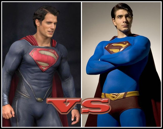
I thought we'd take a break from "Who can beat the crap out of whom" series of Versus Poll Positions and instead focus on one of our favorite subjects -- super-hero fashion! Thus:
Here are the major differences as I see them (actors aside):
- Cavill's midnight blue vs. Routh's more primary tone;
- No undies vs. Undies;
- Hex texture vs Spandex;
- No belt vs. Belt;
- Fatter, more traditional "S" logo vs. more angular, smaller logo;
- Wrist cuffs vs. No cuffs;
- Squared-off collar vs. tighter round collar;
- Piping details vs. No piping at all;
- Costume-sculpted abs vs. What God Gave 'im.
For me personally, I think I prefer the Cavill version for one reason -- it tells a story. The problem with the "Superman Returns" costume was that it was just a redesign, but it didn't really tell you anything about the man (or alien) wearing it. When I look at the costume from the upcoming "Man of Steel", I get at least a general "Kryptonian" vibe from it, which tells me that this is someone trying to retain some vestige of their history, their culture, their heritage. I don't know in what way or how it will translate into the story, but I get the feeling there's thought and story behind the choices that were made, and not just "Let's modern this baby up some".
But that's just me, I'd love to hear how you voted and why!
I would love to see a mash up between the two, The color of Cavill’s cape and neckline is awesome but I would like to see superman in a more hopeful color scheme like Routh. I do like the sculpted abs on the Man of Steel suit but hate the cuffs and logo.
You also have to recall that Superman Returns was almost worse than Superman 3. Routh’s craptastic acting aside, I have no intention of of ever watching Superman Returns again. At least not of my own volition anyway.
Plus, with Man of Steel, we get away from the whole underwear-on-the-outside superhero costumes and into the much more interesting way of costume designing that Man of Steel represents. The hex mesh stuff on Cavill’s costume also shows much more muscle tone than spandex, which is half of what a superhero costume should be.
Obviously I voted for Man of Steel, since we see the more classic “S” symbol and more heroic-looking individual as well.
This is the like a Yankees vs. Mets World Series. I hate both of them, thus I would hope they would beat each other senseless and bleed out on the side of the road.
Tough to say. I hate the “new” costume, but I have to admit that I buy Henry Cavill in that costume as Superman a lot more than I buy Brandon Routh in the classic costume as Superman.
While I think Supes’ costume is awesome in comic form, but not in realistic movie form. So I went with Cavill, but I do think it’s not as well-balanced as the original (too much blue).
Of the two I’d have to pic Cavill’s however I
d perfer it more of the bright blue of Routh’s and maybe make the piping, and the cuffs Red.
Henry Cavill looks like he is trying to laugh off the burrito he had for lunch while wishing his costume had a buttflap. Superman Returns was just awful. No vote for either.
I think Cavill feel ashamed if he must wear undie outside, so the designer hide it
I’m not a Supes fan. Haven’t seen a Superman movie since Richard Pryor and Jon Cryer….for very good reason.
I don’t know/care about either of these two actors. Christopher Reeve is and ALWAYS WILL BE Superman, period.
As far as costumes are concerned: Cavill’s hex, logo, and square neckline are all better. Routh’s “traditional” costume appeals more out a pure sense of nostalgia, but the logo shouldn’t have been messed with and the cape and undies need to be redder.
PS: Codpieces have always made me uncomfortable, but Routh could use a little more Cavill in that area. He looks a little…ahem…Ken doll-ish. But Cavill loses points for having tailored abs. That’s almost as metro as spray on man tans.
jack kirby saved hostages!
http://www.cracked.com/article_19458_the-5-most-badass-teams-famous-people-to-ever-join-forces.html?utm_source=facebook&utm_medium=fanpage&utm_campaign=new+article&wa_ibsrc=fanpage
I say the whole point of superman is the underwear on the outside unbelievably perfect person. I personally really dislike superman as a hero, but he is kind of fun when not taken seriously.
I wish I could vote for the Lois and Clark Superman over any of these two. Let me be honest–these guys are both two narrow of chest for what Superman was descended from–the reason he had a Strongman’s attires was he was built a bit broader. The costumes aren’t the issue for me. Although I prefer more classical.
I’m really torn on this one. On one hand, I agree that the Cavill version has a more spaceman feel to it, which is good. I also like that the colors have been toned down so I don’t need sunglasses to look at it. The muscles are a definite plus, and I like the bigger logo.
On the down side, the hex pattern is a little too busy. I think it would be better if the pattern didn’t extend over the S logo. That’s a small complaint though, and I imagine it won’t look as busy in action scenes when the pattern isn’t so obvious.
On the DOWN side, like, Marianas Trench depths down side, there’s the “crotch of steel.” It’s disturbing, and it’s impossible not to look at. The reflective nature of the costume means it catches the light. Then there’s the piping and the beltless buckle, elements that basically create a visual arrow to drag your eyes down. The angle of the cape at the shoulders and the pleats in it, which form a bunch of vertical lines, combined with the logo, creates more visual flow guiding your eyes down the costume. Notice the side detailing over his hips also creates arrows towards the buckle, which then points down. It’s like the whole costume was designed around one focal point, and it ain’t one I wanna be looking at.
Ultimately, I’m still going with Cavill’s version, mostly because I think it’s got a lot more potential. It seems more real to me.
I went with the Brandon Routh costume, only because it looks more like the Christopher Reeve costume, and by extension, the classic comic book costume. I mean, the costume isn’t super imaginative (pun intended), and I was never a big fan of the big blue boyscout, but it’s iconic. Why mess with that?
found this image online and feel this the direction they should have taken with the suit.
http://www.chartmovieinfo.com/wp-content/uploads/2011/09/henry-cavill-superman-man-of-steel-costume.jpg
Superman is meant to be a beacon of hope for humanity and can be played well that way (read the new Action Comics for a really good example) I think there is room in the superhero movie universe for a little more positivity in our heroes without making them seem lame.
I can’t help but think it’s too early for this poll. We’re looking at a sanctioned officially released photo of Routh vs. a bootleg on-set unauthorized photo of Cavill without the lighting, color correction, CGI or whatever that’s going to make it what it is when the movie’s released. I can’t know this for sure, of course, but I’d be surprised if it didn’t look different in the final product. Yes, we have the basic design of the suit to lambaste, but we don’t, I suspect, have the full picture.
That said, I’m voting for the MoS costume anyway. The producers had the guts to try something new; to put their personal vision out there. I am of the school that says no underwear on the outside, and the 1939 strongman-outfit roots of the look are immaterial now. I’m willing to give this change a chance.
Could someone define “iconic” for me?
Bah! Both designs suck! Superman’s costume didn’t change from George Reeve to Steve Reeves, and should never change.
Watson Bradshaw (14): Yeah, I’d really prefer that version over either of these two.
Skybandit (16): George Reeves I’m aware of, though I’m pretty sure the second one is Christopher Reeve from the Superman movies of the 70’s and 80’s.
Between Jim Lee’s pug-ugly super-armor and Caville’s attire, I’ll take Caville’s attire any day. It also looks somewhat conceilable, whereas Jim Lee’s abortion has space booties and a freaking turtleneck. How does Clark Kent hide that under his suit?
Rant aside… Both these costumes have their strong points and their weak points. Routh’s has the brighter blue but Caville’s has the brighter red. Routh’s has the nice belt and the red strongman shorts breaking up the middle, Caville’s has a nicer S-sigil. Routh has the traditional suit with non-sculpted muscle, Caville’s has the lower neckline which makes the supersuit more concealable under a regular outfit.
You know what? Tie. Both suits have their strong points and their weak points.
Although I find it intriguing that neither actor has managed to get the hair right.
Ultimately, Christopher Reeve swoops in in his Super-suit and beats both. 😉
Dean Cain’s Super Suit wasn’t bad either – http://images1.fanpop.com/images/photos/2400000/Dean-as-Superman-dean-cain-2451807-482-720.jpg
Arrgh! Do I go with the classic one or the cool lookin’ one? The original ones costume just looks like your every-day Superman, where as the other one looks like Superman but he got some advice from Batman on how to look cool. I haven’t seen anything cool about him in the movie, it’s not out yet, so I’m not sure how cool he is. In Superman returns, doesn’t he like save a lot of people from the airplane crashing into the baseball stadium? Or was that a different one? I think I’ll have to go with the Superman Returns one.
Neither is perfect for me (I’m a big supporter of Supe’s over-unders), but I certainly like the new one over the old one that looks like a halloween costume.
So in hungary we know a few of superman. If i see visualy, the new Superman cloth looks so good, but if i think for my childish head i well remember for the old cloth. It’s hard decision what i choose.
This poll position is actually quite pointless. Sorry, if that comes out too harsh, but it is like comparing an apple with a banana and having to decide, which is the better fruit.
There is no answer, because it is a question of personal taste.
Brandon’s costume is bright and cheerful. I like it for nostalgic reasons, because it honors the traditional take on superman.
Cavill’s costume is elegant and looks kinda SciFi. You can almost believe that an alien from a another planet might wear something like that. I like it because it promises a fresh take on Superman.
Hyperanthropos, so “Batman vs. Wolverine” is some sort of empirical exercise that can be determined with mathematical precision, unlike the messy example of which bit of fashion you like better? If you’re going to take the position that matters of personal taste are inappropriate topics for debate, then you’re not going to find much interesting around here 🙂
“I like bananas better than apples” is a perfectly valid answer. Objective truths are not the only truths there are, nor are they the only truths that are worthy of discussion. Subjective truths are fundamental to the human experience and a staple particularly of the geek culture.
Declaring the comparison of two different costume designs for the exact same character to be “pointless” isn’t harsh, it’s baffling. I mean, you might as well toss out all discussion of all forms of art, all discussion of what people you like better than other people, all discussion of politics, and the vast majority of human interactions.
I am a bit baffled on many levels. For one, this is the most Apple to Apple comparison you can possibly make. Superman costume vs. Superman costume. No bananas there.
Sorry, but underwear is out. Superman looks not so gay without.
And this… is my only argument for this vote. *rolleyes
Cavill wins hands down, however I think they logo should be shrunken down and lowered to the belt level as the “buckle”. More muscle structure is needed as well, showing strength through the design. As far as coloring… I’d prefer to lose the blue all together, aiming for either black or silver. I’ve seen some logo revamps out there that pay homage to the original, but have a much less “big s” design, like the Kingdom Come version. I’m really all for a total revamp from the ground up, not just with Supes, but 90% of mainstream comics. Without the same stories if possible…
@McKnight57:
That’ll teach me not to watch Hercules movies while I’m typing! 🙂
I was honestly trying not to say anything, since 98% of my posts drift into obscurity, but the numbers are too close on this one.
Seriously? 49% of you think the new outfit is better? If I recall correctly, I recollect Jeff saying, earlier on, when this new outfit was first spied, that it has a possibly more Kryptonian look to it. I won’t cop to that, but I will say this, It looks like what an intergalactic pimp might wear, one possibly from Krypton.
Cavill’s midnight blue vs. Routh’s more primary tone
At least with the primary colors being as brilliant as they are you can tell he’s a man who not only knows how to do his laundry properly, but cares about his appearance.
No undies vs. Undies;
The red undies gets a bad rep from people who hate on comics. Even when Robin started wearing leggings he still kept the undies.
Hex texture vs Spandex
I could be wrong, but I think that Routh’s outfit, at least the blue portion of it, was some sort of neoprene body suit, maybe a diver’s suit. Even still, what the heck does a super hero need with a hexagonal pattern all over his body for???
No belt vs. Belt
Since no incarnation of the suit has ever had pockets, the belt is there in case Supes needs to hang on to something yet needs both hands to beat Lex stupid. Also, nearly every memorable super hero has worn a belt, even if it was made entirely out of a strip of cloth and sewed into the outfit. What’s this new outfit have? A belt buckle without a belt.
Fatter, more traditional “S” logo vs. more angular, smaller logo
The size of the logo only needs to be large enough to be recognized, not to draw attention to one’s self. Is the new Superman that attention-starved?
Wrist cuffs vs. No cuffs
If one looks closely, they bare a striking resemblance to the Bracelets of Submission worn by Wonder Woman.
Squared-off collar vs. tighter round collar
Here’s the shocker, I actually like the squared off collar. It’s more traditional, shows off the man neck better, and lends the suit a more intimidating look.
Piping details vs. No piping at all
Piping is for formal wear and female outfits. What does a male super hero need with piping? that stuff can rip an outfit in twain if it snags just right. I don’t think anyone wants to see Superman flying through the air in his birthday suit.
Costume-sculpted abs vs. What God Gave ‘im.
The abs go up into the sternum! That just ain’t right. That’s the moment they cease being abs and become extra man boobs, or as I like to call ’em “moobs.” Sure, the movie incarnations of Batman’s outfit has the muscular look built into the suit, but anyone who knows enough about bats knows full well, in the movies, they are providing him with body armor. In the comics, the male super heroes simply doesn’t need his suit to make him look muscly… because he already has the muscles sculpted into something called a BODY, not a body suit. Regardless, I think that every Superman has at least held his own (with the changing times) in the real muscles department. If a Superman doesn’t have his own washboard then he’s not really a super man, is he? (yes, I typed that the way I wanted to)
Ritoru, I’m not one of them, but I’m reasonably sure there are, in fact, people who want to see Superman flying through the air in his birthday suit. Fanfic sites will back me up on that, I believe. 😉
And I think, however freakish it might look, Cavill’s real abs do go up that far. Image search “Henry Cavill Theseus” and a shirtless pic of him should be in the top ten.
As for myself, I like the new outfit. For the movie, it works. There are things that look good in art that just don’t look so good in real life, and spandex is one of those things. Outfits done all in primary colors are another. (And, actually, I think if the printers had been able to print more than four colors 70 years ago, there would probably be more color subtlety to the iconic outfits even on the printed page.) Also, circus performers these days don’t wear trunks over their outfits, so why should supers still be doing it?
I apologize for my insensitve phrasing. I have come out like a dick. I simply wanted to voice my opinion, but it wasn’t my intent to insult anyone.
I shouldn’t have said “This discussion is pointless”, I should have said “I find this discussion pointless” as in “This is my personal opinion, you are welcome to yours.” Again, I can only sincerely apologize for my rudeness.
“Superman Returns”. 1) If the Kryptonian funny tights was the O.G. of superheroic fashion, it should remain so. Supes doesn’t need the urban camo wash, no superpeep does.
2) Real muscle means real results. Unless there’s an explanation for the armor sculpt like Batman or Spartan Hoplite Muscle Armour, then it must be a traditional thing.
NOW, let’s take a poll on brunette Lois versus “Man of Steel” redhead Lois!
Brunette. Lana is the redhead.
The new Lois is going to be a redhead? I’ll have to reserve my opinion on that one. Redheads are my kryptonite.
Put Routh’s “S” on Cavill’s suit & it would be perfect.
Time will tell if Cavill makes a better Superman than Roth, but personally his costume looks worse. Unless “Man of Steel” is going to say Jor-El knew exactly how tall his son was going to be and what his exact measurements would be as an adult, the suit should have a more Earthy feel rather than Kryptonian. Kal-El knew Earth better than his homeworld, and in most instances it’s Ma Kent who makes the costume. She certainly didn’t know what they wore on Kyrpton. The almost all blue really attrachs the eye to the cod piece, and without the red at the waist it’s missing a lot.
Excellent points, one and all, knight1192a! I forgot about Ma Kent making the costume. I was never really too much of a Superman buff, but I was aware of that fact (just too old to remember it on the fly, like how you did).
My first impressions of Superman was the Reeve movies. His Superman inspired me to actually make some of the good choices in my life that I now enjoy the fruits of. Routh seemed to have really studied his (Reeve’s) role and take it as far as he could, yet still keeping to his own style of acting. While watching Superman Returns I felt as if Christopher Reeve’s spirit was really in the movie. And did anyone notice they didn’t pretend like they were good enough to fill the shoes of Marlon Brando’s Jor-El? That really spoke to me, as a fan of Superman and of cinematography. Those are some pretty serious shoes to fill, and they chose Russel Crow……… That alone tells me a portion of how this movie is going to turn out. Out of all of the much more qualified actors out there; Anthony Hopkins, Peter O’Toole, Liam Neeson, even Stellan Skarsgård. For such a heavy role, even if it’s just a few scenes, they should have been a little more open with their budget.
I like some aspects of the new one. the main thing is them taking the undies out. that is not the man of steel to me. as for it telling a story.. If i remember correctly Ma Kent made the costume for him so it wouldn’t have any Kryptonian elements to it. Unless they are going with a story where he makes the costume himself after using the original one first. But I doubt it. I will most likely wait for a rental on this one. With the bad choice of actors in some roles and the crappy parts of the costume, it leaves a bad taste in my mouth.
Michael: Could you ellaborate what casting decisions are “bad choice of actors”?
@Ritoru Bushi, I have to disagree with one thing you said. As a huge Russell Crowe fan, he’s the only reason I’m even going to see this mess. Obviously we all have our own personal tastes, but as far as I’m concerned, the only person who could come close to Brando would be Crowe. The other guys you listed would be way to hammy in the part.