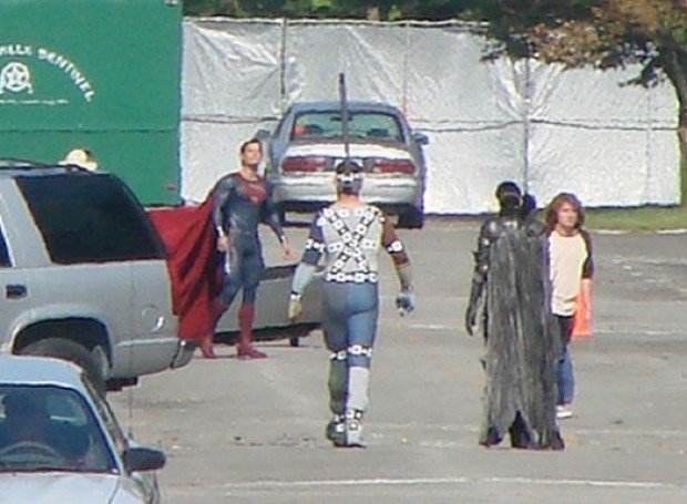
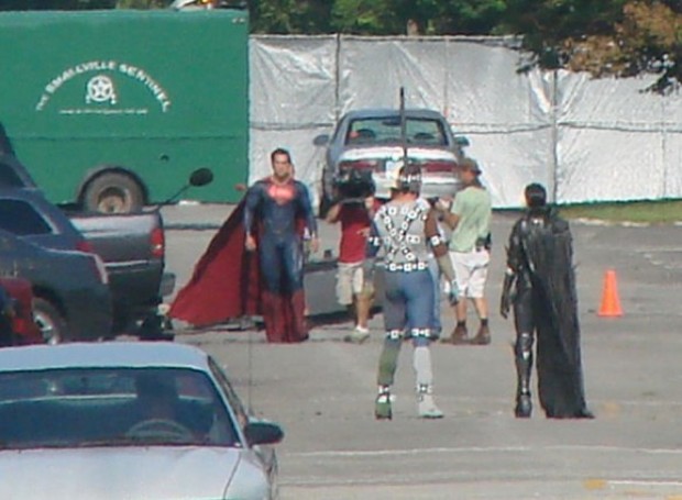
Several new photos have been sneaked out of the new Superman “Man of Steel” set, this time featuring full frontal Superman:
I say it every time, but it’s hard to judge a motion picture super hero costume from stills, or even fan videos. You have to see it in motion, with full effects treatment, in the context of a story to know if it “works” or not. Having said that, I am very dubious about the choices made here, specifically about removing the red trunks.
I know the arguments against them, made most prominently by Dan DiDio, Co-Publisher of DC Comics, that modern audiences simply cannot accept the sight of an actual man running around in his underwear. If that’s your position, that’s fine — I don’t necessarily agree, but I can understand it.
However, just removing the trunks without paying attention to the impact that has on the overall design is, in my opinion, a serious mistake. And lazy. That visual band of red with the yellow belt serves to separate the uniform into a shirt and pants. Simply removing them, as it appears has been done in the movie costume, means you end up with a grown man running around in a onesie instead of his underwear. I’m not sure that’s necessarily an upgrade.
You need either some kind of a visual break there like a belt (that’s not the same color as the top and pants!), or you need to design the tunic and pants in such a way that they’re clearly separate elements. You can do it with piping, or seams (the modern equivalent of the Nineties pouches), or you can make them subtly different colors (i.e. different blue tones), but you need something to make it clear that we’re not looking at a one-piece leotard. Because outside of the Bolshoi or an NHL game, men in one-piece leotards look ridiculous.
Friend of HeroMachine John Hartwell had another excellent point as well arising (if you will) from these shots:
It’s like a naked blue buff man in a cape. Are the Village People in town?
And I’m sorry – but the tight “onesie” look (well said) only draws attention to his groinal area when the light catches it the wrong way, as you can see in the shot where he’s facing the camera. There’s this expanse of blue, then, hell-oooo! It’s a super-crotch! It’s just…disturbing.
Now, I don’t necessarily have anything against seeing the outline of a guy’s junk. Goodness knows, I have junk myself and I’m happy for it. But in terms of costume design, if you don’t have anything else going on in that region then the junkage becomes the focus, rather than the costume.
Fundamentally, that’s my problem with this. It’s not that the trunks are gone, it’s that the trunks were removed and seemingly no thought was given to how that impacts the overall design.
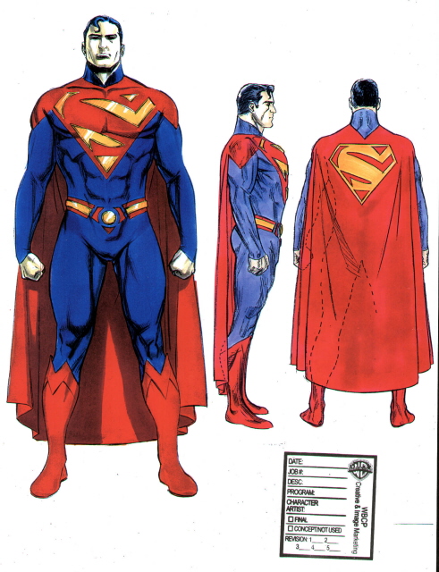
I poked around online and found some suggested “no trunks” alternatives that I thought solved the problem in a much better way, and which in my opinion would look better “live” than what I see in the stills above. Thoughts?
(Movie photos from SuperHeroHype.com.)


Y’know, I think this all boils down to functionality.
Besides the obvious design elements, the red trunks (which in the 1930’s took their cue from circus performers) at least helped to establish that this Strong Man was wearing a shirt and pants. It gave the visual cue that he was wearing something that was recognizable and functional.
Design elements and color breaks aside, without the trunks, he’s wearing…what? And more to the point, why?
It makes me really appreciate Marvel’s approach to their character’s on-screen design. Looking at the X-Men, Daredevil, Thor and Cap, all of those characters have costume designs that functionally make sense. They’re all some sort of uniform or armor that would be beneficially functional in a “real world” sense.
The exception, of course, would be Spider-Man. I recall Raimi talking about how the idea of a dude swinging around Manhattan in his ‘jammies would just look ridonkulous. But, give the designers credit – they came up with really good texture and fabric solutions that sold it on-screen and made it work exceptionally well.
With DC, the armored movie version of Batman works because, duh, dude like that would NEED to wear some body armor. Just makes sense.
Superman though…what does he need? Why does he wear what he wears? He doesn’t need armor. Doesn’t need anything protective. So what’s the purpose for what he’s wearing? This big plastic onesie with Junk Enhancement doesn’t really seem to really answer that question. It just makes him look…odd.
@John, I agree on most of what you said, except for Spider-Man. It’s one of the reasons that I didn’t like the movie, becasue he just shows up in this rubber suit that there was no way movie-Spidey should have had. They out of their way to show him as being a down on his luck mope, but yet he can afford to have this intensly layered and detailed rubber suit made? And since this is a Peter that didn’t invent web shooters, I don’t believe that he could have just created the “fabric”. What did he do, steal a bunch of footballs and sew them together? People can say what they want about Fantastic Four, but at least they explained their costumes. And Daredevil, like Batman, was believeable because DD has money. And as far as Superman goes, I’m with Jeff on trying not to judge costumes before you see them in action, but I’m am not digging it at all. But I’m also not digging the rest of what I’ve heard about the movie either. DC needs to be really careful here, to avoid another Green Lantern type situation.
All those alternatives look way better than the live action version. Especially the last one looks pretty iconic, and kryptonian, to me. But I’m still going to give it the benefit of the doubt. It looked a lot better in the promotional image.
http://fashiontrendspictures.com/wp-content/uploads/2011/08/Actions-The-New-Superman-Man-of-Steel-Costume-Henry-Cavill.jpg
Also, the way the light’s catching on the rest of the costume, it makes it look like it’s made out of plastic or rubber, which looks a bit odd, especially next to the fabric cape. And what are those shiny metal-looking things on his wrists?
Thing is, the red trunks and yellow belt also help break up the monotony of the costume. Until you get to the boots, it’s pretty much just flat blue.
Still, as you said, we’ll have to see how it looks on the big screen. But some of those redesigns do look a bit better.
Those examples you posted really do a more effective job of removing the trunk’s issue (although frankly, since the man could kill us all in about five minutes if he so chose; I think he can wear whatever the he’ll he wants) while addressing the design issues you brought up. Even just the side paneling with the different shade of blue would have been better than one solid color.
Keep in mind this is a Zack Snyder film, so I doubt the costume will end up looking as it does in this natural lighting before all the post production visuals his other films are known for.
he has a belt, it can be seen in the first picture, and appears to be blue or a similar color to the rest.
Marco: Yes, I saw the belt, but as I said it has to be a different color or it’s useless.
DiCicatriz (5) brings up a good point. It is a Zack Snyder film, so while it looks flat now, that might be in order to give the visual artists a distinct, yet clean palette to juice up during post. Or at least that’s what I’d like to tell myself.
This just reminds me of the number of OCD submissions, where the advice is to break things up near the waist on a costume. If a hero wants to go out and fight crime in footie-pajamas, that’s his call. But it helps if he can try to accessorize so it doesn’t look like he’s wearing footie-pajamas, even when he is.
I like the first two pics for a live action costume of Superman. Not sure on the Zack Snyder suit at this point. My one main beef with it is the overlong cape. It should end somewhere between the calves and the ankles.
Mr. Q
Hey guys so they are intentionally hiding superman’s crotch in the promotional image and when the movie comes out they’ll be like “Hey! Guess what,he’s not wearing undies”.
Ok I get it you want a more modern look ,but could you at least change it up a little more so it doesn’t look like a blue ,naked Ken doll with a cape.
On the upside, he looks great next to those other two costumed people.
I really like the fake “belts” on images 2, 5 and 6.
You don’t comment about the two villains. The girl in leather and kevlar black costume is OK. But the man in grey and blue spandex with chains and straps is particulary ridiculous. I don’t know the DC universe, and i’ve no idea who is he, but he make eyeache.
Fabien, those are CGI markers. The actor you see is just standing in, the actual creature or villain or whatever it’s going to be will be added via computers in post-production. Kind of like the guy who was “Gollum” in the LOTR movies — he just had a green leotard with CGI targeting discs all over him during the actual filming.
It also looks like he’s got some sort of metallic gauntlets on.
People who scoff at the red trunks and say “He’s running around in his underwear! That’s just silly! Get rid of those things!” piss me off.
Not only are they displaying their ignorance of the origin of the costume (as someone pointed out above it’s based on the circus costumes and older wrestling uniforms) they also miss the point of why those old costumes had those little shorts.
In the old days those little shorts were called “modesty shorts”. They were invented because someone discovered that when you put a man in a pair of tights they tend to “cling” around the crotchal area. To cover themselves up circus performers would throw on a pair of shorts that wouldn’t cling quite so tightly.
Maybe it’s just me but I can’t stand when someone criticizes something they know nothing about like that. It annoys the shit out of me.
Maybe those people are just really, really interested in a view of his crotchal area outlined in loving detail. Who are we to judge? (Oh, wait–I judge all the time. Nevermind, then.)
@Doornik1142: Point taken, but I am fully aware of the origin of the shorts on the outside, and I still think they look silly. While the modesty of circus performers may have needed safeguards, the modesty of comic book characters can be maintained otherwise, as shown by, for example, The Flash. If comic book artists, or fans, were that concerned about modesty, the costumes worn by characters such as, oh, I don’t know, say, Wonder Woman, would look quite different. Personally, I’m so accustomed to heroes who follow the UOTO code (Underwear On The Outside) that I barely notice, but your rage over this seems to me to be inordinate. Lots of better things in the world to be targets of such vituperative rhetoric.
Does anyone else think that all the costumes on this set look like a knock-off of an 80’s hero movie? Just saying. They really need to update the looks and make them a bit more modern rather than copying them from the comics. I’ve always been more of a fan of costumes that didn’t follow the pics exactly but still resembled them. I’m disappointed with the costumes here.
Jeff, you bring up a good point, however I’m looking at a lot of your replacements and… I dunno, none of them look much good either. A lot of them sport the “victorian high collar” look that is both impractical and silly-looking, others make the suit ressemble a power armor (both things being aspects of the new Jim Lee redesign that are really, really stupid). The rest seem to turn the belt into a “decorative element that sorta ressembles a belt but isn’t a belt”, and at that point I just say “Why?”.
The fourth one, IMO, is the one that would be the most workable, but it would need the red boots again, and replace the big simplified S-sigil with the traditional one, perhaps in the center of this downward V, with a raised look not unlike both Cavill’s attire and Routh’s.
Is it just me or does Supes look more like badly painted action figure in those stills? And what’s with those two with their backs to us?
It gets worse folks. They just released these new stils.
http://movies.cosmicbooknews.com/content/man-steel-2013-close-images-henry-cavill-superman
Dear God, what the hell is on his hips? That really does not look good.
I’m pretty sure that we are now entering Schumacher territory with this costume. The bulging crotch, the unneccessary details, the overall sense of “Meh”. Plus the added Snyner slo-mo Matrix ripoff effects. I’m really trying not to be a downer, but I’m not feeling it at all.