Many thanks to everyone who entered Character Contest 54! I’m going to do something quite different with the results this week: I’ve chosen one entry I felt was the best from each person who provided a valid link and will comment on it. Then at the end, I’ll announce which one I think was the winner overall.
Usually I’d pick out 10-20 of the very best overall, but I can see how it would be frustrating to work hard every week only to never get any sense for why yours wasn’t chosen. I can’t promise I’ll do this every week because it’s a lot of work, and the descriptions may be as brief as just a sentence, but we’ll see how it goes. I’d love to hear what you think of this approach, though.
Practically speaking, that means you’re going to find a lot of images after the jump, so click through with caution!
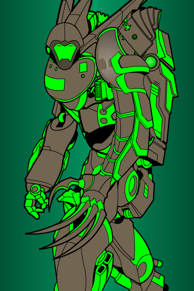
Abominal401, “Green Mist”. I love the way you’ve made him appear to be striding off-screen. One of the best mechs I’ve seen so far.
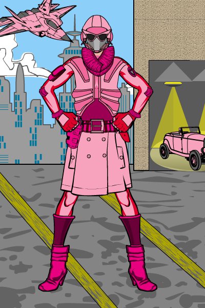
AJW, “Fuchsia”. I just got done reading the Ultimate Spider-Man version of Silver Sable, and Fuchsia has the same feeling about her of a woman very put-together and no-nonsense about her bounty-hunting business, but still with a sense of flair.
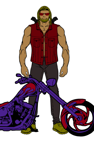
AlphaAlphaRomeo, “Bounty Hunter”. The face makes this one, particularly the hair and beard. He looks like a real-world bounty hunter. A bit plain to be a winner, unfortunately, but still good.
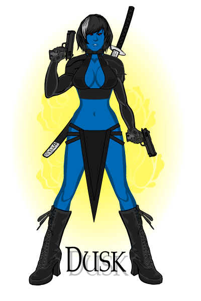
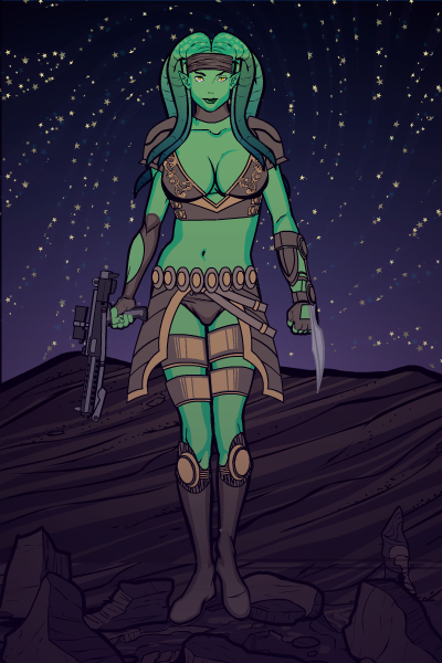
Anarchangel, “Dusk”. I love the background and the overall character design, especially the neat loincloth arrangement with the belts. The stance works really well also, making those boots not look as out of place as they usually do due to the weird angle at which I drew them. A bit too Mystique-like to be a winner, but put together very well to make a totally bad-ass woman.
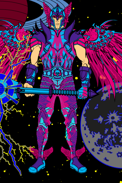
Archetype, “Justifier”. An interesting Jack Kirby style “space god” type of character, but ultimately the riot of colors is just too much for me.
Asder, “Coyote Jones”. I love, love, love this extraordinarily well-done scene. Note the consistent use of colored lines throughout to give it a softer, more animated-style feel. Asder used the same three basic colors on all of the ground elements to unify them so it looks like all one thing instead of pieces stuck together randomly. The subtle glows in the sky are fantastic, with the warm-colored clouds over the cooler sky being a real home run. The character is also really good, although for me personally the large boots are a little off-putting. I get what he’s going for, though, and it works in the context of the overall feel. A truly exceptional entry!
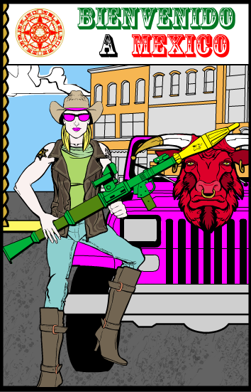
Atomic Punk, “Vulpina”. A fun story and an interesting visual. A bounty hunter with a missile launcher better hope the client is particularly lenient on the whole “Dead or Alive” concept.
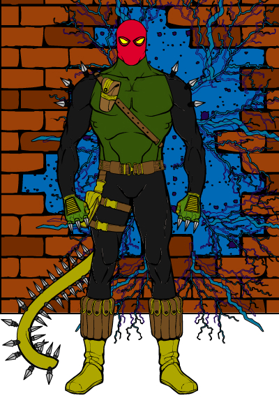
Badger King, “Jinxi”. A solid four-color style traditional super-guy. The tail in particular is cool, and must have taken a lot of nit-picking movements, well done.
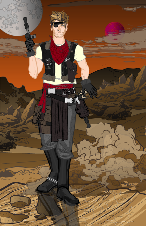
BClouser, “Hayden Chase”. Another fantastic setting, for a lot of the same reasons as Asder’s. The gradients in the background, the coloring of the ground (and the gradients there, too), the choice of clouds and hidden satellites, all make for a great scene. I like the changes made from the first version to this one, too, including the slight step forward the character is taking to give him a sense of movement. I like the character design, too, sort of a piratical Han Solo. I mean, even more piratical than usual for Han. Great job, BClouser!
Blink, “Scar”. A solid image, but a bit plain-Jane to be a contender for the title.
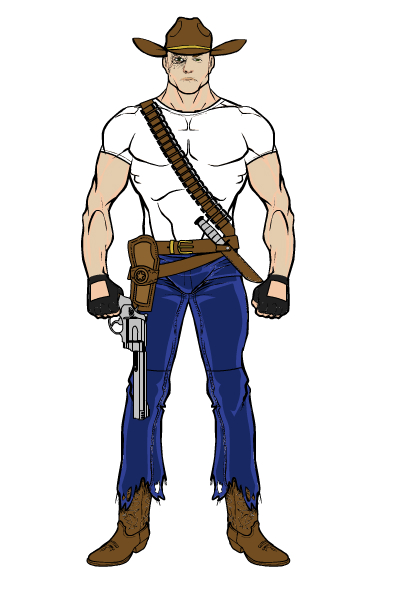
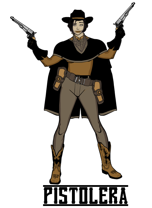
Blue Blazer, “Pistolera”. Compare this one to “Scar”, just above. Both are somewhat plain in terms of clothing and items, but the changed stance to make the figure look like she’s at an angle, and the pistols raised over her head, give her a sense of personality. The name helps, too, strangely enough, as Pistolera is kind of exotic and different. My major beefs with this one are the way the holsters seem to jut out unnaturally from the hip, and the way the shading on her face make her look like she has five’o’clock shadow …
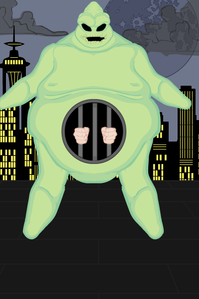
BornToBeALoser, “Bag ‘Em”. Love it! A ghostly, alien bounty hunter who swallows his targets into a gastronomic prison, just brilliant.
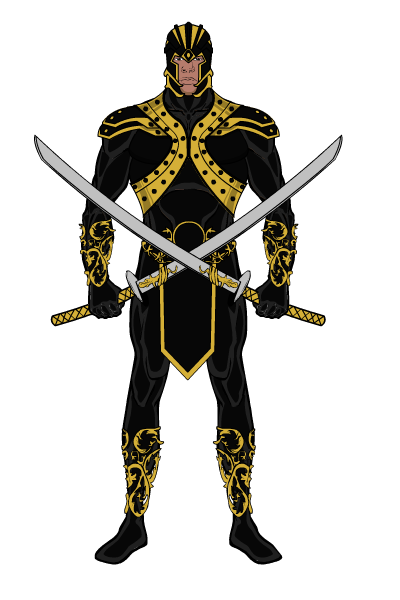
CPrime, “Warbound”. First, nice to see you back, CPrime! Warbound is a solid character and a well-executed image. But I can’t say it screams “Bounty Hunter” to me — he looks more like an upper-caste warrior type. Still, you’re good at this, and I hope to see more entries from you down the road.
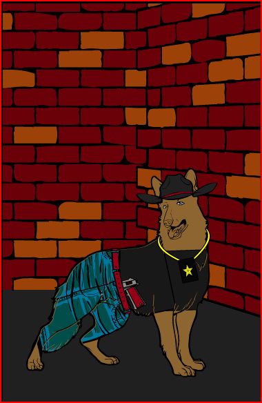
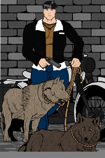
DJ, “Dawg The Bounty Hunter”. Welcome back to you, too, DJ! You were overseas last time I heard, am I remembering that correctly? Anyway, the masking of the jeans and the pistol in his belt are just too cute, thanks for sharing. I may have to buy one of our five dogs a gun!
dm3588, “Top Dog”. I like the way the nooses seem to fit over the dogs’ heads, and I’m not sure how that was done. Share?
Domhellsing, “Nex Bounty Hunter”. Very well put-together character! I agree with one of the other commenters too, those swirly stars are awesome. Was that a mask onto an aura … ?
Firecracker, “Bounty Hunter”. She looks good and the backgrounds all work well. I like the set of the glasses in particular, it gives her a bit of pizzazz the image lacks otherwise.
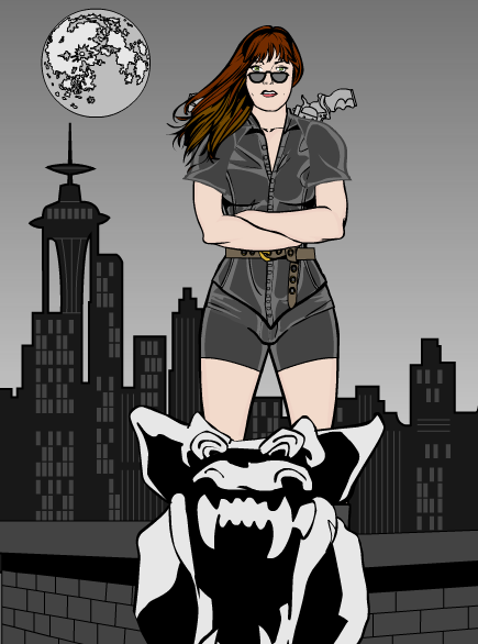
Frevoli, “Locust Assassin”. I love the head and the idea of someone using locusts as their weapon. I do think the surroundings get a bit cluttered, though, making it hard to separate the character from the background and the stars and the locusts themselves.
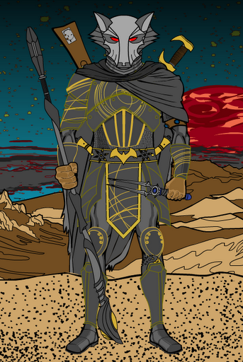
GeneH, “Jaffa Bounty Hunter”. I like the image overall, but my favorite part is the inscribed planets and swirly bits on the chest piece. That’s an awesome effect. It doesn’t work as well for me on the shoulder pads as the lines cross over what are supposed to be recessed plates and it kind of ruins the effect. I think the helmet and sandy foreground could have benefitted from some of the same kind of line coloring as in Asder’s and BClouser’s settings to help them blend in a bit more, making the character pop. Well done, though.
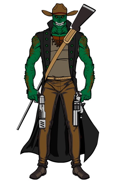
GuyDiga, “Croc Gunslinger”. The name pretty much says it all! I like the idea and you’ve done it nicely.
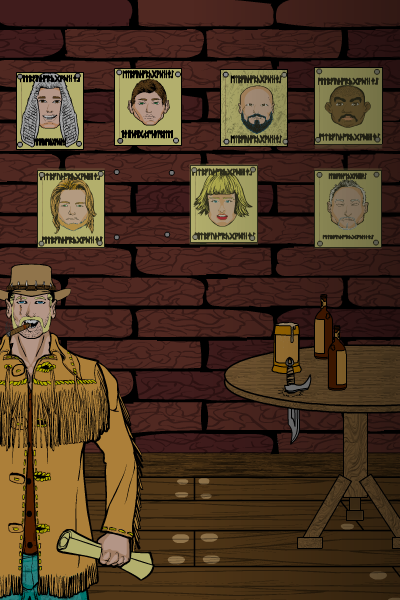
IFlyte, “Brandon Bullet Simmons”. A great setting, particularly in the small touches like nails for each poster, the dagger through the table, and the patterning on the bricks. I think the character himself could have been larger given the perspective of the room you’ve created, but it’s a great idea.
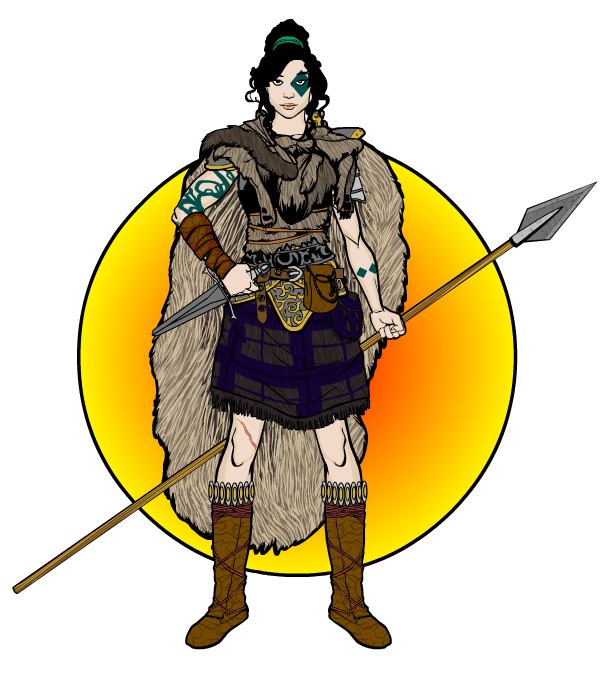
Imp, “Anka”. The usual excellent Imp construction. I like the patterning in the fur cape and the tops of the boots, those are nice details along with the leg scar and tattoos. In terms of coloring, I wonder if it might have been better to go with the darker cape liner and lighter kilt, or maybe put a top-dark to bottom-light gradient on the cape … Anyway, nice job as always.
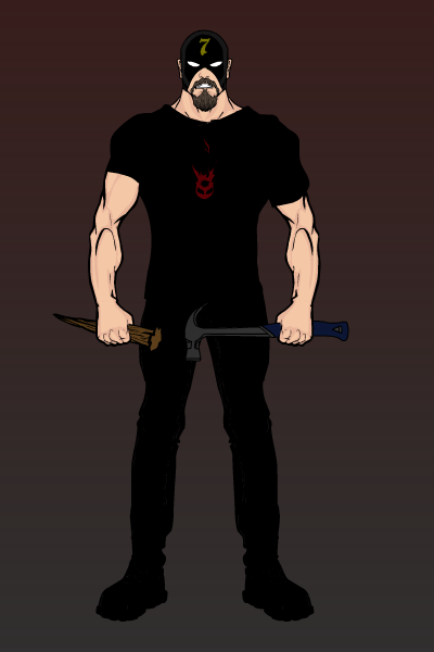
Invisiboy, “Demon Hunter”. For me, this one was just too dark. I couldn’t make out any details of the costume at all, and the background being so close in value to the clothing muddied it up, making it hard to differentiate the various planes.
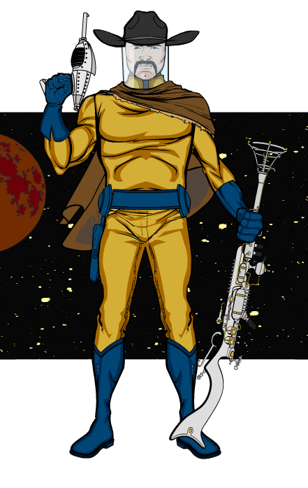
Jack Zelger, “Space Bounty Hunter”. Love it! The homage to the golden-age TV space-adventures is spot-on and very much appreciated, from the colors to the boots to the nifty guns. The “capper” (ha ha) is the cowboy hat on top of the space helmet, that’s awesome. Really well done, Jack. And bonus points for using the framed-out background as in my last tutorial!
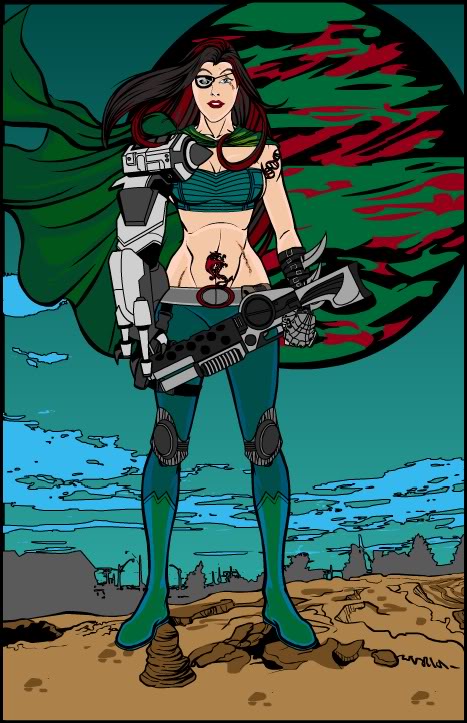
Jessica, “Charratha Starfallen”. Good one! I like the cybernetic arm and the tattoos in particular. The flared cape gives some sense of movement as well. I think the background is not as strong as the character; toning it down with maybe colored lines instead of blacks would have helped, especially in the big planet. Speaking of which, I think it would also help to move the planet to the left ten or twenty pixels so the rim doesn’t blend in with where her hair runs into the cape, it confuses the eye a bit.
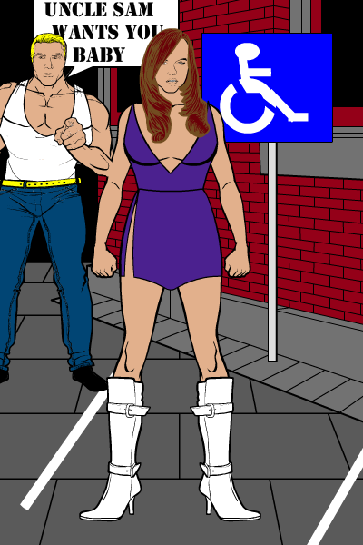
Joel, “The Booty Hunter”. Very funny!
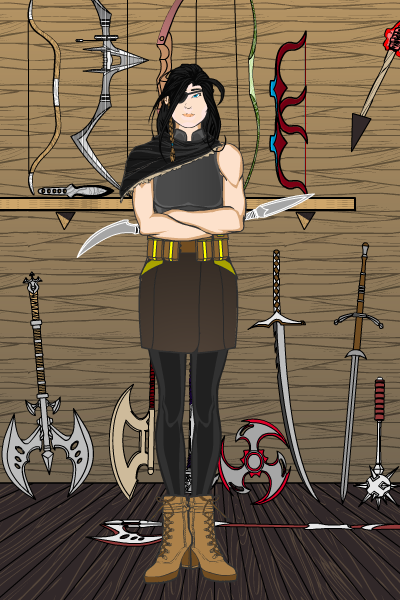
Knitesoul, “Trader”. A neat idea and a solid image, but I don’t quite get how this is a bounty hunter.
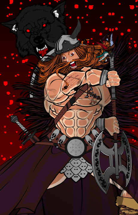
Krashnaak, “Mannuluvr”. Wow, that’s very dynamic! I’m not usually a big fan of blood spattering, but the dynamism of the image overall supports it. Major props for doing something so innovative. I think, though, that the hands fall short of the rest of the composition — I can’t quite make sense of how he’s holding that axe, particularly with the rear hand. It doesn’t seem like an arm would bend that way. And the foreground hand definitely needs to be much bigger. But a very fun image, thanks for sharing it!
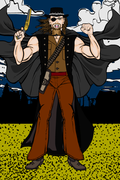
Kyle, “Outlaw Jack”. Technically he’s the bounty and not the hunter, but he’s a good character regardless. I like the vaguely Merle Haggard look to him.
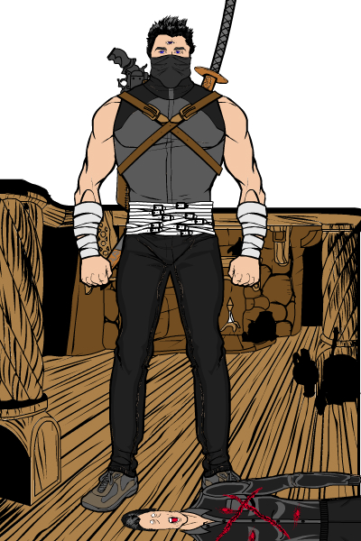
LBClark3, “Hunter of the inner Eye”. This one’s all about that third eye, it makes for a cool concept. Unfortunately the victim looks like he was run over by a steamroller, which detracts from the overall image. The bounty hunter himself is really well done though.
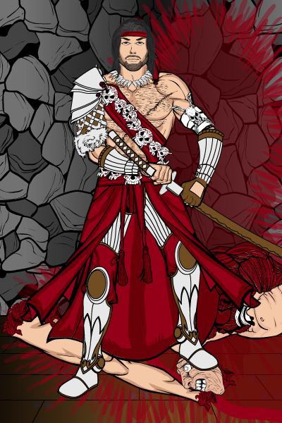
Liam, “Edmund”. As I said, I’m not a big blood and guts guy, so that part of the composition isn’t to my personal tastes. But the coloring is extremely effective and the character looks awesome.
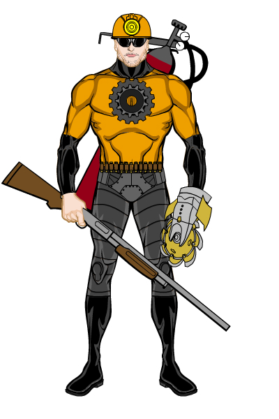
Malfar, “Demolisher”. A neat looking guy in the tradition of The Demolition Crew. I like the helmet particularly.
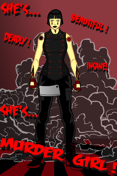
Maniac Mick, “Murder Girl”. A really nice poster! The words work great here and the name is fantastic. A character I could probably see in an actual comic.
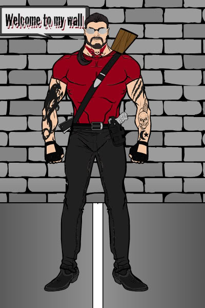
Mr. Matt 22, “BGunnar”. I like the throat tattoo, actually, that’s interesting.
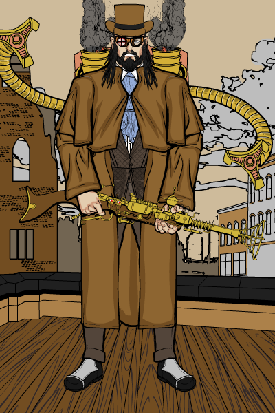
Myro, “Trapper”. A fantastic steampunk style character! Turning the jet pack upside down so they become smokestacks was a brilliant touch. The coloring on the arms and gun nail the whole era, and you even managed to make the buildings genre-appropriate. Great job!
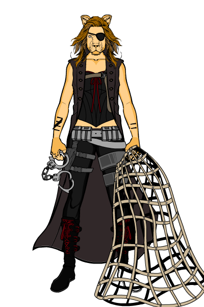
Pdubbs, “Bounty”. Another solid entry.
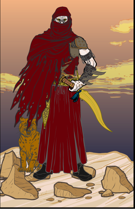
Rancid, “Orcon”. I love the creepy, vaguely undead Arab look of this guy. The clouds are also interesting. I think the major failing is in the positioning of the cat and the character over the rocks, they look like they’re standing on top of them somehow and it’s a jarring effect.
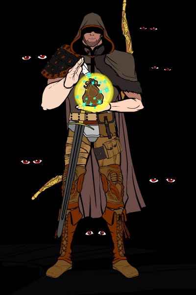
Rapthama, “Morrok Wallinder”. Love this one! It has a great “atmosphere” with the colors and the eyes on the black background. The spell effect is perfect as well. I love what you’ve done with the boots and knee wrappers, too, that’s a great look.
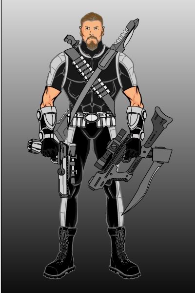
Sawyer Heppes, “Clayton Jones”. This guy definitely looks ready to take on any and all comers. The weapons are cool and the simple color palette works well.
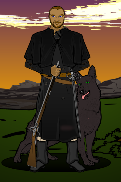
Somebody, “1864”. A very effective period piece, the character and scene both look great. My only minor quibble would be with the shadow beneath them, which I think would work better as a black-to-transparent disc so the edges aren’t so sharp. As it is, they look like they’re standing on a hole.
Spidercow2010, “Bagger Caine”. Wow! Great job making him look like he’s on the horse. And is that James Brolin?! The barrel-on gun view is also perfect, nice job on that.
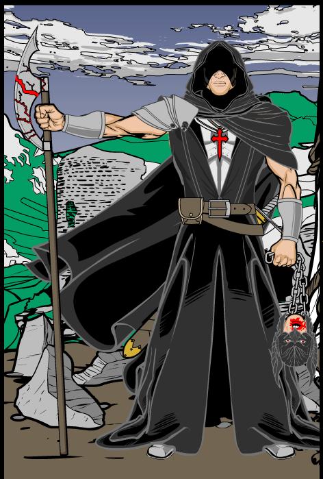
Sutter Kaine, “Last Crusader”. Awesome image. Love the character design, the item choices, the background, everything. Did I say awesome already? Cuz it is.
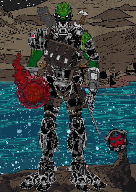
The Random HERO, “Krail Hunter”. Very well done alien hunter character. I like the camo only in certain parts of the armor, and the stars in the river are a startling effect. Well done.
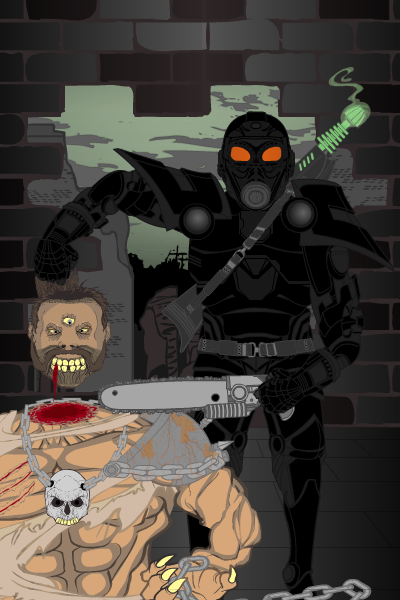
The Turhake, “Mutant Hunter”. Too gory for me, but the background and gun are really well done.
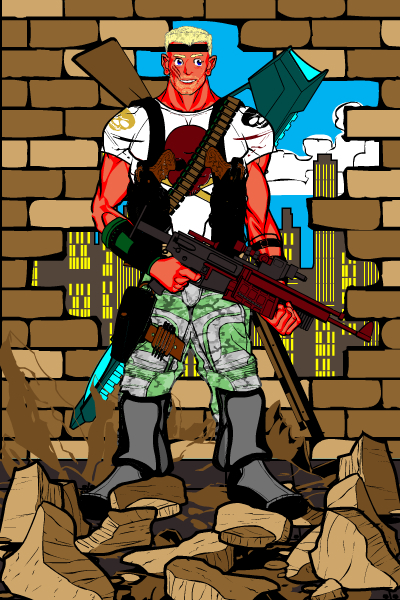
Tuldabar, “Mikail”. The combination of the rubble and the hole-in-the-wall background definitely make it look like he just busted in, which is cool. The proportions of the figure are a bit too far off for me, particularly the length of the arms and the stoutness of the lower legs.
Victor Hugo Contreras Tellez, “Warstrike”. A nice looking warrior style character.
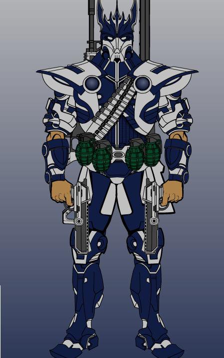
Vodnik, “Goodfellow”. A very different and cool concept, I love it! He’s put together really well and immediately makes me want to know more about him.
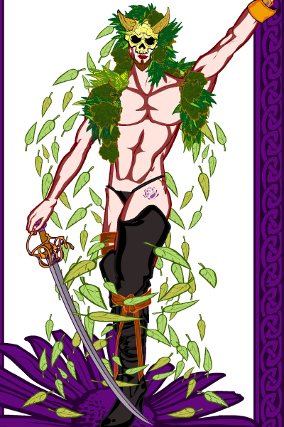
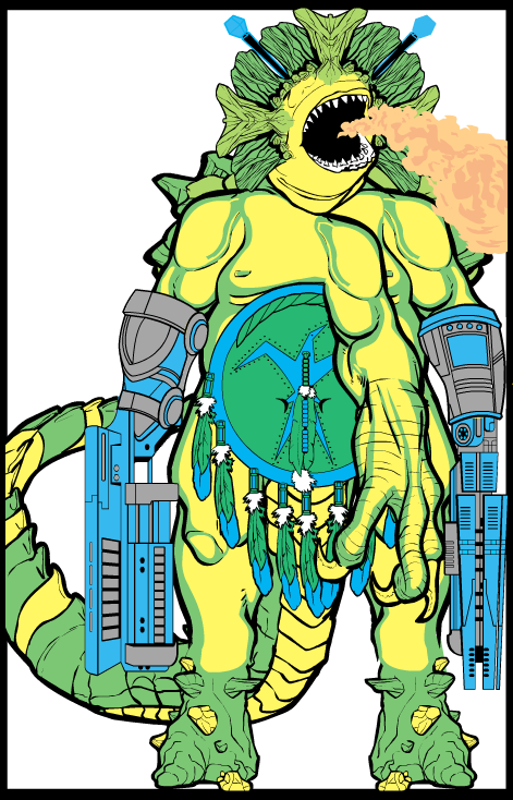
VonMalcolm, “CyBeast”. VonMalcolm continues to do horror and monsters better than almost anyone out there, and this one’s right in the sweet spot. I love the alien shark head and the overall feel of the guy.
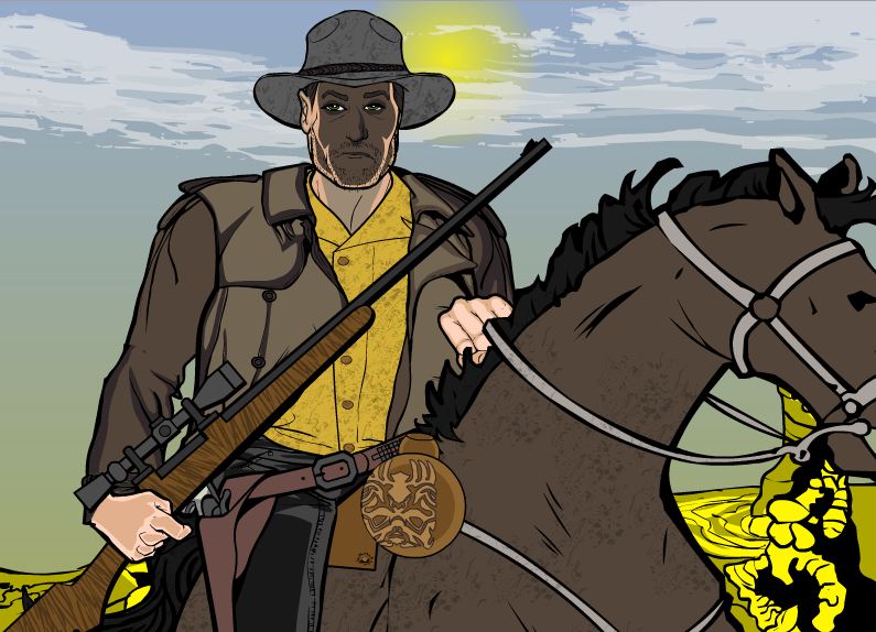
Watson Bradshaw, “Drifter”. Wow. Just, wow. I think this is a fantastic composition. Bringing the character up close, cutting him off at the waist like this, makes for a very powerful effect. The backlighting of the face is also spot-on and completely sells the idea that he’s riding in from the sun. The simple but subtly powerful background choices, particularly in color, set the scene perfectly without distracting from the most important parts. Exceptionally well done!
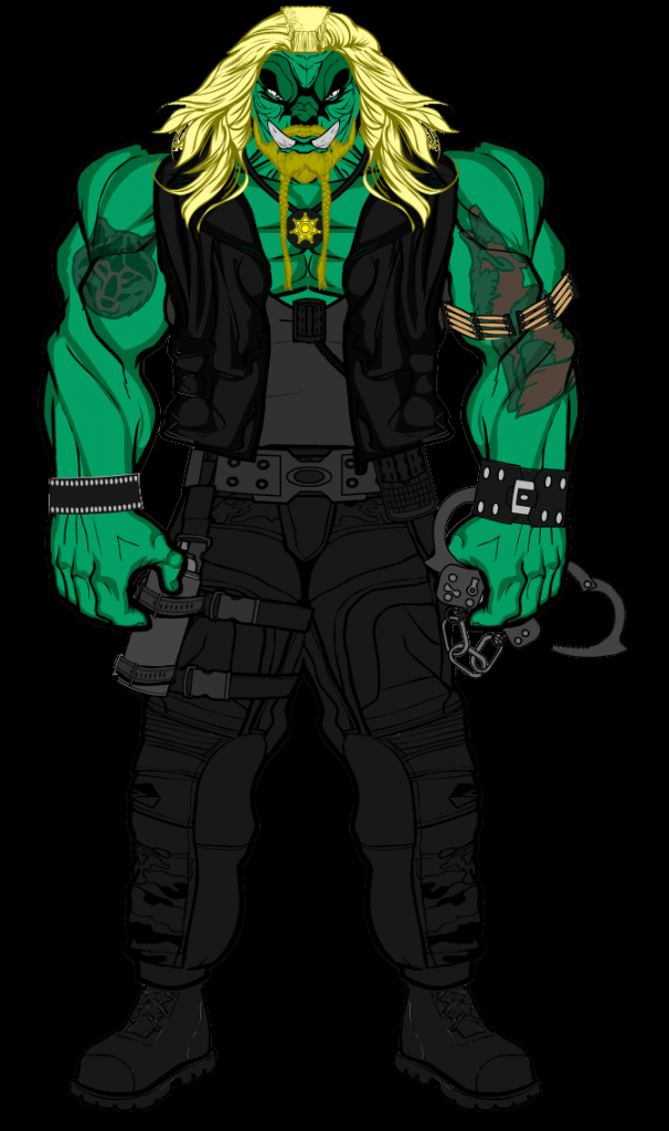
Xavier Kaine, “Trog the Bounty Hunter”. Yes, I’d pay cash money to see this guy go up against Lobo in a comic. Make it so, someone at DC.
XionUnborn01, “Green Behemoth”. The proportions on this one don’t quite work for me, but I like the overall idea.
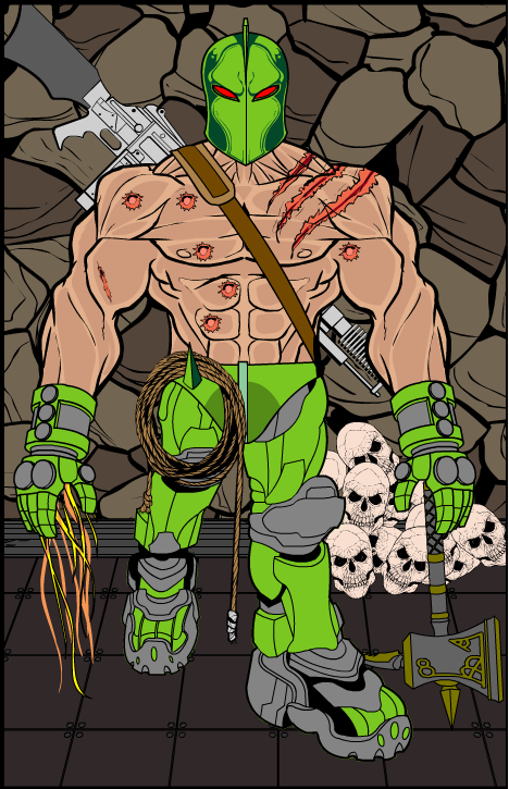
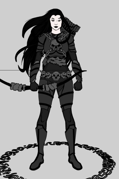
Zaheelee, “Obsidian”. A nicely done character!
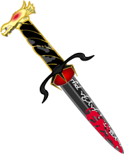
Zar, “Dagger”. I love me a good custom item, and this one is great! Thanks for thinking outside the box, Zar, I appreciate this kind of creativity very much.
Phew! As you can see, I have a hard time judging each week because there are so many great entries. And some of the folks above submitted multiples, all of which were fantastic!
Were this a regular week, though, the ones I probably would have picked as “Finalists” would have been Anarchangel, Asder, BClouser, BornToBeALoser, Domhellsing, Jack Zelger, Joel (so I like a good booty joke, sue me), Krashnaak, Maniac Mick, Myro, Rapthama, Spidercow2010, Sutter Kaine, Vodnik, Watson Bradshaw, and Xavier Kaine.
Out of those, probably my top three would have been Asder, BClouser, and Watson Bradshaw.
And out of THOSE three, my top pick would have to be … Watson Bradshaw! I think the innovative angle and the overall effect were just stellar. Part of my “winner” criteria is “Did I go WOW when I opened the image” and I definitely did on this one. Well done, sir!
Thanks again to everyone who entered, I am as always humbled by your creativity and artistry. Keep on creating, and don’t let the opinion of anyone (least of all ME!) keep you from expressing yourself in some way or another, whether that be HeroMachine or something else.
Imagination is king, baby!




Thank you and congratulations Watson and congratulations to everyone else!
I can hear my one, but I don’t see it
@Jeff fair point about the cluttered background. I guess I’m just trying to keep up with the guys coming up with awesome layouts (BClouser comes to mind)
Seeing as we’ve gone from villain to bounty hunter, could I suggest that next we do henchmen/minions (unless it’s been done already, that is)?
Nice job everyone. it seems our judge has a weakness for bad/dirty puns, i may be able to use this to my advantage in the future. (he he he)
Wow there really was some stiff competition.Great entries all and congrats to the winner and runners up!
on to the next one.
Hey, I wonder what “Special Celebrity Guest” Will Smith has to say about these entries?
Will Smith: Now THIS is what I’m talkin’ about! You know what I’m sayin’? Yo… congrats, Watson.
i like em all but id like to point out that the name Anarchangel used is one of them that Peter Parker used durin the identity crisis saga.
here’s proof of what im sayin:http://marvel.com/universe/Dusk_%28Cassie_St._Commons%29
no big deal just pointed it out
http://marvel.com/universe/Dusk_%28Cassie_St._Commons%29
i apologize the link didnt work
also Sawyer Heppes, “Clayton Jones” gave me an idea for a character in a story of mine i appreciate it
The dogs’ leashes in mine were done with rope necklaces for the collars, and the rope item (ItemRight, miscellaneous, third page, first item) as a leash, one rope for each dog, carefully stretched and positioned so the ends are hidden.
But yeah, as soon as I saw Watson’s “Drifter,” I knew I was toast. Congrats!
Congrats Watson. That really is an outstanding creation. Well done.
@Aaron – “Dusk” is just a word used for the beginning of darkness. (She manipulates shadows) I’m pretty sure Marvel can’t sue me over it…or at least I hope not…Anyone know a good lawyer?
Congrats Watson.
@anarchangel i dont think they can ethier just pointing it out
Happy to help, Aaron. I will warn you he is a character in the current Mutants and Masterminds campaign I am running, so tread lightly. Haha.
@Aaron although name sharing isn’t an ideal situation; I don’t think it’s a large issue, being not uncommon practice
e.g. Scarcrow, Captain Marvel, Nighthawk… etc
@Joshua might I add, what an excellent impression
Glad to see Trapper would have made the finals cut. It was my first foray into the Steampunk genre, although I had seen enough examples that I was pretty sure I could nail the details.
But, yeah, when I saw Watson’s entry, I was pretty sure that was the winner. Congrats.
holy smokes, just got home from work to find out I won! Wow, there was some awesome work done and didn’t think I had a chance. thanks Jeff and everyone for the great feedback 🙂
for my price I would like something simple that a lot of people have asked for to help with poses, and that’s a set of legs which end closed at the knees.
http://i122.photobucket.com/albums/o240/watson_kaboos/watsonbradshawprice.png
@Watson Bradshaw: Congratulations, of course. The sun and shadow effects are well done.
I also like “Home Office.” Don’t take this the wrong way. You obviously worked very hard on the design. But, you misspelled “Reception.”
It’s very subtle, but that slip takes the whole scene from serious to silly. A couple of gritty, hi-tech bounty hunters inspired by “Firefly.” Instead, an amateur ragtag crew like “Red Dwarf.” It works even better!
@All: Creative stuff and enjoyable as always.
@Blue Blazer (and All): Check out Franco Nero in “L’ultimo pistolero.”
@Jeff: I tried a props page myself. It is seriously time-consuming. And… thanks for the props. ;9
Congrats Watson and I just want to point out that Frevoli’s Locust Assassin doesn’t seem to show on this page.
Sorry for making it so dark. I was high on the idea and thought black clothing would look cool, but I guess it is kind of impractical. Also, I was working on a laptop and the contrast looked a bit sharper to me–sorry. In short, I’ll try and do better next time. Peace out!
by the by, if the knees have already been claimed by another winner I would also like to see a new interior background like a star-ship bridge or cockpit.
http://www.gmonweb.com/portal/Portals/0/Daz%20Studio/bridge.jpg
http://www.chromecreations.co.uk/3d/filefront/02_serenity_progress12.jpg
Nice job everyone. Great portrait, Watson. Looks just like a real image!
I can’t but laugh at Kaine’s entry, with the character holding a bloody head of the helmet I used on my character last week that he said looked like Hawkman. Funny stuff. Btw great concept, a crusader/Templar holding the bloody head of a guy. Great depiction of religion.
I have to say two of my favorite entries were definitely Orcon and Edmund. Great job those, guys.
Wow, there were some really good entries this week. I agree with you. The coloring was kinda hard to figure out with my entry (especially with greens). I think I will try either more muted tones next time or a faded background. I do like the winner’s entry. It sort of looks like his face is in shadow and that is really hard to do. The clouds and the horse are my personal faves. Congrats Watson and keep it coming!
congratulations for the winner!
all right let’s get ready to rumble
let’s start the battle royal of the bounty hunters
I was! Thank you for remembering. I am back in the great state of Texas now. Thanks for mentioning mine.
My only defense for the odd proportions was for me using the “dwarf” recipe card while finalizing the details on my guy. And the back-guns are too big, which he didn’t mention. But I appreciate the feedback nontheless, and congradulations to Watson Bradshaw!
There are only so many ways to say “Great job, everyone, and congratulations to…” …to Watson Bradshaw, this time. Don’t mean to be flippant, but the seemingly infinite proliferation of excellence inevitably exhausts one’s congratulatory vocabulary. But sincerely, great job, everyone, and congratulations to Watson Bradshaw, who to my delight has claimed as his prize the thighs with knees, which I have myself lusted after for so very long. Well done again, Watson!
BTW, WB, does your nom de web have anything to do with Holme’s steadfast biographer and/or Nick Danger’s police nemesis?
SC2010, I have been known as Watson since I arrived from England to the States back in 95, and it stuck. My friends dubbed me so after the fact that I looked just like the kid who played the character in Young Sherlock Holmes.
Now does your handle have anything to do with this image?
http://www.dazmarshall.com/images/spidercow/spidercowsmall.jpg
DUDE I WON!!! *high fives everyone here* what did i win?
Forget that last part.
oh whatever
I believe Obsidian was a re-uploaded picture. It looks very, very familiar.
how do you make that blood effect